Merging two apps into one, and building the learning platform kids could actually navigate alone.
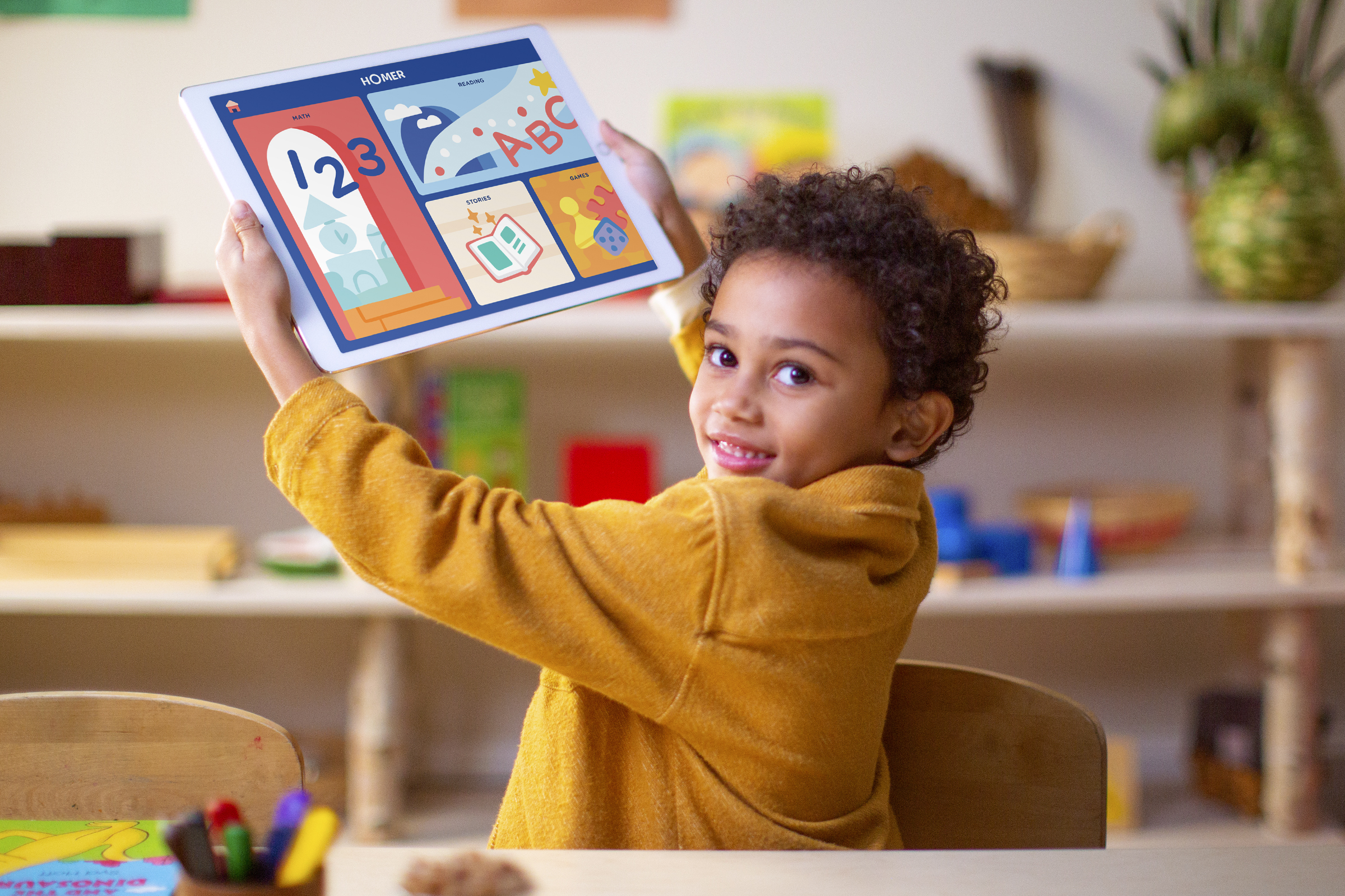
A comprehensive early learning platform for children ages 2–8, built to replace two separate apps with a single personalized experience. HOMER had the content. We had to make it navigable by a two-year-old.
HOMER Learning had built a strong product in HOMER Reading — an app proven to increase early reading scores by 74% with just 15 minutes a day. But the company's ambition had grown. The goal was to merge HOMER Reading and HOMER Stories into a single unified platform spanning reading, math, social-emotional learning, creativity, and thinking skills. That meant throwing out the old architecture entirely and starting from scratch.
I joined as a product designer partnering with the design lead on what was effectively a zero-to-one rebuild of HOMER's core product. The scope covered end-to-end UX — information architecture, interaction design, design system, and final UI — across iOS and Android. I worked within an agile sprint process alongside a product manager, user researchers, engineers, curriculum experts, illustrators, animators, and a marketing team.
The hardest design constraint wasn't the content library. It was the user.
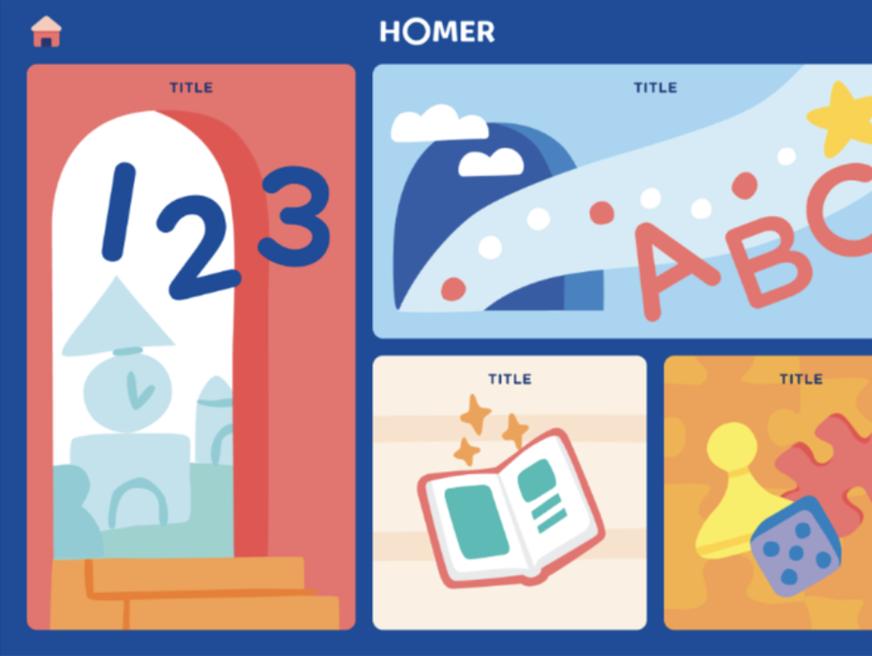
Before the redesign
Before touching screens, I spent significant time with HOMER's learning and curriculum experts and immersed myself in research on child psychology and developing motor skills. Children ages 2–8 have an extremely low tolerance for frustration, limited literacy, and no patience for hierarchy. Every assumption I brought in from adult product design had to be pressure-tested against that reality.
A 2-year-old navigating alone means every extra tap is a potential exit point. Content should never be more than 3 taps away.
Research synthesis — constraints from child development and the legacy pathway model.
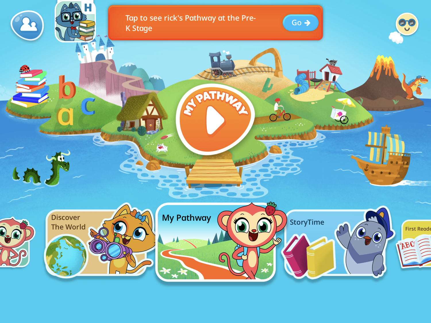
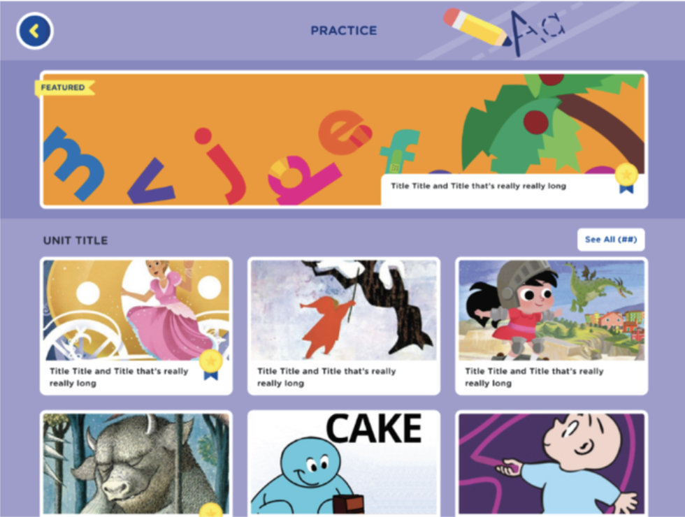
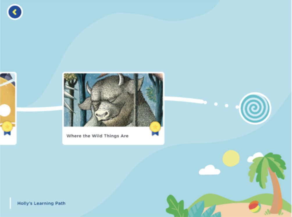
We also inherited a specific challenge from the previous app: HOMER Reading had used a centralized learning pathway model that worked well for a single subject but couldn't scale to a multi-subject platform. We needed a new architecture from the ground up.
Three goals. Each tied to something measurable.
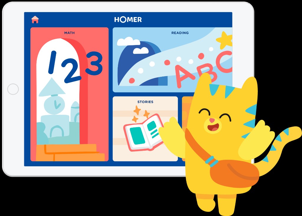
Make content discovery work without reading
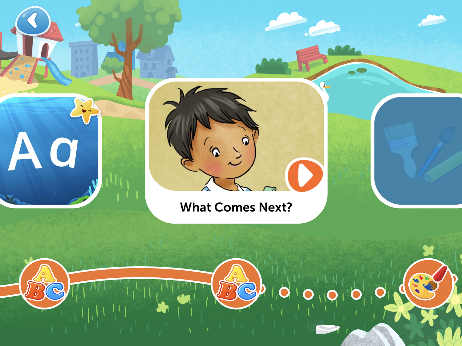
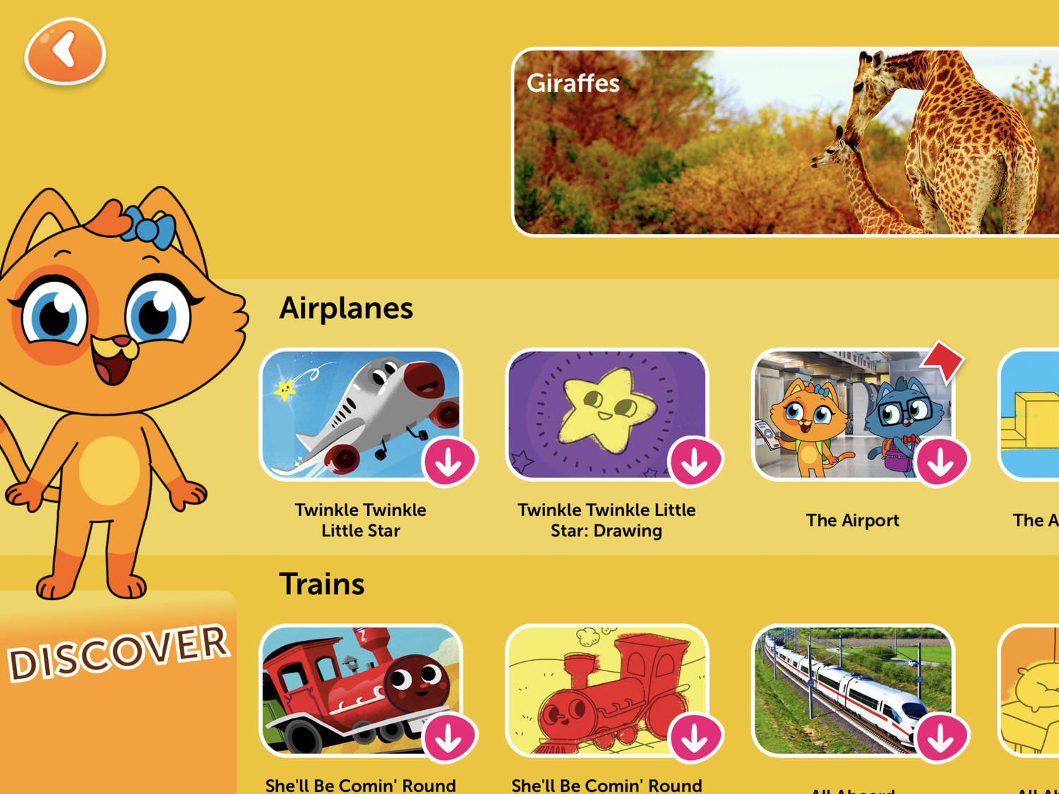
The new platform had hundreds of pieces of content across five subject areas. Kids couldn't rely on labels or categories. Navigation had to work through visual recognition, age-appropriate iconography, and a shallow hierarchy that kept the main menu always within a few taps.
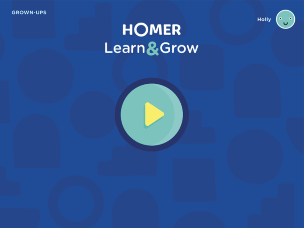
Design for two audiences in one app
HOMER Learn & Grow had to serve children independently while giving parents visibility and control. Parent-facing screens, settings, and alerts needed to coexist without confusing young users — using age gates, muted visual hierarchy for adult UI, and clear exit paths if a child accidentally triggered a parent screen.
Build in delight that earns its place
Moments of joy — Lottie animations, in-app transitions, sound design — are what make children come back. They're also the first things cut when timelines compress. Advocating for these wasn't just a design preference; it was a retention argument.
A shallow architecture, a flexible grid, and a design system built to grow.
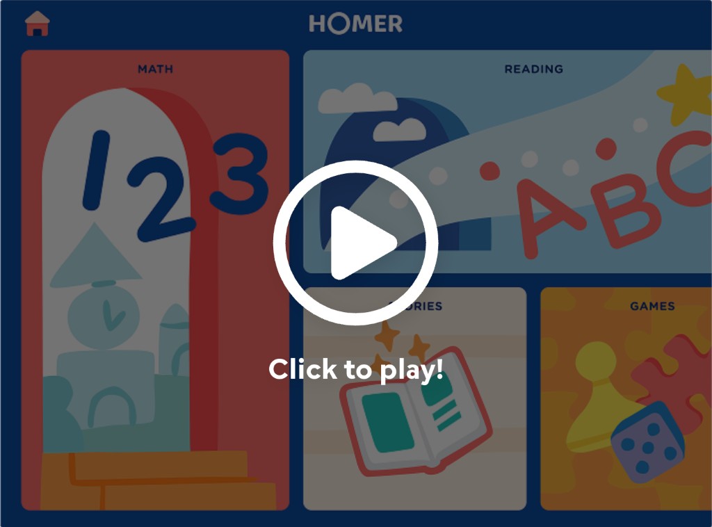
The core navigation decision was a deliberately shallow information hierarchy — a flexible grid of content categories on the main menu, organized by age and emotional scheduling needs, so that kids were never more than a few taps from anything. Button placement on the main menu adapts based on the child's age, making the experience feel personalized without requiring any input from the child.
Learn & Grow information architecture and core app flow
From concept to foundation
We built the design system from scratch — streamlining button styles, states, and positioning to create consistent UI patterns that supported intuitive navigation. Every button and illustration was tested with real children to ensure they were communicating clearly before going into production.
For the parent experience, we used age gates and visually subordinate UI to keep parent-facing screens accessible but unobtrusive — always pairing them with voice-over instruction and easy exit paths for kids who wandered in accidentally.
Using motion to create delight and engagement
The delight layer — Lottie animations, in-app transitions, sound effects — was designed in close collaboration with the illustration and animation team, and advocated for at every roadmap review. These moments aren't decoration; they're what make a children's app feel alive and keep young learners coming back.
After the redesign
Zero-to-one in sprints — systems, specialists, and constant kid testing.
We ran in agile sprints with tight feedback loops between design, product, research, and engineering — and we treated curriculum experts as design partners, not reviewers at the end. That rhythm let us kill dead-ends early and keep the IA decisions tied to real child behavior.
Child sessions stayed on the calendar even when timelines compressed. The shallow architecture, parent gates, and design system foundations were the scaffolding everything else hung on — so we protected testing and system consistency the same way we protected launch scope.
The app launched to press coverage and a 25% increase in child engagement.
HOMER Learn & Grow shipped as a full platform replacement — not an update, a complete reimagination — and was covered by Business Wire at launch. The redesigned navigation and optimized core app flows drove a 25% increase in child engagement across the 2–6 age range, validated through playtesting and iterative UX improvements.
The platform replaced both HOMER Reading and HOMER Stories while preserving existing users' reading pathways, expanding the curriculum to five subject areas, and earning KidSAFE certification. It remains HOMER's core product today.
The shallow architecture proved its worth immediately — children could navigate independently, which was the product's central promise to parents: guilt-free, educational screen time, any time, anywhere.
What I'd do differently
I'd push harder for delight from the start of the roadmap conversation, not at the end. Lottie animations and sound design were consistently the first things cut under timeline pressure — but they're also what makes a children's app actually sticky. Making the retention case for those moments earlier, with data, would have protected more of them.
I'd also advocate for more structured testing with the youngest users — ages 2–3 — where our signal was weakest and assumptions were most likely to break down.
The decision to design the system from scratch rather than retrofit the old architecture. Starting with a clean design system meant consistent patterns, faster iteration, and a product that felt cohesive from day one.
And the relationships with curriculum and learning experts. Designing for children without deep subject matter input is a liability. That cross-functional trust was what kept the product honest.
The app is available on iOS and Android.
Note that the product has continued to evolve since the original 2020 launch — this case study reflects the work completed during my tenure.