Redesigning how children ages 2–6 learn to feel, connect, and grow.
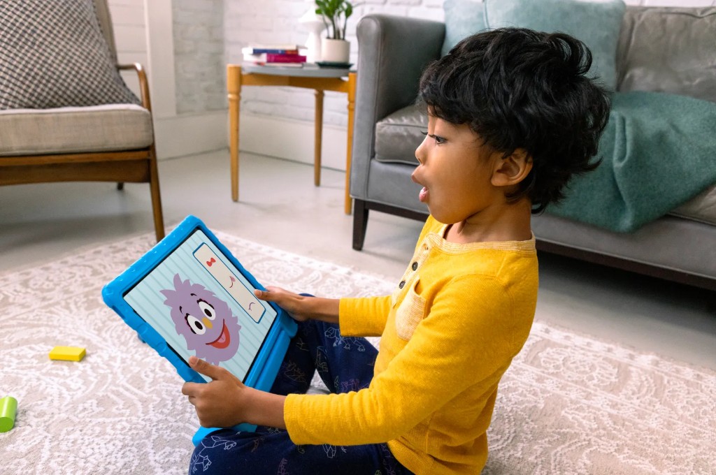
A social-emotional learning app for children ages 2–6, built in partnership with Sesame Workshop. Homer had the platform. I had 6 months to make it real.
HOMER partnered with Sesame Workshop during the pandemic to build a new social-emotional learning app from scratch — helping children who lacked in-person socialization learn to identify emotions, manage feelings, and navigate peer relationships alongside their Sesame Street friends.
To accelerate development, we reused structural components from the HOMER Learn & Grow app I had worked on previously. That foundation shaped everything — and constrained some things too.
I served as lead designer on the project, working across a cross-functional team spanning product, curriculum, engineering, and outside illustration vendors — while collaborating directly with the Sesame Workshop stakeholder team to navigate a complex approval process across two organizations with different priorities and design sensibilities.
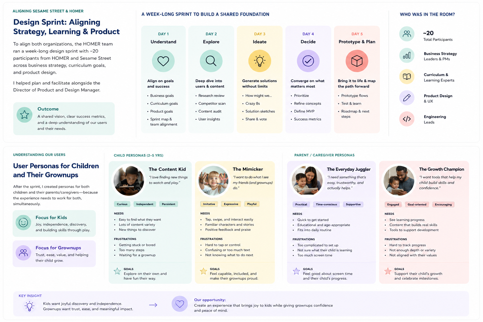
We spent a week in a design sprint before touching a single screen. It was the right call.
Before the project kicked off, I researched around 20 apps in the SEL, wellness, and education space to map the competitive landscape. Most were either too adult-directed, too gamified, or too content-heavy for very young children.
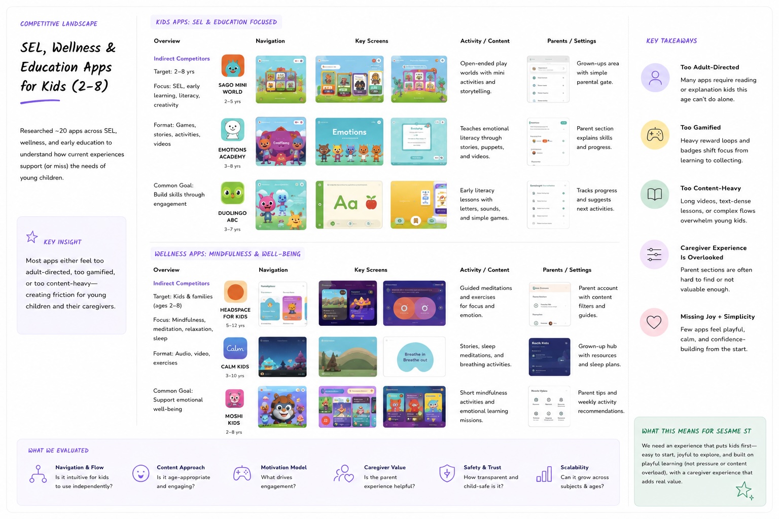
Image of a FigJam board from a group brainstorm session that I hosted
To align both organizations, the HOMER team ran a week-long design sprint with around 20 participants from Homer and Sesame — covering business strategy, curriculum goals, and product design. I helped plan and facilitate alongside the Director of Product and Design Manager.
After the sprint, I built out user personas for both children and their parents and caregivers — since the app had to work for both simultaneously.
Working session during the week-long sprint before screen design.
We then tested early navigation prototypes with 10 children ages 3–4, focusing on key questions: Where do they tap? Do they understand the buildings and characters are tappable? Are the background images distracting? Can they find their way back to favorite content? The answers shaped every structural decision that followed.
Children ages 2–4 cannot read category labels. Any navigation system that relied on text was silently failing our youngest users.
This single finding shaped every design decision that followed.
Three goals. Each tied to something measurable.
Make content discovery work without reading
The app had 1,000+ pieces of content. Kids couldn't find anything — not because there was too little, but because the navigation assumed literacy. We needed a system that worked for a 2-year-old navigating alone.
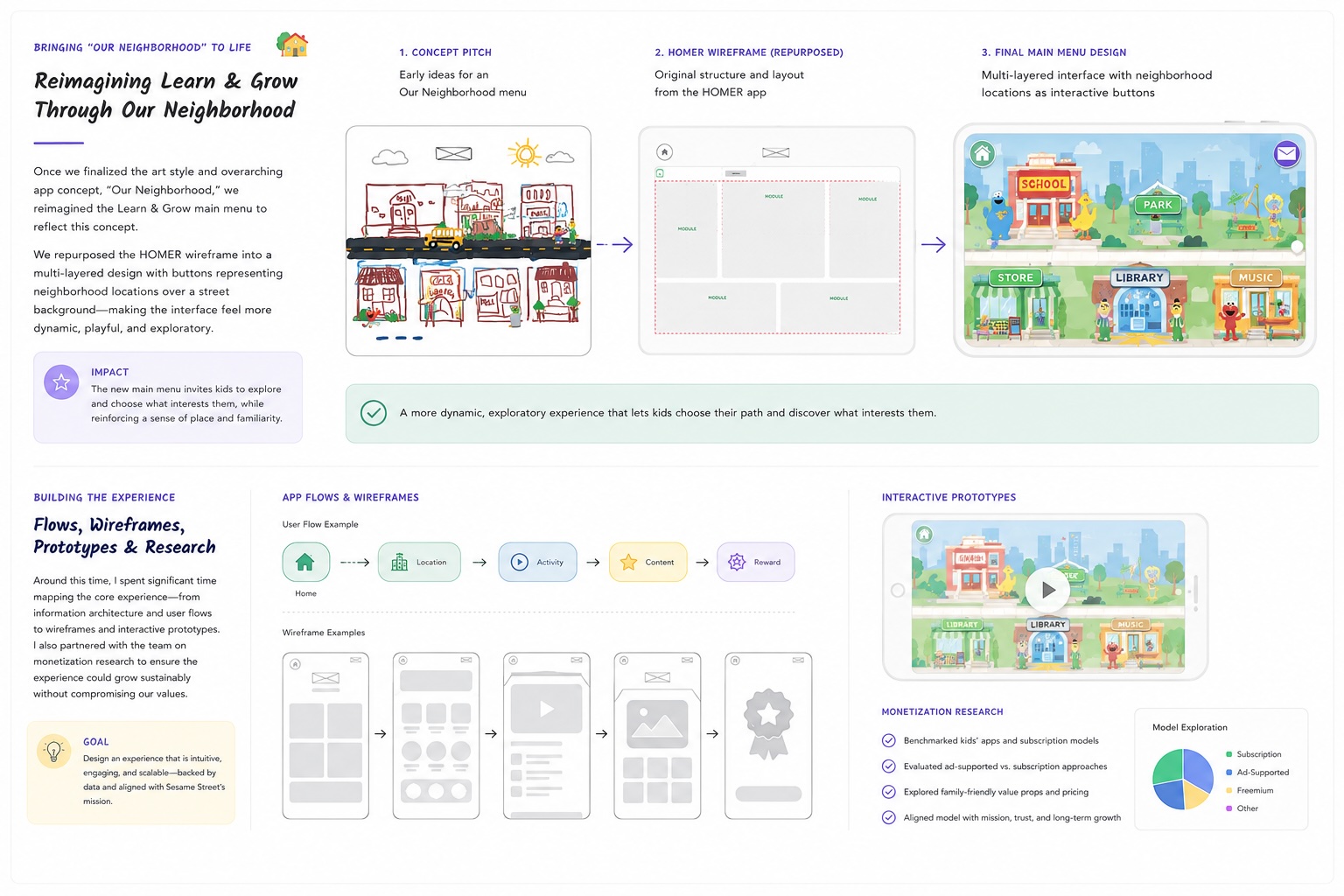
Build an "Our Neighborhood" world that felt alive
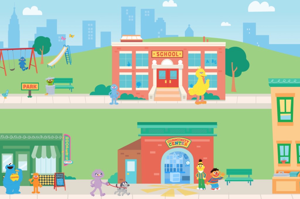
We tested multiple art styles and app store prototypes with real children and parents before locking a direction. The winning concept used Sesame Street's iconic locations as navigation hubs — giving children a spatial, character-led mental model instead of a category list.
Design for sequential content consumption
Sesame Workshop decided mid-project that each location would represent a specific SEL theme — the Playground for Kindness and Empathy, the School for Navigating Social Spaces — with content experienced in a specific order. This changed the navigation problem entirely and required a full redesign of the submenu system.
A location-based main menu, icon-only navigation, and a content flow system that guided children without them knowing they were being guided.
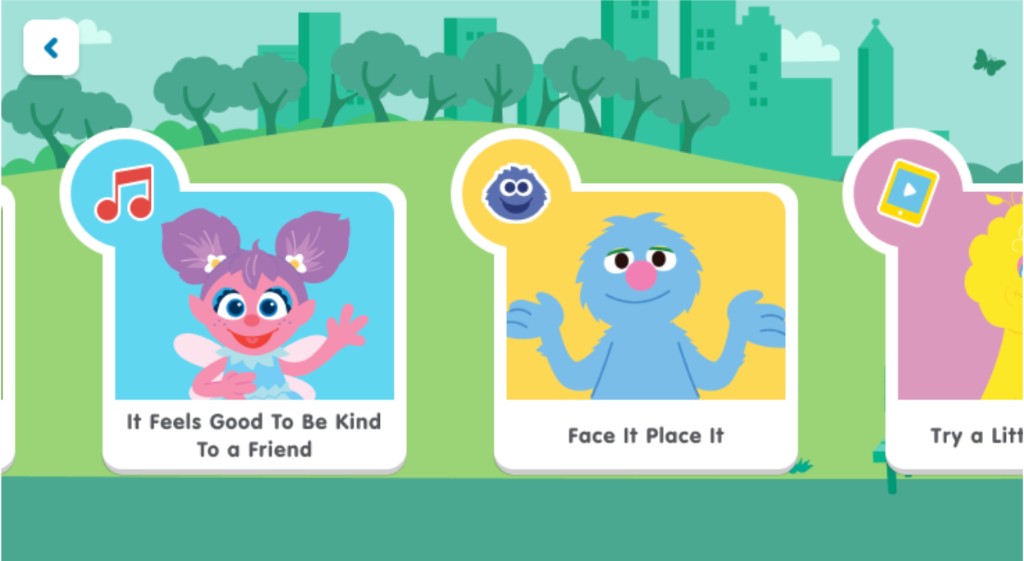
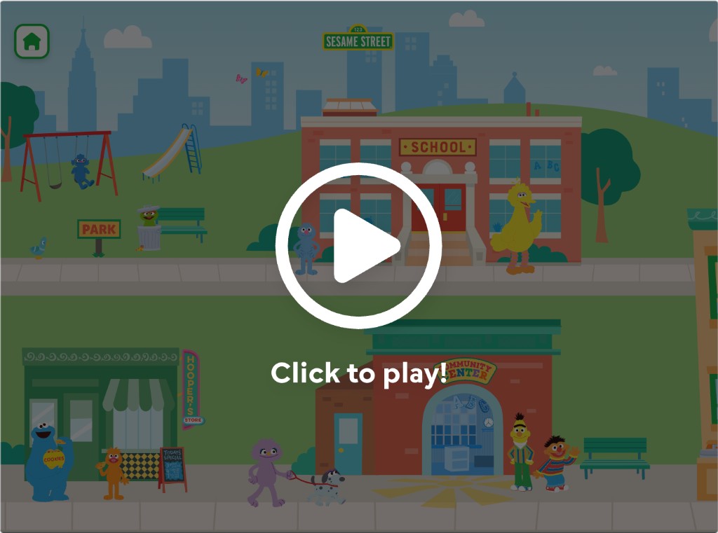
Main menu
The main menu became a richly illustrated neighborhood map — each building representing a content theme. Children navigated by tapping locations, not reading labels. Characters were placed throughout to draw attention and signal interactivity.
Submenu - content navigation
The submenu system went through two full redesigns. The first version used illustrated background scenes with tappable characters — children froze, confused about whether the background was a video. We scrapped it entirely.
We tested the prototype with children ages 3–4 to better understand how pre-literate users interpreted the navigation system and interacted with the environment.
We specifically wanted to learn:
- Do children understand that buildings and characters are tappable?
- Do they navigate using spatial memory or visual detail?
- Are illustrated backgrounds perceived as interactive or passive?
- Can children independently return to previously viewed content?
- How much visual complexity is too much before interaction clarity breaks down?
The results fundamentally changed the product direction.

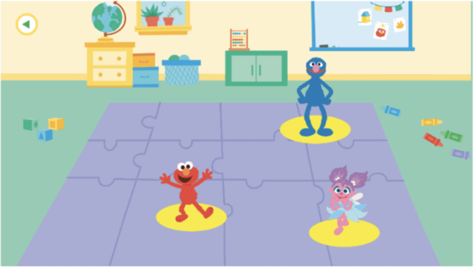
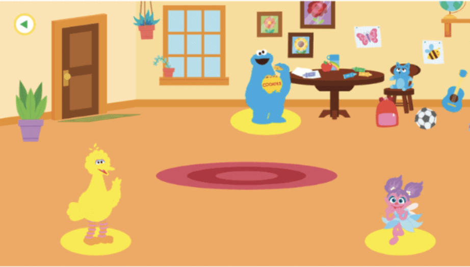
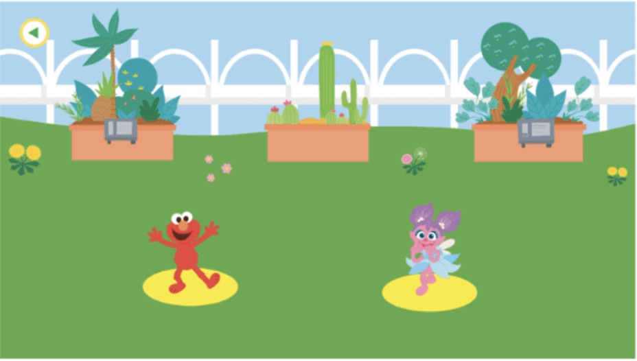
Three location submenu screens from the first version of the submenu navigation. Children confused interactive elements with video.
The first submenu prototypes used richly illustrated interactive environments designed to feel immersive and playful. In testing, the opposite happened.
Children often struggled to distinguish interactive elements from decorative scenery. Several users attempted to tap background objects repeatedly, while others ignored important navigation cues entirely.
One child froze completely after entering the submenu because she believed the environment was a passive video rather than an interactive screen.
The testing revealed that visual richness was competing directly with usability.
The second version used a minimalist monochrome background to separate it visually from the main menu, with horizontally scrolling content buttons featuring icons and titles for parent legibility.
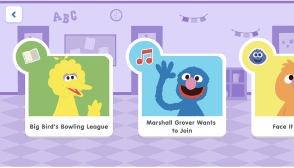
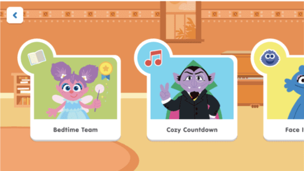
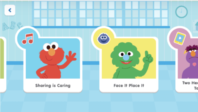
Pages 5–6 — before showing the cluttered illustrated submenu, after showing the clean monochrome version. Three location submenu screens showing the redesigned clean monochrome version that made it into production.
To reduce cognitive load, we simplified the visual hierarchy dramatically. The redesigned submenu system separated background environments from tappable content, introduced horizontally scrolling content cards, and reduced the number of simultaneous interaction targets on screen.
The result was visually less ambitious, but significantly easier for children to understand and navigate independently.
Content flow: putting it all together
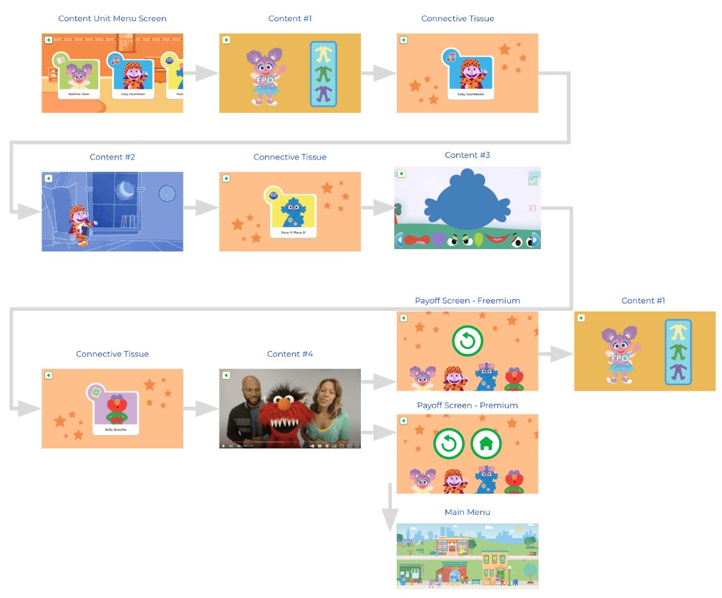
Content flow from unit menu through connective tissue and payoff screens.
Navigation between content pieces used an autoplay system with gentle nudges, payoff moments, and connective menus — guiding children through a themed sequence without requiring decisions at every step.
The hardest part wasn't the design. It was advocating for the user inside a stakeholder structure that wasn't built for it.
The Sesame Street team required sign-off on every aspect of the app. They were primarily accustomed to designing for older audiences and sometimes made assumptions about 2–6 year olds that didn't hold up in testing. Branding consistently took priority over usability, which created recurring tension.
The most significant challenge came midway through: Sesame changed the content architecture entirely, moving from random assortments to themed content units per location. This invalidated the submenu designs we'd already built. Because engineering hadn't started on the wireframes yet, we were able to pivot — but it compressed the timeline significantly.
The app launched on schedule for Q4. It's still reaching children today.
The Learn with Sesame Street app shipped on schedule and has since reached over 500,000 downloads on Android alone, remaining an active product under Begin Learning's portfolio today.
The final product shipped across iOS, Android, and web with a multi-layered “Neighborhood” navigation model built around spatial recognition instead of reading comprehension. Children navigated by recognizing locations, characters, and visual landmarks — not category labels.
Prototype testing validated that younger users understood the neighborhood mental model significantly faster than traditional menu-based navigation. Children were able to independently return to familiar locations and favorite content using spatial memory alone.
The final experience guided children through themed SEL learning paths without requiring constant decision-making at every step. Instead of functioning like a traditional content library, the app behaved more like a structured emotional learning journey disguised as exploration and play.
One of the biggest wins was simplifying the submenu system. Early versions used fully illustrated interactive environments, but testing revealed that children struggled to distinguish decorative background elements from tappable interactions. Reducing visual complexity and introducing horizontally scrolling content cards dramatically improved usability and interaction clarity.
The navigation foundation proved durable. The app has since expanded with an extended content library, new exclusive classes, and physical kit bundles — all built on top of the same core architecture we designed.
What I'd do differently
Push for clearer stakeholder alignment at the start — specifically around who has final design authority when brand and UX decisions conflict. Advocate for more testing with children under 3, where our signal was weakest. Document the information architecture in writing before any design begins, so a mid-project pivot has a cleaner path to resolution.
The design sprint. Getting both organizations in the same room for a week before touching any screens was the single best investment we made. Every major decision that followed had a shared foundation.
The bigger lesson: designing for children is humbling. Every assumption you bring in from adult product design gets tested hard. The kids don't lie.
Watch the app demo above, or download it yourself:
Note: the product has continued to evolve since the original 2021 launch — this case study reflects the work completed during my tenure.