HOMER learn & grow app redesign
UX/UI case study

Project overview
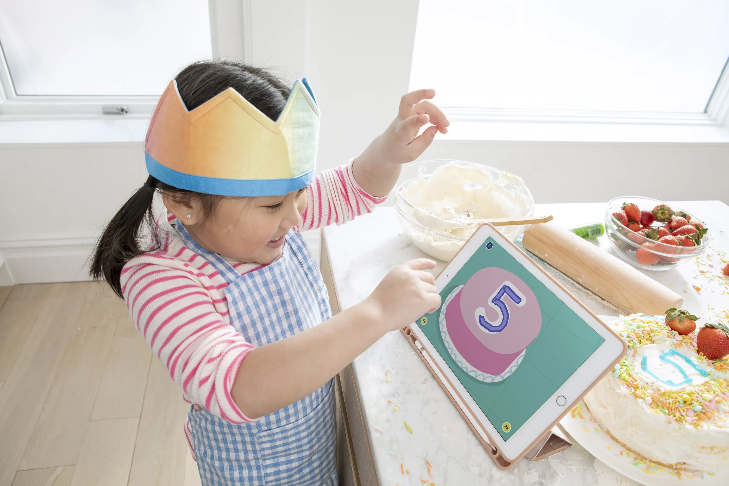
I played a key role in redesigning HOMER Learn & Grow, an app-based learning program for children ages 2–8. Following a brand refresh, we redesigned the core HOMER app to enhance its UX while expanding its product offerings.
My role
I collaborated with a design lead, product manager, user researchers, engineers, content specialists, and other cross-functional teams to develop the cohesive digital strategy, app architecture, and visual redesign.
The challenge
Previously, HOMER had a suite of apps, including HOMER Reading, which used a centralized learning pathway for literacy. Our goal was to merge content from multiple apps into a single, comprehensive platform featuring a rich library of subjects, including math, social-emotional learning (SEL), and critical thinking.
We also revamped the app experience to make it more engaging and enjoyable for our young users by applying new visuals and UX strategies, informed by hundreds of hours of playtesting and user research (UXR).

Objective 1
Make relevant content more accessible
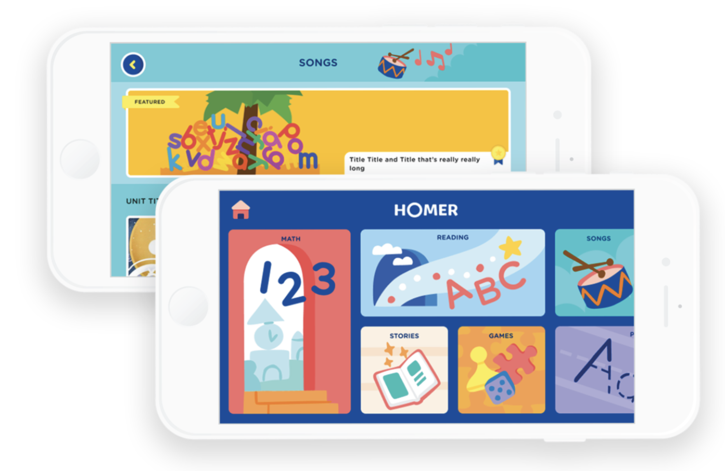
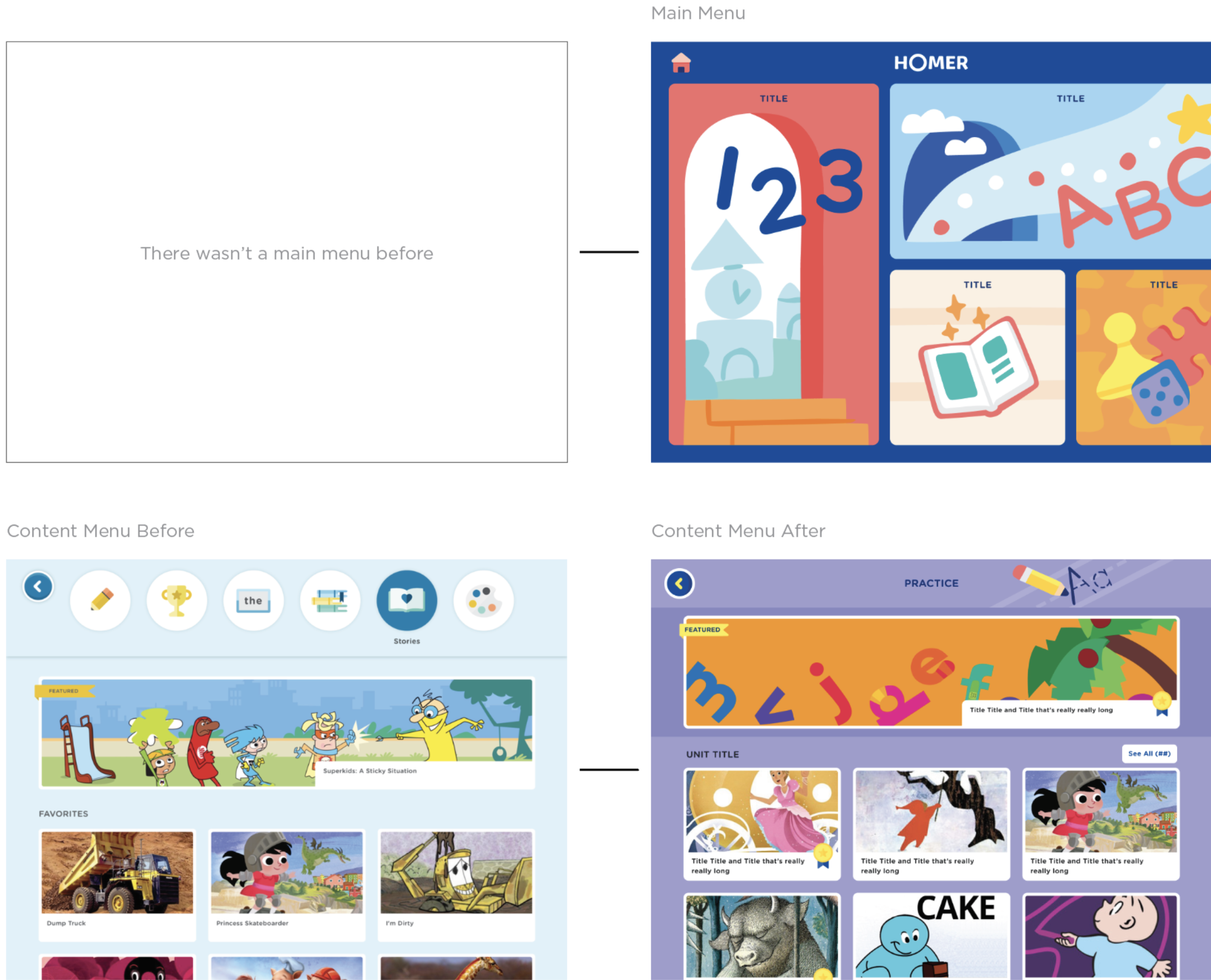
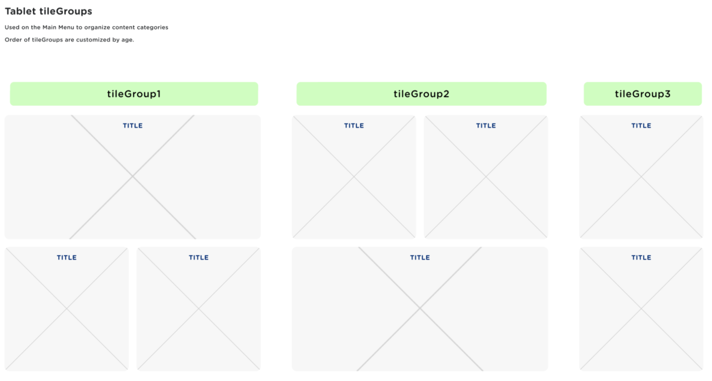
The design team's biggest challenge was developing a new app architecture capable of supporting a vast content library, including videos, books, and interactive games across multiple subjects.
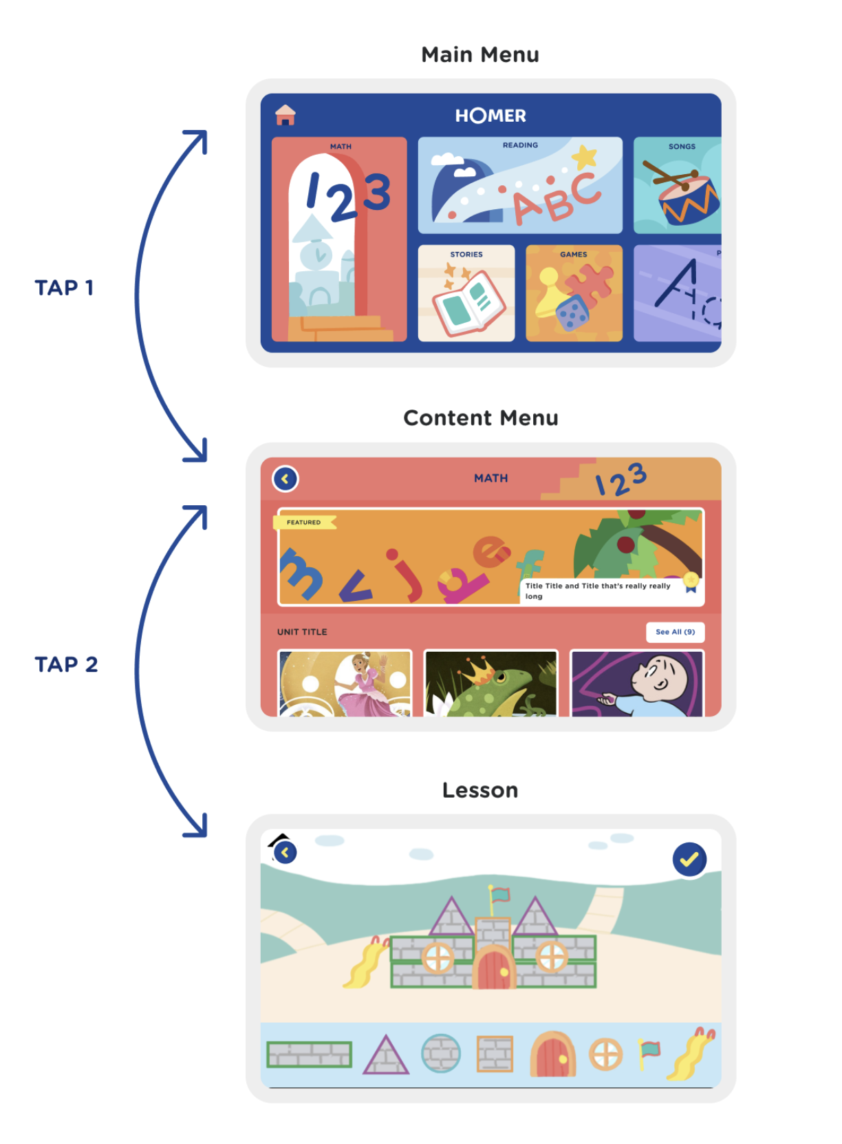
I collaborated with the design lead to explore various directions with the larger team, facilitated brainstorming workshops, and created prototypes for kid testing. Through this process, we arrived at the final launch direction: a shallow architecture with a flexible grid of categories organized by age and emotional scheduling needs. The button placement on the main menu adapts based on the child's age.
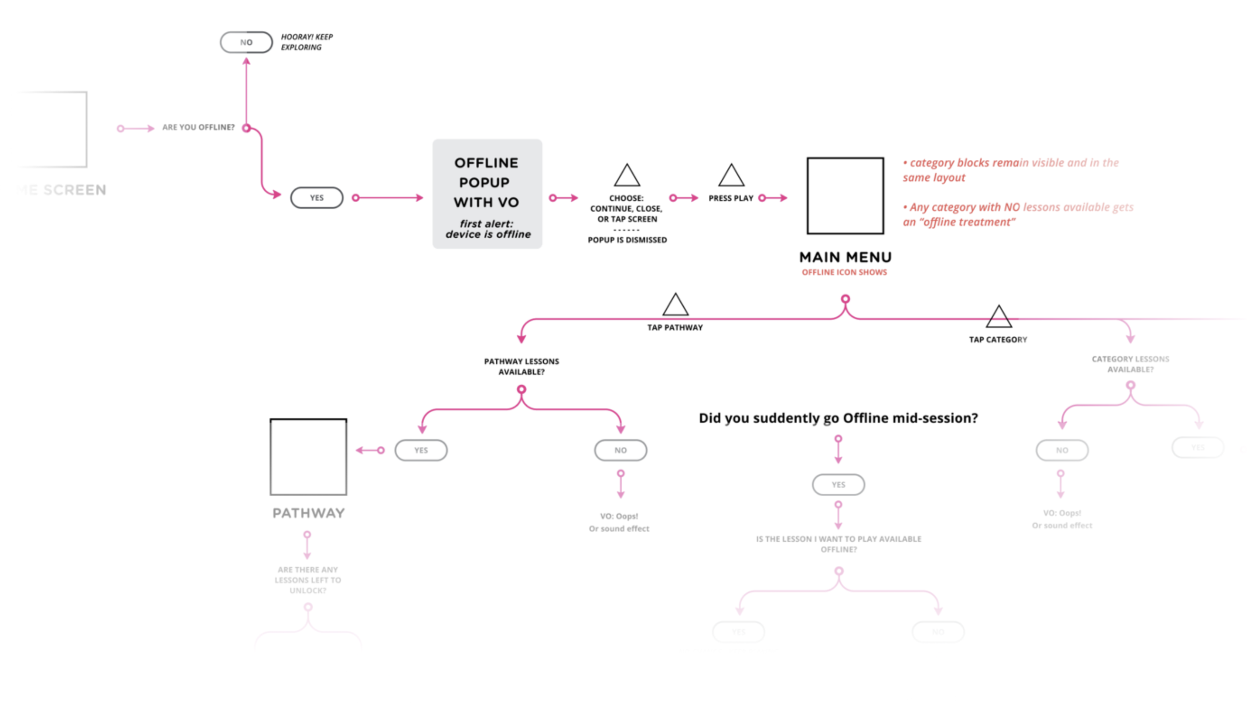
The following images illustrate the app's flow and information architecture. The shallow hierarchy ensures that kids are always just a few taps away from the main menu, helping them quickly learn navigation and understand what to expect.

Objective 2
Enhance usability
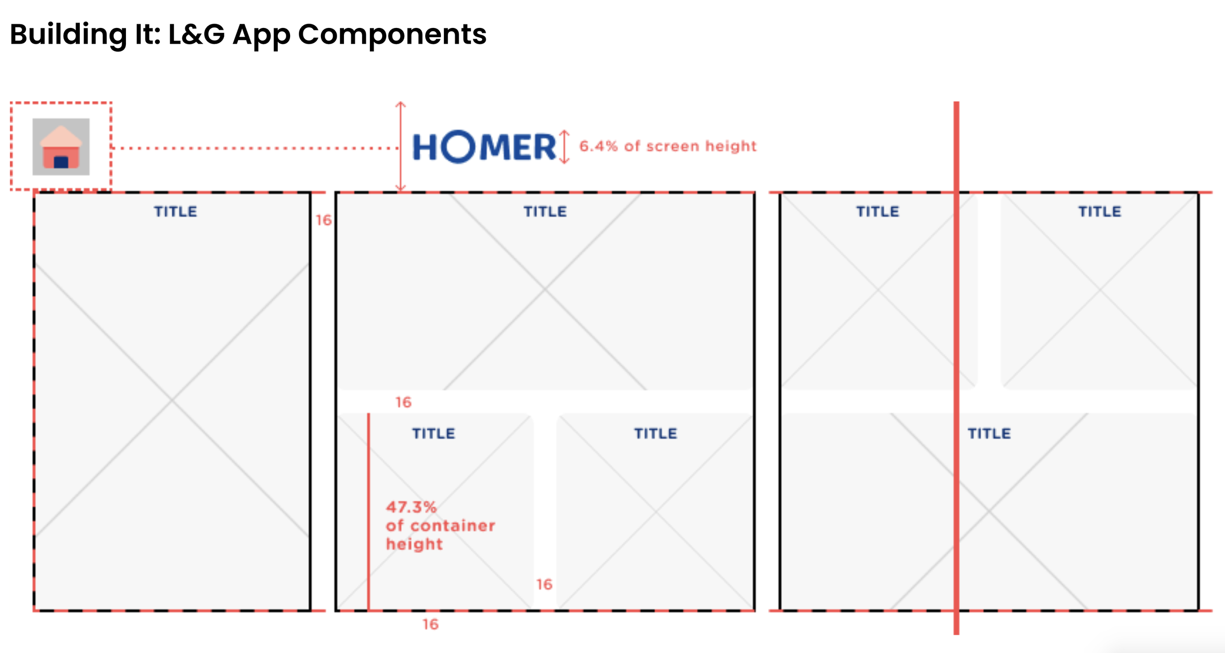
Once we figured out the direction we were going to go in, we collaborated directly with our engineering team through the design and implementation process to bring features to life. This process included user flows, wireframes, prototypes, and a design system/final UI, as you can see in some of the examples here.
I’m always iterating on ways to best communicate features while still pushing the bounds of what’s possible in a native environment. The majority of our users are on IOS so we developed that first then Android was a fast follow. The main devices we design for are Iphone 8, Iphone X, Ipad Mini, Android 360, Android Pixel 2, and the Galaxy Tablet 10.
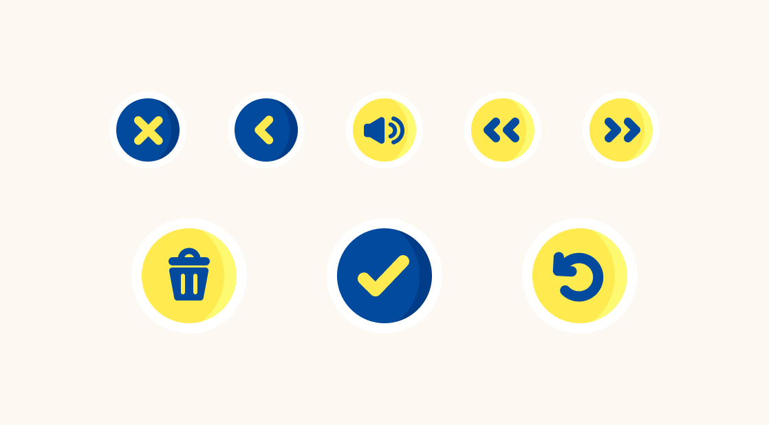
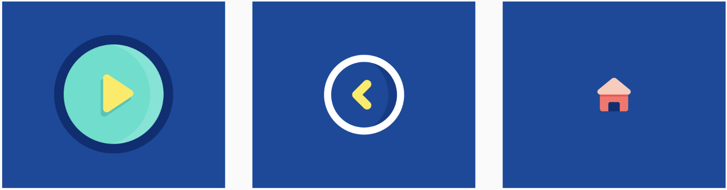
Consistent UI patterns support intuitive navigation, helping kids feel in control. Designing a new product allowed us to streamline button styles, states, and positioning, establishing a cohesive design system from the start. We tested all buttons and illustrations with kids to ensure clear and effective communication.

Objective 3
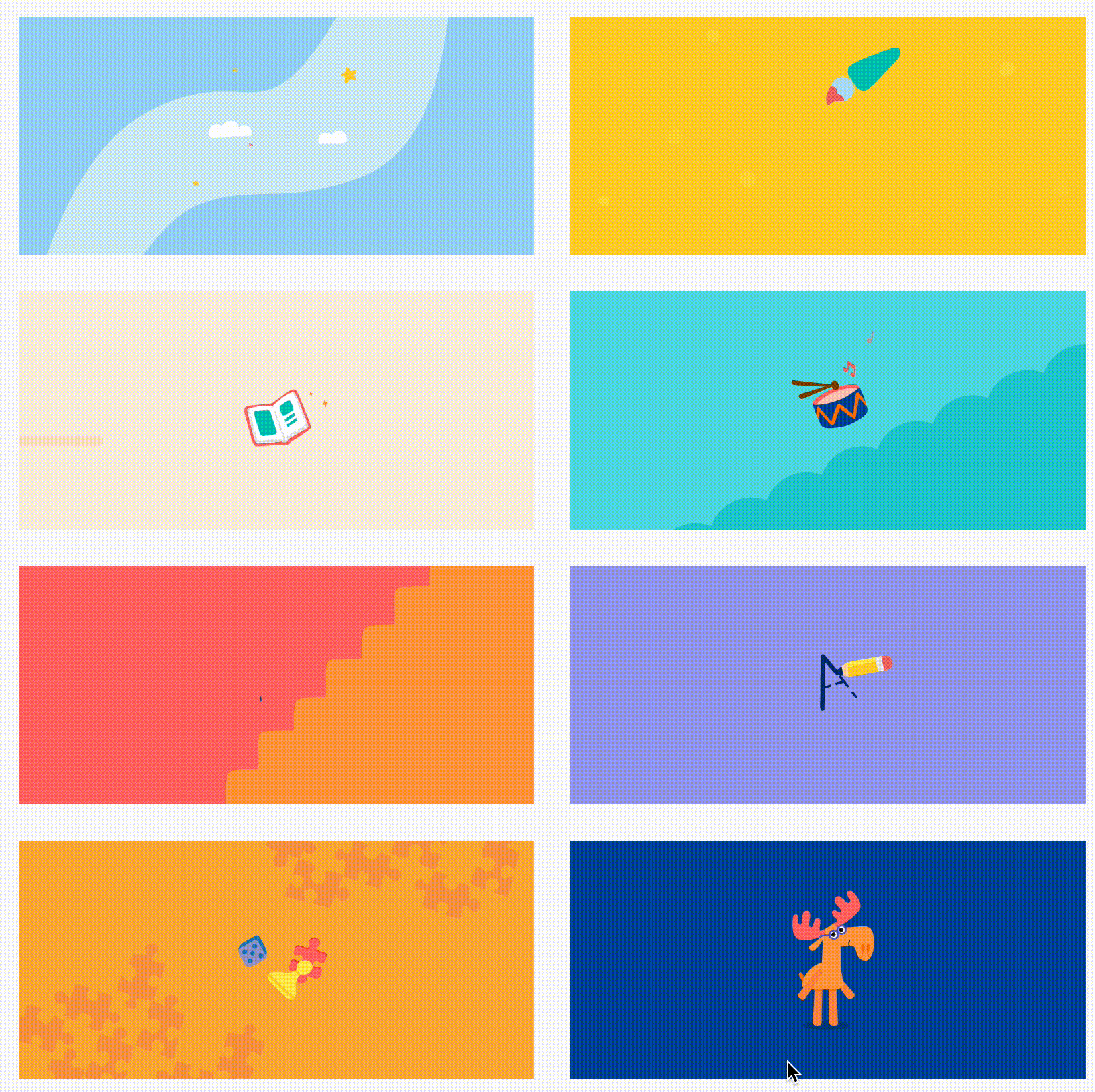
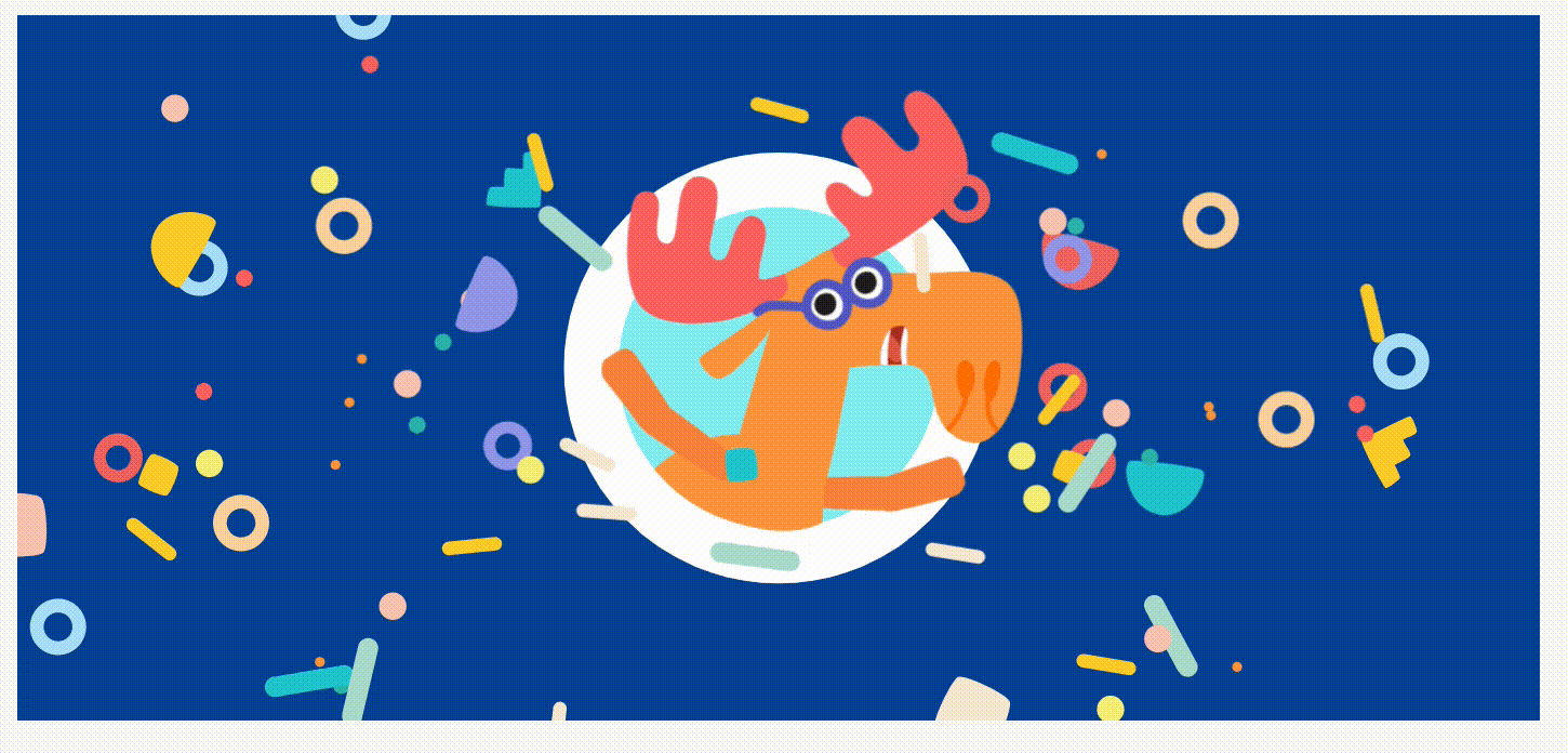
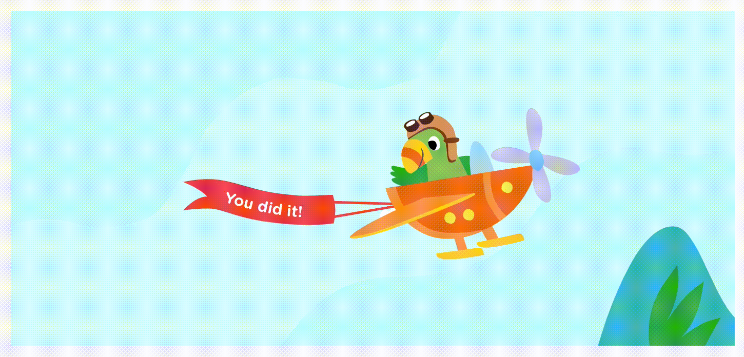
Spark joy
I collaborated closely with the illustration and animation team to add delightful touches, such as in-app transitions and Lottie animations. These moments are especially important in a children's app, as they enhance engagement and encourage young learners to return. Additionally, I helped integrate music and sound effects, further enriching the experience and bringing the app to life.