Sesame learn & play app design
UX/UI case study
Project overview
HOMER partnered with Sesame Street to develop a new social-emotional learning app from the ground up. During the pandemic, they recognized a need for such an app to help children, who lacked in-person socialization, learn to identify and manage emotions and navigate peer relationships with the help of their Sesame Street Muppet friends.
My role
The team structure and design process were similar to those of the Learn & Grow app; however, I was appointed lead designer for this product under the guidance of a design manager. An added challenge was working with the Sesame Street team (the stakeholders), which made it difficult to meet tight timelines due to their required final sign-offs and the complexity of having too many contributors involved. We needed their approval on all aspects of the app, which often felt similar to client work at an agency. Additionally, we collaborated with outside vendors for menu illustrations and content designs.
The challenge
To save time and reduce costs, we reused the structural components (like grid systems) from the HOMER Learn & Grow app that I had worked on previously.
The first part of the project was to come up with a concept, content, and monetization strategy for the app.
The second part, once the direction was solidified, was to take the foundation HOMER had laid out and completely reimagine it to accommodate different types of content, a younger audience, and a new brand identity.


Competitive analysis + design sprint
Process notes
Before the project with Sesame Street kicked off, I researched around 20 different apps in the SEL, wellness, and education sectors to determine the ideal market fit.
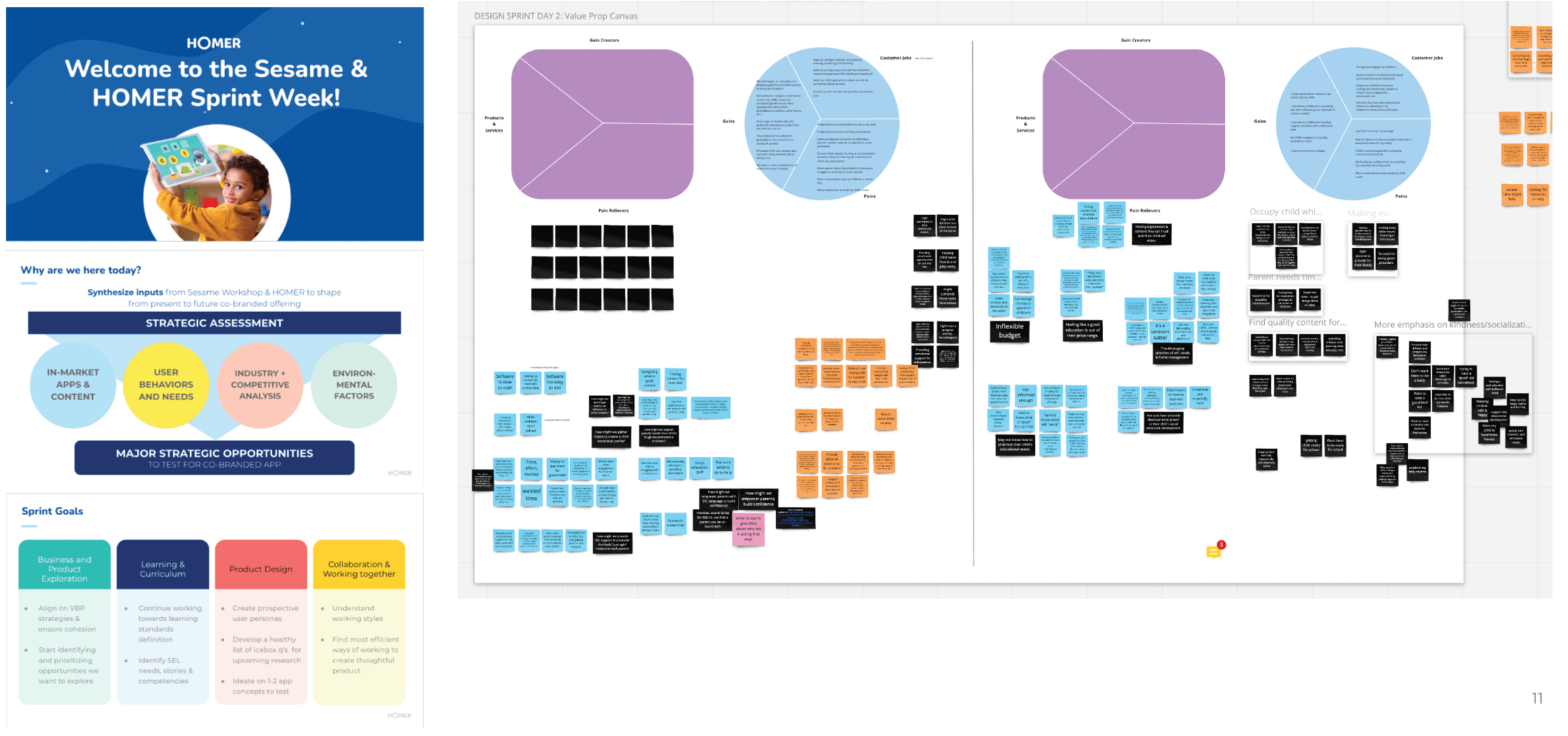
To initiate the project and learn how to collaborate effectively with the Sesame team, the HOMER team led a week-long design sprint. I helped plan the sprint alongside the Director of Product, Design Manager, and Director of Learning and Curriculum.
Around 20 people participated in the sprint, including members from both HOMER and Sesame. The sprint covered business and product exploration, learning and curriculum, and product design.
The sprint included presentations, competitive analysis, research evaluation, and whiteboarding exercises such as card sorting and crazy 8s. The primary design goal was to create prospective user personas and develop 1-2 app concepts for testing.

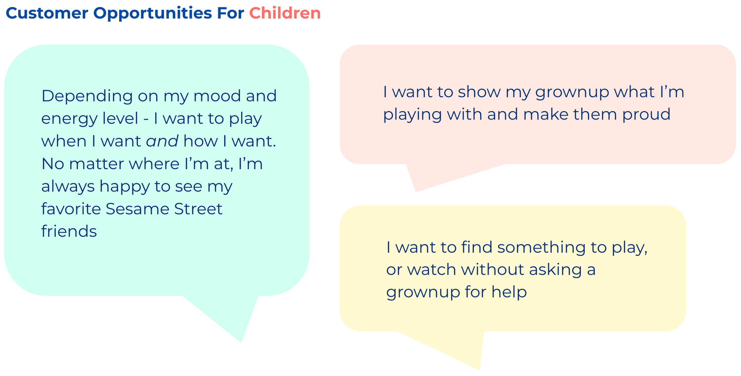
Personas and problem statements
At the end of the sprint, I spent a lot of time with my team synthesizing the data we’d collected and the inspiration we’d gathered. We worked to create cohesive user personas and problem statements to guide our next steps. Since our audience includes both parents and children, we made sure to consider both perspectives

In partnership with a user researcher, we tested several app store prototypes to A/B test different design styles and concepts—one featuring only SEL content, and another combining SEL with other educational content like math and reading. We also interviewed parents to gauge their interest in Social and Emotional Learning content and to understand how they thought it compared to other similar apps on the market.
Additionally, we conducted research to determine which Sesame Street art styles were most appealing to our target age group by playtesting different prototypes with children.
App concept and art style testing

UX and menu development
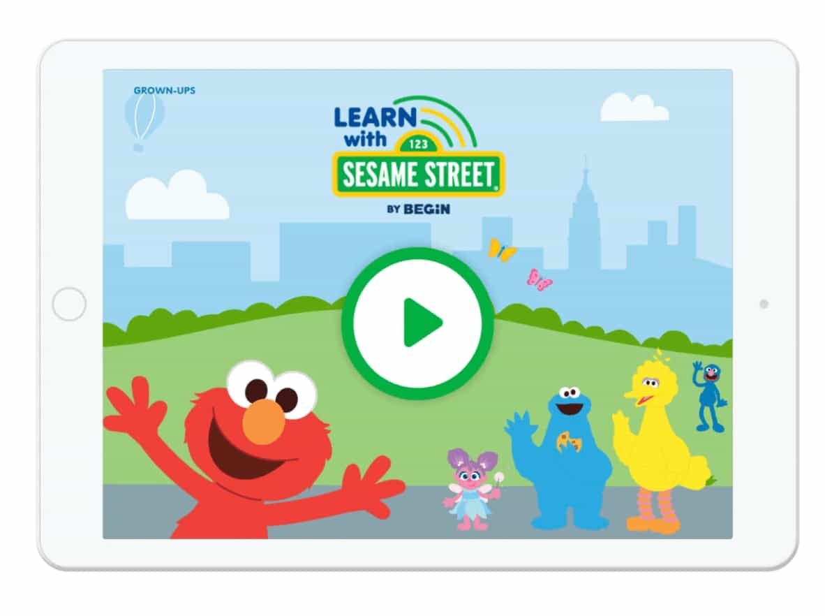
Once we finalized the art style and overarching app concept, which became "Our Neighborhood," we began reimagining the Learn & Grow main menu UI to reflect this concept. We repurposed the HOMER wireframe into a multi-layered design with buttons representing the various Our Neighborhood locations over a street background, making the interface feel more dynamic and exploratory.
Around this time, I also spent a lot of time creating app flows, wireframes, and prototypes for the core app experience, as well as conducting monetization research.

Menu UI and prototype testing
In addition to the main menu, we also created mockups of the location-themed submenus that would house the app’s main content and built a prototype for child playtesting.
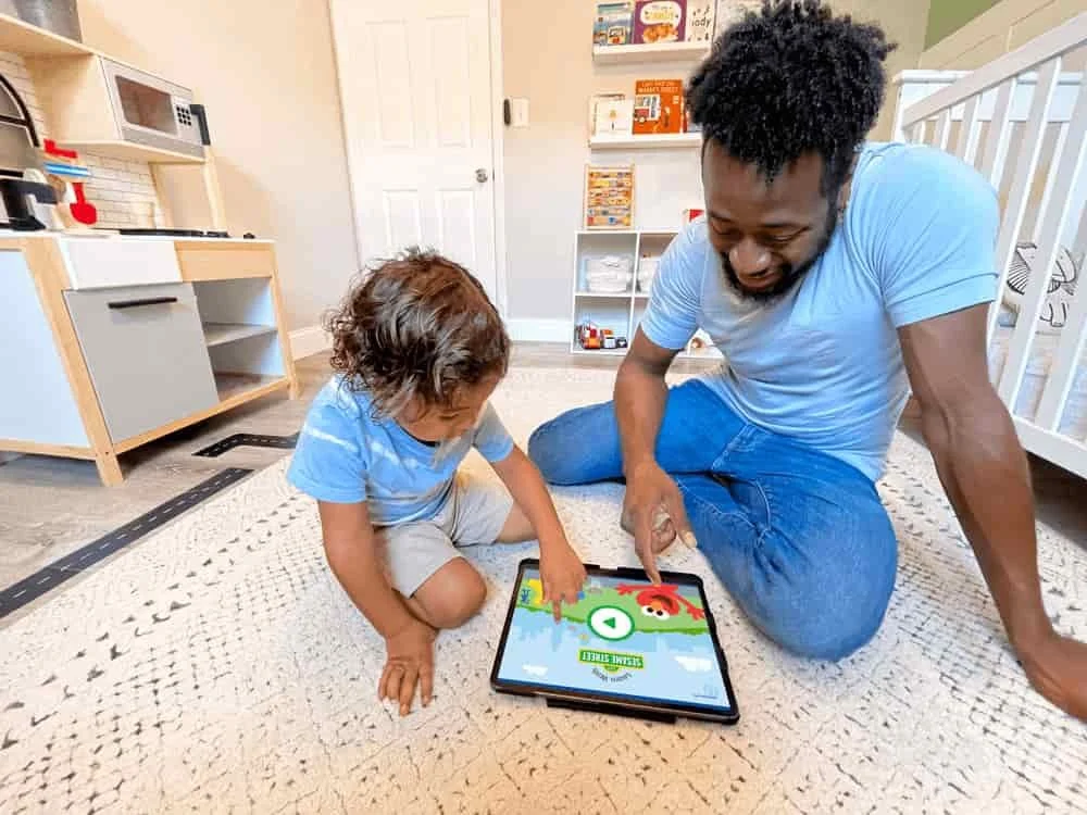
We tested the prototype with 10 children, ages 3–4, to collect data on our research questions regarding navigation and content organization, such as: "Where do they tap? Do they understand that the buildings and characters are tappable? Are the background images distracting?" and "If they liked a video, can they return to find it?"
We found that children became confused and tried to interact with the elements in the background. One child even froze when she reached the submenu because she thought it would be a video. We also encountered issues with differentiating between content types and adding context, like titles and icons, to the content buttons. Additionally, we realized that the grid needed to be more flexible to support more than four pieces of content at once—when we tried the design, it became too crowded.
Needless to say, we had to go back to the drawing board.
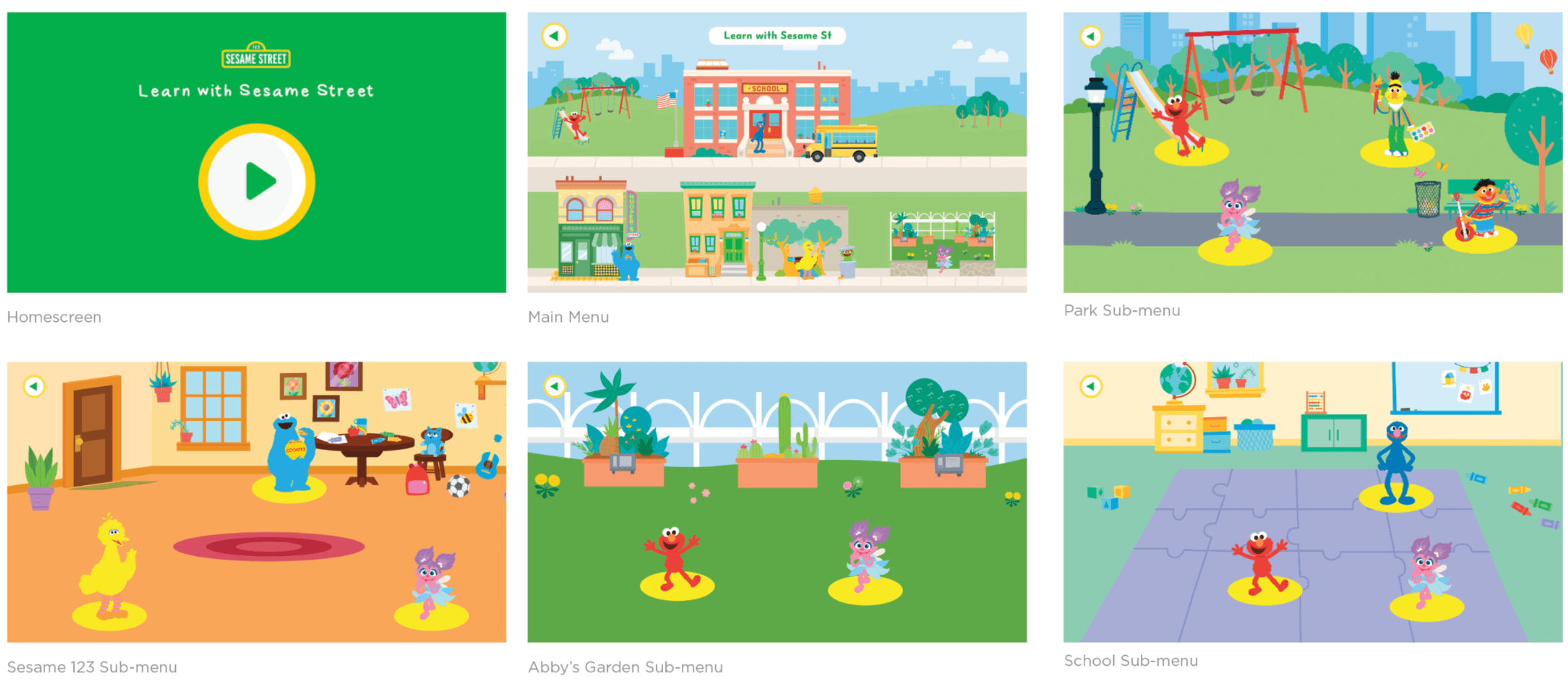
Redesigned submenus
To further complicate the challenge, the Sesame Street team decided halfway through the project that, instead of each menu holding a random assortment of content, they would create themed content units for each submenu. This meant that each location on the main menu would represent a specific theme—for example, the playground would focus on Kindness and Empathy—with a structured content sequence meant to be experienced in a specific order.
After extensive back-and-forth with Sesame Street, I designed a new submenu to address these issues. It features a minimalist, monochrome background of the designated location to separate it visually from the buttons, horizontally scrolling buttons with icons indicating content type, and content titles to aid parent navigation. The buttons are designed to be more age-appropriate for our youngest users (as young as 2 years old) and allow us to better control the order in which content is consumed.
One drawback is the inconsistency in the visual experience—this is the only part of the app with a monochrome background—but hopefully they can refine that with future iterations.

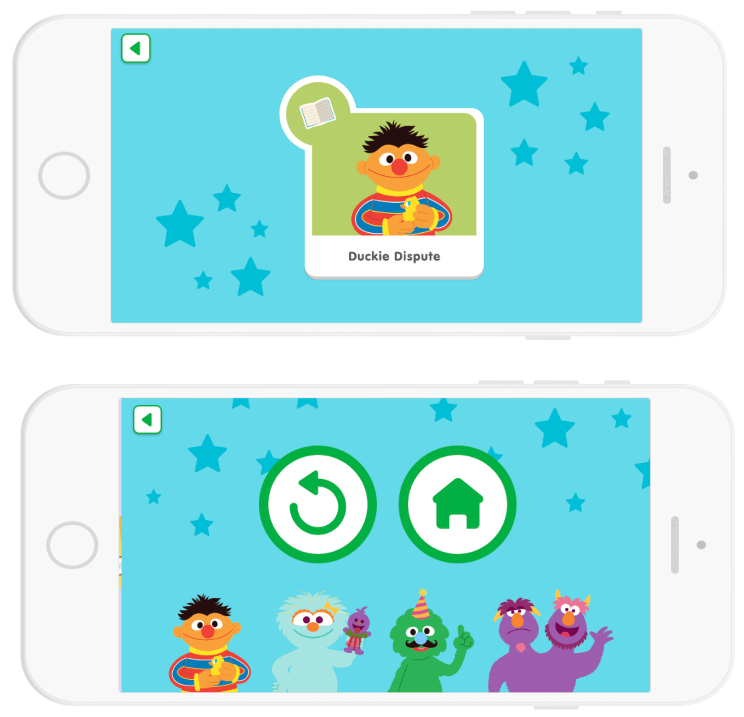
Navigation and UX
Another challenge was ensuring that content was played in a specific order. To address this, we implemented an autoplay system, gentle nudges, a payoff moment, and connective menus at the end of each content piece to seamlessly guide the child’s experience.

Concluding remarks
One of the biggest challenges I’ve faced with this app is advocating for the user and presenting my ideas to stakeholders with vastly different opinions and perspectives. The Sesame Street team I’m working with primarily designs web games for an older audience, and they often make inaccurate assumptions about the user base for this new app. Additionally, as a legacy brand, Sesame Street tends to prioritize branding over user experience, which creates further challenges in aligning our goals.
Through this process, I’ve also learned the importance of clearly defining the problem before kicking off a project. When we had to redesign the submenus, we were fortunate that engineering hadn’t yet started on the wireframes, allowing us to adjust our timelines and workflow. Moving forward, I would focus on gaining clarity early on through more in-depth conversations, design sprints, and roadmap and process documentation.