Rebuilding HOMER's digital front door — from a fragmented site to a conversion-driven platform built for millions of families.
A full-scale redesign of HOMER's marketing site and digital brand experience — aligning visual identity, product story, and conversion architecture into a single cohesive platform built to grow with the business

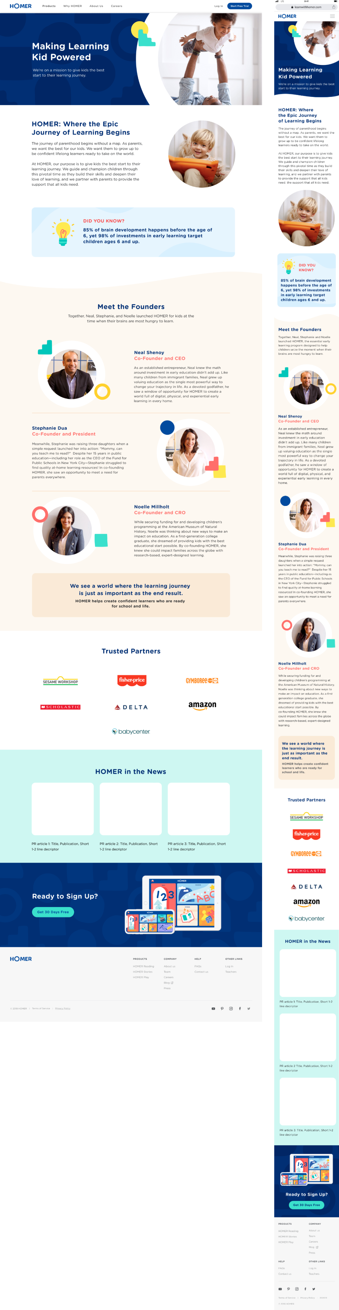
HOMER's website was showing its age. The existing site didn't reflect the current product offering, lacked a coherent brand narrative, and wasn't built to support rapid content updates or A/B testing. As the company evolved — expanding from a reading app to a full early learning platform — the marketing site needed to catch up. This wasn't a refresh. It was a ground-up reimagination of how HOMER showed up for millions of families discovering the product for the first time.
I worked as a product designer alongside a fellow designer, under a design director. HOMER's Brand Creative team established the new visual direction — a fresh color palette, key brand elements, and illustration assets — and our job was to translate that direction into scalable, reusable product design components and a full site redesign. I partnered closely with the Head of Creative on visual language, and collaborated tightly with engineering to ensure the component system we built was performant, scalable, and maintainable. I was also responsible for maintaining and updating the internal Figma component library and creating developer documentation to facilitate the site-wide rollout.
The site had to do two things simultaneously: earn the trust of a skeptical parent in seconds, and guide that same parent seamlessly from curiosity to conversion. Every design decision had to serve both.
Design system first
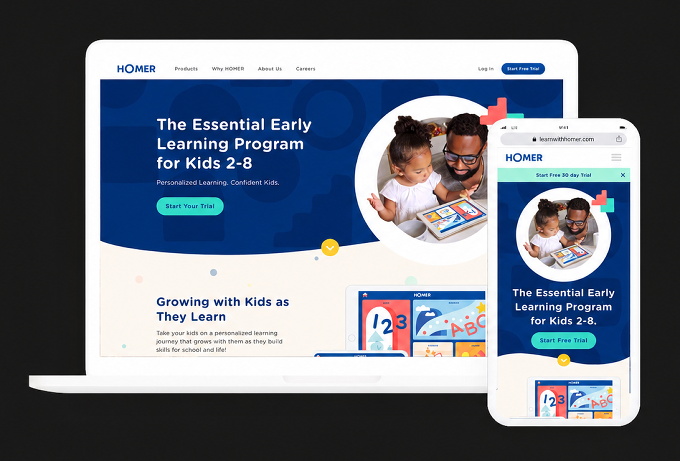
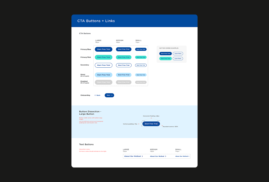
Before touching a single page, we established the foundation — color scheme, grid system, spacing rules, typography, and a responsive breakpoint structure covering mobile, tablet, and desktop. I stress-tested the new brand colors and styles against UI components, then created a new button system with clear guidelines for usage and implementation. The component system was built for flexibility and reusability, with clear states, responsive behavior, and accessibility baked in from the start — so design and engineering could move in parallel without constant back-and-forth.
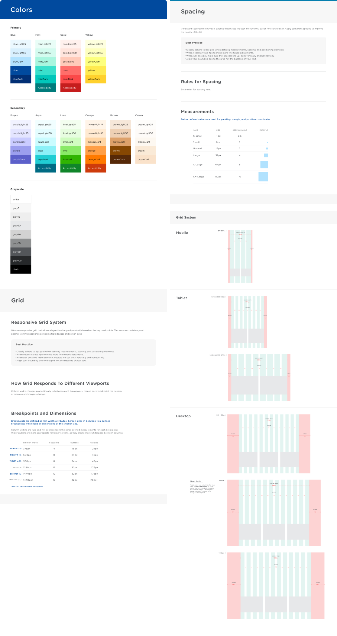
Foundation documentation for color scales, spacing tokens, and breakpoint grid behavior across mobile, tablet, and desktop.
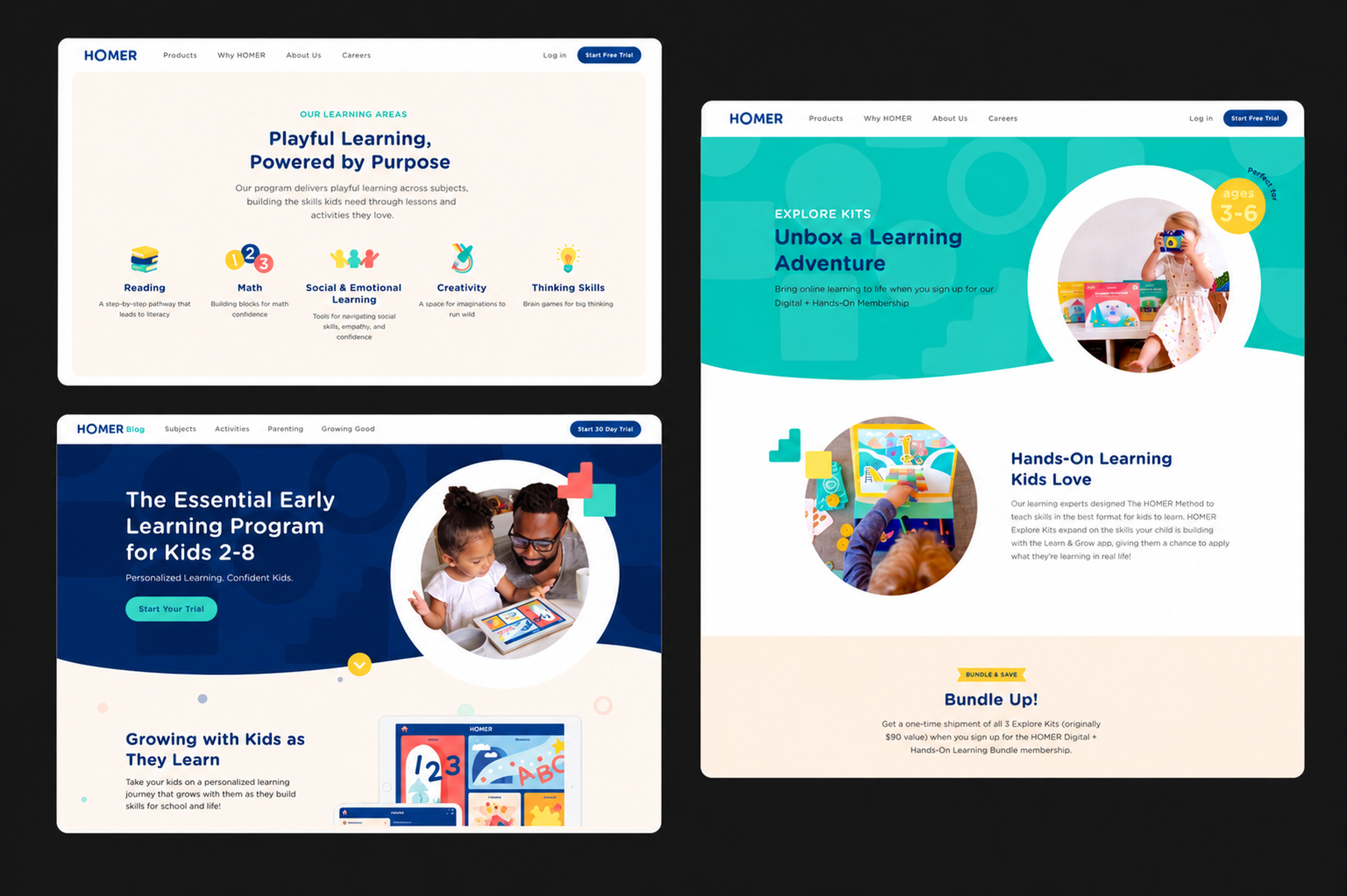
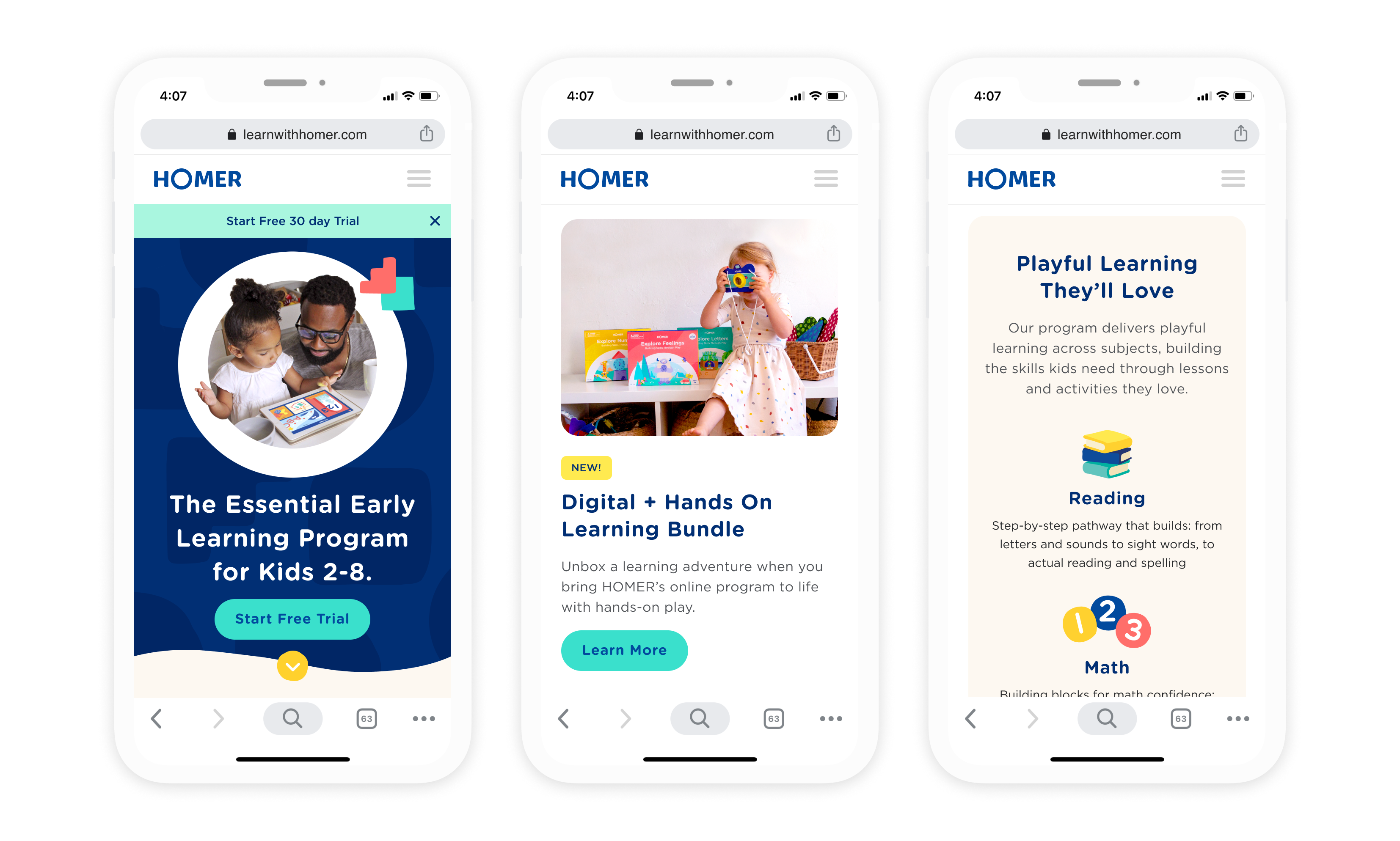
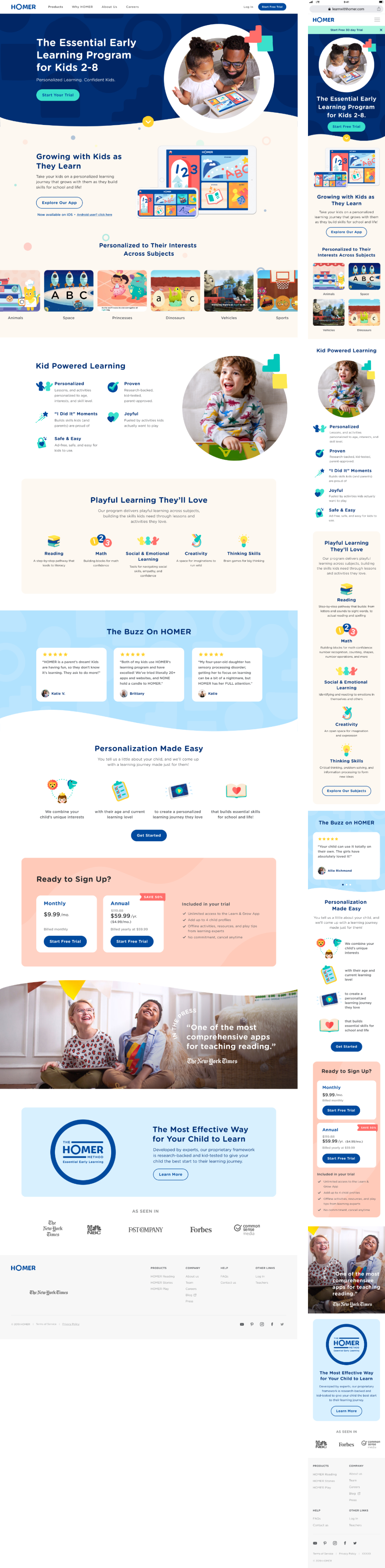
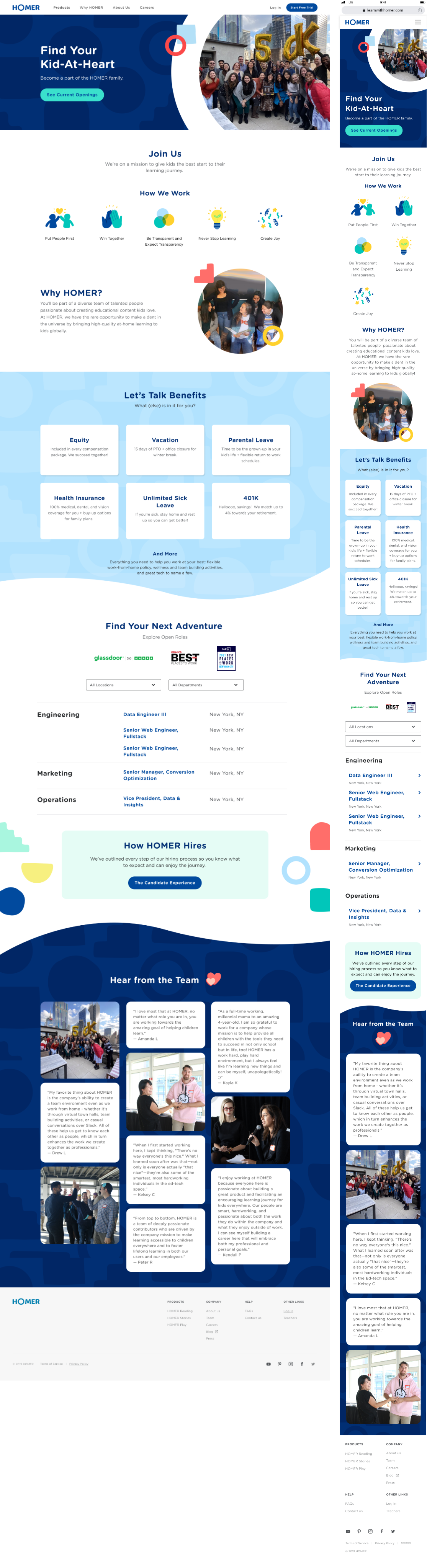
Homepage
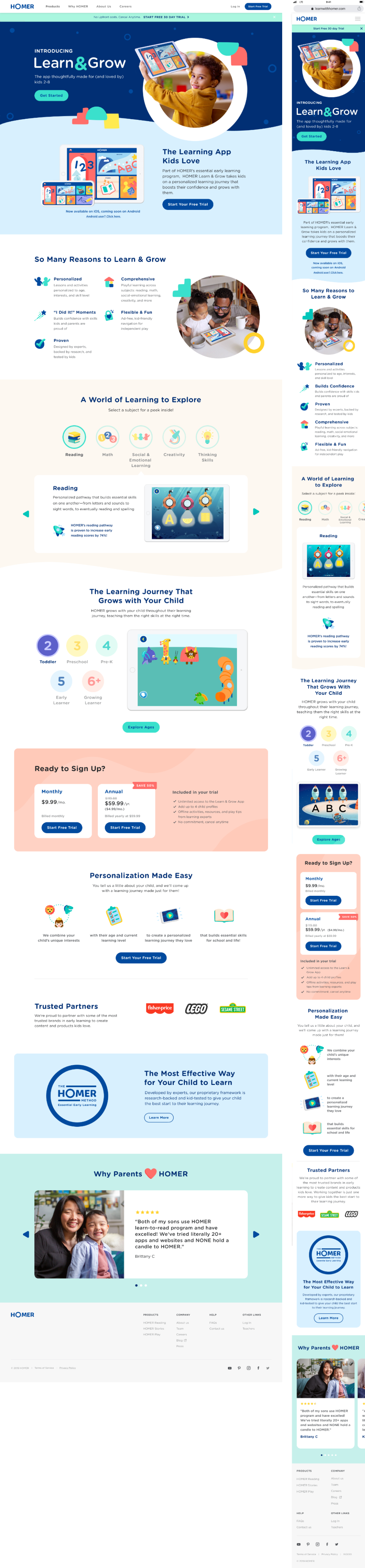
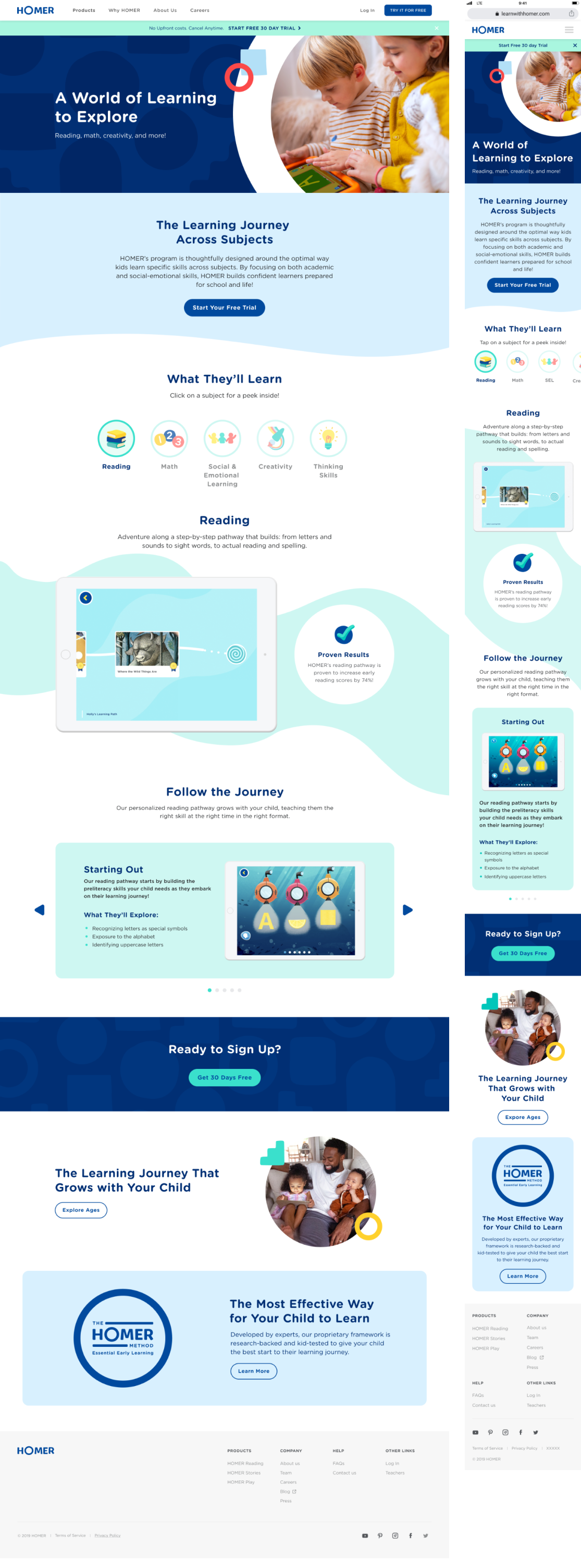
The homepage was the highest-stakes surface — a highly cross-functional page built in close collaboration with brand partners and multiple stakeholders. We restructured the hero and supporting sections to tell a clear, emotionally resonant story, combining aspirational messaging, product benefits, and social proof in a concise, scrollable narrative. Modular components allowed for dynamic content updates and A/B testing without requiring engineering involvement.
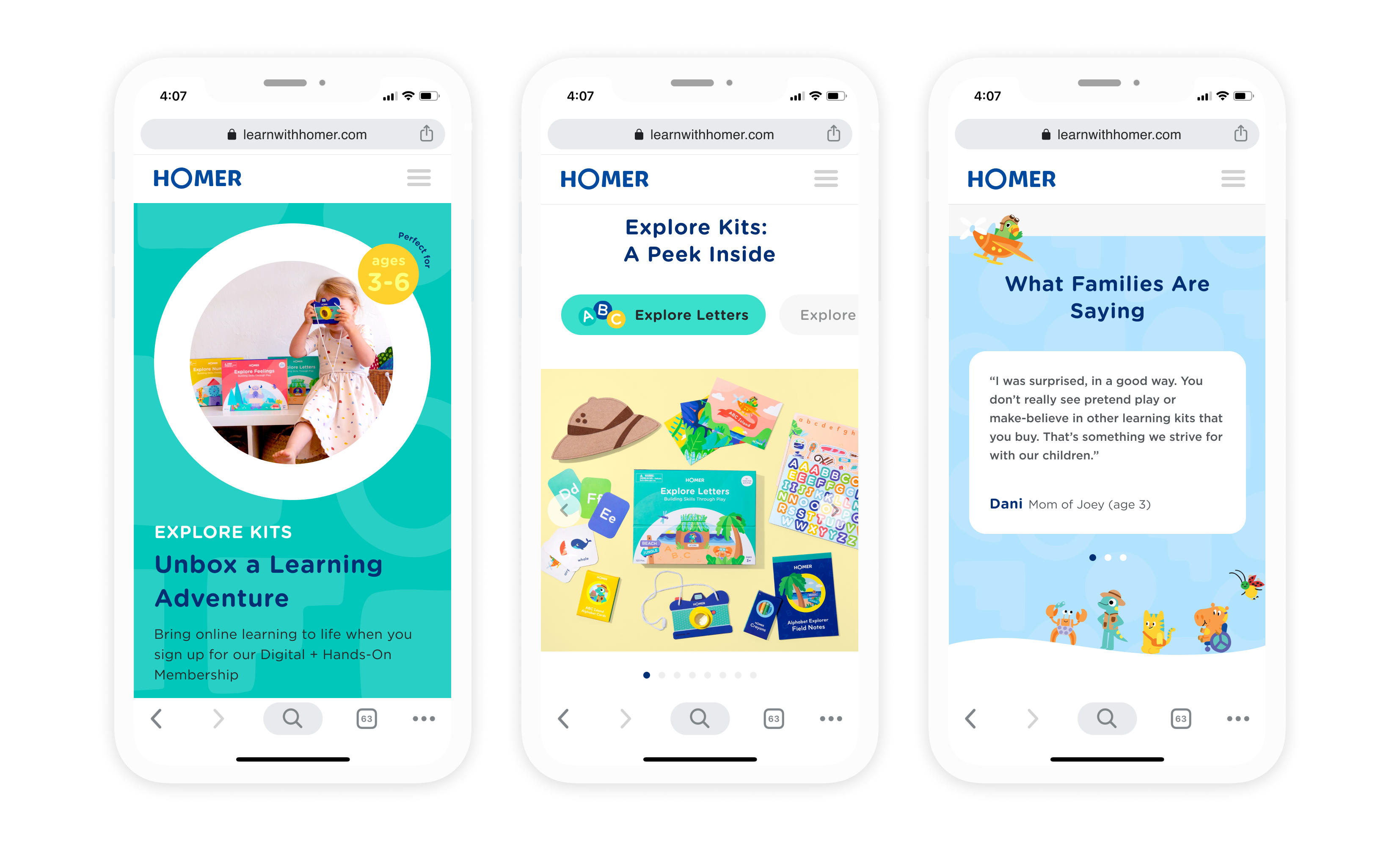
Explore Kits launch page
Working closely with the physical kit designers and the marketing team, I designed the Explore Kits product page from scratch — including new components like the product detail carousel. The page balanced product education, age-appropriate guidance, and clear purchasing pathways, while flexible content modules let the marketing team update offers and seasonal bundles independently.
Full page suite
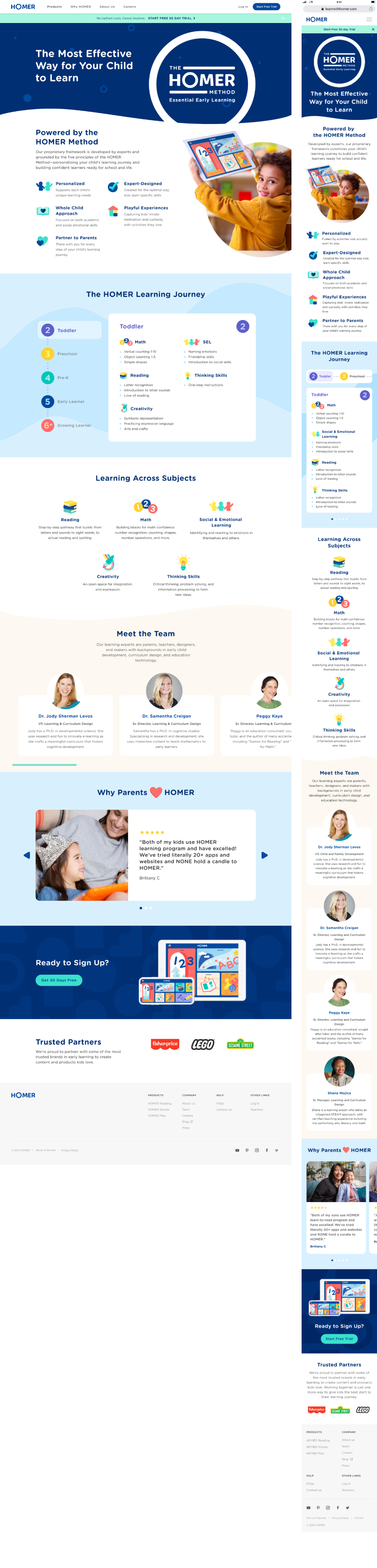
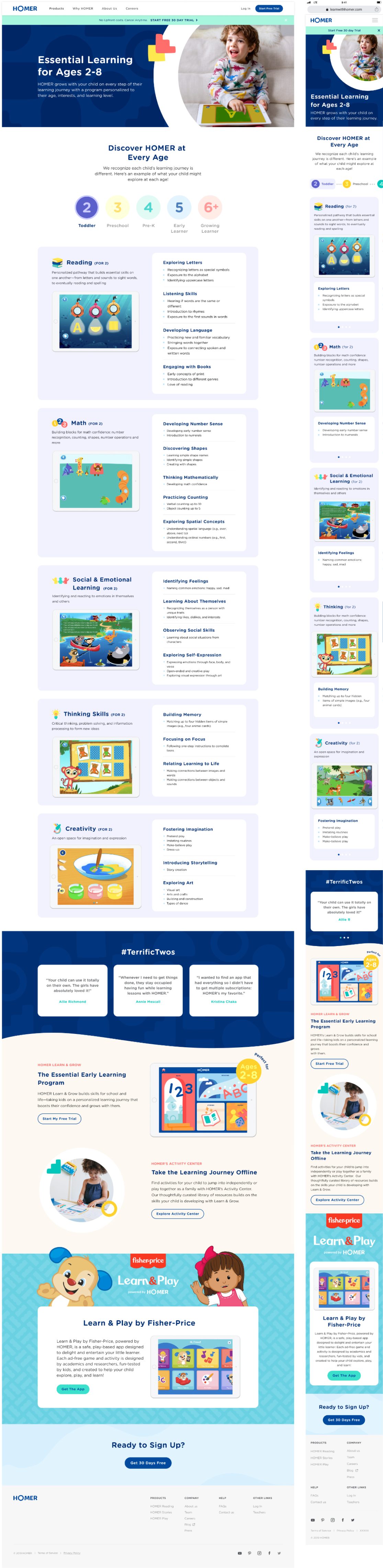
Beyond the homepage, the redesign covered the full site: Why HOMER, About, Subject pages, Learn and Grow landing pages, Careers, and more. Each page was built on the same token-based component system, ensuring brand consistency at scale without manual QA on every update.
A stronger digital presence that directly supported HOMER's next growth chapter
After three months, the redesigned site reflected HOMER's updated branding and full product offering — creating the foundation for subscription plan launches that drove increased Convert to Pay and Annual plan adoptions. The modular component system empowered both design and marketing teams to iterate quickly, launch campaigns, and maintain brand consistency as the product and content continued to evolve.
What I'd do differently
The design system documentation was strong internally, but I'd invest more in making it self-service for the marketing team earlier. There was a period where content updates required more design involvement than they should have — building that capability from day one would have freed up capacity on both sides.
The decision to build the system before the pages. It added time upfront but paid off every time a new page needed to spin up quickly or a campaign required a layout variation. The foundation made everything downstream faster and more consistent.