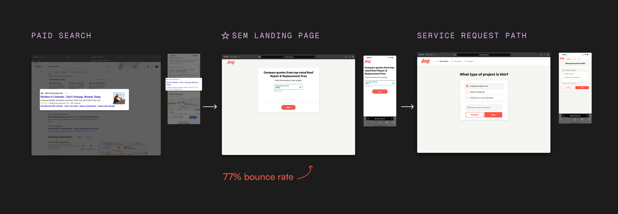
A 77% bounce rate, a $2M/month problem, and everything we learned trying to fix it.
A multi-phase experimentation project to redesign Angi's SEM landing page — the first brand touchpoint for 5 million paid search visitors a year. What started as a straightforward A/B test became a rigorous, two-year investigation into why users bounce, what actually builds trust, and the tension between engagement and conversion.
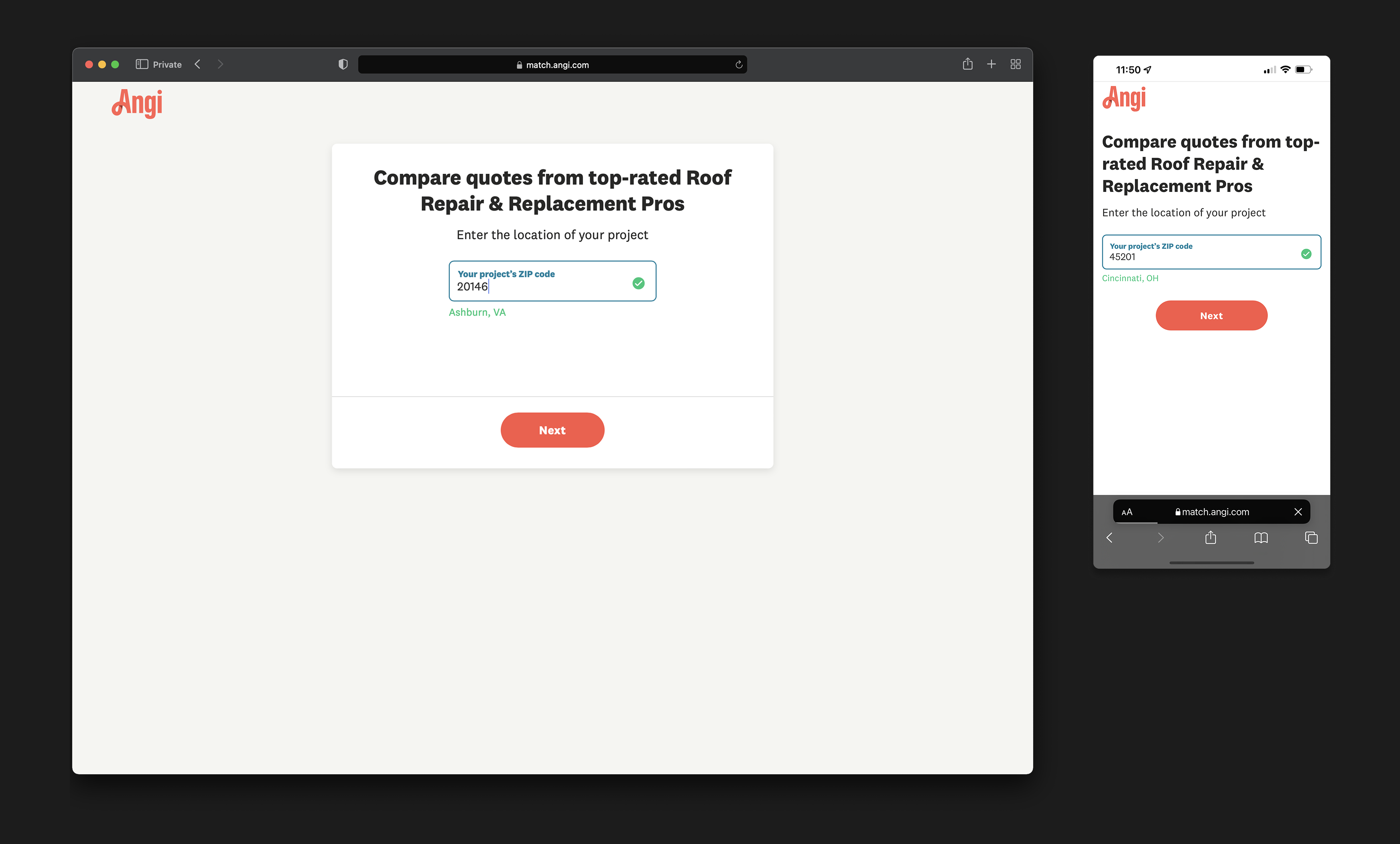
Angi's SEM landing page was bleeding revenue. Paid search pages attracted over 5 million visitors a year and had been performing well — until late 2021, when conversion dropped from 13% to 9% as post-pandemic behavior shifted. The bounce rate climbed to 77%, representing roughly $2.16 million in lost revenue every month. The page itself was sparse: a headline, a ZIP code field, a button. Users who weren't ready to immediately submit a service request had nowhere to go but back. My team was tasked with fixing it.
I led design on this project alongside a fellow designer, a PM, an engineering manager, a user researcher, and a team of engineers. I owned the end-to-end design process across both phases — from competitive analysis and hypothesis formation through wireframing, A/B test design, and the full page reconceptualization. This was my crash course in data-driven design.
The page had a single conversion path for two completely different users — one ready to hire a pro today, and one still figuring out if they even need one. Until we designed for both, we couldn't win.
Top of funnel user journey
SEM LP = the gateway to the Angi experience
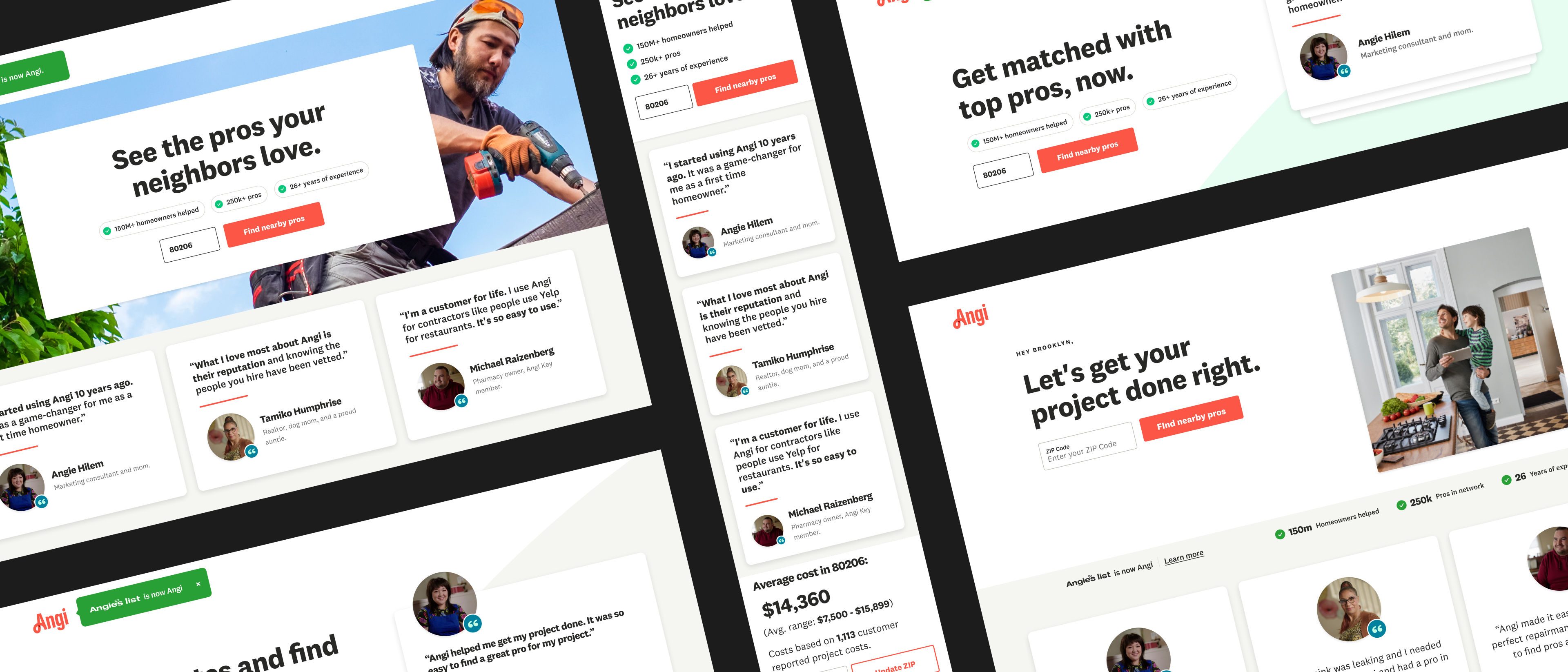
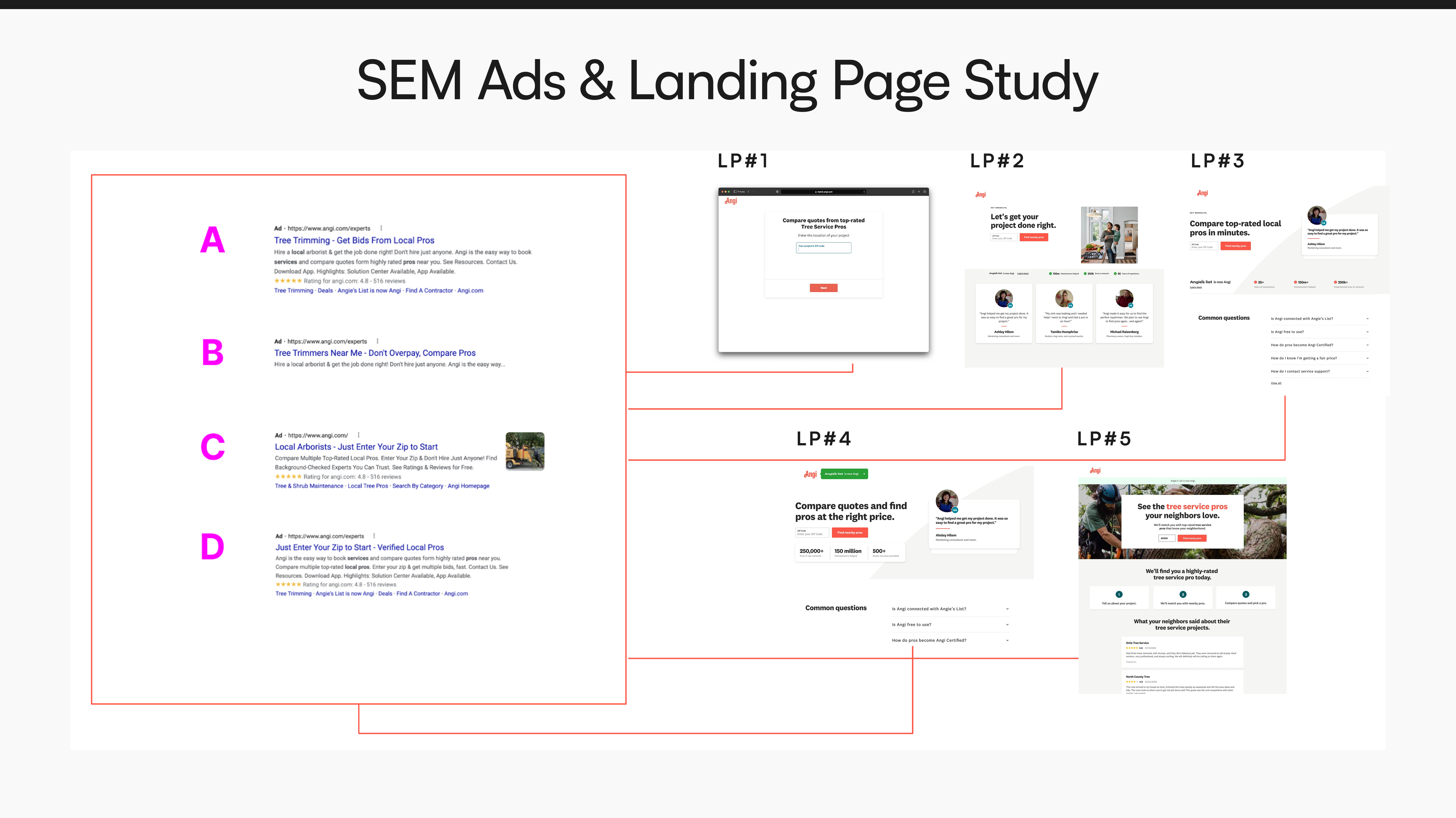
Phase 1 — We optimized the interface.
Leadership needed to see movement fast. Before we had a chance to do SEM-specific research, we were already in testing.
Working with our PM and stakeholders, we aligned on a clear plan of attack: optimize the SEM landing page through a series of A/B tests against the control using component-based design. The goal was to engage users earlier in the funnel and give them enough context to move forward — without overwhelming them into bouncing.
If the SEM page becomes more visually engaging, clearly communicates value, and incorporates known trust builders, then user engagement will increase and bounce rate will decrease.
We defined three success metrics going in: reducing bounce rate was the primary goal — we were targeting a 15% reduction — with increasing SR conversion rate and SR continuation rate as secondary metrics. Having targets set before testing meant we could evaluate results honestly rather than retrofitting a narrative afterward.
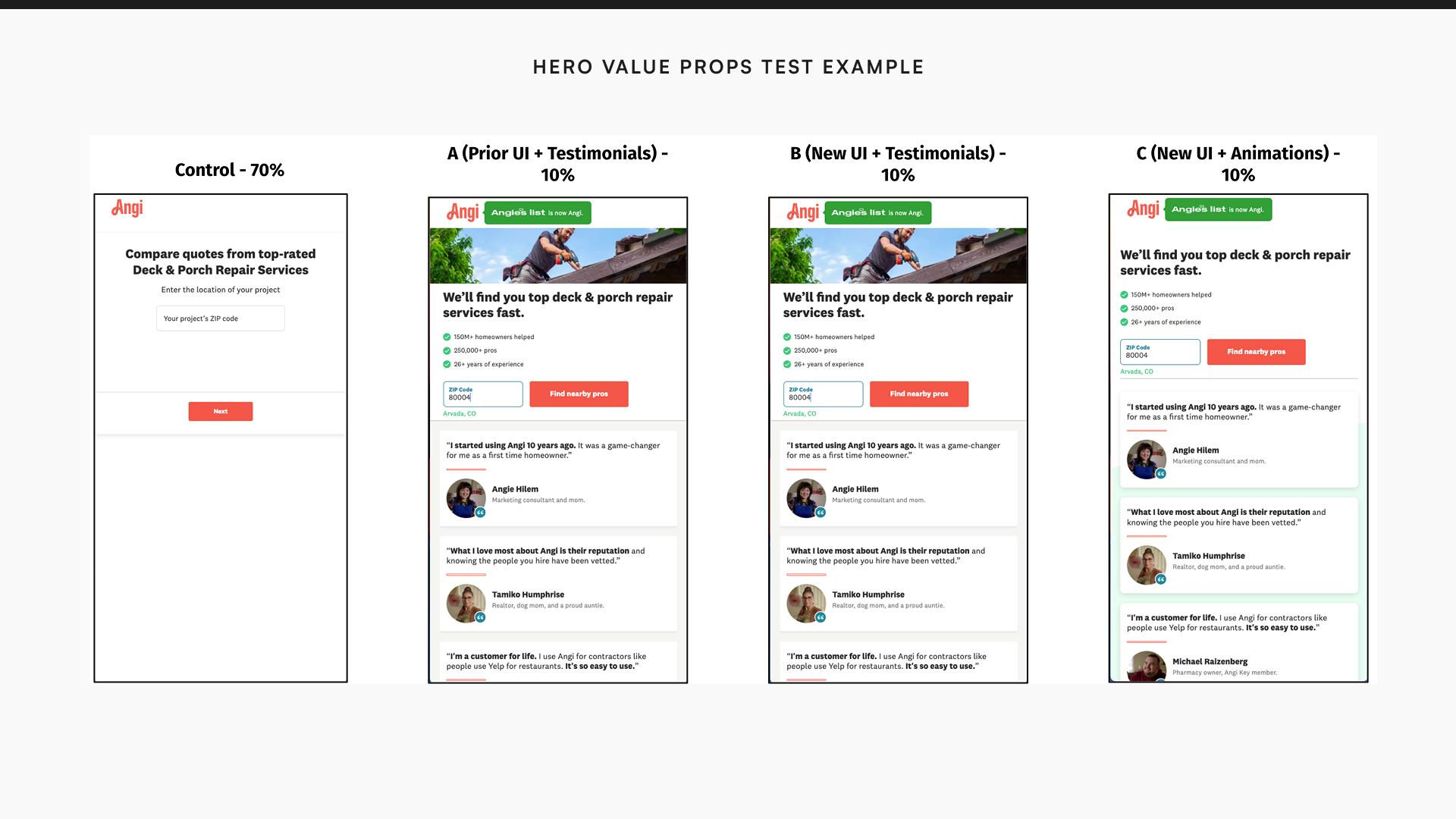
With the goalpost set, we ran three variants simultaneously.
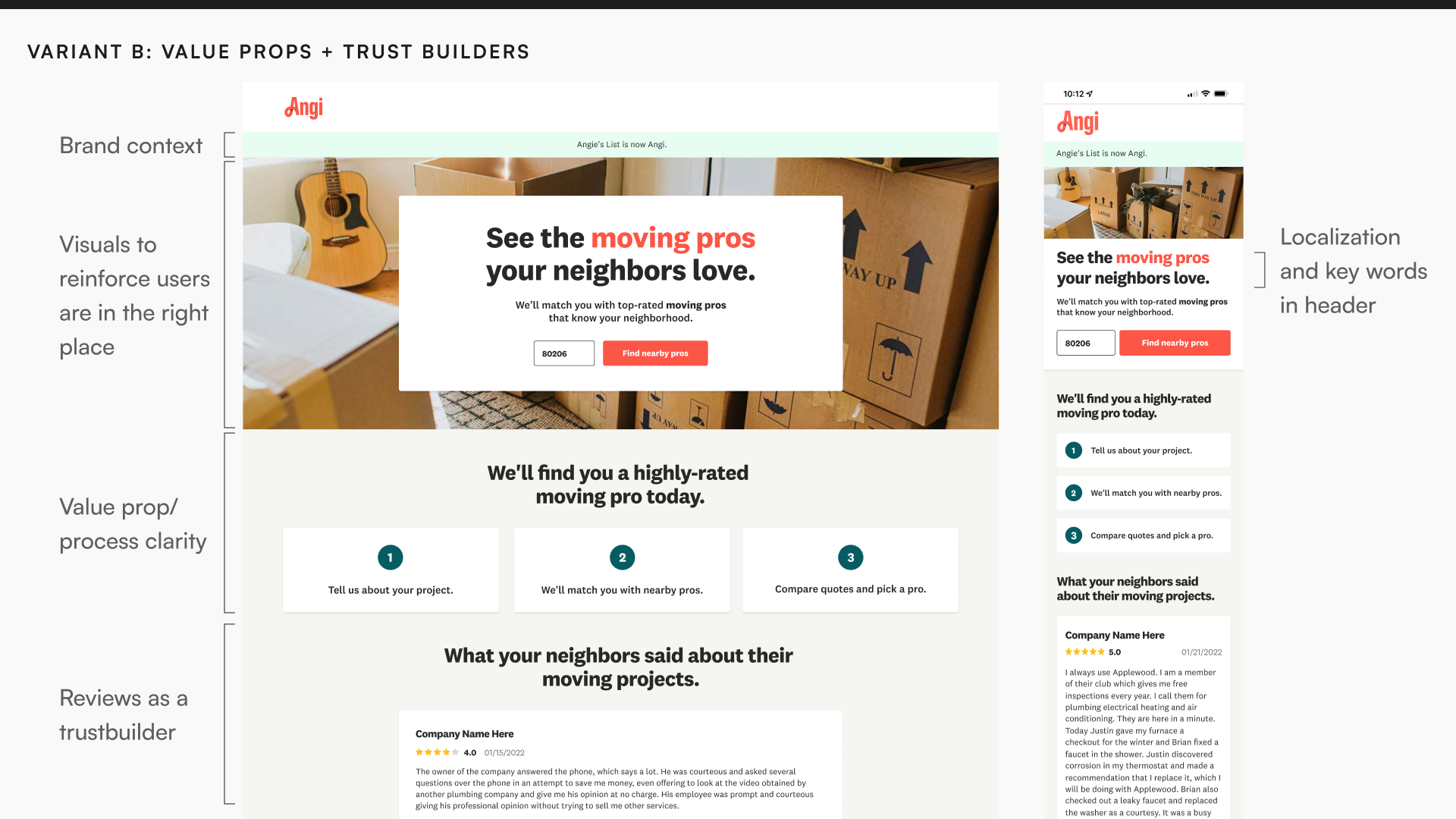
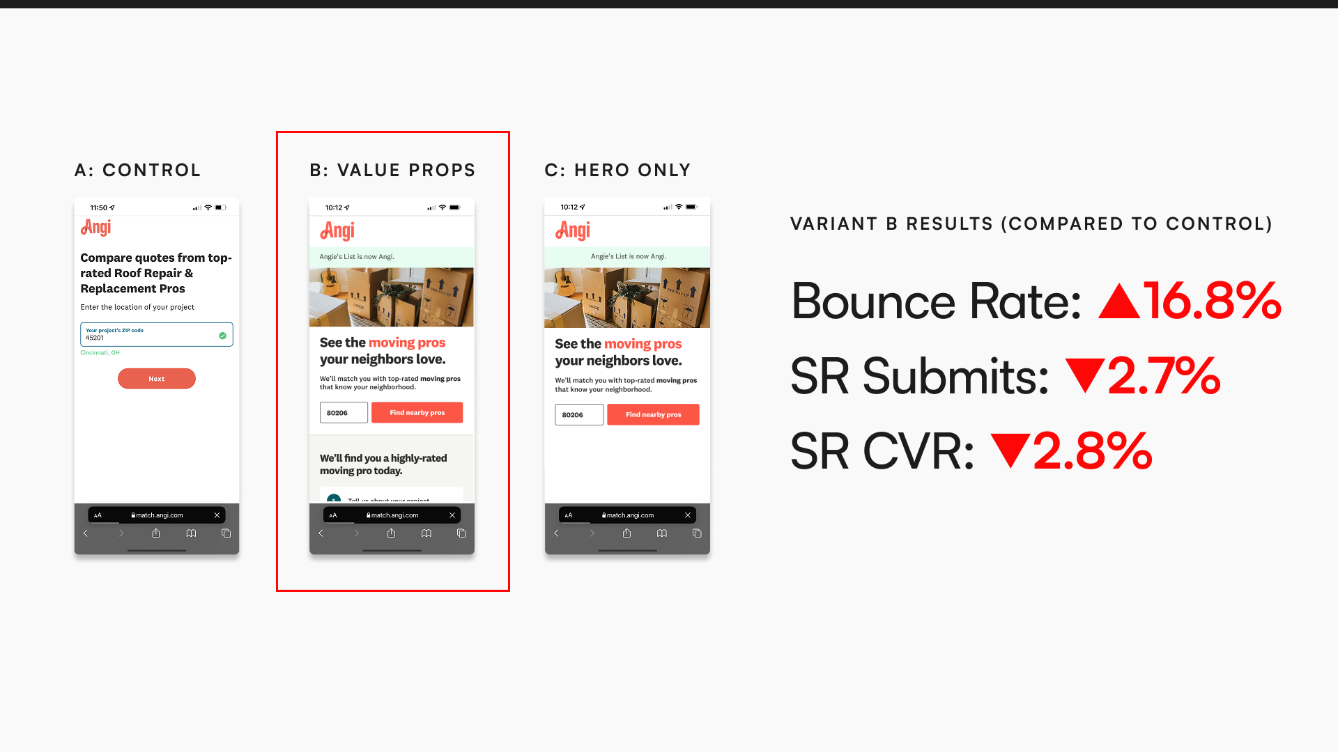
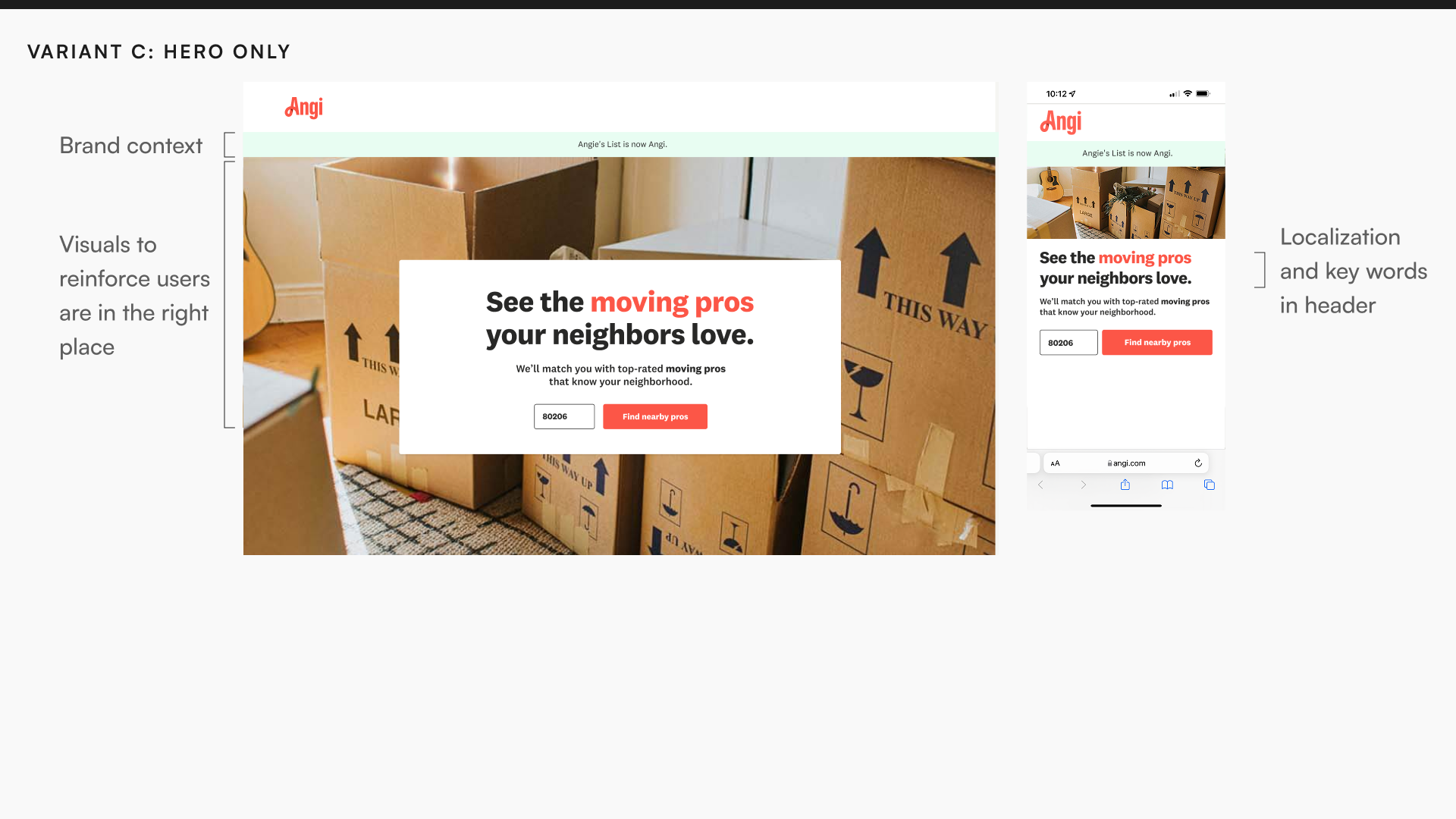
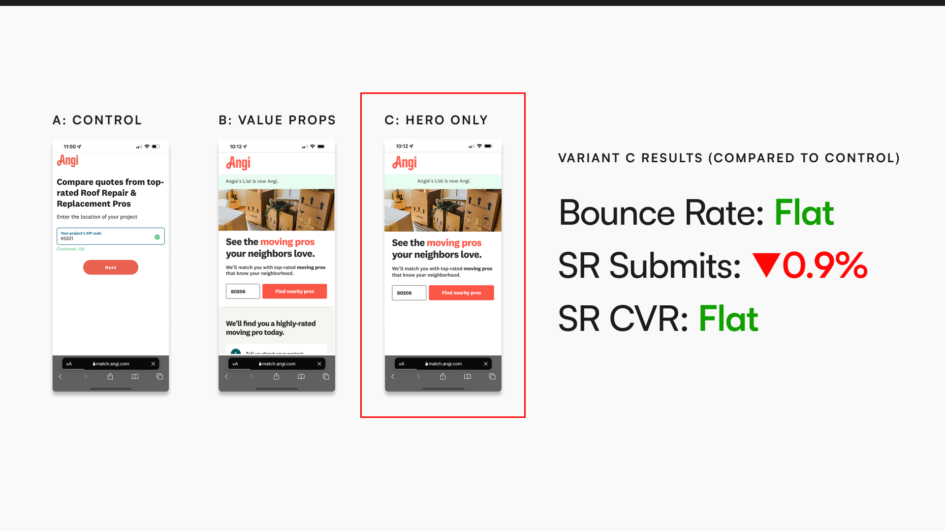
Neither variant won. Variant B added value props and trust builders below the fold — it actually increased bounce rate by 16.8% and hurt SR submits. Variant C stripped everything down to a hero image and headline — it was flat against control.
A SEM landing page is its own unique context. Assuming what resonates on other pages will transfer here is like comparing apples to oranges — and we lost several test cycles learning that the hard way.
Phase 2 — Research exposed a deeper problem.
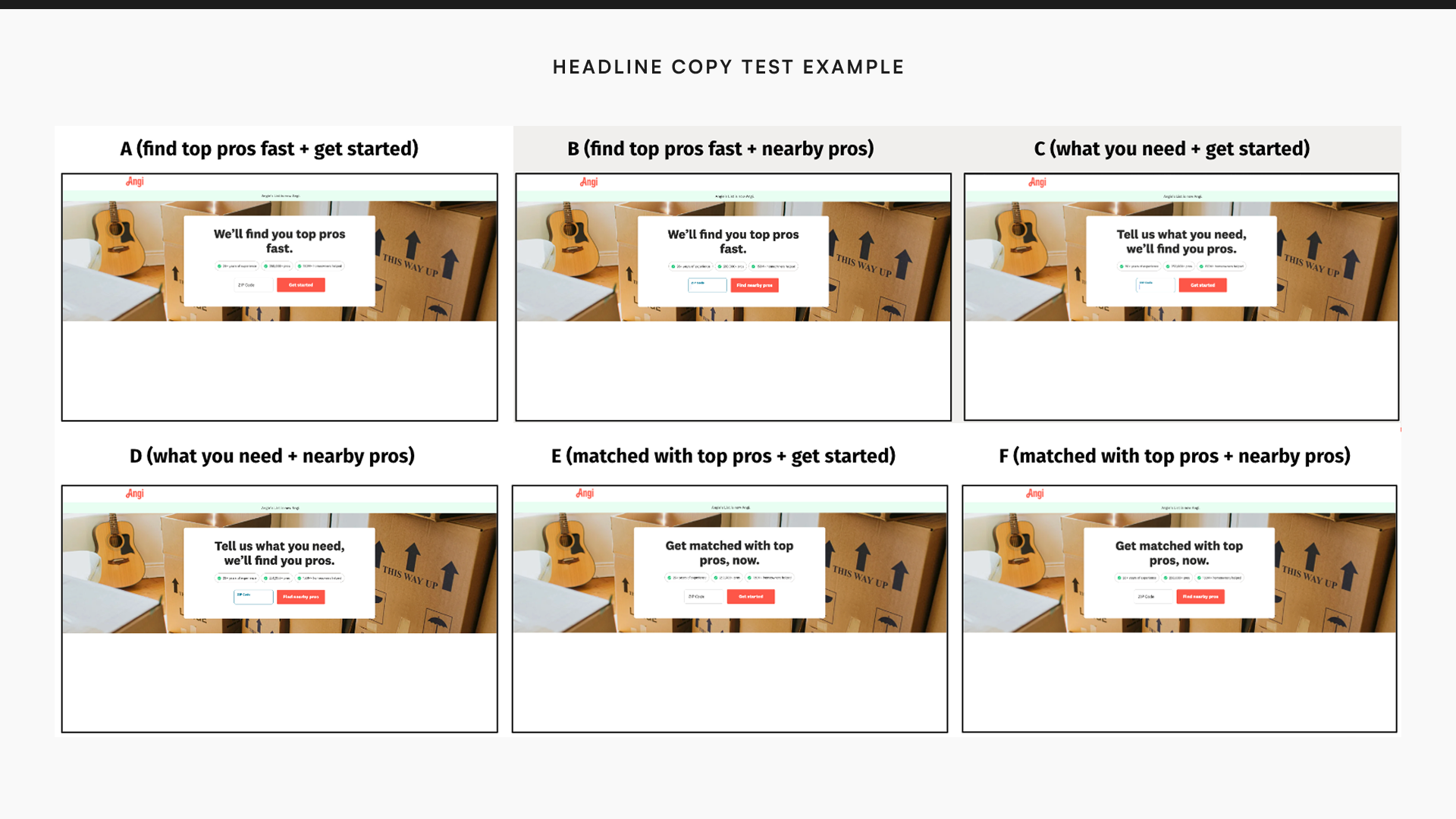
We needed to stop guessing. We commissioned a dedicated UXR study — 4 SEM ad variants and 5 landing page designs, tested with 50 participants across relevance, trustworthiness, confidence, and likelihood to enter a ZIP code.
The research gave us three things we hadn't had before. Certain design components build trust — specifically the Angi brand itself, job-tailored imagery, and numbers indicating Angi's success. Most users expected to see a list of pros after proceeding, regardless of which ad or landing page they came from. And the main bounce reasons came down to two things: wanting more information before committing, or aversion to the Angi brand.
Armed with those findings, we ran a new round of isolated variant tests — keyword copy, hero card treatment, headline copy, value props in the hero. The research also surfaced something that reframed the Phase 1 results: most users weren't scrolling past the fold at all, and when they did, there was little indication they were actually reading. Content volume wasn't the answer.
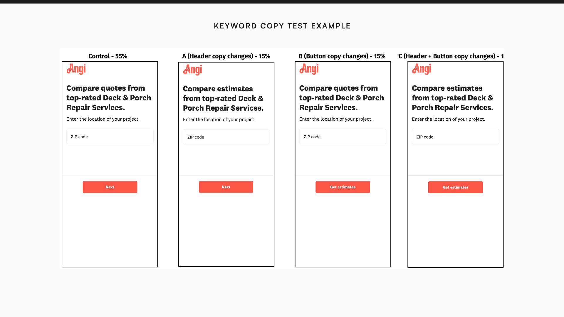
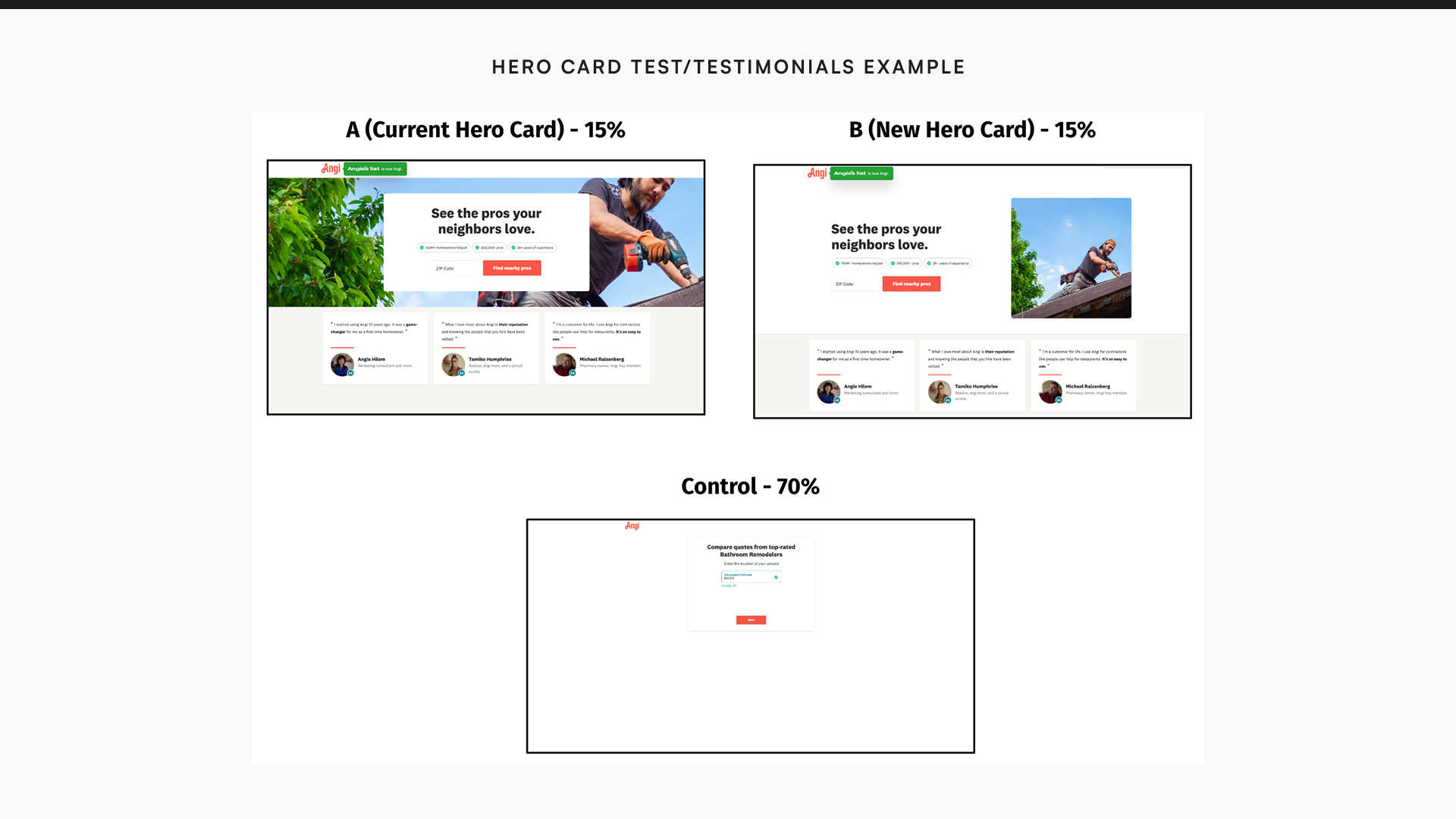
None of the isolated tests demonstrated a significant improvement in key metrics compared to the control. The surface-level variables weren't the problem. Something structural needed to change.
Phase 3 — We redesigned around user intent.
The isolated tests stalling forced a harder question. We weren't going to optimize our way out of this. The real problem was structural: the page only gave users one way to engage — enter a ZIP and start a service request. That worked for users ready to hire. It did nothing for the other half.
Research revealed that 50% of users landing on the SEM page were ready to convert. The other 50% were in a browsing mindset — researching costs, comparing options, not ready to hire. The existing page served only one of those users. Until we designed for both, we couldn't win.
If we leverage content tailored to a specific job to support users at varying levels of readiness, then we will reduce bounce rates and achieve higher 42-day conversion compared to the standard SR path.
We also added a new metric: 42-day CVR. Single-session CVR was the wrong lens for half our audience. Users in the browsing mindset weren't going to convert in the same session — but they might come back. We needed to measure that.
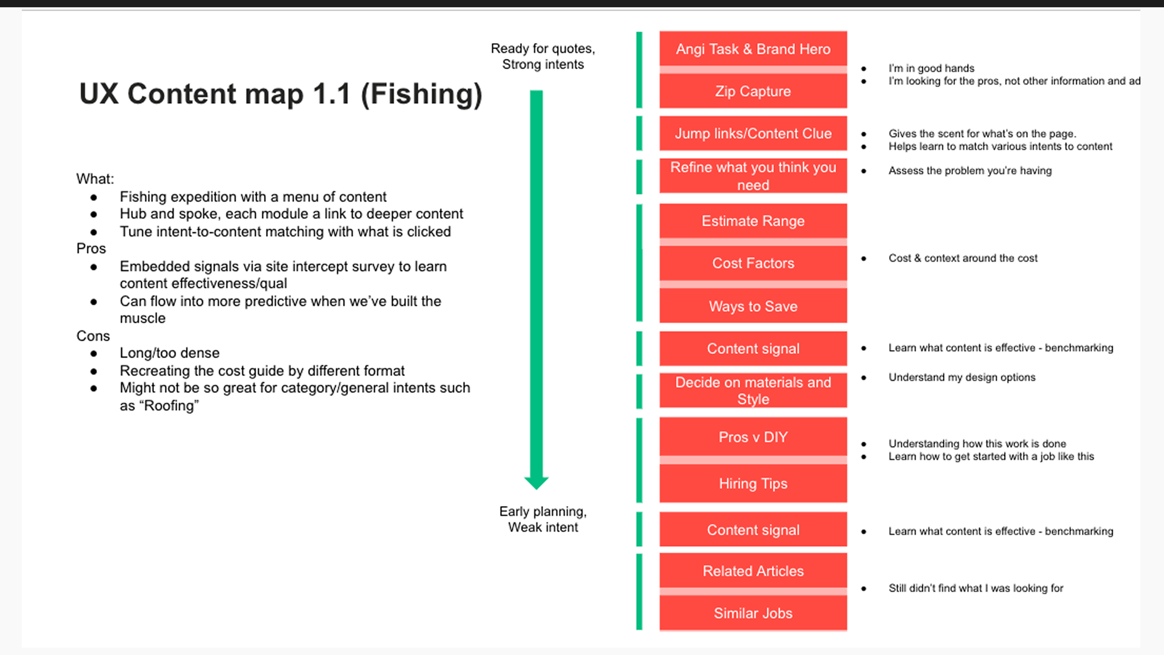
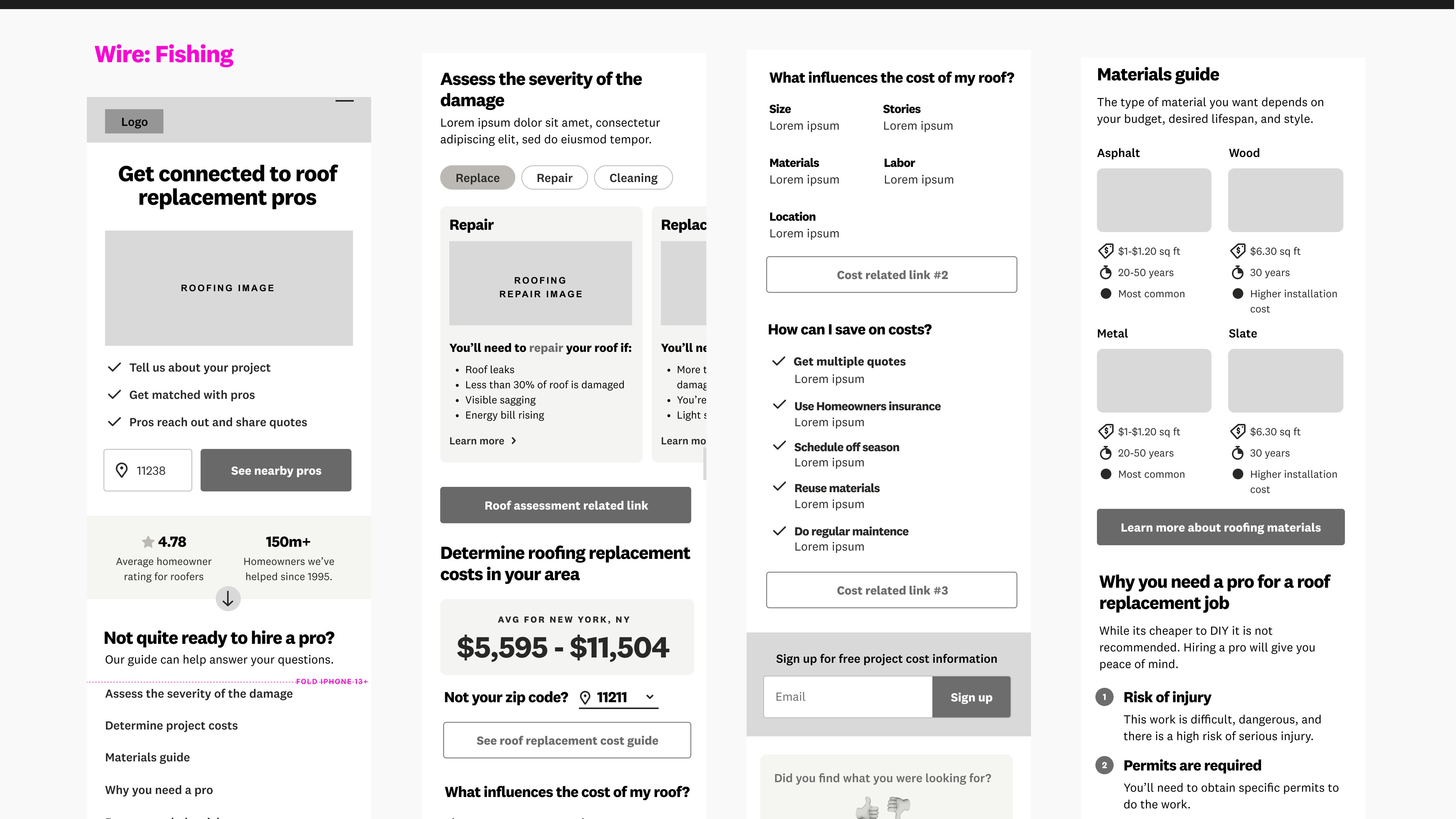
We partnered with leadership and the Angi content team on a full reconceptualization. Two strong concepts emerged from content mapping work. The Fishing model — a hub-and-spoke page ordered from strong to weak user intent, with modules users could self-select into. And the Step by Step model — a page that walked users through four stages of project preparation before connecting them with a pro. I wireframed both and presented them to stakeholders to secure alignment before moving into testing.
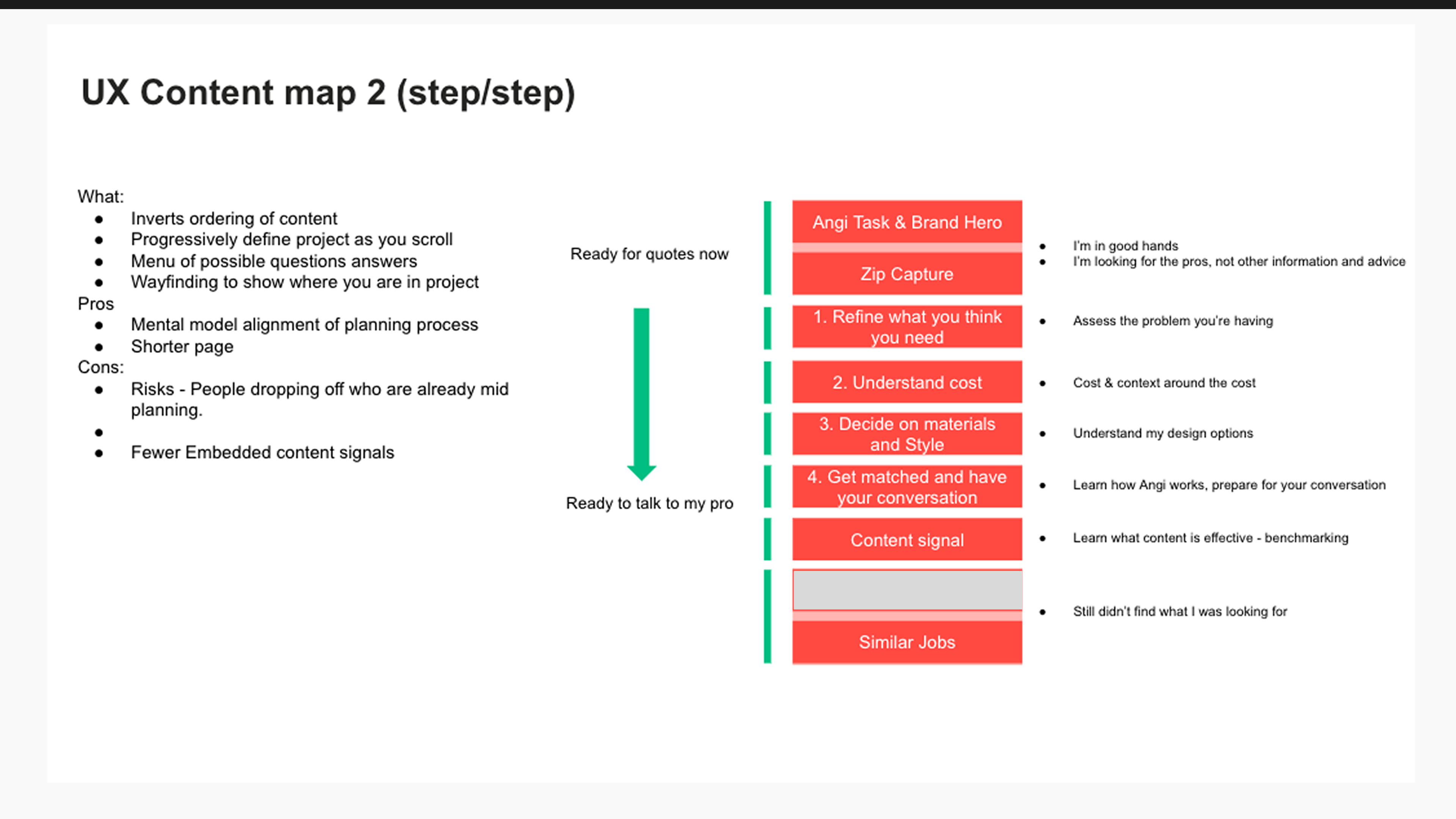
Final concept: stepped approach
In order to meet users where they are, the page outlines steps for users to go through in order to provide all of the information they needed before contacting a pro.
The new page worked — at least half of what we set out to do. Bounce rate dropped 26.9%. CTR on content modules hit 62.6%. Scroll rate reached 45.81% and average time on page was 2.28 minutes. Users were genuinely engaged. But SR CVR dropped 33.51% and 42-day CVR dropped 34.5%. Of the users who did engage, 30.6% entered the SR path directly — but 54.1% of those who scrolled to project costs then exited, signaling they were still in consideration mode, not ready to convert in the same session.
The users who engaged most deeply with our content were the least likely to convert that session. That wasn't a design failure — it was a targeting problem we hadn't named yet.
Not a clean win — something more valuable.
Two years of rigorous testing reshaped how we understood SEM user behavior. We established that the page serves two distinct user types with fundamentally different needs — and that designing for both requires rethinking what success looks like. Engagement and immediate conversion are in tension by design on this page. Ironically, the findings led us away from the original SEM page entirely. The reconceptualized experience launched as a standalone product for high-consideration categories — roofing, HVAC, major renovations — where users genuinely need more information before committing to a pro.
What I'd do differently.
Start with SEM-specific research before running a single test. We assumed learnings from other page contexts would transfer — they didn't. The SEM landing page is a unique moment in the funnel with its own psychology, and we lost several test cycles to assumptions we could have invalidated in week one with a targeted study. I'd also push harder to reframe the success metric earlier. Bounce rate and single-session CVR are in tension by design on a page that serves both ready-to-convert and still-researching users. Until we added 42-day CVR as a metric, we were measuring the wrong thing for half our audience.
The decision to go back to fundamentals when the isolated tests stalled. It would have been easier to keep tweaking variants. Instead we did the harder thing — content mapping, concept development, stakeholder alignment, full wireframes — and came out with a much more honest understanding of the problem. That's the work that actually moved the team forward.