HOMER Learning Website Redesign

Client: HOMER | Company: HOMER | Timeline: June 2020-Nov 2020 | Role: Product Designer
Function: Web Design | Tools: Figma
Overview
I collaborated with the Marketing team and another Product Designer to redesign Homer’s website with updated branding using a new grid, modular design, and design system. Aside from the branding, the website was outdated and did not reflect Homer's current product offerings.
Design System Sample

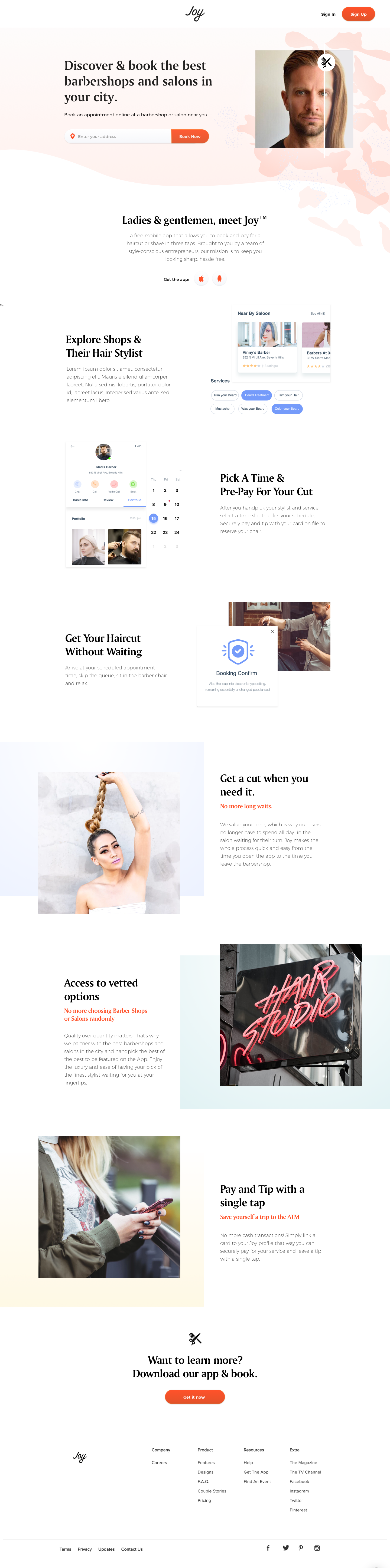
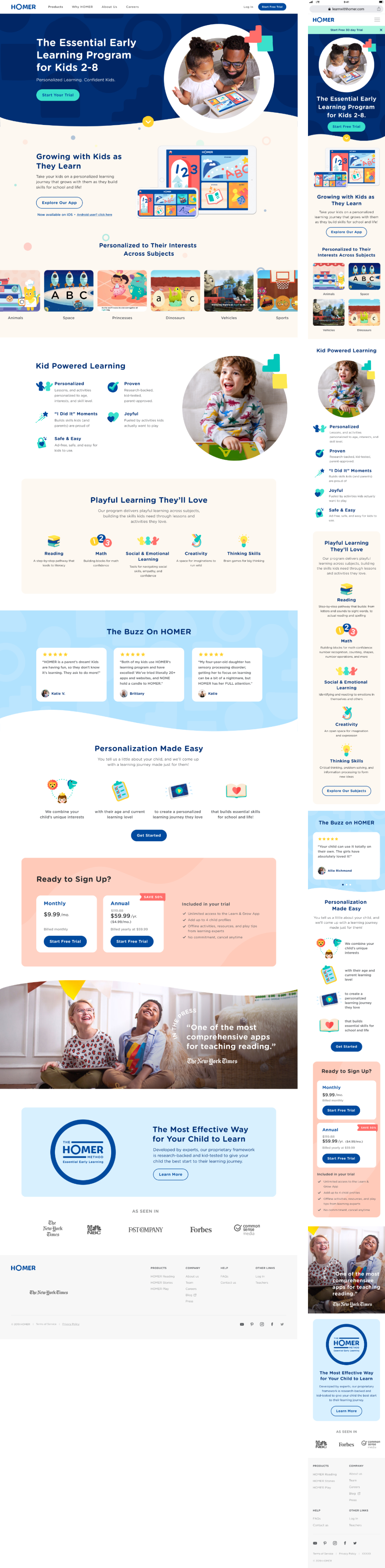
Homepage
Why Homer

About Homer

Learn & Grow Product Page

Ages

Subjects

Careers

Sephora Targeted Promotional Emails

Client: Sephora | Timeline: Oct 2019-Dec 2019 | Role: Digital Design Lead
Function: Email Design | Tools: Sketch, Photoshop
Overview
One of Sephora’s key business objectives for 2019 was to create an engaging templated email promotion system to target strategically identified recipients and get them to convert via actioned-oriented emails. Tests on the targeted promotion emails have been estimated to drive anywhere from $161K to $1.6M annually.
The challenge
My team was tasked to create to dynamic 2 email templates, 1 for each of the two buckets that the promotional offers could fall into: “Repeat” and “Try Something New”. We were to brand the program with a client friendly name and come up with a fresh look and feel that could work as a design system for the emails.
Process
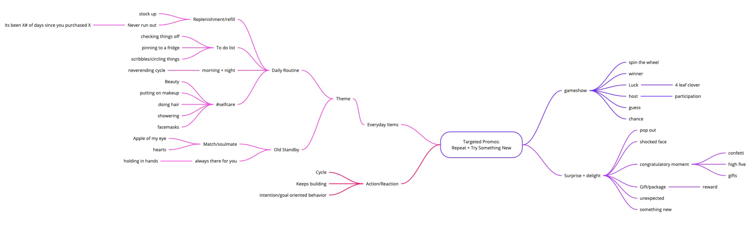
We started out with a few initial brainstorming sessions with the founder of the design firm, the design director, copywriter, project manager, and creative strategist. After doing our research we moved onto some concepting sessions between creative strategy, copy and design that include mind maps and mood boards full of design inspiration.
Mood Boards:

Mind Map Brainstorm:
After we got our concepts locked in we moved onto some rough sketches/wireframes.
Wireframes/Sketches:


Design Pin-ups
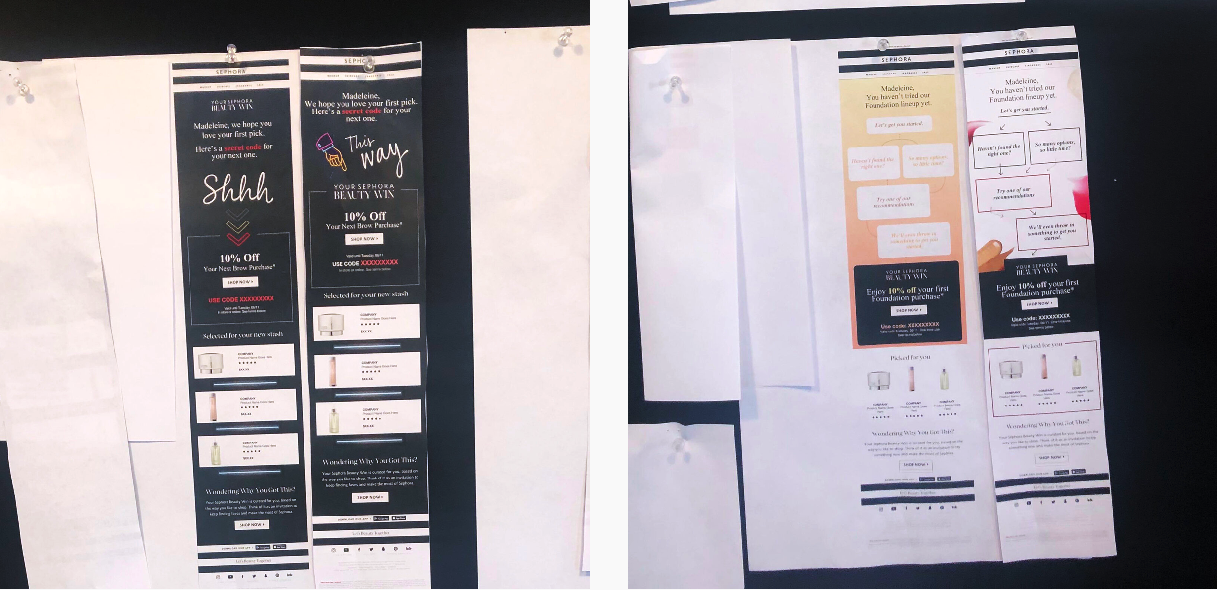
For the client presentation we presented 4 concepts total, 2 for each email template. The client selected 2 concepts to move forward with.
Client Presentation (4 Concepts)
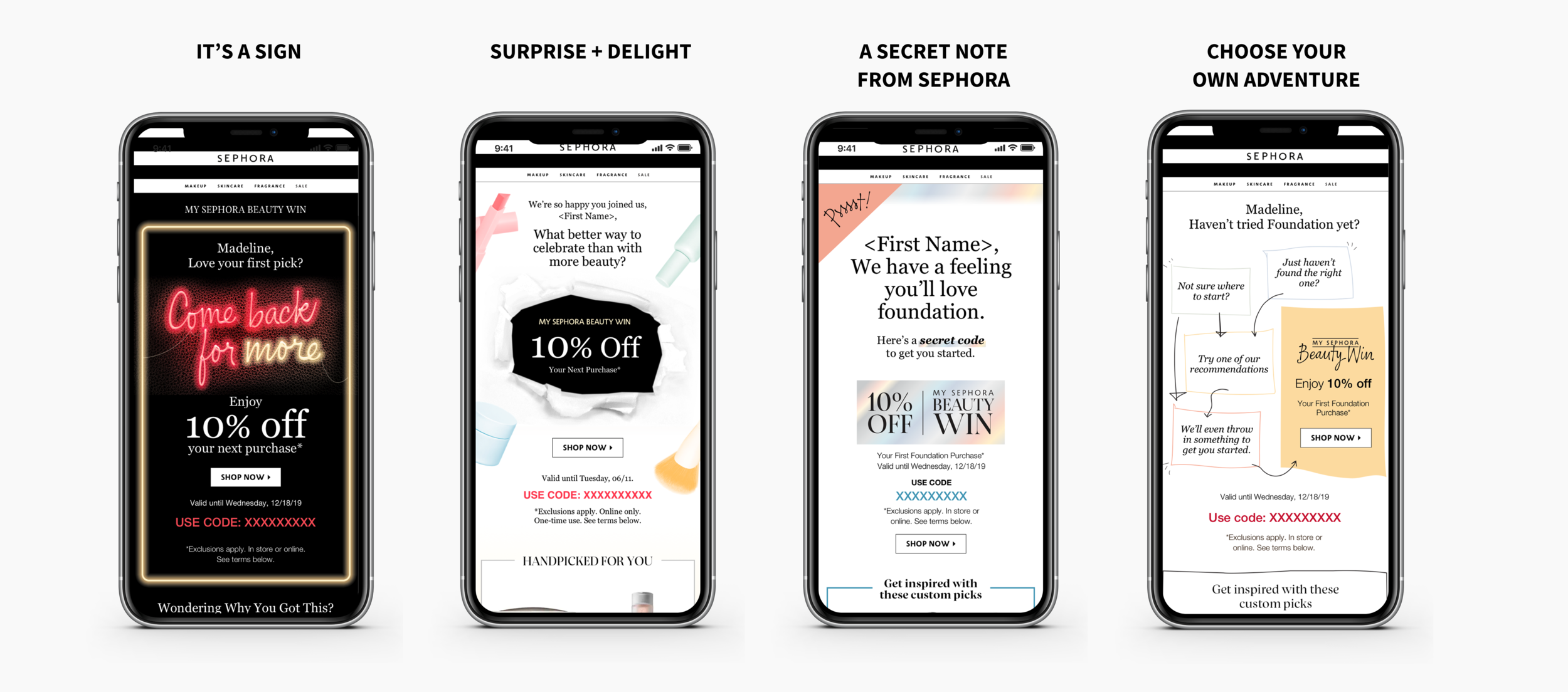
Sephora ended up going with concept 1 and 4 (above). The concepts were refined through a number of different rounds until we arrived at the final design.
“It’s a Sign” Concept Evolution

Round 2

Round 3

Round 3 (Alt)

Round 4
“Choose Your Own Adventure” Concept Evolution

Round 2

Round 3

Round 4
Final Designs with Animation
At this phase I worked with a production designer and external developer for handoff.


Social Media Execution

First Manhattan Co Website Redesign

Client: First Manhattan Co | Company: Sarankco | Timeline: July 2019-Sept 2019 | Role: Digital Design Lead
Function: Web Design | Tools: Sketch, Photoshop, Abstract, InVision
Overview
Our client First Manhattan Co is a wealth management in NYC that wanted to update their brand for a more modern audience. After Sarankco (the agency I was working with) redesigned their Visual Identity System and core marketing assets they reached out to have us redesign their website as well.
Solution
We went with a template based modular design hosted by Craft CMS.
Process
After the client signed off on the structure/IA/wireframes we got a start on the visual design. I worked with a junior designer under the art directors to come up with 3 concepts (using the recently redesigned VI) to present to the client. After they chose a concept, we allowed for some revisions and then we proceeded to come up with a design system and redesign the site module by module, template by template at 3 breakpoints. We then handed the project off to the developer (along with documentation of our design system and functional specs) for them to implement and roll out the design.
Sitemap

Wireframe example

Spec Sheet Example

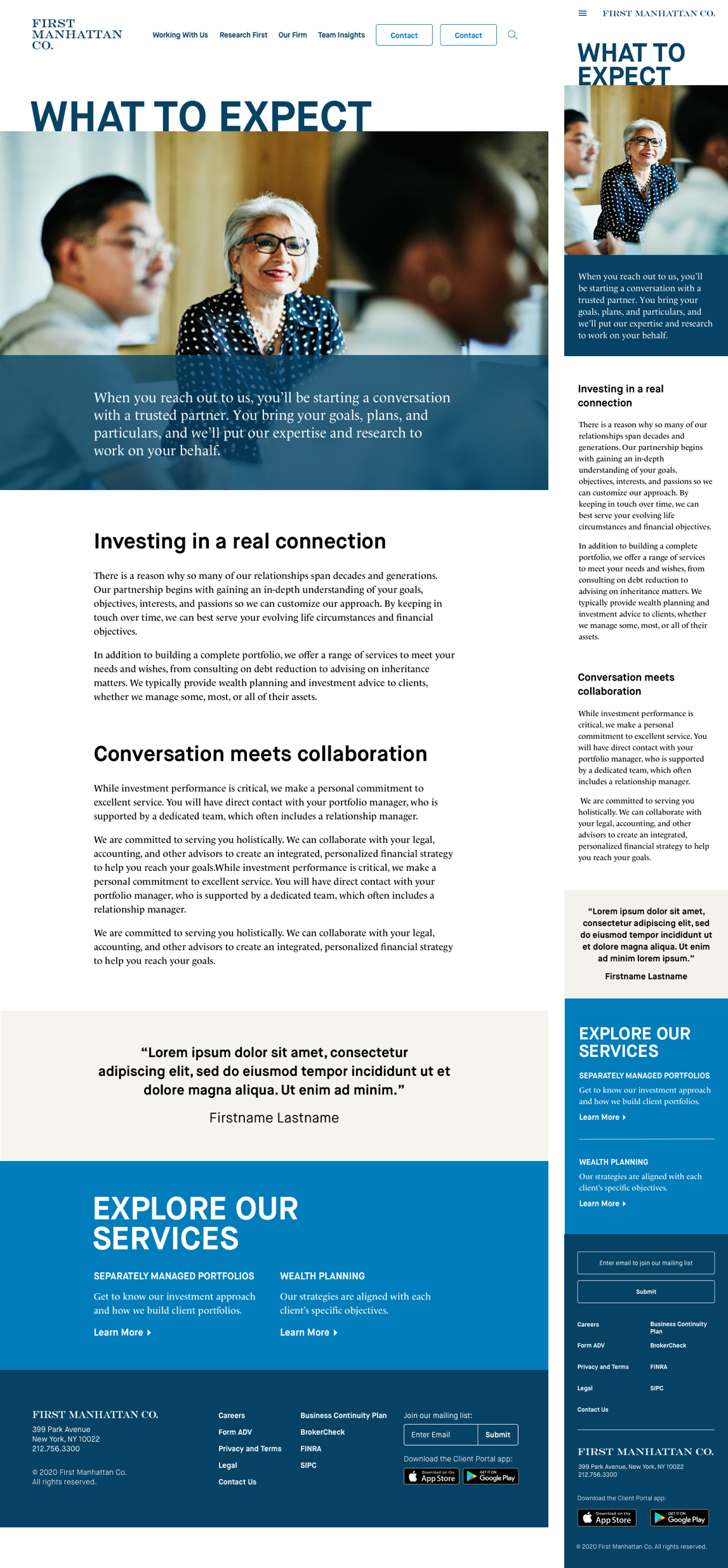
Final Designs


Stackla Brand Refresh & Marketing Asset Evolution

Client: Stackla | Timeline: Sept 2016 - Jan 2019 | Role: Visual Design Lead | Function: Brand Design, Communication Design
Tools: Adobe Creative Suite, Sketch, Invision | Notes: I singlehandedly designed all the visuals you see below
Opening Statement
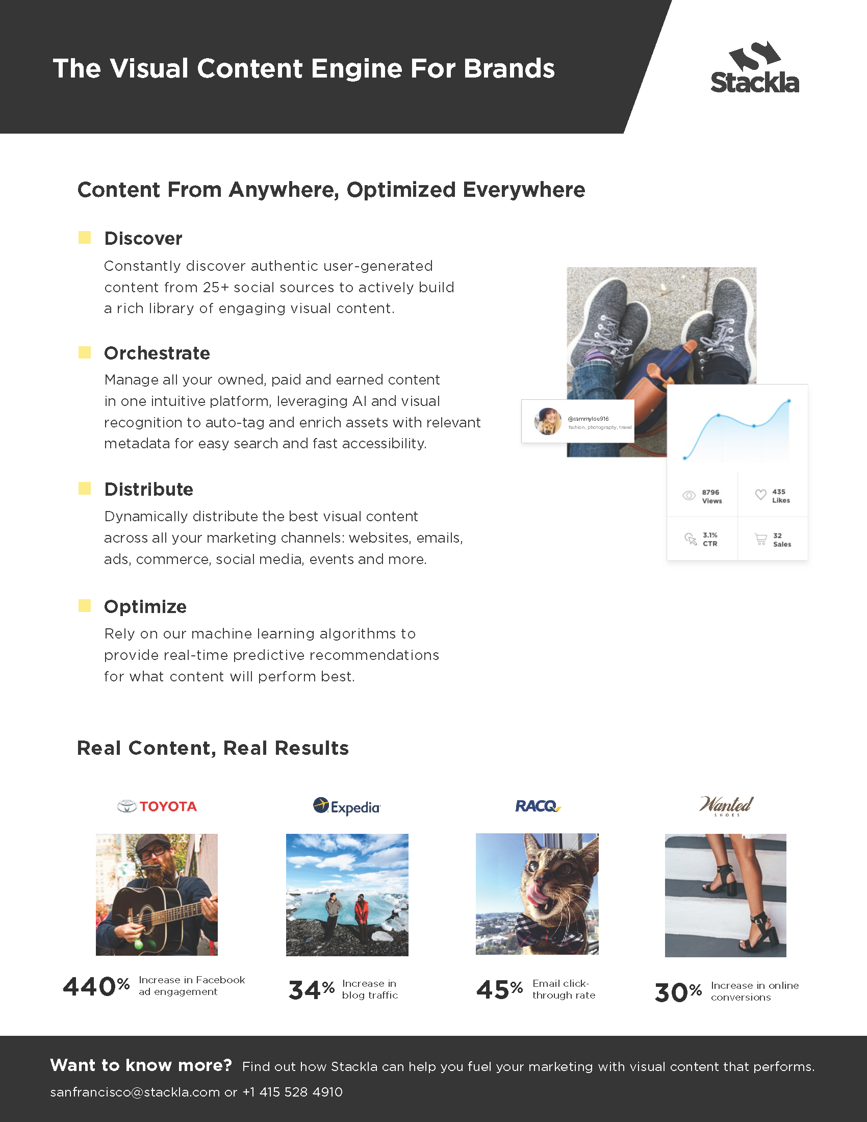
Stackla underwent many momentous changes over the past few years, evolving from merely a user-generated content platform to the “world’s smartest visual content engine”. It ramped up it's enterprise capabilities, launched AI-powered smart filtering, enabled machine learning powered content recommendations, and added a digital asset manager to it’s offerings. Consequently, it outgrew it’s original branding.
What is Stackla?
Stackla is a SaaS application that helps marketers discover, manage, display and optimize authentic user-generated content (UGC) alongside their branded assets to scalably create personalized experiences at every touchpoint. The platform is used by over 400 multinational enterprise brands like McDonalds, Expedia, Toyota and Sony to name a few.
The Starting Point: Brand Assets in 2016
Their branding was high contrast, harsh and masculine. It relied heavily on the use of the brand yellow, the diagonal framing element, in-device mockups and UGC image mosaics. The color palette was very limited and distracting.
#Uninspirational
One of the biggest issues with Stackla’s old branding is that it wasn’t selling their vision. There’s a world of dazzling UGC out there [that Stackla can help marketers tap into, saving time, money and effort] but Stackla wasn’t drinking its own kool-aid. They were still using stock photos in their marketing assets which muddled their message.
Role + Deliverables
As the only Visual Designer, my challenge was to push the brand forward and ensure that all brand and marketing assets continually looked fresh and engaging while reflecting Stackla's value and market positioning. I was tasked to:
Create a new visual language and rewrite the brand guidelines
(in collaboration with Stackla’s Head of UX Design)Redesign key assets ie sales deck, digital ads, event kiosks, and marketing materials
(in collaboration with Stackla’s Head of Content)Redesign Stackla.com
Brand Experimentation
We decided that at this point in time, we should experiment with the brand to see what works by slowly pushing it forward (rather than overhauling it in one fell swoop). It was a good time to implement some changes, because Stackla called for some Campaign specific sub-branding during this time period for its Co-Pilot product launch (AI-Powered predictive content recommendations). As another marketing push, we also tried some vertical specific design featuring UGC photos. We were looking to specifically target travel, CPG, and automotive customers.
Co-pilot Sub-Branding

Vertical Specific Sub-Branding
Moving in the Right Direction
Over time we phased out some of the unsightly and clunky elements of the branding: the black backgrounds, the diagonal, image mosaics, stock photos and distracting swatches of yellow. We subbed in more beautiful large scale UGC photos, clean product UI mocks, concise iconography, and more animation showing how the product works.
A Whole New Brand?
There was a lot of discussion about which parts of the brands to keep and what to do away with. Ultimately, we decided to keep the logo, fonts, and yellow color. We’d worked hard to build brand recognition over time and didn’t want to lose that.
The refreshed brand aims to strike a balance between coming off as innovative, capable and polished without talking down to our audience or appearing too “smart” for them. Dry tech visuals weren’t going to create the sense of aspiration we wanted our audience to feel.
“We sell a product that conveys trust, authenticity and real human connections, so that should be at the heart of our visual presentation.”
Our process was roughly:
Compile all existing brand assets for review
Interview with founder + key stakeholders
Research / mood boards / inspiration
Redesign key assets + roll out over time
Overhaul website
Mood Boards
I utilized mood boards such as the one below to compile inspiration for the Stackla brand refresh. This helped me communicate with / get buy in from key stake holders about the direction of the new visuals.

Competitive Analysis
Extensive research of the Stackla’s competitors helped me to differentiate the Stackla brand.

The Results

Brand Guidelines
Once we nailed down a visual language, it was time to rewrite the brand guidelines document to ensure quality and consistency across all brand assets and minimize confusion around the implementation of the refreshed brand.

Reflections
“It’s through mistakes that you actually can grow. You have to get bad in order to get good.”
I’d love to tell you that we paused our other projects, set aside a bunch of time to come up with the perfect idea for a brand refresh, wrote up some amazing guidelines, redesigned the brand/marketing assets methodically, then rolled out the rebrand in one fell swoop. Tada! Stackla was transformed and saw a huge spike in their revenue and everyone was happy. Rainbows and butterflies! Unfortunately, thats never the reality when working for an under resourced startup.
The path to getting Stackla’s brand, design assets and website in shape definitely wasn't linear. There was a lot of experimentation and consequently, failing forward. Many projects weren’t executed at the level of design polish that I wanted because we were lacking design resource, time and budget. We were working under the mantra “done is better than perfect” / “perfect is the enemy of good”. This also meant that we often weren’t able to use research and analytics to test and iterate upon design, something that I want to do more of moving forward.
Password Protected Page
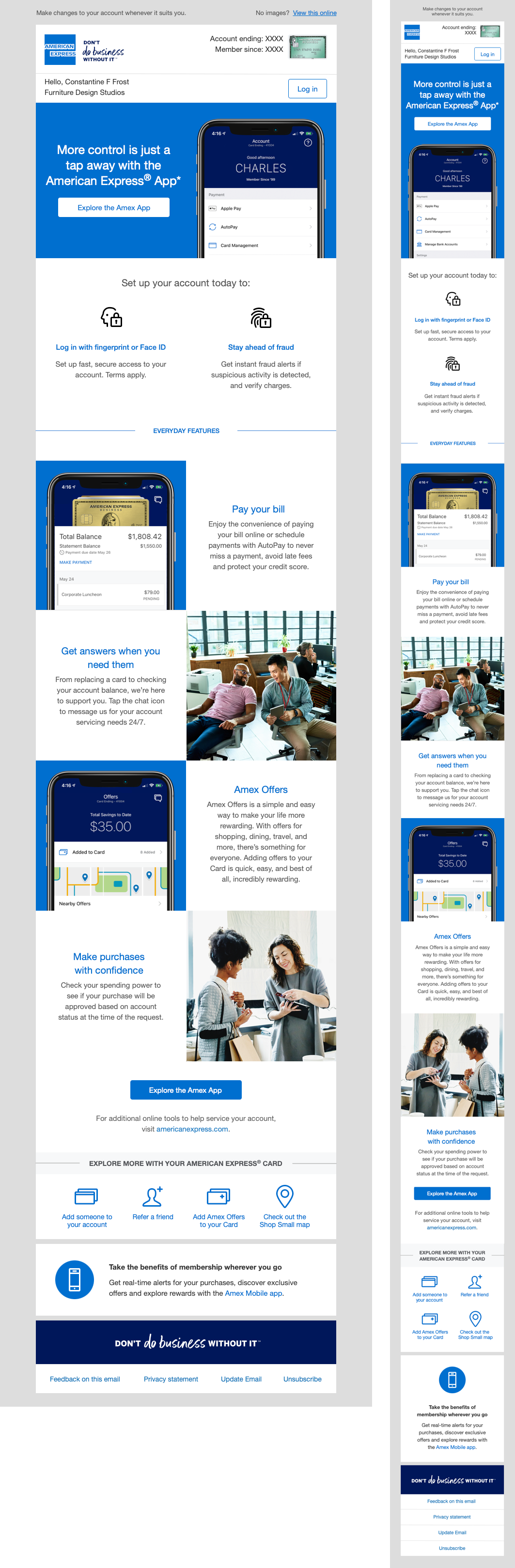
Amex Trigger Emails

Client: American Express | Company: Sarankco | Timeline: Oct 2019-Dec 2019 | Role: Digital Design Lead
Function: Email Design | Tools: Sketch, Photoshop
Membership Rewards 101 Trigger Emails Overview
AMEX needed some new trigger email templates that target card users who did not reach the spend threshold to earn bonus points on their cards within the first 3 months of card use. They are designed to educate users about how many points they currently have, how they can maximize their point earn on purchases, and how they can then use those points.
The Challenge
The challenging aspect of this project was that the same email template had to work across many different types of users (those who almost reached the spend threshold to those that were very far away) and card products (Amex EveryDay, Amex EveryDay Preferred, Green Card, Gold Card, and Platinum Card).
Process
We started out with a few initial brainstorming sessions with the founder of the design firm, the design director, copywriter, project manager, and creative strategist. After doing our research we moved onto some concepting sessions between creative strategy, copy and design.
The Solution
In order to best engage these Card Members, we opted to dynamically populate content into these new MR 101 emails based on two key criteria: card product and card member spend.
AED Card (Close to Spend Threshold)
Audience: Basic entry level card, the most accessible to everyone. Used for day to day expenses like groceries and gas.

Platinum Card (Far From Spend Threshold)
Audience: Focused on an older audience who likes luxury and travel.

MYCA (My Card Account) Trigger Emails Overview
The purpose of these emails was to drive enrollment in MYCA and engagement with the Mobile App. They are triggered to be sent to card members that A) have 45 days of tenure and have not yet enrolled in MYCA or B) have not have had their first login in the app.
Welcome to Mobile Email (Consumer)
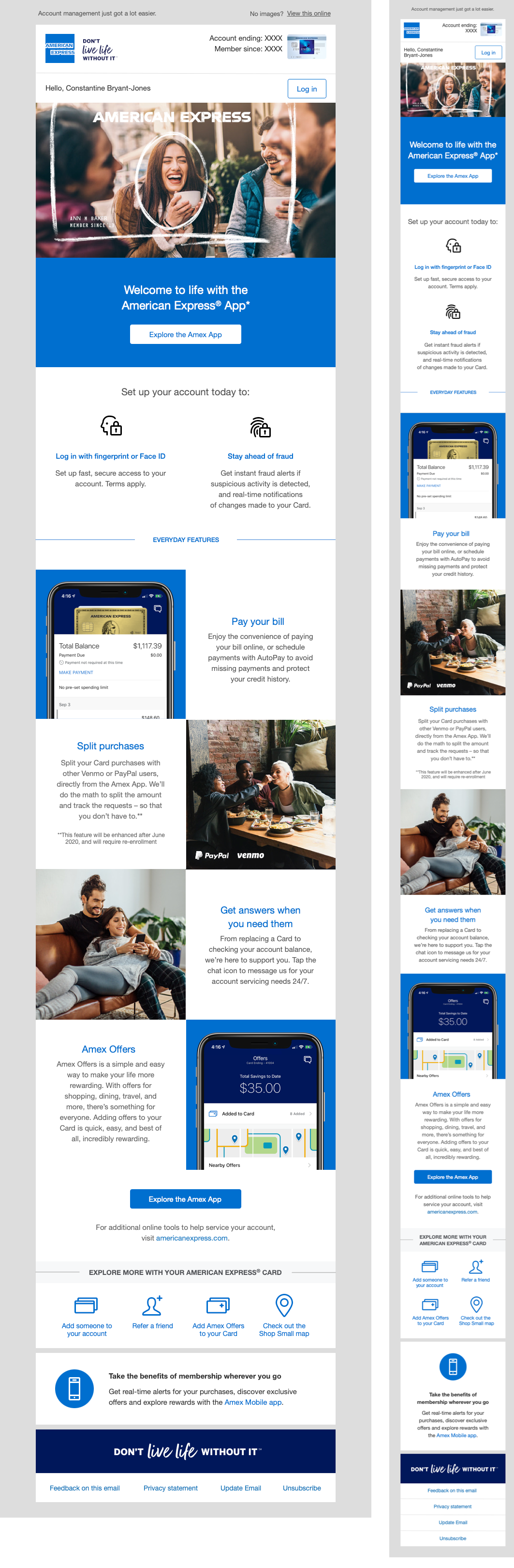
Welcome to Mobile Email (Business)
Day 45 Mobile App Trigger Email
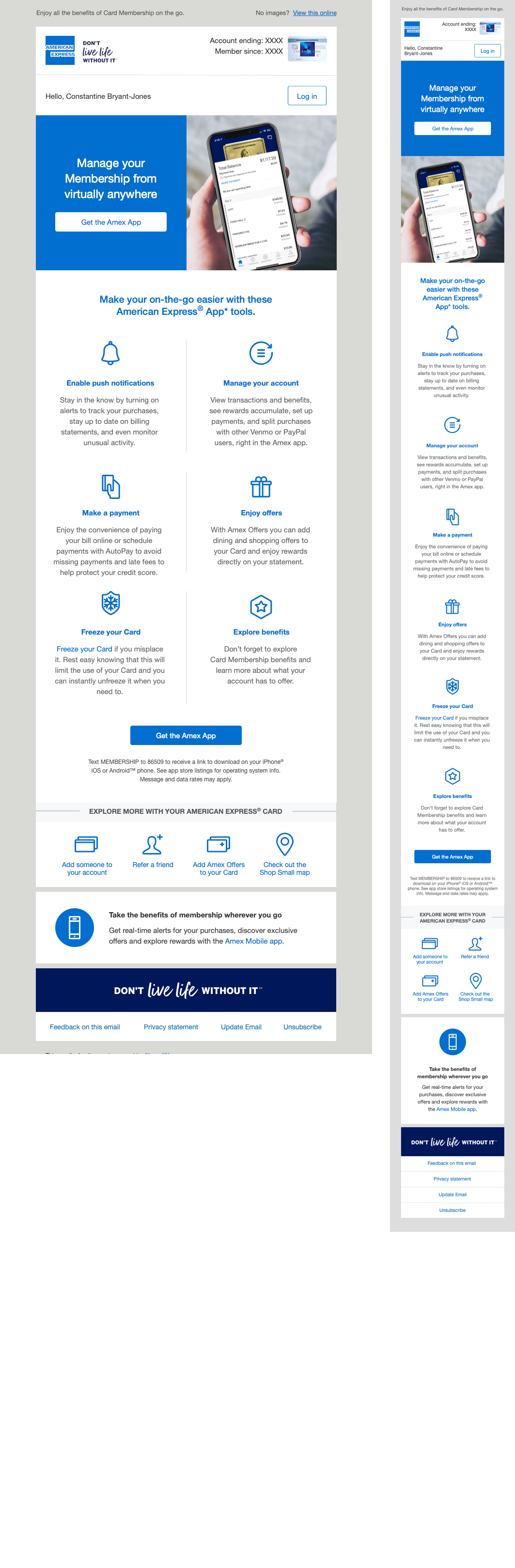
Day 45 MYCA App Trigger Email

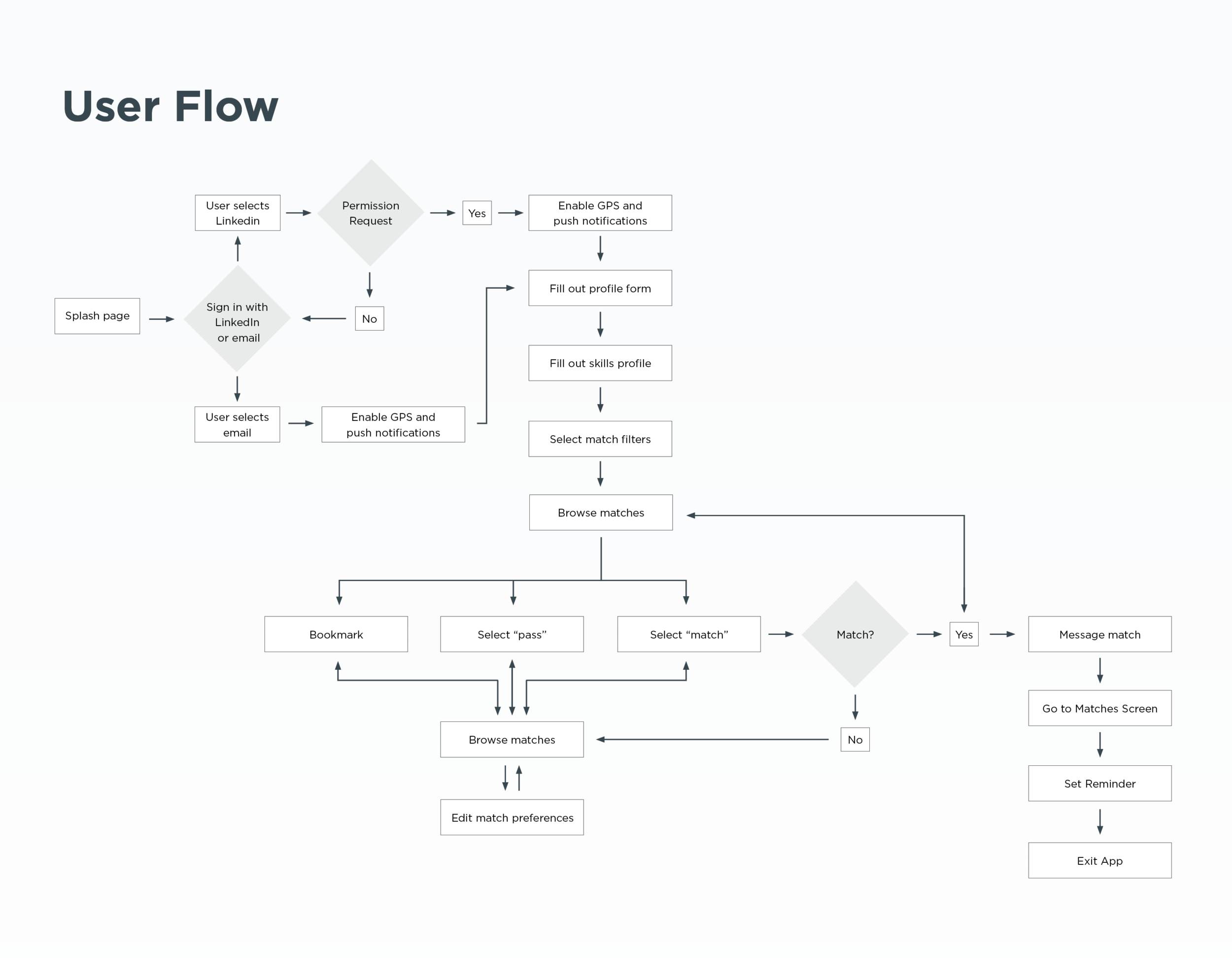
MatchUP App UX Case Study

Client: Student Project | Timeline: October 2017 | Role: UI/UX Designer
Function: User Research, UX Design, UI Design | Tools: Sketch, InVision
Opening Statement
As a student of General Assembly’s User Experience Design Course, I chose a final project topic that was both a proven need in the marketplace and of deep personal interest: a way for newbies in the UX world to connect with mentors.
I was responsible for synthesizing user research and customer feedback to design and iterate on a solution, and for producing a full suite of UX documentation: User Research, Competitive Analysis, MVP Proposal, User Personas, Information Architecture, User Flows, Key Screens, and a Prototype.
In this case study, I’ll walk through each stage of my design process and illustrate key considerations that shaped the MVP of my final product, MatchUP: a native iOS application that connects UX career mentors, peers, and mentees.


Problem Statement
The problem I suspect is that educated millennials [who are unhappy with their current occupations] want to make a career switch in the tech world [specially UX design] but they face difficulty finding mentors and building relationships with them.
Hypothesis
We believe that making an app that connects people with others in their industry will help facilitate relationships that will get them the information and resources needed to expedite a career change or growth in their current roles.
We will know this to be true when we see people making meaningful connections and setting up meetings [virtual or in person].


Reflections
As with any project, there is always room from improvement. I’ve learned that user testing delivers incredibly valuable information, and would have liked to interact with more users had I had more time in class. I was only have to test my paper prototype with 4 people (thus learning about gaps in my flow/missing buttons) but I would have loved to test my final prototype to get the confidence that my design decision are clear and straightforward.
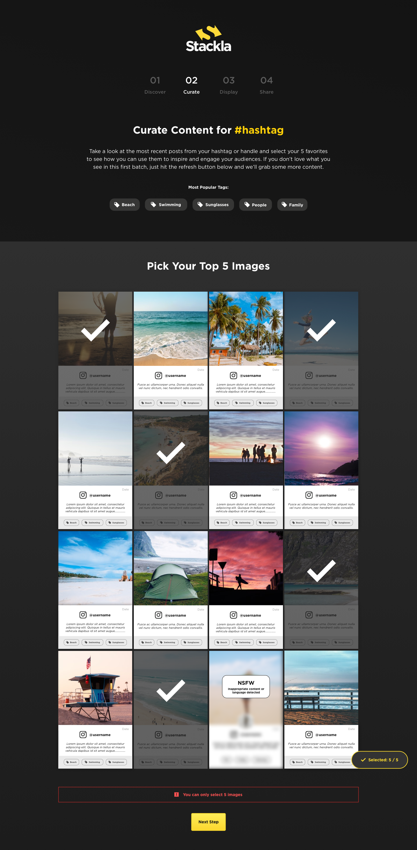
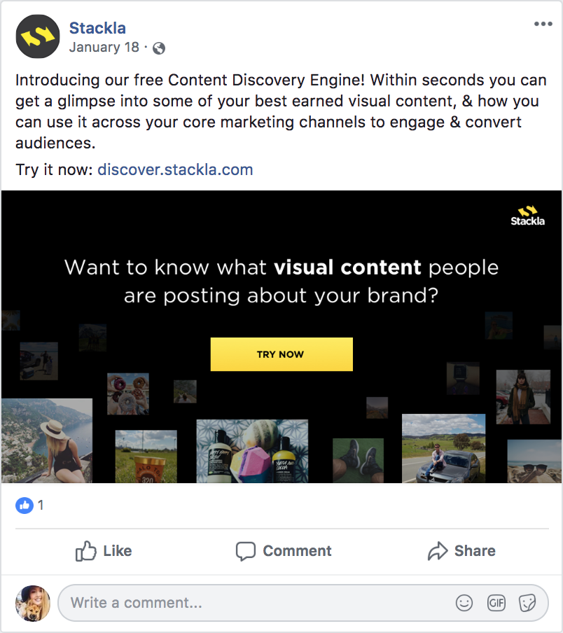
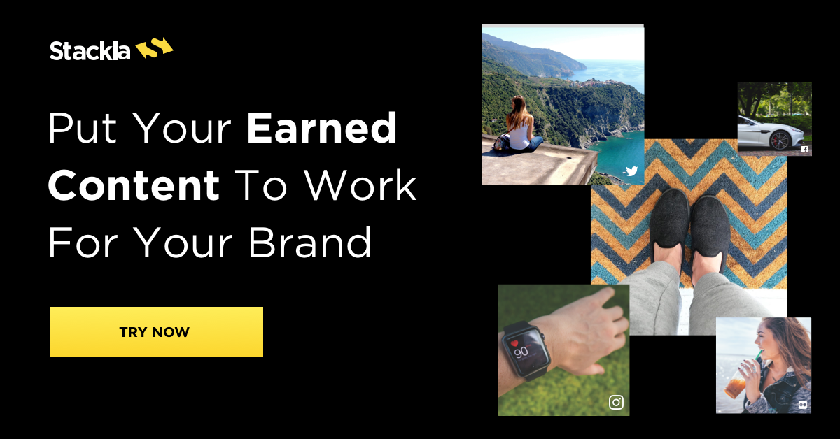
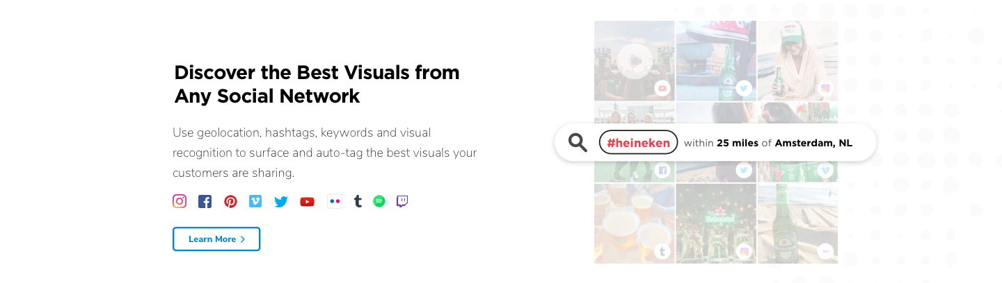
Content Discovery Engine Microsite
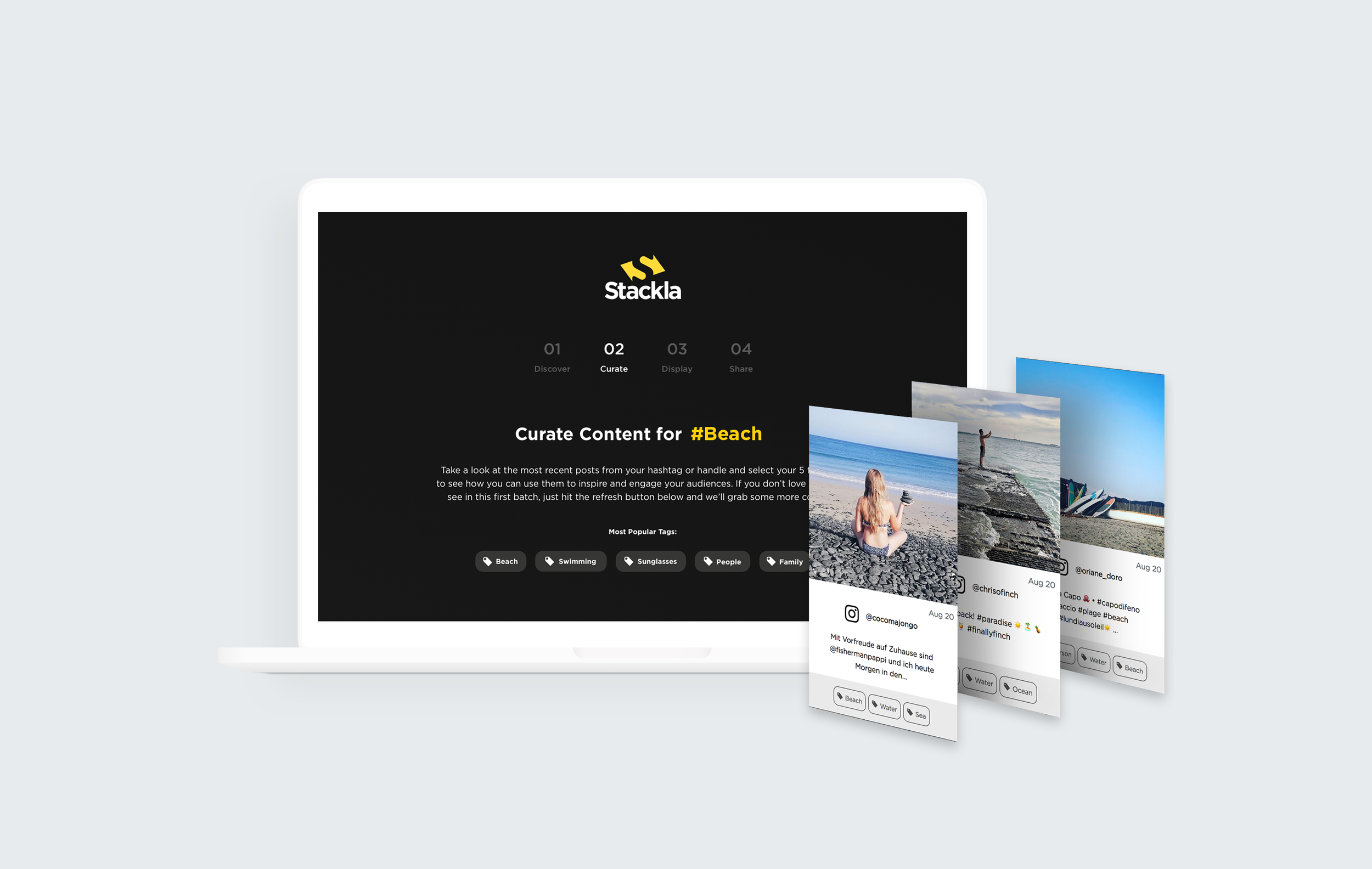
Client: Stackla | Timeline: June 2018 | Role: Visual Designer
Function: Web Design, UX Design, UI Design | Tools: Sketch, InVision
Opening Statement
Stackla needed a quick and easy way to showcase the product’s functionality to potential clients without taking them through a full on product demo (which can be clunky and requires a lot of setup). This microsite is meant to inspire prospects by showing off some of the content users are creating about their brands and then taking that content and showing it in mockups, serving as examples of how that content could be used across all marketing touchpoints. It also doubles as a gated asset to generate marketing leads.
The challenge
I was responsible for designing the microsite and all the graphics accompanying it from initial sketches to polished webdesigns to hand off to the developers. I partnered with Stackla’s head of content, product marketer and founder.
Additionally, I created social ads for Facebook and Linkedin to advertise it to prospects and an email design for marketing outreach.
Users
There are 2 main user groups for this project.
Internal: Stackla Sales and Customer Success Representatives
External: Prospects who arrive at this asset through paid search, Stackla social media, or retargeting ads.
User Flow

Wireframes

Version 1 - High Fidelity Draft
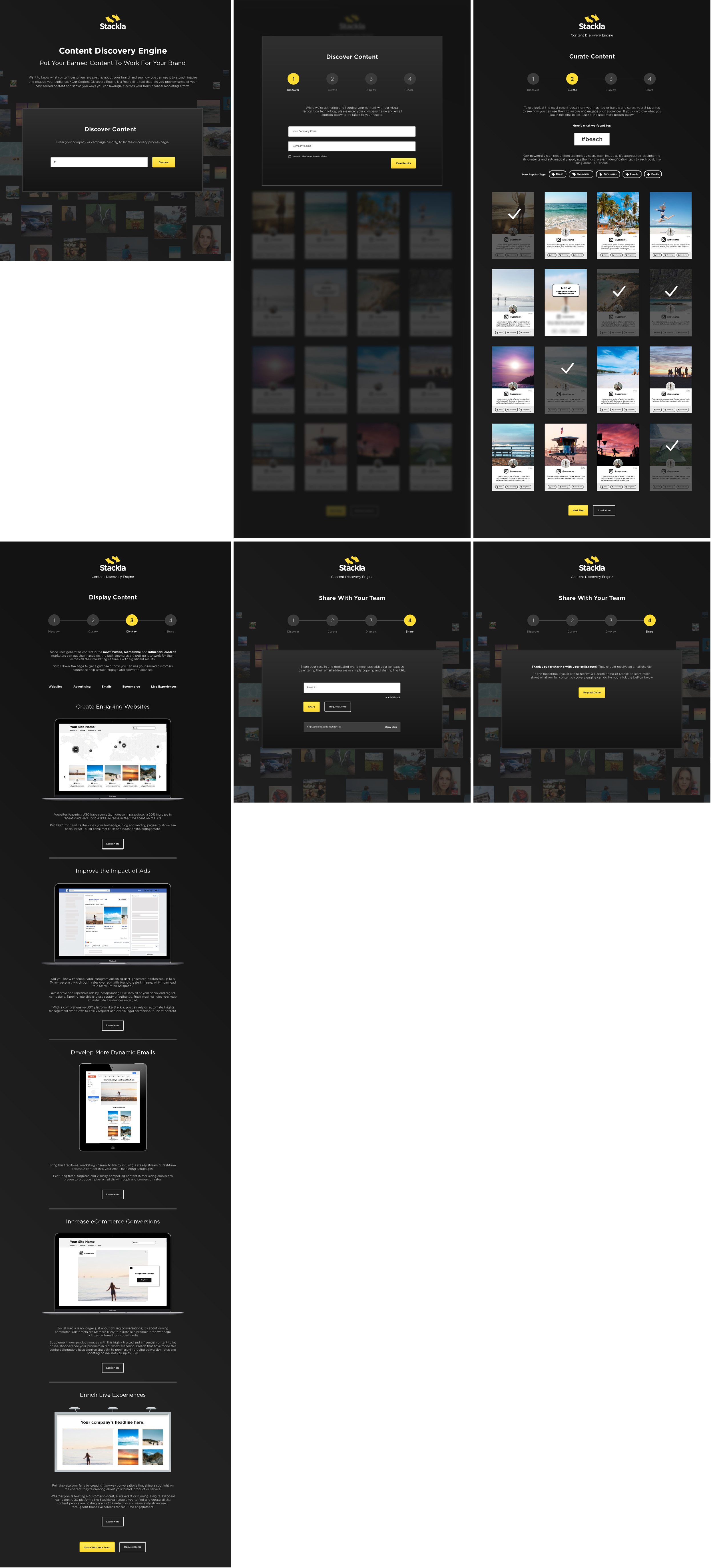
Mobile Designs

Edits to Version 1
After we reviewed and user tested the first draft (we interviewed Sales and CS people at Stackla that were using the microsite) we realized that we had to make some key changes.
Add the option to search by hashtag OR geolocation
Add loading screen animation
Add company name to the form so we can pull in their brand logo and apply it to the mocks (increase personalization)
Take instagram profile photos off content tiles (problem with pulling them from the API)
Make some stylistic changes to the UI mocks and put them in a white vector mobile device (so it doesn’t get lost on the black BG)
Add stats to each use case to show the value of user-generated content and further inspire potential customers
General stylistic updates to UI for a more streamlined look
Final Designs


Marketing Email

Social Ad + Display Ads


Results
This project has been a success. Its received rave reviews from the Sales and CS teams at Stackla and also generated over 500 net new leads for Stackla in 6 months time.
Reflections
I would have loved to have done more user testing through out the whole process to learn about potential problems and pain points having to do with the design and overall experience. Since we were under a tight budget and deadlines we didn’t test the prototypes as much as we should have.
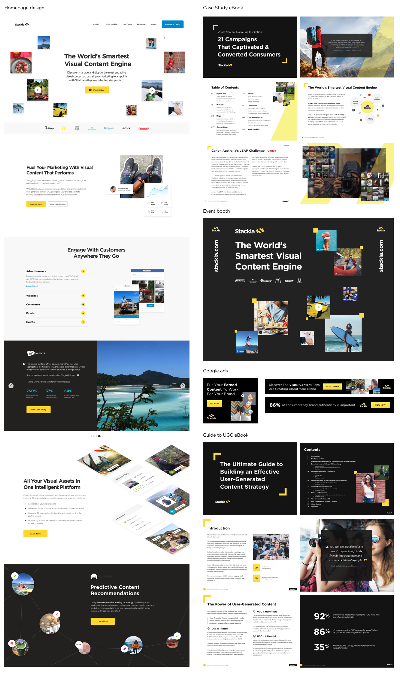
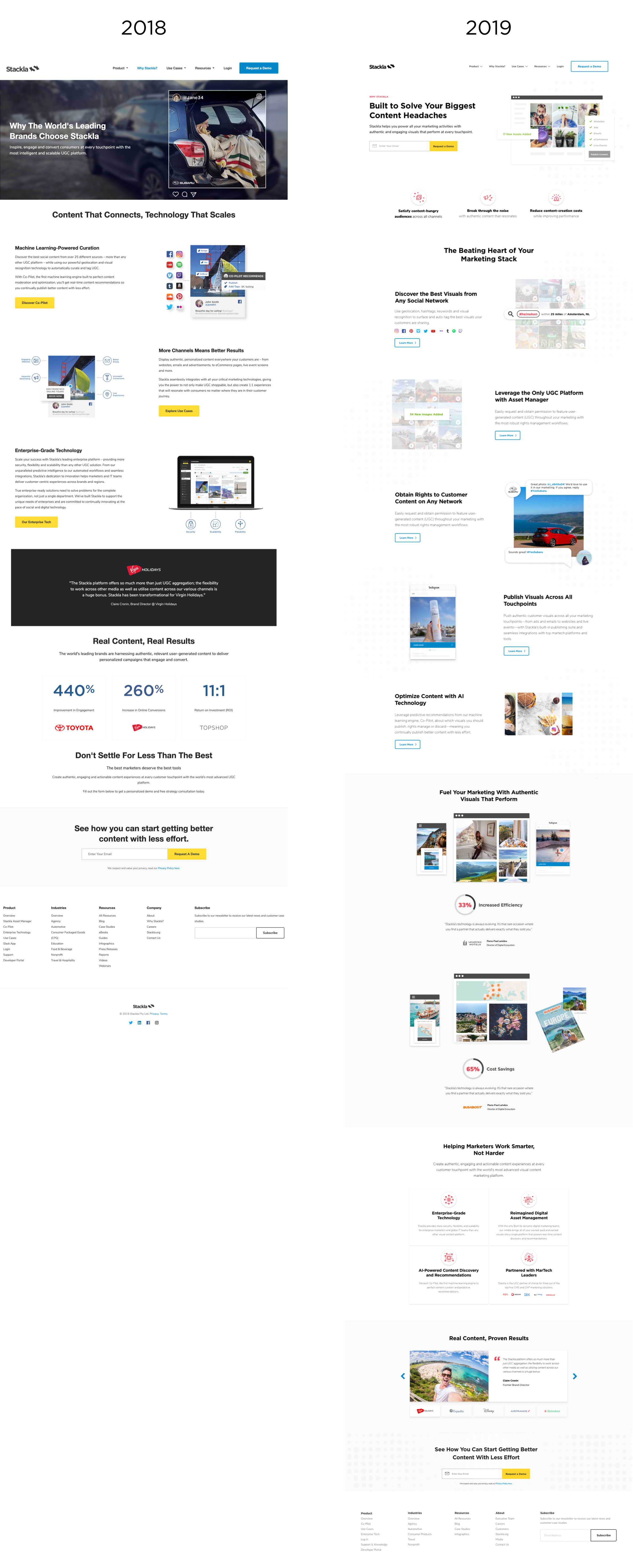
Stackla Website Redesign
Client: Stackla | Timeline: Jan 2018 - Ongoing | Role: Visual Design Lead
Function: Web Design, Animation, UI mockups | Tools: Sketch, Invision, AfterEffects
Opening Statement
Stackla today is the world’s smartest visual content engine, helping modern marketers discover, manage and display the best content across all their marketing touchpoints with an AI-powered user-generated content (UGC) platform and asset manager.
But before, it was marketed as a social media aggregation platform. Stackla’s branding and website didn’t accurately reflect the company that it had become.
I worked closely with Stackla's marketing team in an effort to overhaul its brand identity. Afterwards, it was time to design a website that aligned with its new direction.
The challenge
Frankly, Stackla’s website was a bit of a mess. There were tons of different page styles using mismatched variations of Wordpress components. The content and design was outdated. I was challenged to come up with a versatile template and redesign the page layouts and visuals.
Stackla’s Homepage Evolution over the years
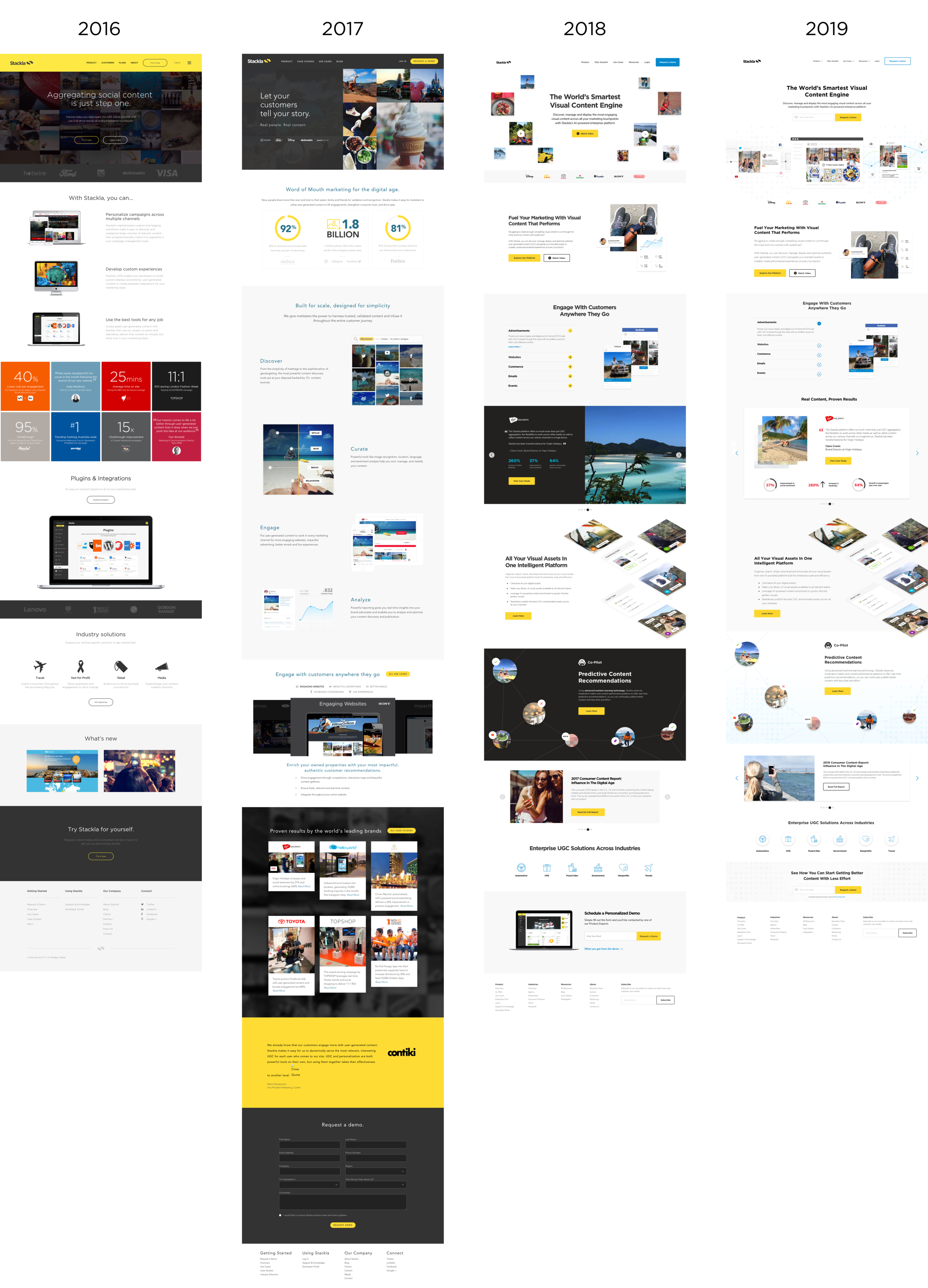
Role + Deliverables
I worked as the lead Visual Designer on this project to redesign Stackla’s website - starting with the homepage and key (most trafficked) webpages.
I was tasked to:
Adapt Stackla’s refreshed branding and new messaging for the web and apply it across the site (in collaboration with Stackla’s Head of Content)
Create a new visual language, component and UI library that could be used for consistency across the site.
Partner with a developer at an agency to ensure quality in execution.
Template
I aimed to make a template that could work for a variety of different types of pages on the website. The key was to create something basic and flexible, allowing for enough customization to keep it dynamic.
Since Stackla uses Wordpress, the template was made of interchangeable components. Ultimately, this saved them a lot of web development time and enabled the site admin to create new pages on their own.
Web UI Kit

Before + After
Product Page

Stackla Asset Manager

Why Stackla
Paid Landing Page

Homepage - Before
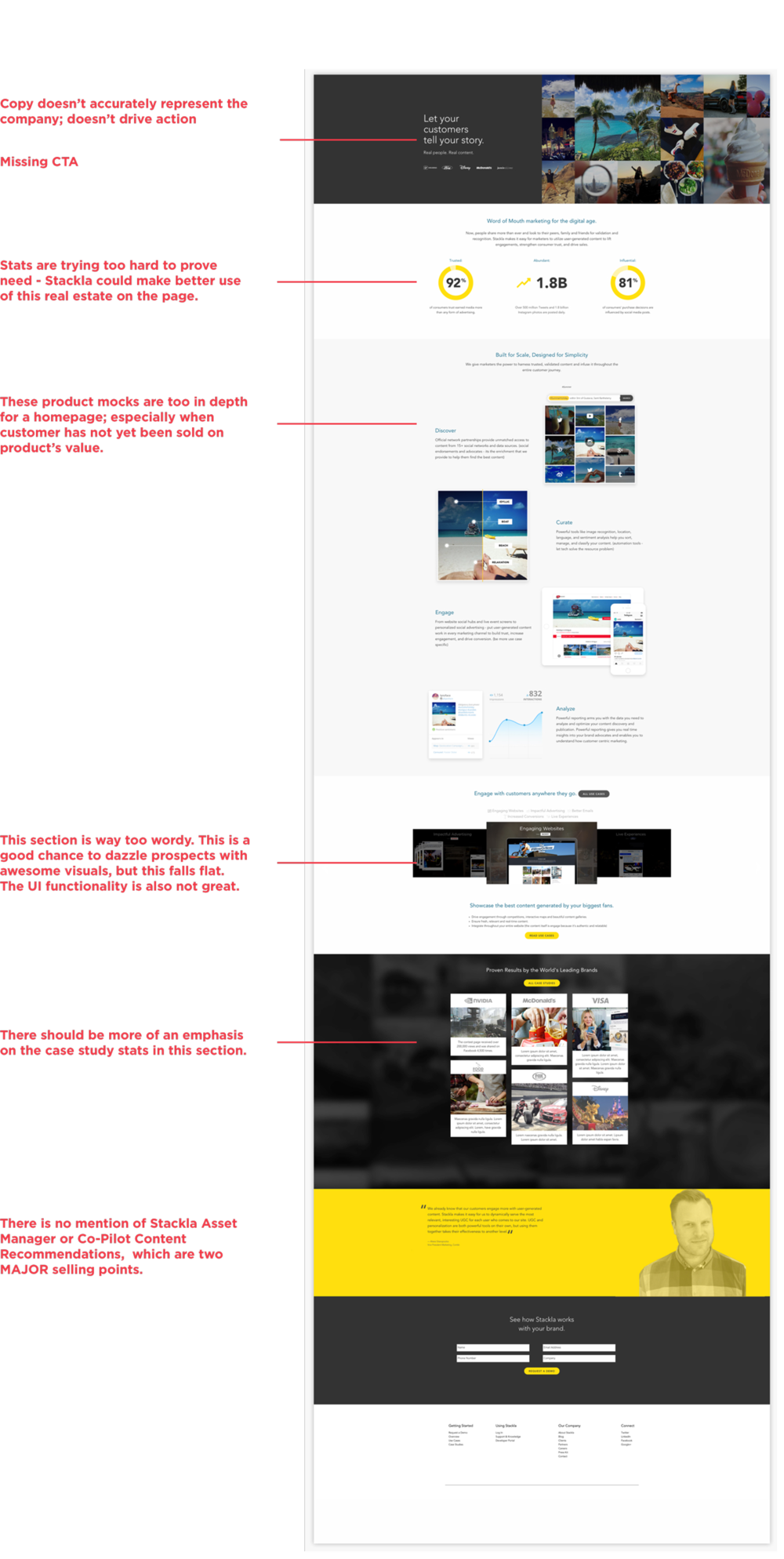
Homepage - After

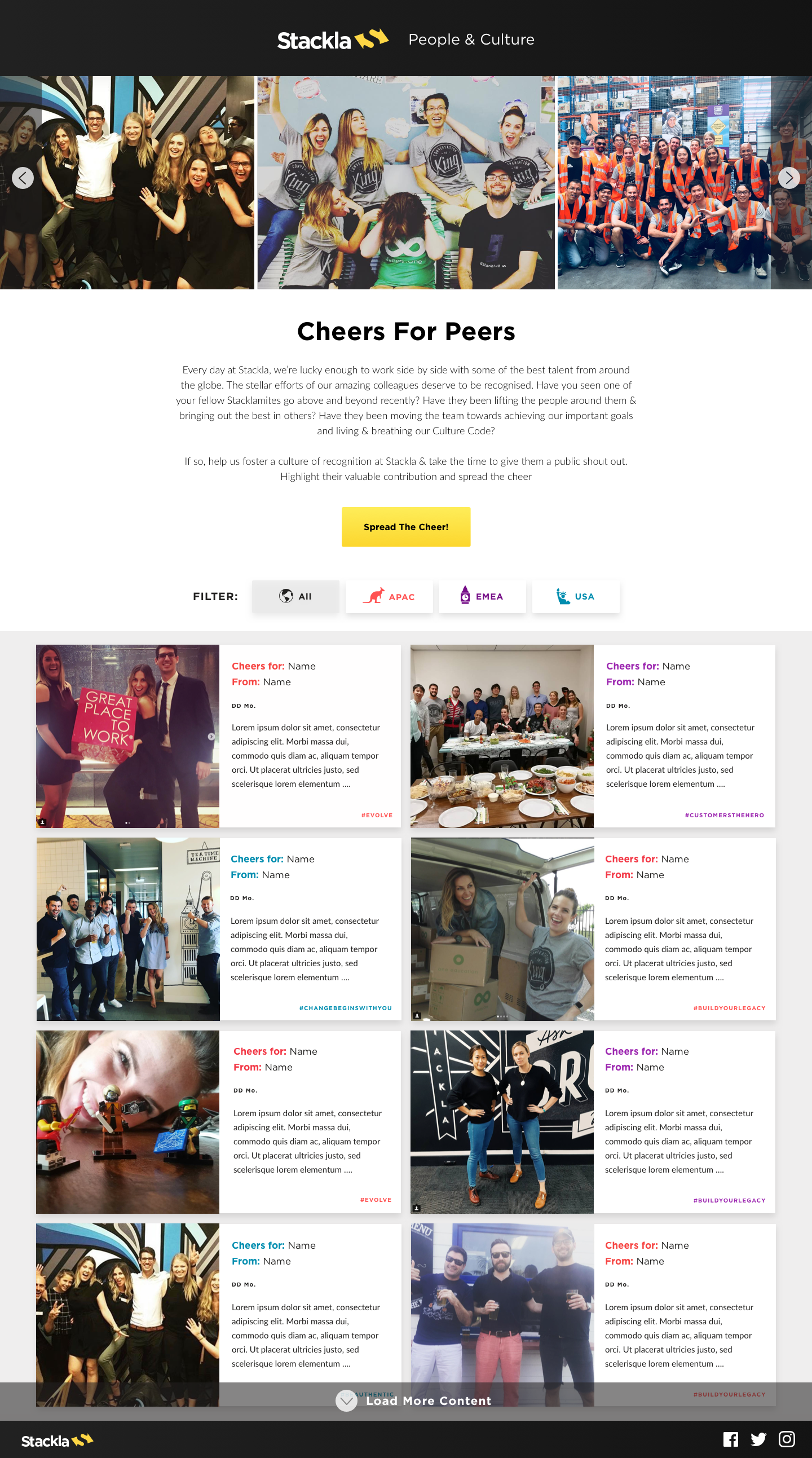
Cheers for Peers Microsite

Client: Stackla People & Culture | Timeline: Nov 2017 | Role: Visual Designer
Function: Web Design, UX Design, UI Design | Tools: Sketch, InVision
Opening Statement
The Cheers for Peers Microsite was created for Stackla People & Culture as an element of Stackla's broader employee recognition program. It was launched specifically to better enable peer to peer recognition. With Stackla’s employee’s scattered through out the world in various offices (San Francisco, Austin, NYC, London, and Sydney) the Cheers for Peers site is a way to bring everyone together by allowing for visibility into each other’s accomplishments and a way to celebrate wins. Additionally, it brings awareness to Stackla’s Culture Code Values.
The challenge
I was responsible for designing the microsite and all the graphics accompanying it from initial sketches to polished designs to hand off to the developers. I partnered with Stackla’s Global VP of People & Culture to get this site off the ground. Since this microsite is to be accessed at work we didn’t create a mobile version at this time.
This was fun project because I got to deviate from Stackla’s branding and use playful language and iconography.
User Flow

Wireframes

Version 1 - High Fidelity Draft

Edits to Version 1
Photo banner: 3 photos in view at once to showcase people from all 3 regions
Filter button: needs to look more like a button, show active state
Tiles: Change BG color of tiles - they were getting too busy and hard to read with the colorful backgrounds, cleaned up the grid, changed place of the date, lessened the amount of text allowed, added a pop of color to correspond with region
Form: change to limit selection to only 1 culture code value
Final Designs


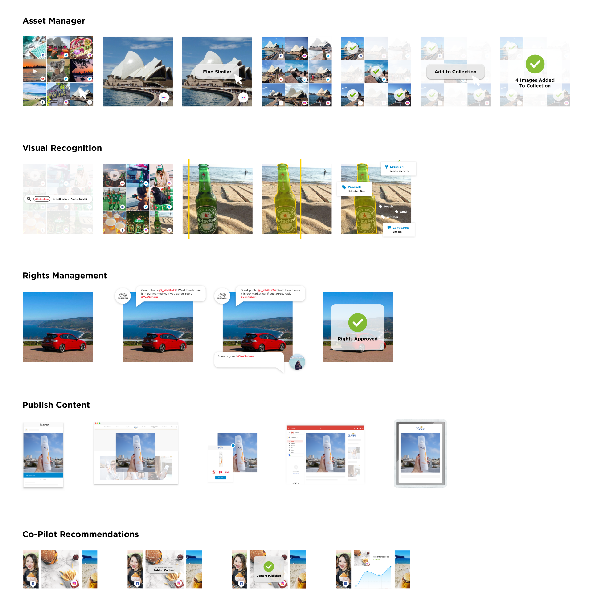
Product Mock UI Animations
Client: Stackla | Timeline: Feb 2019 | Role: Visual Designer
Function: Web Design, Animation, UI mockups | Tools: Sketch, Keynote
Opening Statement
I was tasked to redesign one of Stackla.com’s most visited pages: Why Stackla. The purpose of this page is to explain Stackla’s value proposition by walking the viewer through the product’s main selling points: Asset Manager, Discover/Visual Recognition, Rights Management, Publish Content, and Co-Pilot Content Recommendations.
The challenge
The previous design was very outdated. It used the mocks below, which are as unattractive as they are confusing and better suited for print. I used animation to break down each step of the process in a series of 5 eye catching animations that play automatically as one scrolls down the page.
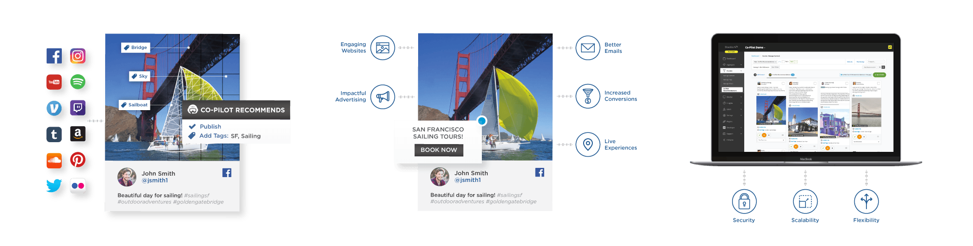
Animation Storyboards
Final Animations
Asset Manager
Publish Content
Visual Recognition
Co-Pilot Recommendations
Rights Management
Animations In Situation on Webpage
Results
The animation helped simplify technical concepts that are hard to relay in a static UI mock. The redesigned page conveys what Stackla does and why it’s important in a much clearer, more concise way.
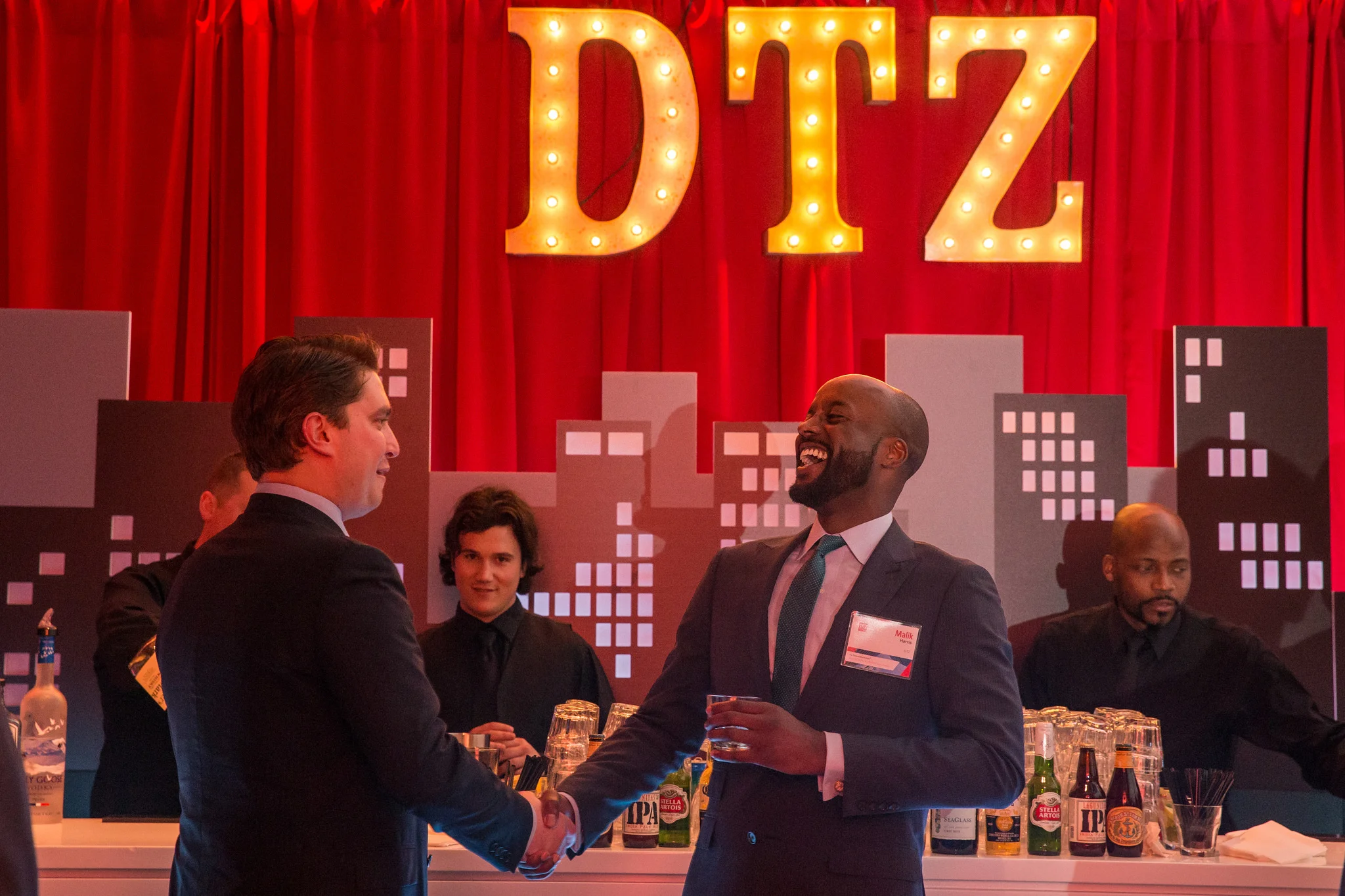
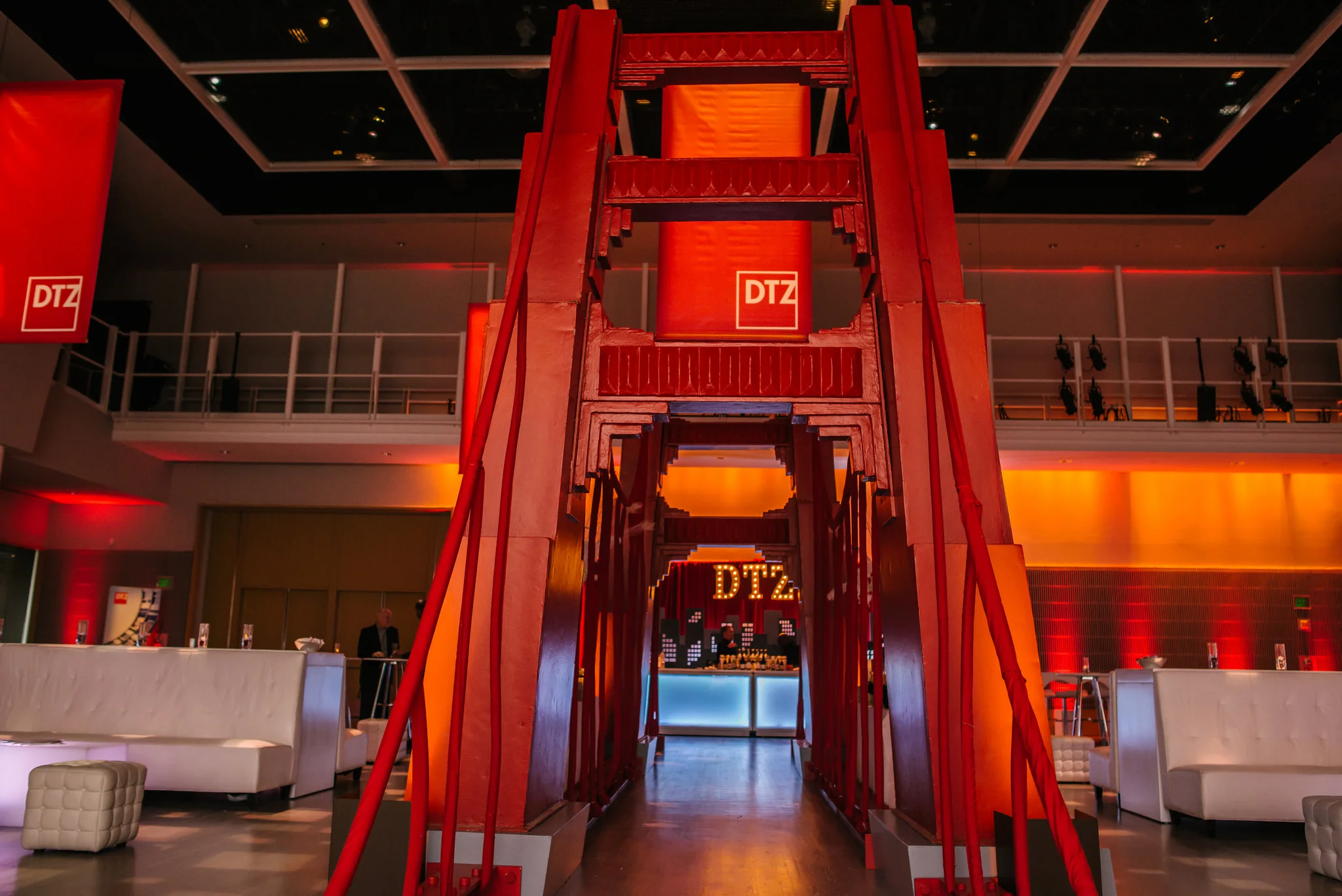
Marketing Design for Commercial Real Estate

Client: DTZ, Cassidy Turley, Newmark Cornish & Carey | Timeline: 2013-2015 | Role: Visual Designer
Function: Branding, Web Design, Email Design, Environmental, Print | Tools: Adobe Creative Suite
This is a sampling of projects I created when I was working at Cassidy Turley (rebranded to DTZ) and Newmark Cornish & Carey.
Century Plaza Branding + Webdesign
I worked on this project with a senior designer at Cassidy Turley, a commercial real estate company that rebranded to DTZ (and has since been acquired by Cushman & Wakefield). Century Plaza is a commercial office park in San Jose. The real estate brokers came to the design team needing a full suite of branding and marketing assets. We started with a logo, then created a website and email blast template, and some environmental graphics that were to be displayed in the office building.
Homepage

Environmental Graphics

Email Header

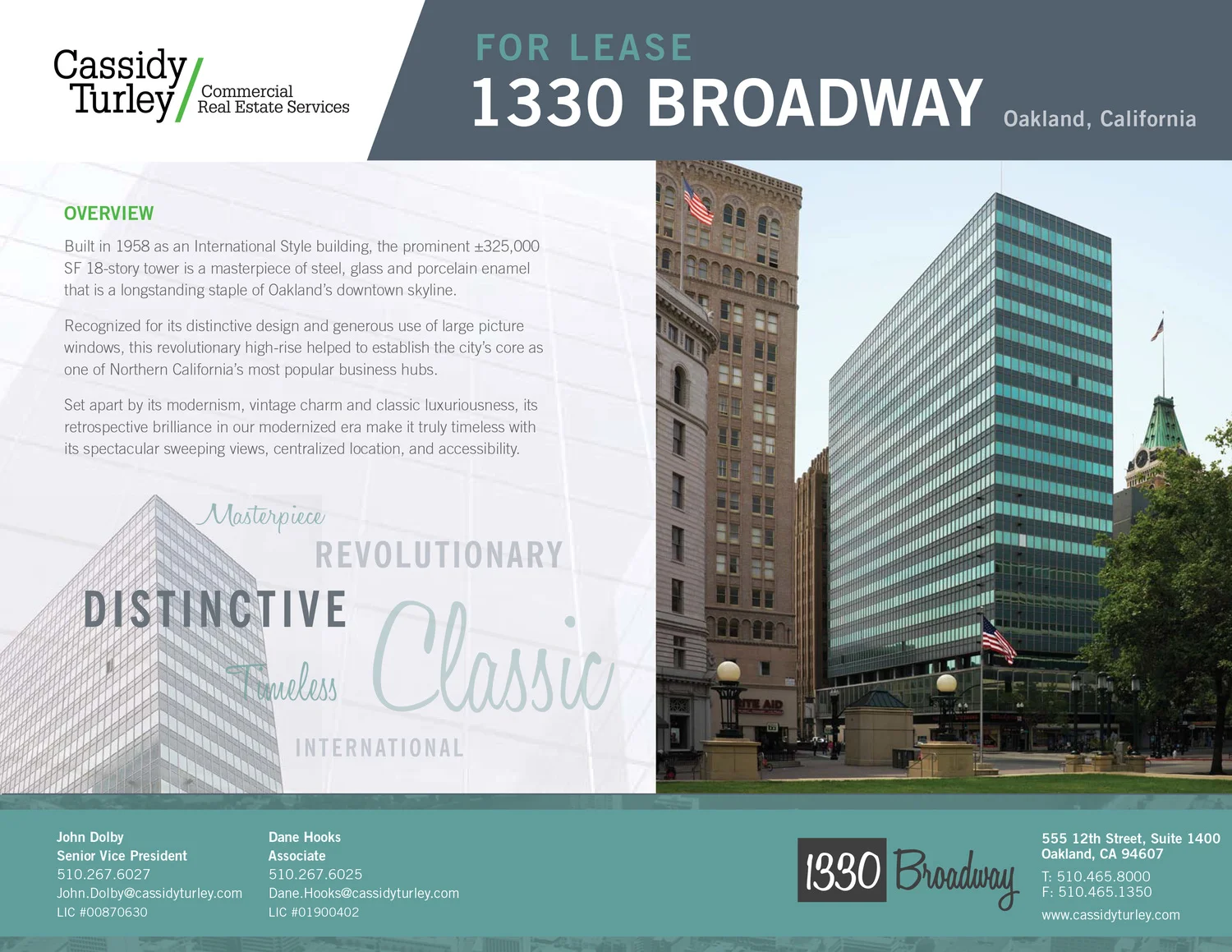
1330 Broadway Branding + Webdesign
1330 Broadway is an 18-story, 320,000 square foot trophy office tower in downtown Oakland, California. It has defined itself as one of the USA’s finest examples of International Style architecture (a major architectural style that was developed in the 1920s and 1930s and was closely related to modernism and modern architecture).
I was tasked to work with a senior designer to create a logo, website, email blast and flyer advertising the property. The brokers really wanted to showcase its unique style so we used photocopies from old print ads from the 1920s and created a custom logo in a vintage script.
Website + Email Blast Template
Digital Flyer
55 Almaden Environmental Graphics


589 Howard Street Print Flyer


170 Columbus Offering Memorandum


Gated Digital Assets + Print Collateral + Event Kiosks for Marketing Lead Gen

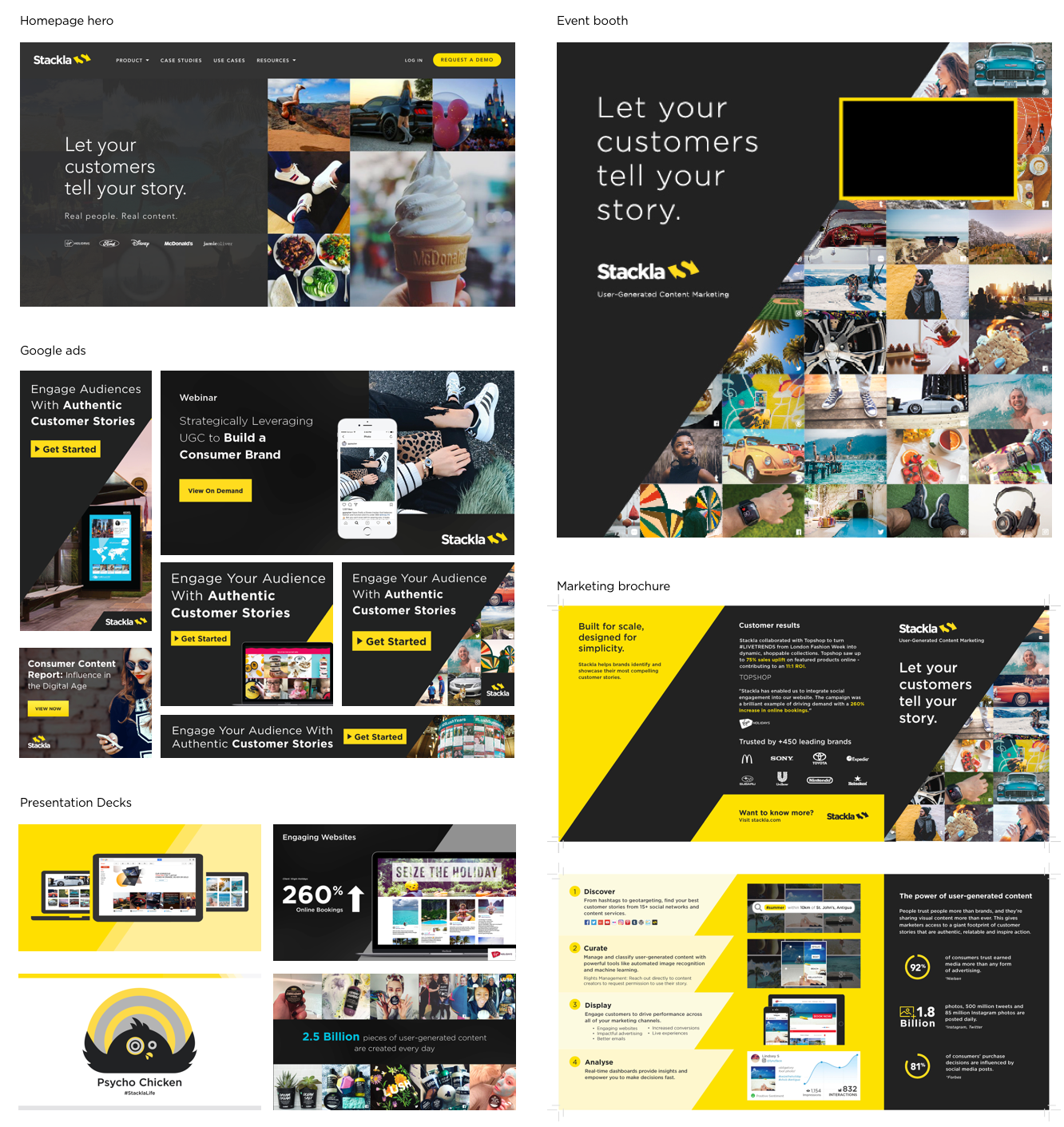
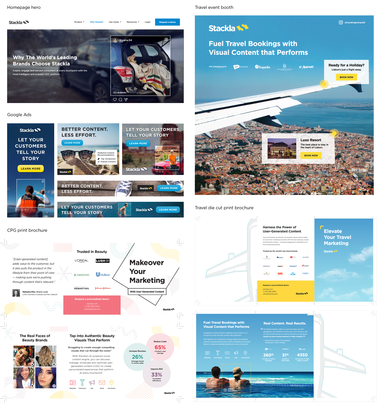
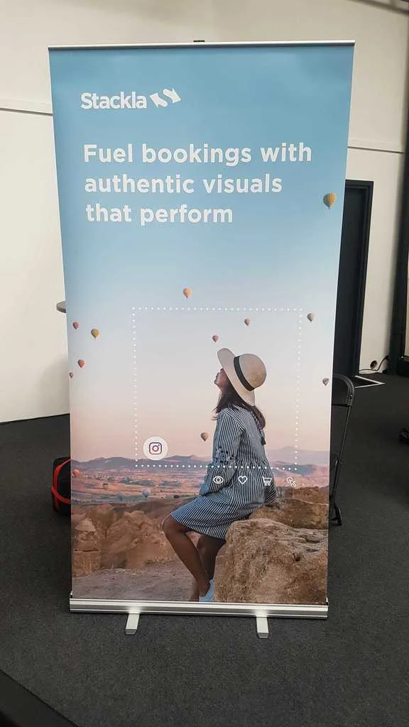
Client: Stackla | Timeline: 2017-2019 | Role: Visual Designer
Function: Print, eBook, Infographics, Marketing Collateral, Pitch Deck | Tools: Sketch, Adobe Creative Suite
This is a collection of projects that I designed for Stackla (a SaaS startup in the MarTech sector). For all of these assets I was the only designer, working in collaboration with Stackla’s Head of Content and Director of Marketing.
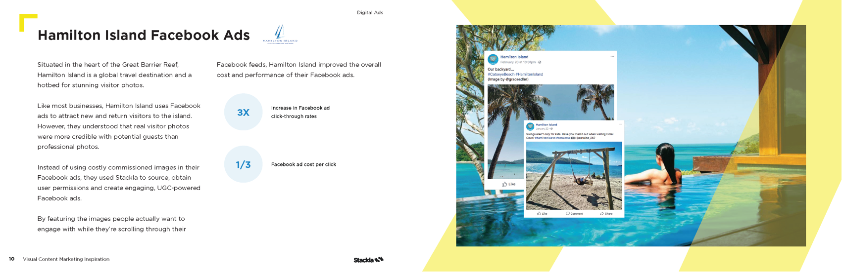
Influencing Travel:
How to Turn Lookers into Bookers
Project: Travel booklet showcasing travel client’s user-generated content and stats
Medium: Digital & print
Purpose: Travel event collateral + gated asset to obtain marketing leads
SEE FULL EBOOK


10 Food & Beverage Campaigns That Satisfied People’s Hunger for Authentic Visual Experiences
Project: Food+Bev booklet showcasing client’s user-generated content and stats
Medium: Digital & print
Purpose: Food+Bev event collateral + gated asset to obtain marketing leads
SEE FULL EBOOK


21 Campaigns That Captivated & Converted Consumers
Gold Winner - Hermes Creative Awards
Project: Booklet showcasing Stackla customers’ campaigns across key marketing use cases: digital ads, websites, maps, competitions, emails, live experiences and eCommerce.
Medium: Digital & print
Purpose: Event collateral, leave behind for sales and CS meetings, gated asset to obtain marketing leads
SEE FULL EBOOK


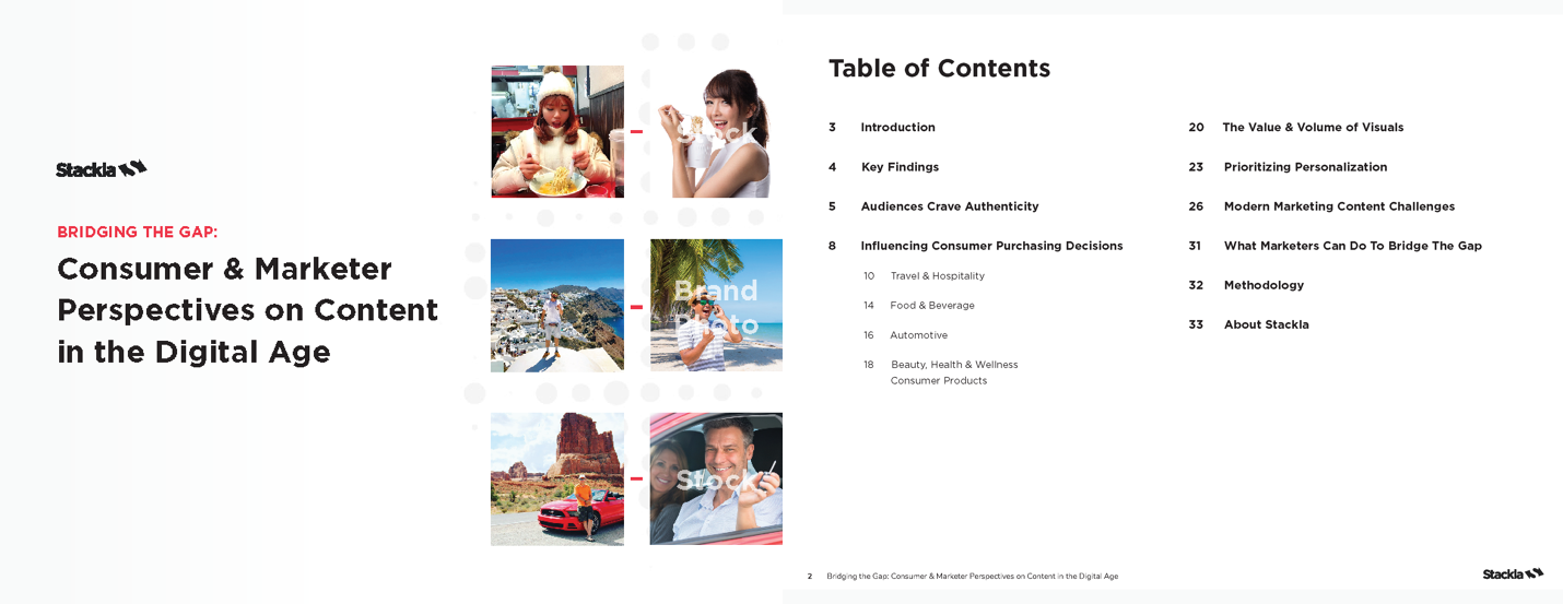
Bridging the Gap: Consumer & Marketing Perspectives on Content in The Digital Age
Gold Winner - Hermes Creative Awards
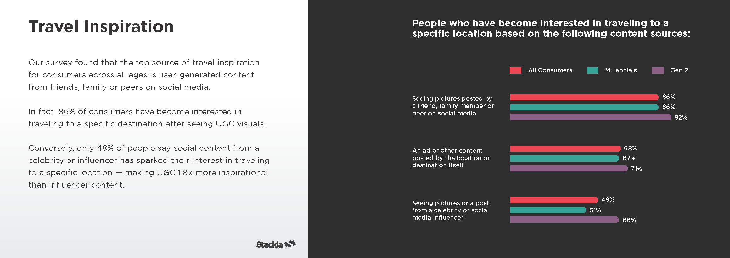
Project: Data report showing the gap between consumer and marketer perspectives and trends in the marketing industry within the last few years
Medium: Digital
Purpose: Marketing lead generation, client education, sales + CS promotional material
SEE FULL DATA REPORT

The Ultimate Guide to Building an Effective User Generated Content Strategy
Project: eBook meant to promote Stackla and educate marketers about UGC strategy
Medium: Digital
Purpose: Marketing lead generation, client education, sales + CS promotional material


Main Stackla Sales Pitch Deck
Project: Pitch deck for Sales meetings
Medium: Digital
Purpose: Educate potential clients about Stackla
SEE FULL DECK


Travel Event Brochure
Project: Collateral for travel focused events
Medium: Print


Beauty/CPG Event Brochure
Project: Collateral for beauty focused events
Medium: Print


Marketing Event Kiosks
Project: Promote Stackla at Marketing Events
Medium: Environmental, digital presentation, print collateral, swag
Purpose: Promotional, marketing lead generation


Overview Onesheet
Project: Promote Stackla at Marketing Events
Medium: Print collateral
Purpose: Promotional, marketing lead generation

Event Design + Marketing Campaign

Client: DTZ | Timeline: Feb 2015 | Role: Visual Designer
Function: Environmental, Branding, Motion Graphics, Digital, Print | Tools: Adobe Creative Suite
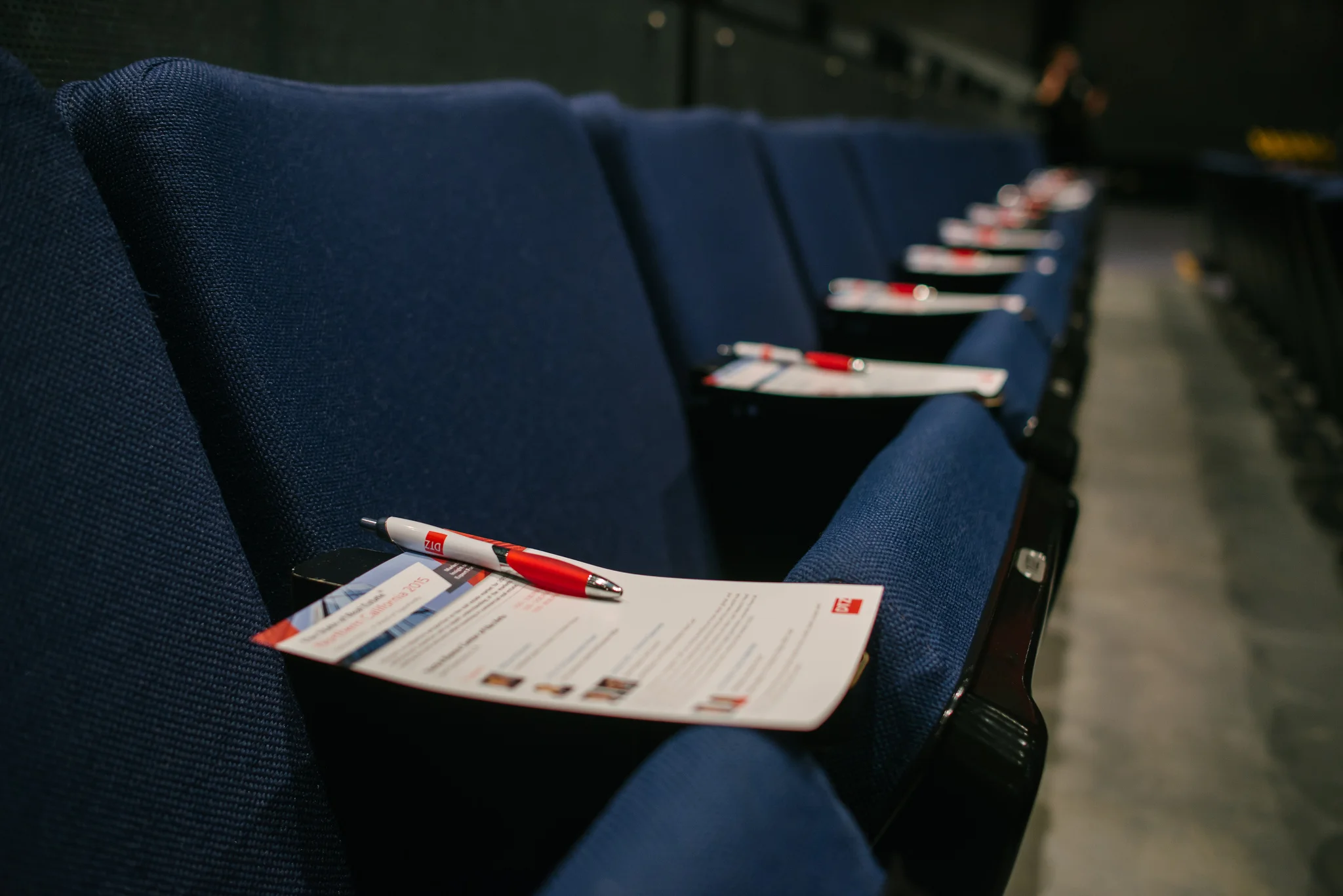
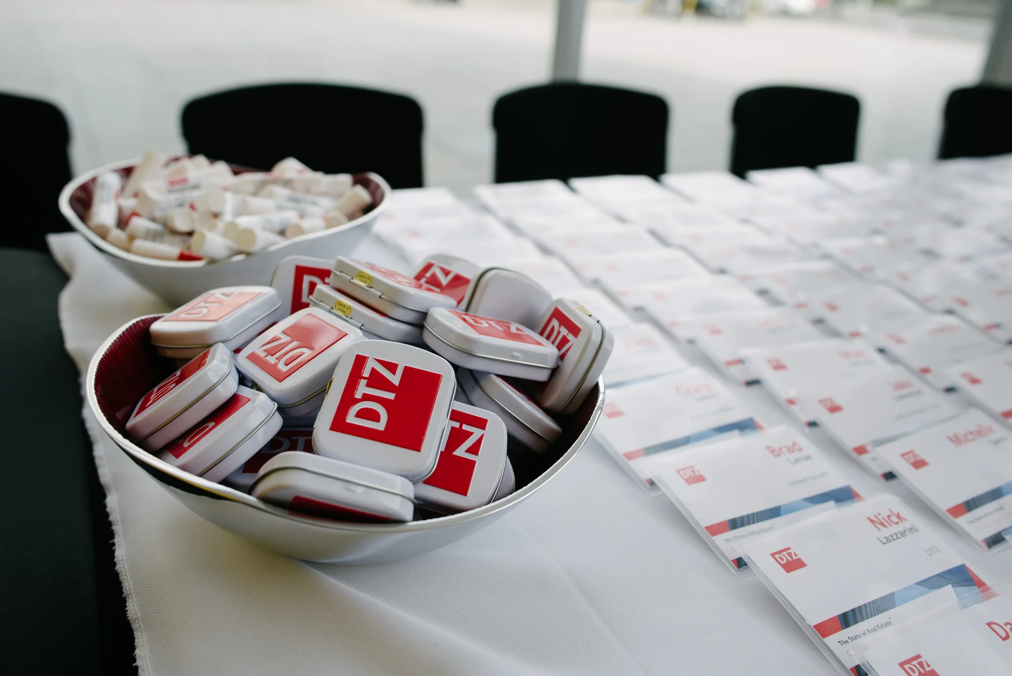
I worked closely with the Art Director and a team of designers to help create the marketing campaign and brand experience for this event: The State of Real Estate 2015.
I personally designed web banners, the city skyline backdrop behind the bar, name tags, event pamphlets, and a motion graphic piece that was projected onto the walls.
“Over 800 people attended DTZ's 2015 'State of Real Estate' forecast presentation and brand launch party on February 4th at the Yerba Buena Center of the Arts. The presentation examined the current macro and micro economy, its impact on Bay Area real estate markets, and a forecast of things to come. The event also celebrated the news that DTZ was last week ranked No.1 Commercial Real Estate firm in the Bay Area by the San Francisco Business Journal in the journal's latest round of listings.”


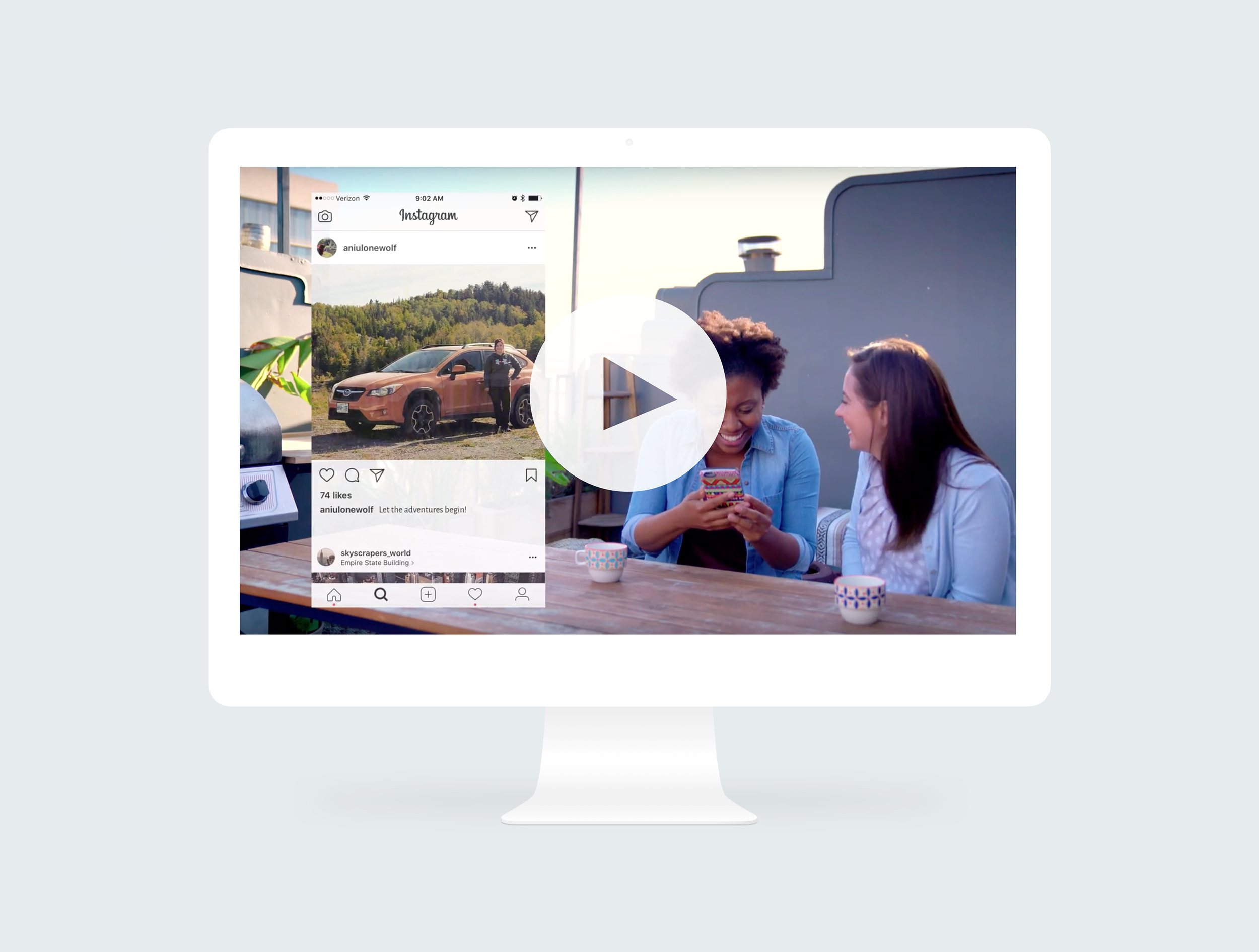
Marketing Videos for a Tech Startup
Client: Stackla | Timeline: June 2017 | Role: Visual Designer, Art Director
Function: Art Direction, Animation, Illustration | Tools: Sketch, AfterEffects
Stackla: Putting User-Generated Content at the Heart of Brand Marketing
This is a company overview video that I worked on with Stackla’s marketing team and an outside agency. It went on Stackla’s homepage and was sent out to prospects as a quick way to education them about the company’s value. I provided conceptualization, art direction and graphics.
Rights Management for UGC
A sales, CS and Marketing asset that helps highlight some of the competitive differentiators when it comes to RM.
Creating Authentic Customer Experiences With User-Generated Content
This video is a sales tool to help prospects (and current customers) envision what a comprehensive UGC strategy could look like from their customers' perspectives. I worked with Stackla’s head of content and an Account Executive to come up with the content and voice over for the video. I provided graphics and art direction, building it out in AfterEffects from start to finish.
Animated Google Ads
+ Landing Page Design

Client: Stackla | Timeline: Oct 2018 | Role: Visual Designer
Function: Animation, Digital Designs | Tools: Sketch, AfterEffects
This is a set of retargeting ads that I created for Stackla (a SaaS startup in the MarTech sector). I created them in HTML5 using Adobe Animate for use on the Google Adwords platform.
The ads link to Stackla’s main landing page, which I’ve also redesigned.
Note: Ads below are compressed into .gifs so the images don’t look as crisp as they do in HTML5.


Open Transit Web App

Client: Code4SF | Timeline: Jan 2019 | Role: UI/UX Designer, Brand Designer
Function: Prototyping, Dashboard, Data Visualization, UI Design | Tools: Balsalmiq, Sketch
Opening Statement
OpenTransit is dedicated to empowering people around the world to work with local governments to improve public transit using data, starting with the San Francisco Bay Area. This will be done by visualizing real-time data of the MUNI system so riders understand bus speed and reliability, and using the data to improve the Muni system.
I worked on this project with a Product Manager and a team of Front End and Back End Engineers at Code4SF (part of the Code for America brigade network — a Civic Hack Night where volunteers can discover local civic tech projects to get involved in or start their own).
MVP
For OpenTransit’s minimum viable product, our aim was to create a rider-facing web application that lets riders understand how good — or bad — their most-used bus routes are using historical data.
This consists of two parts:
A data analysis module that calculates key metrics for a given bus route and stop, such as the average historical waiting time at that stop or the average historical travel time between stops (plus min/max, standard deviation, quartiles, etc). This involves querying our raw data to compute when each bus reached each stop, then running algorithms to compute the desired metrics from this information.
A web app that lets riders choose the routes/stops they care about and visualizes the relevant metrics for them. This will live independently of the existing map app.
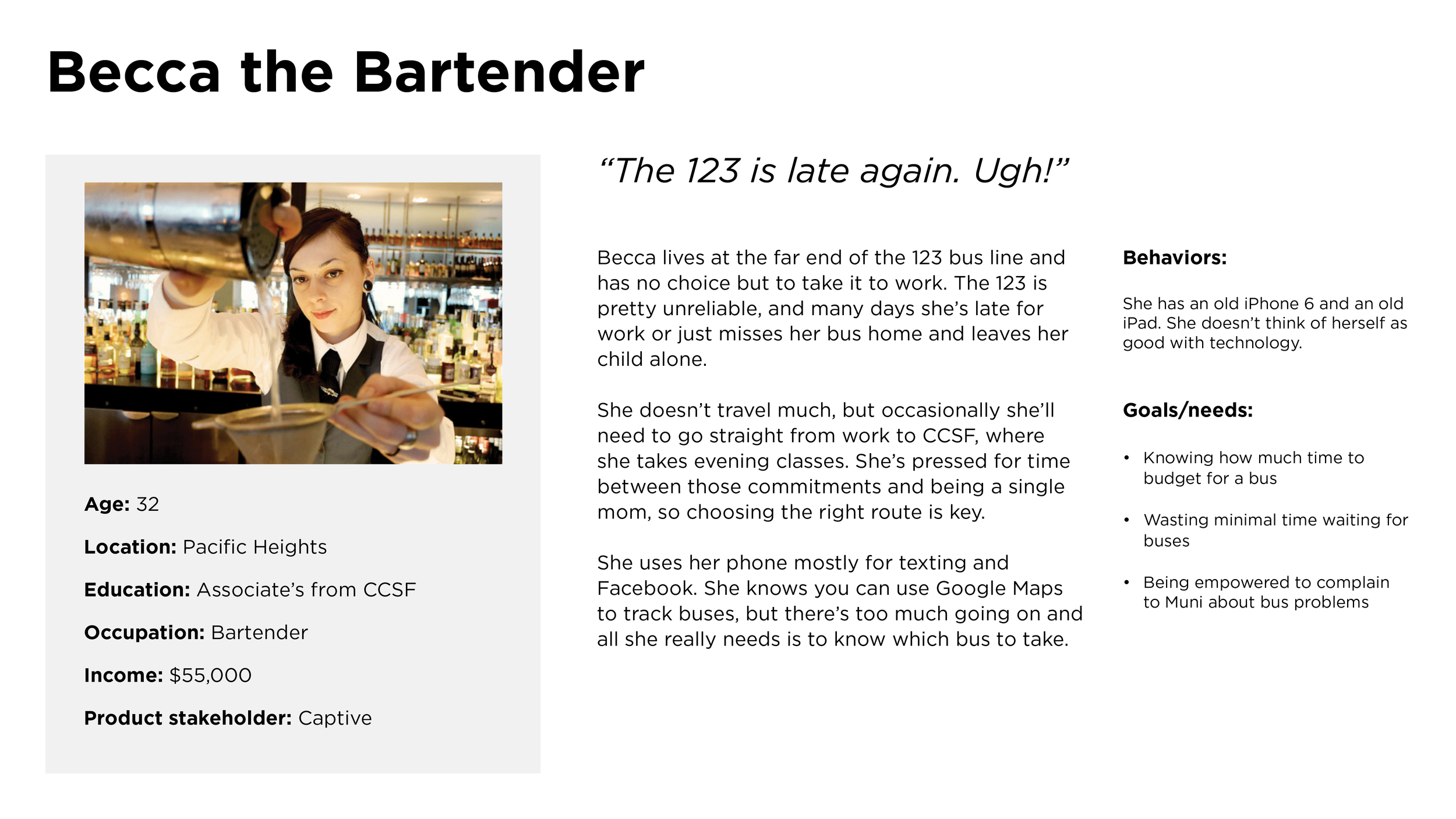
User Personas


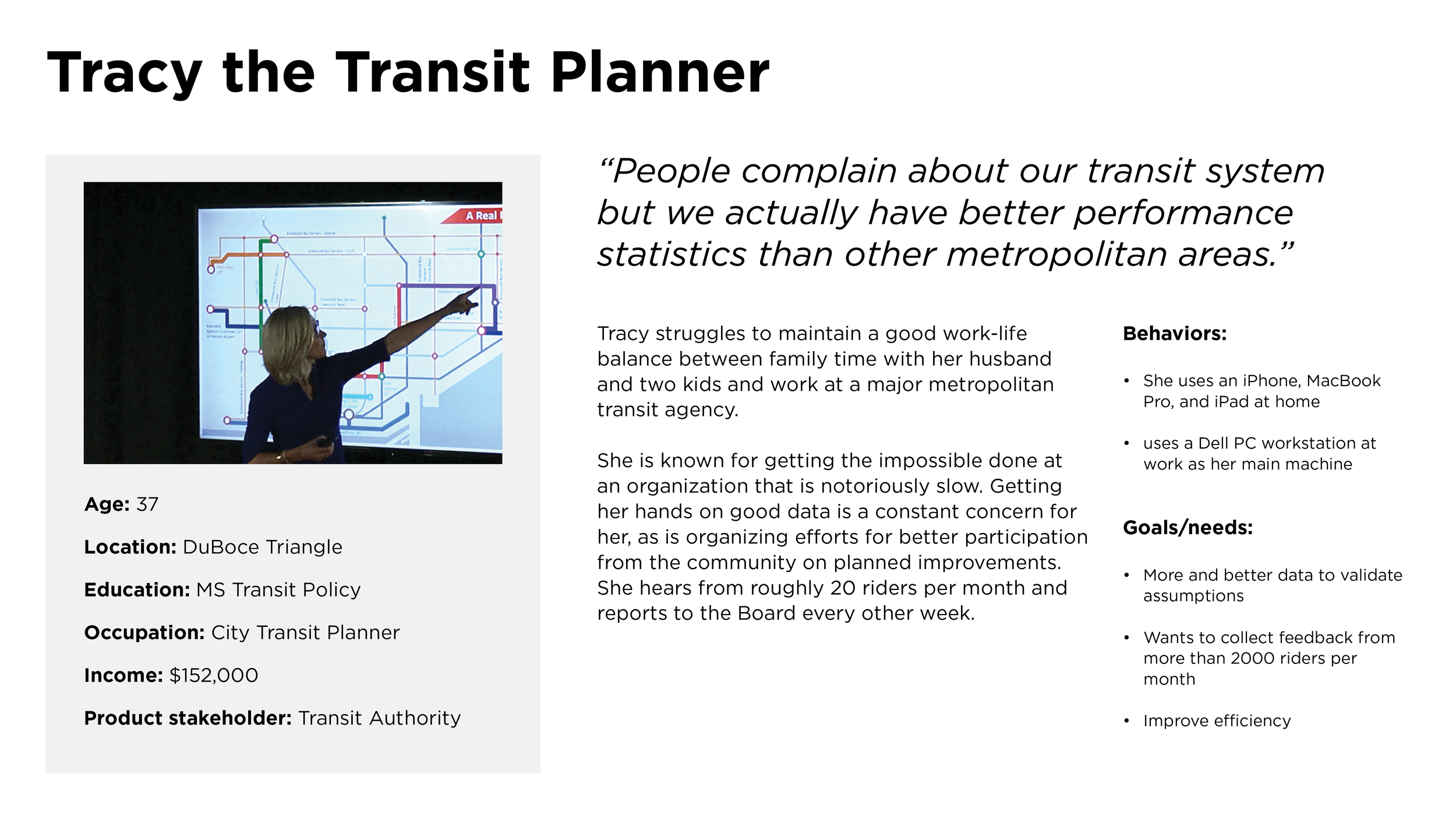
Journey Map: Yvette After Work

Competitive Analysis: Bus Stat NYC Web App

What we like about Bus Stat:
1-3 big key metrics
Color-coding of the metrics
Comparing different neighborhoods
Graph of average waiting time at each stop on a route
Cumulative travel time across stops vs. schedules
Helps citizens figure out where the bus is getting derailed so they can pinpoint a particular area to complain about
Not that useful until we have the schedule
Graphical stop chooser
The way busstat does it, you have to choose your direction first and that restricts which “to” stop you can pick. It would be better to have the user choose their “to” and “from” and then pick the direction based on that
Shows breakdown of journey into wait time and onboard time
Graph metrics over time (e.g. average waiting time over the last year) so you can understand trends. But offer things like “7-day moving average” or average out over a week/month.
So user can know if the route is getting better or worse
Compare different days of the week
Filter by weekday/weekend and time window (morning commute, afternoon, evening commute)
Compare wait time vs onboard time so user knows how their time is being split
What we dislike about Bus Stat:
System-level summary (no benchmarks, not actionable)
What is the “planning” time on the journey performance graph? Needs clear labeling
Michael’s feedback: too much stuff on screen, eye isn’t being drawn to the important top-line takeaways
Also route summary isn’t as interesting as stop-to-stop journey
These graphs take some time to dig into
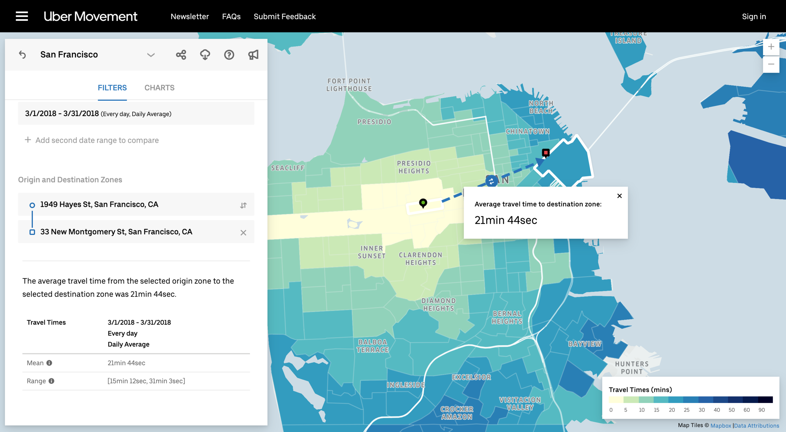
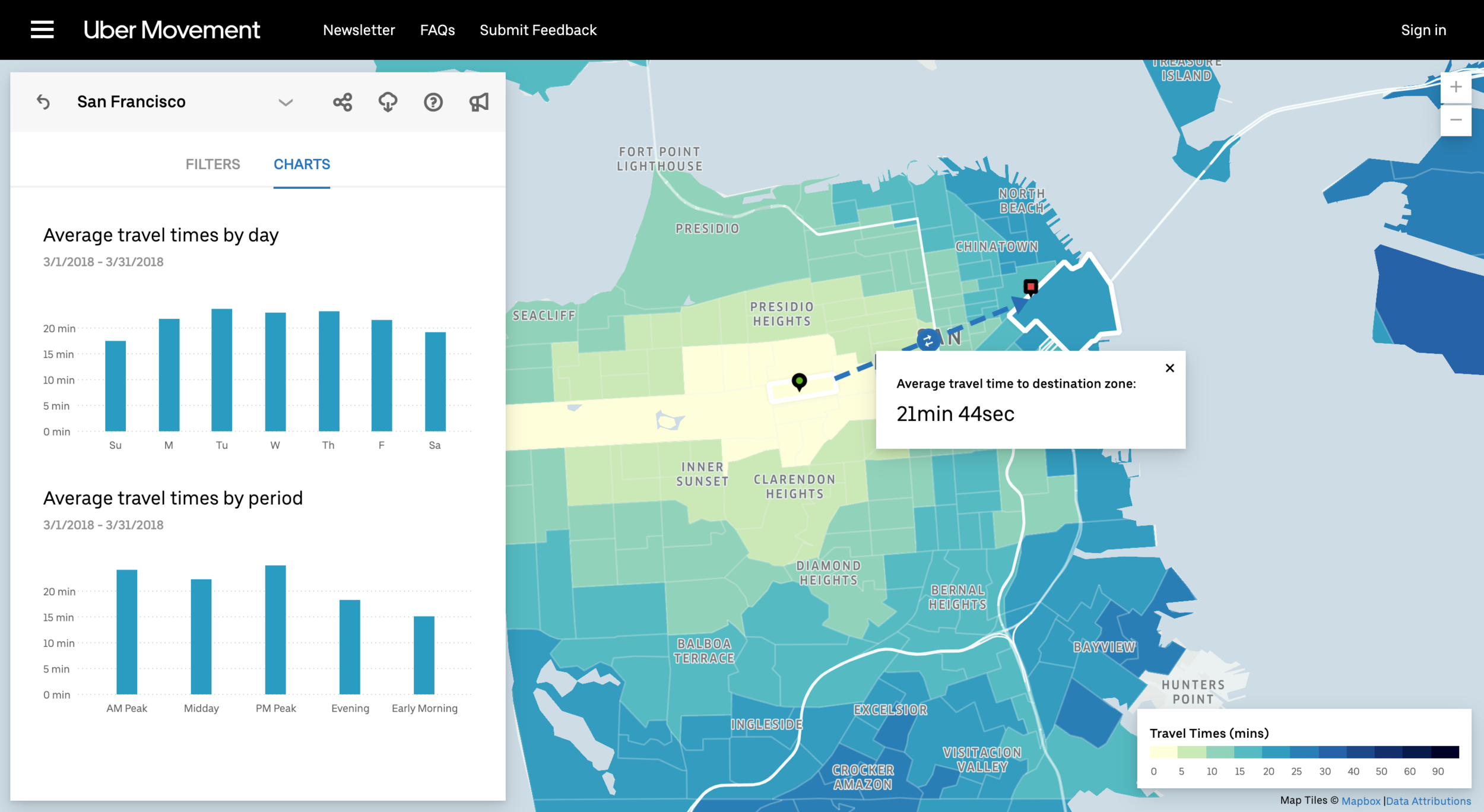
Another Great Example: Uber Movement
Digital Prototype: Draft 1
Digital Prototype: Draft 2
Daily UI Challenge
In an effort to improve my UI Design skills (and to get out of a creative rut at work) I challenged myself to do one UI exercise a day for 100 days - this is the result! http://www.dailyui.co/