Stackla Brand Refresh & Marketing Asset Evolution

Client: Stackla | Timeline: Sept 2016 - Jan 2019 | Role: Visual Design Lead | Function: Brand Design, Communication Design
Tools: Adobe Creative Suite, Sketch, Invision | Notes: I singlehandedly designed all the visuals you see below
Opening Statement
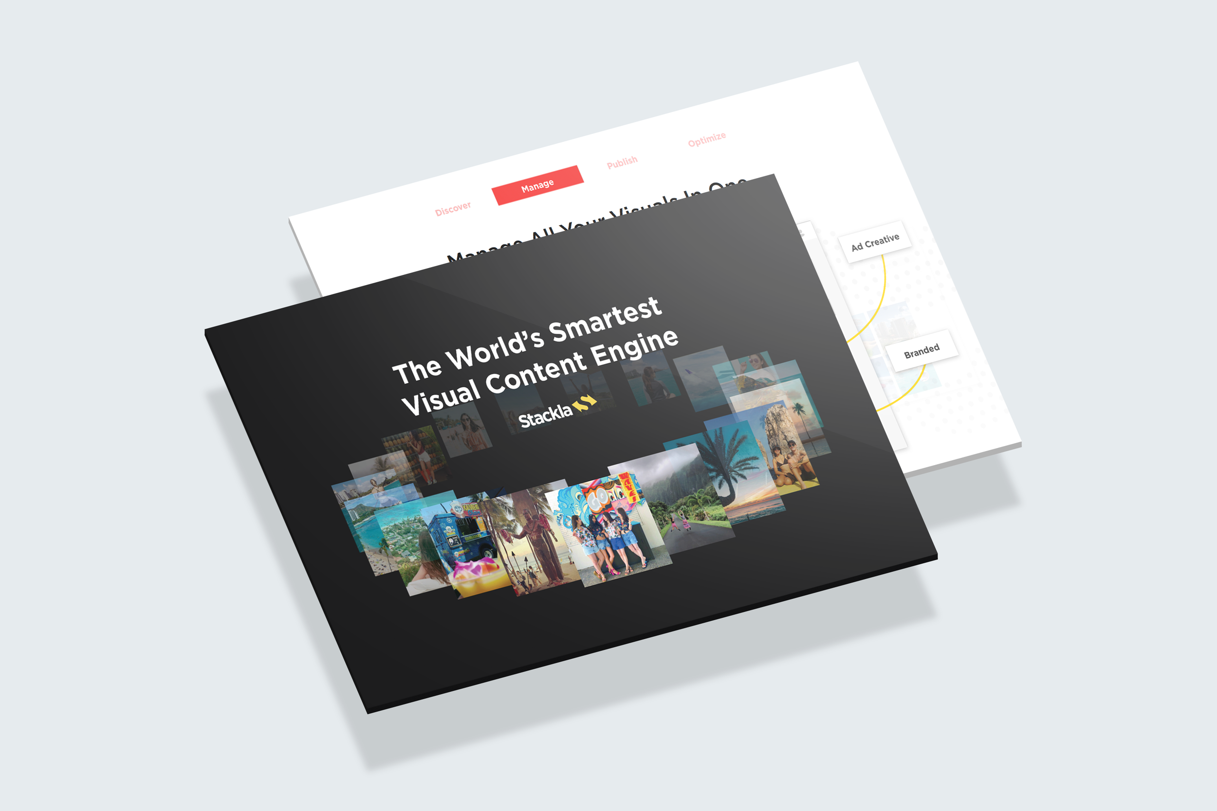
Stackla underwent many momentous changes over the past few years, evolving from merely a user-generated content platform to the “world’s smartest visual content engine”. It ramped up it's enterprise capabilities, launched AI-powered smart filtering, enabled machine learning powered content recommendations, and added a digital asset manager to it’s offerings. Consequently, it outgrew it’s original branding.
What is Stackla?
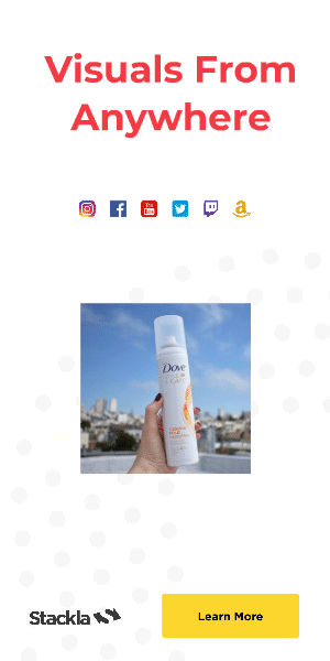
Stackla is a SaaS application that helps marketers discover, manage, display and optimize authentic user-generated content (UGC) alongside their branded assets to scalably create personalized experiences at every touchpoint. The platform is used by over 400 multinational enterprise brands like McDonalds, Expedia, Toyota and Sony to name a few.
The Starting Point: Brand Assets in 2016
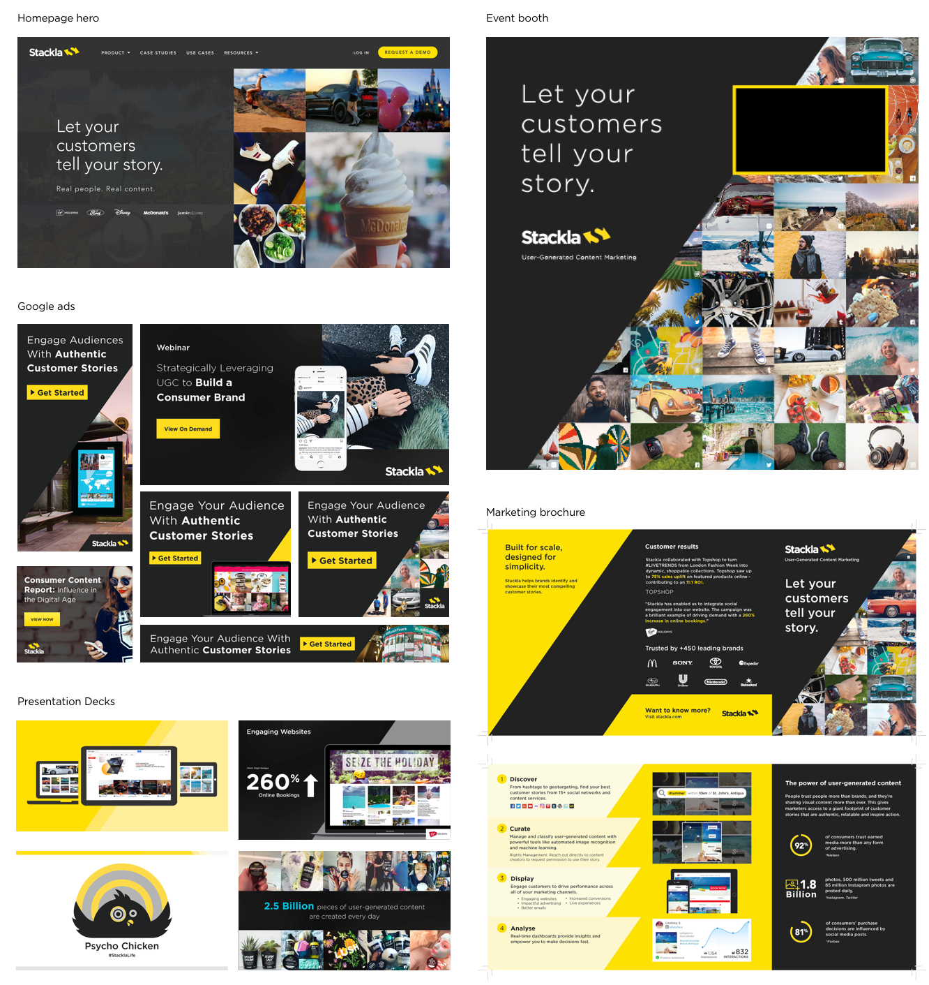
Their branding was high contrast, harsh and masculine. It relied heavily on the use of the brand yellow, the diagonal framing element, in-device mockups and UGC image mosaics. The color palette was very limited and distracting.
#Uninspirational
One of the biggest issues with Stackla’s old branding is that it wasn’t selling their vision. There’s a world of dazzling UGC out there [that Stackla can help marketers tap into, saving time, money and effort] but Stackla wasn’t drinking its own kool-aid. They were still using stock photos in their marketing assets which muddled their message.
Role + Deliverables
As the only Visual Designer, my challenge was to push the brand forward and ensure that all brand and marketing assets continually looked fresh and engaging while reflecting Stackla's value and market positioning. I was tasked to:
Create a new visual language and rewrite the brand guidelines
(in collaboration with Stackla’s Head of UX Design)Redesign key assets ie sales deck, digital ads, event kiosks, and marketing materials
(in collaboration with Stackla’s Head of Content)Redesign Stackla.com
Brand Experimentation
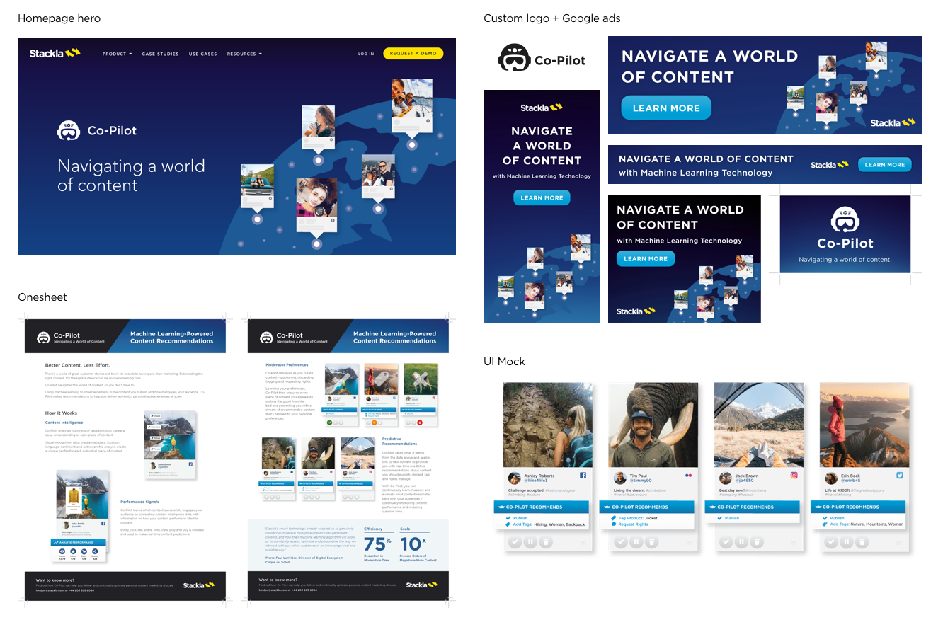
We decided that at this point in time, we should experiment with the brand to see what works by slowly pushing it forward (rather than overhauling it in one fell swoop). It was a good time to implement some changes, because Stackla called for some Campaign specific sub-branding during this time period for its Co-Pilot product launch (AI-Powered predictive content recommendations). As another marketing push, we also tried some vertical specific design featuring UGC photos. We were looking to specifically target travel, CPG, and automotive customers.
Co-pilot Sub-Branding
Vertical Specific Sub-Branding

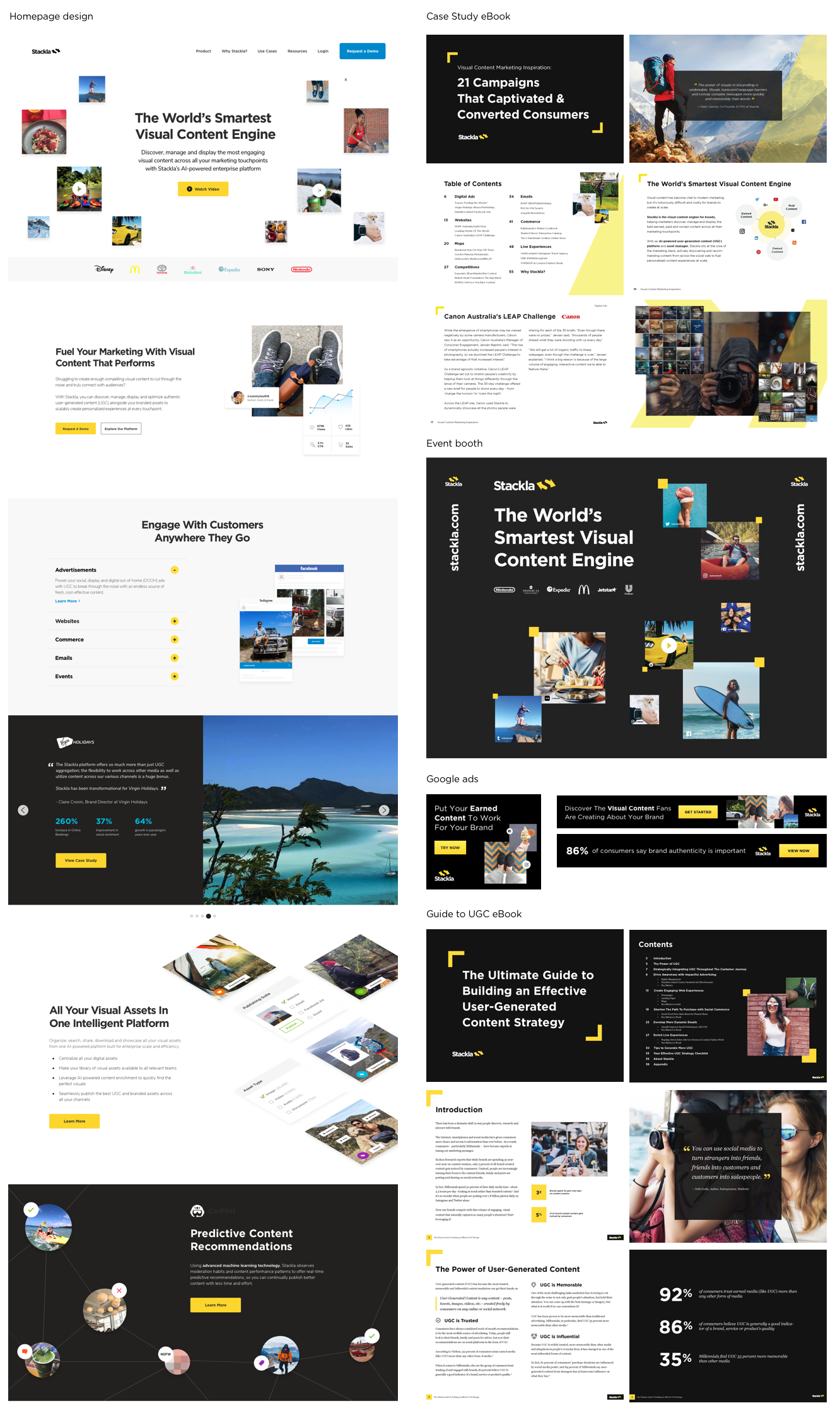
Moving in the Right Direction
Over time we phased out some of the unsightly and clunky elements of the branding: the black backgrounds, the diagonal, image mosaics, stock photos and distracting swatches of yellow. We subbed in more beautiful large scale UGC photos, clean product UI mocks, concise iconography, and more animation showing how the product works.
A Whole New Brand?
There was a lot of discussion about which parts of the brands to keep and what to do away with. Ultimately, we decided to keep the logo, fonts, and yellow color. We’d worked hard to build brand recognition over time and didn’t want to lose that.
The refreshed brand aims to strike a balance between coming off as innovative, capable and polished without talking down to our audience or appearing too “smart” for them. Dry tech visuals weren’t going to create the sense of aspiration we wanted our audience to feel.
“We sell a product that conveys trust, authenticity and real human connections, so that should be at the heart of our visual presentation.”
Our process was roughly:
Compile all existing brand assets for review
Interview with founder + key stakeholders
Research / mood boards / inspiration
Redesign key assets + roll out over time
Overhaul website
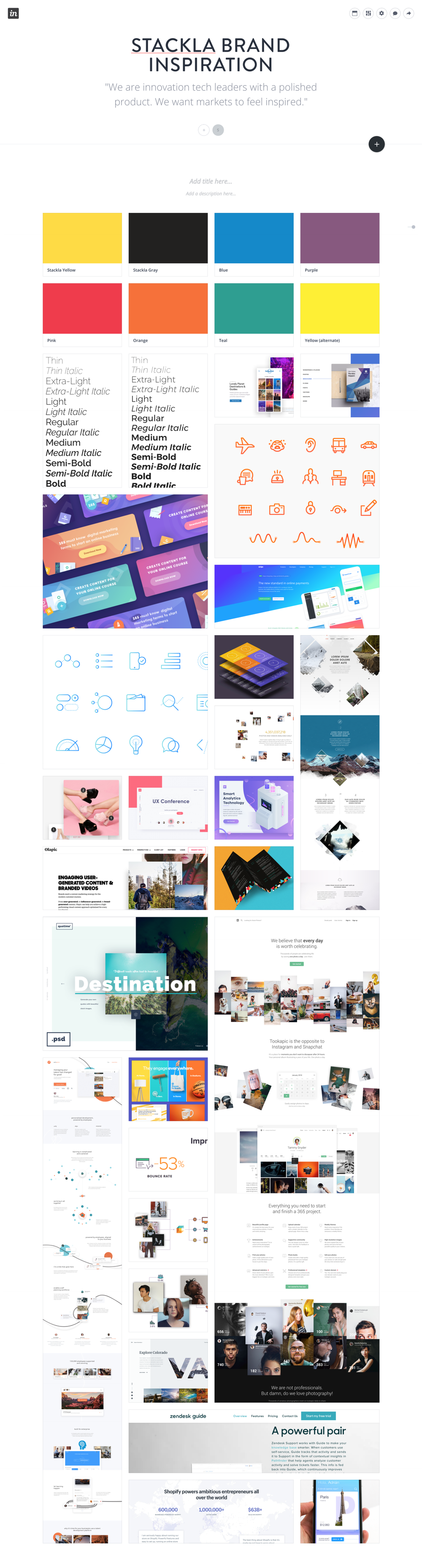
Mood Boards
I utilized mood boards such as the one below to compile inspiration for the Stackla brand refresh. This helped me communicate with / get buy in from key stake holders about the direction of the new visuals.
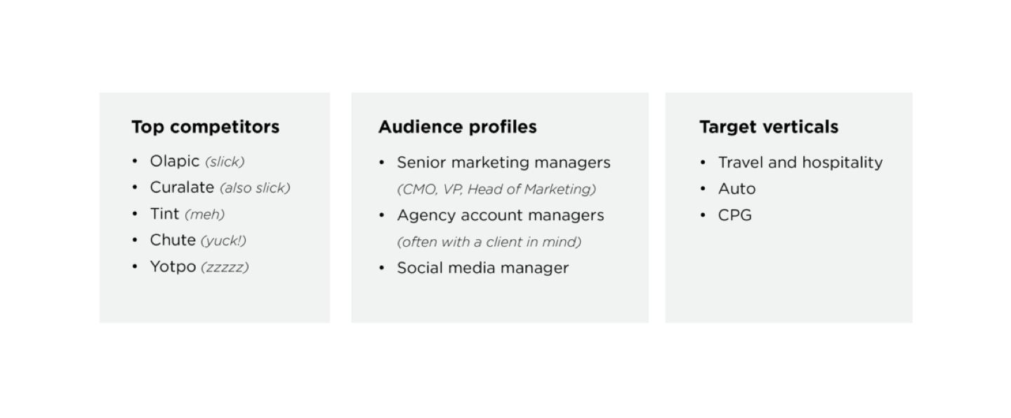
Competitive Analysis
Extensive research of the Stackla’s competitors helped me to differentiate the Stackla brand.
The Results

Brand Guidelines
Once we nailed down a visual language, it was time to rewrite the brand guidelines document to ensure quality and consistency across all brand assets and minimize confusion around the implementation of the refreshed brand.

Reflections
“It’s through mistakes that you actually can grow. You have to get bad in order to get good.”
I’d love to tell you that we paused our other projects, set aside a bunch of time to come up with the perfect idea for a brand refresh, wrote up some amazing guidelines, redesigned the brand/marketing assets methodically, then rolled out the rebrand in one fell swoop. Tada! Stackla was transformed and saw a huge spike in their revenue and everyone was happy. Rainbows and butterflies! Unfortunately, thats never the reality when working for an under resourced startup.
The path to getting Stackla’s brand, design assets and website in shape definitely wasn't linear. There was a lot of experimentation and consequently, failing forward. Many projects weren’t executed at the level of design polish that I wanted because we were lacking design resource, time and budget. We were working under the mantra “done is better than perfect” / “perfect is the enemy of good”. This also meant that we often weren’t able to use research and analytics to test and iterate upon design, something that I want to do more of moving forward.
Gated Digital Assets + Print Collateral + Event Kiosks for Marketing Lead Gen
Client: Stackla | Timeline: 2017-2019 | Role: Visual Designer
Function: Print, eBook, Infographics, Marketing Collateral, Pitch Deck | Tools: Sketch, Adobe Creative Suite
This is a collection of projects that I designed for Stackla (a SaaS startup in the MarTech sector). For all of these assets I was the only designer, working in collaboration with Stackla’s Head of Content and Director of Marketing.
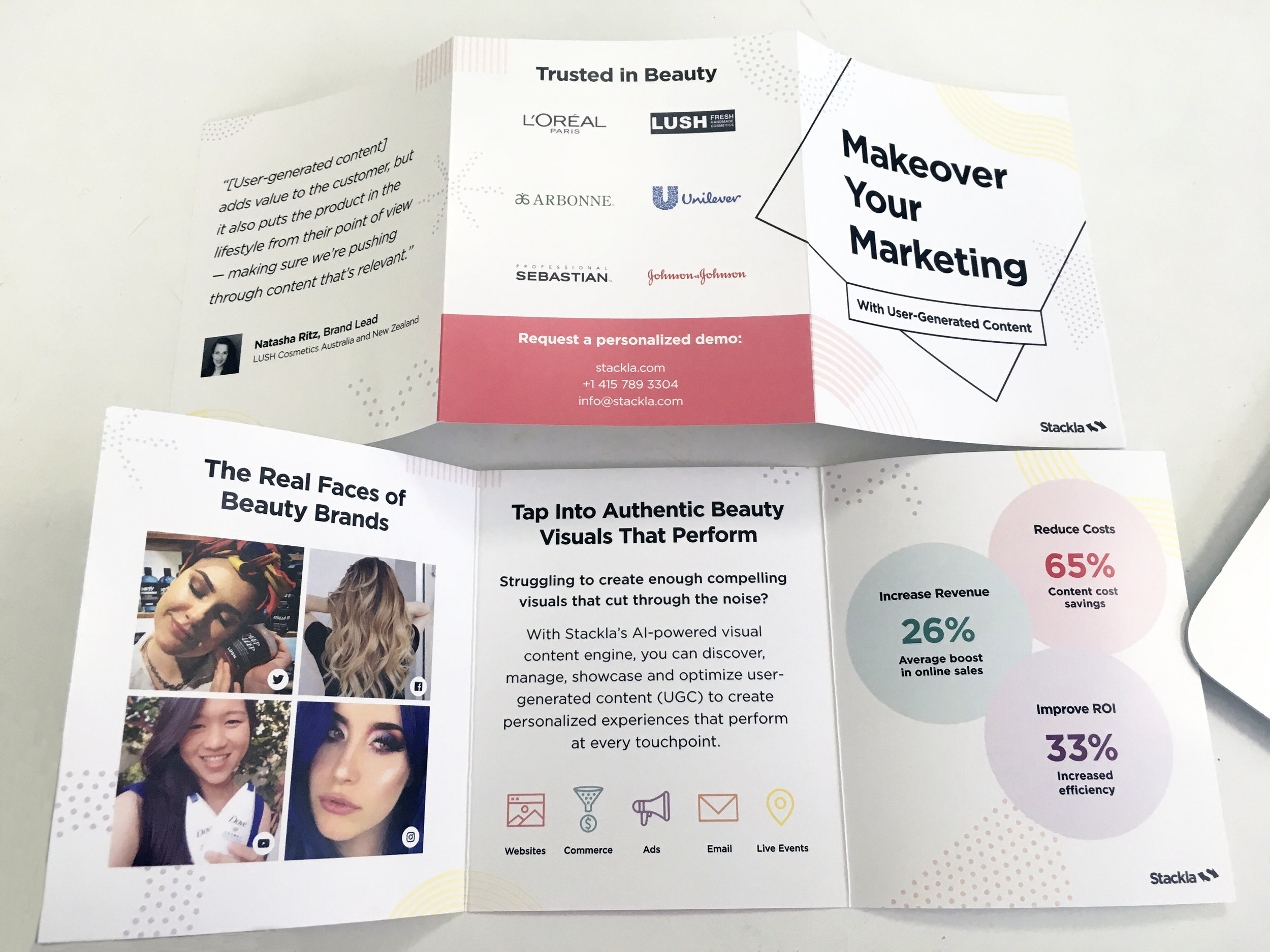
Influencing Travel:
How to Turn Lookers into Bookers
Project: Travel booklet showcasing travel client’s user-generated content and stats
Medium: Digital & print
Purpose: Travel event collateral + gated asset to obtain marketing leads
SEE FULL EBOOK


10 Food & Beverage Campaigns That Satisfied People’s Hunger for Authentic Visual Experiences
Project: Food+Bev booklet showcasing client’s user-generated content and stats
Medium: Digital & print
Purpose: Food+Bev event collateral + gated asset to obtain marketing leads
SEE FULL EBOOK


21 Campaigns That Captivated & Converted Consumers
Gold Winner - Hermes Creative Awards
Project: Booklet showcasing Stackla customers’ campaigns across key marketing use cases: digital ads, websites, maps, competitions, emails, live experiences and eCommerce.
Medium: Digital & print
Purpose: Event collateral, leave behind for sales and CS meetings, gated asset to obtain marketing leads
SEE FULL EBOOK


Bridging the Gap: Consumer & Marketing Perspectives on Content in The Digital Age
Gold Winner - Hermes Creative Awards
Project: Data report showing the gap between consumer and marketer perspectives and trends in the marketing industry within the last few years
Medium: Digital
Purpose: Marketing lead generation, client education, sales + CS promotional material
SEE FULL DATA REPORT


The Ultimate Guide to Building an Effective User Generated Content Strategy
Project: eBook meant to promote Stackla and educate marketers about UGC strategy
Medium: Digital
Purpose: Marketing lead generation, client education, sales + CS promotional material


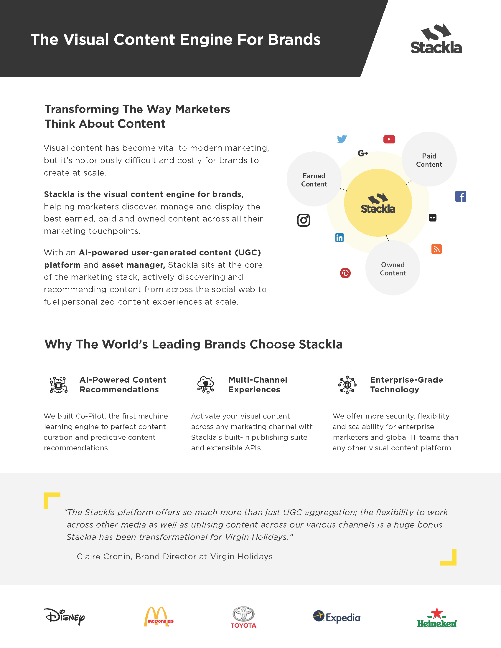
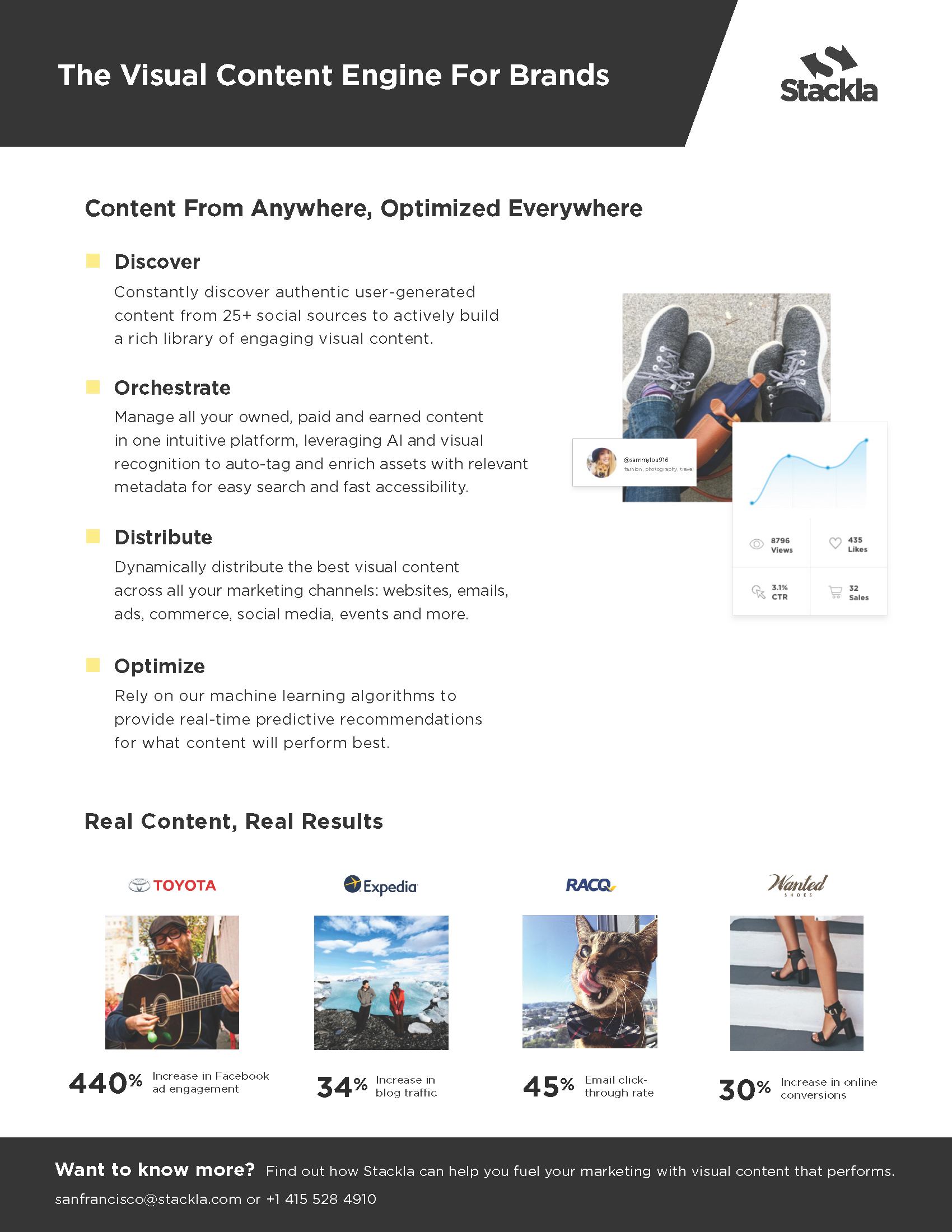
Main Stackla Sales Pitch Deck
Project: Pitch deck for Sales meetings
Medium: Digital
Purpose: Educate potential clients about Stackla
SEE FULL DECK


Travel Event Brochure
Project: Collateral for travel focused events
Medium: Print


Beauty/CPG Event Brochure
Project: Collateral for beauty focused events
Medium: Print


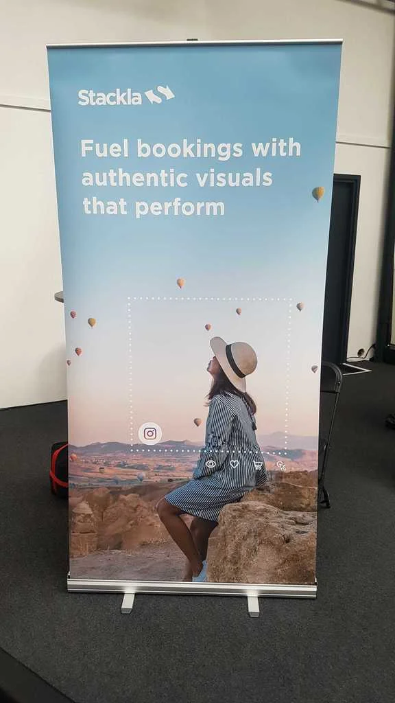
Marketing Event Kiosks
Project: Promote Stackla at Marketing Events
Medium: Environmental, digital presentation, print collateral, swag
Purpose: Promotional, marketing lead generation


Overview Onesheet
Project: Promote Stackla at Marketing Events
Medium: Print collateral
Purpose: Promotional, marketing lead generation
Marketing Design for Commercial Real Estate

Client: DTZ, Cassidy Turley, Newmark Cornish & Carey | Timeline: 2013-2015 | Role: Visual Designer
Function: Branding, Web Design, Email Design, Environmental, Print | Tools: Adobe Creative Suite
This is a sampling of projects I created when I was working at Cassidy Turley (rebranded to DTZ) and Newmark Cornish & Carey.
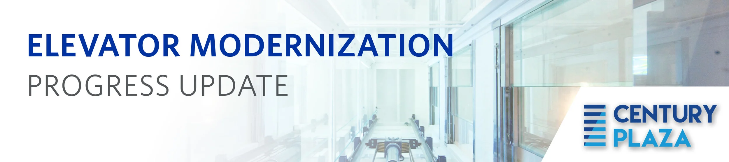
Century Plaza Branding + Webdesign
I worked on this project with a senior designer at Cassidy Turley, a commercial real estate company that rebranded to DTZ (and has since been acquired by Cushman & Wakefield). Century Plaza is a commercial office park in San Jose. The real estate brokers came to the design team needing a full suite of branding and marketing assets. We started with a logo, then created a website and email blast template, and some environmental graphics that were to be displayed in the office building.
Homepage

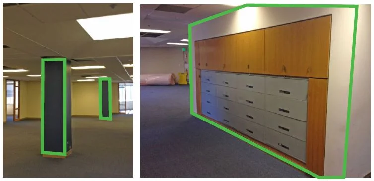
Environmental Graphics

Email Header
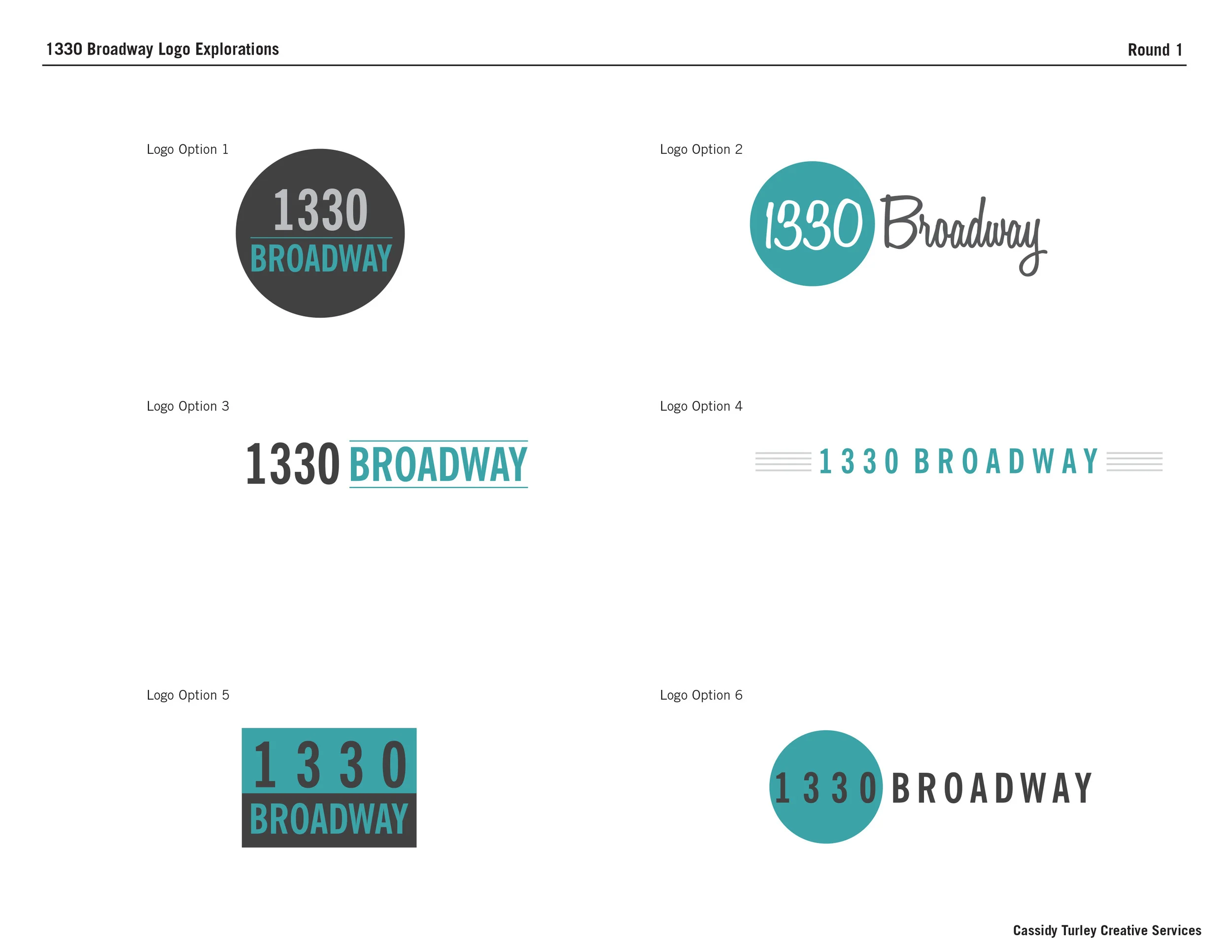
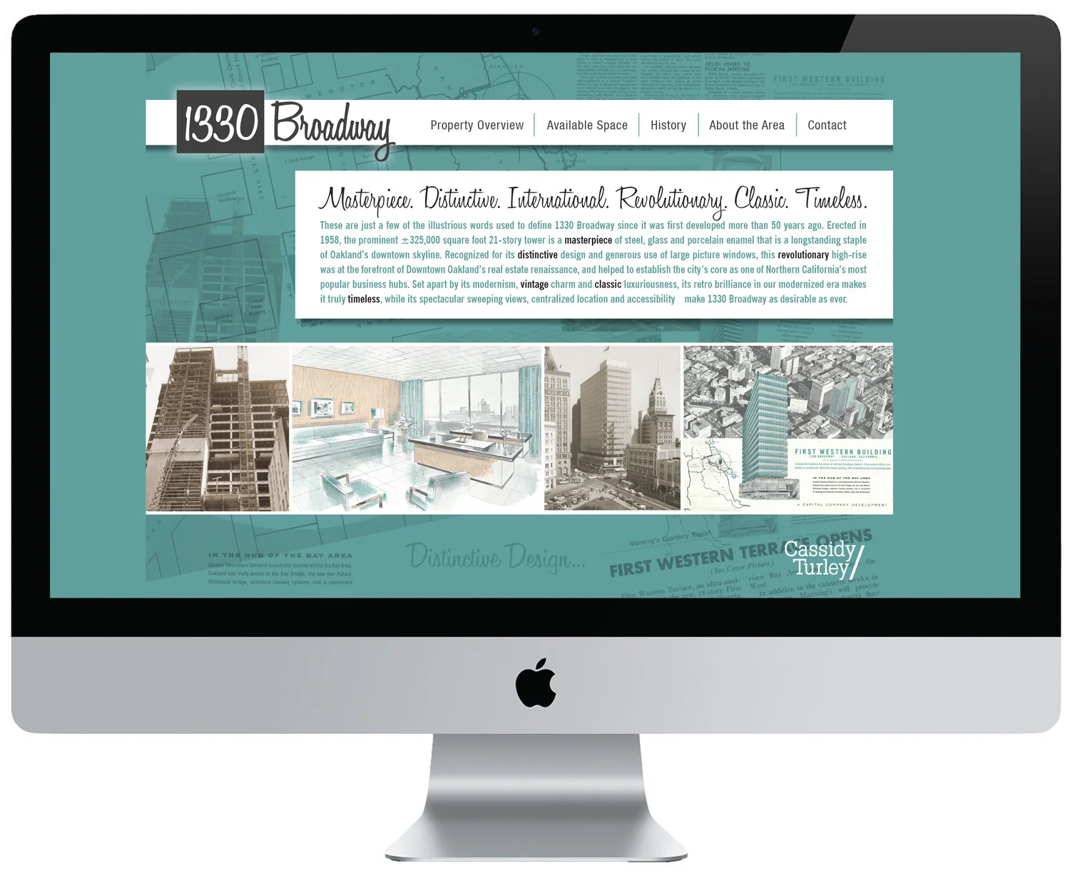
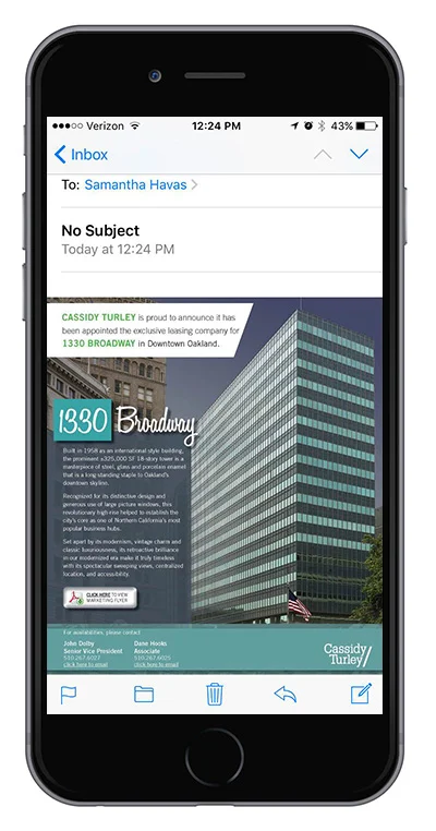
1330 Broadway Branding + Webdesign
1330 Broadway is an 18-story, 320,000 square foot trophy office tower in downtown Oakland, California. It has defined itself as one of the USA’s finest examples of International Style architecture (a major architectural style that was developed in the 1920s and 1930s and was closely related to modernism and modern architecture).
I was tasked to work with a senior designer to create a logo, website, email blast and flyer advertising the property. The brokers really wanted to showcase its unique style so we used photocopies from old print ads from the 1920s and created a custom logo in a vintage script.
Website + Email Blast Template
Digital Flyer

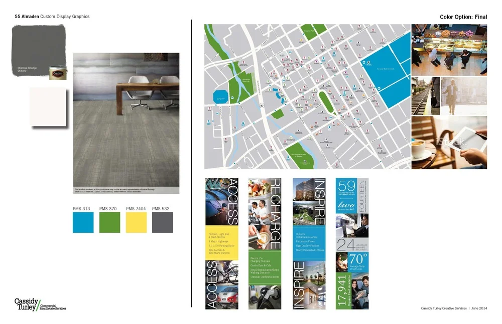
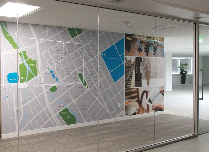
55 Almaden Environmental Graphics


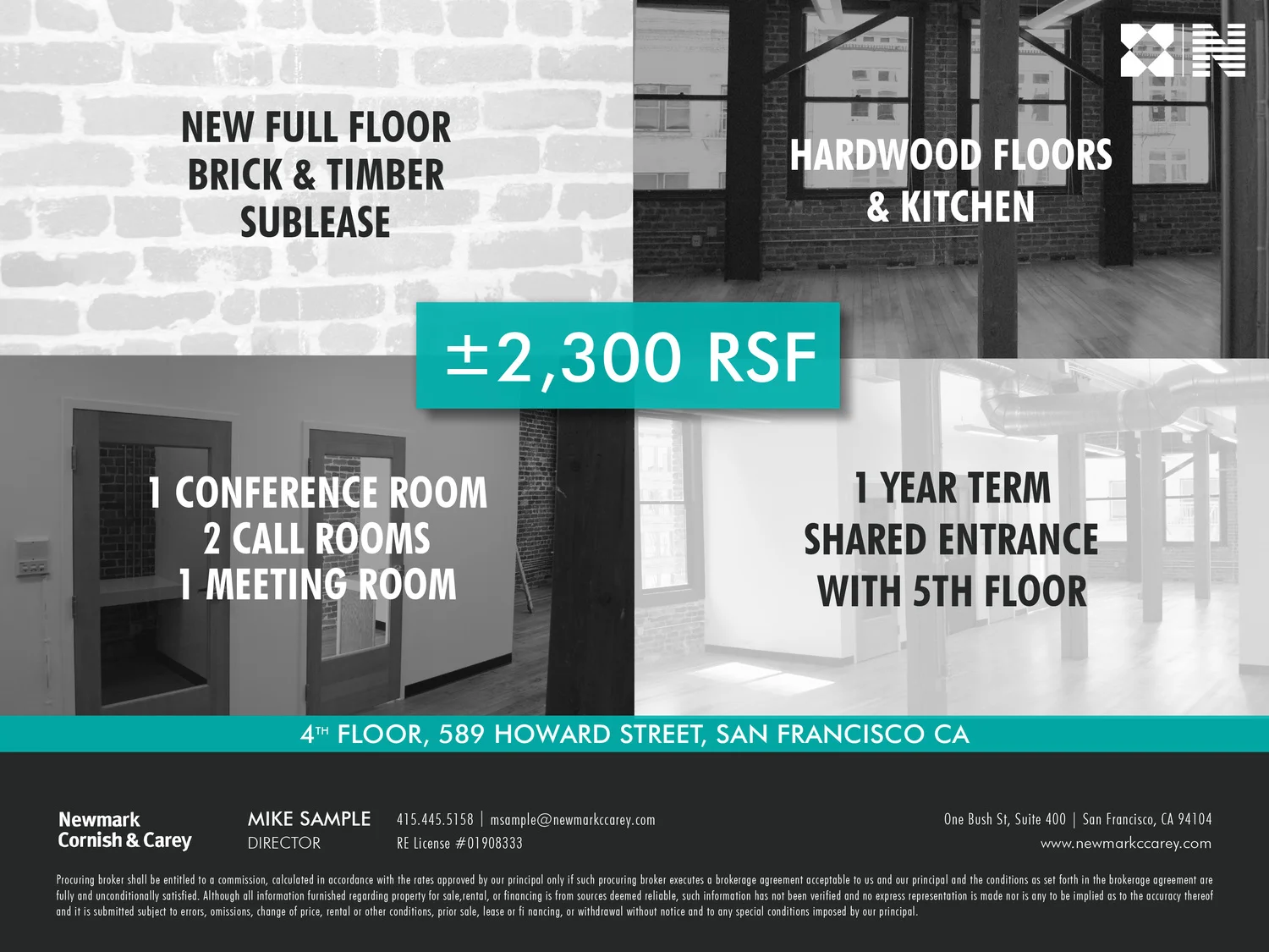
589 Howard Street Print Flyer

170 Columbus Offering Memorandum


Event Design + Marketing Campaign
Client: DTZ | Timeline: Feb 2015 | Role: Visual Designer
Function: Environmental, Branding, Motion Graphics, Digital, Print | Tools: Adobe Creative Suite
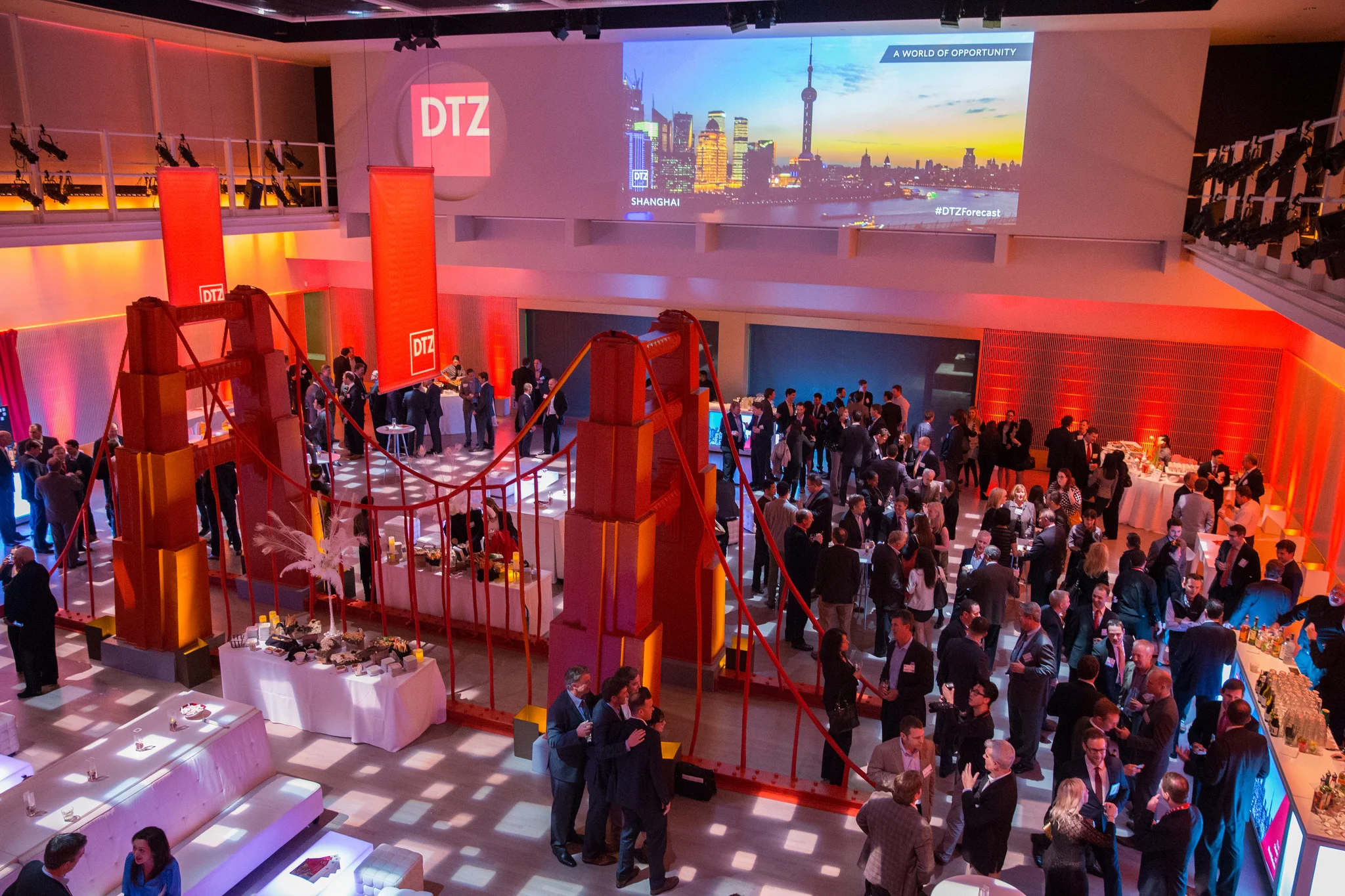
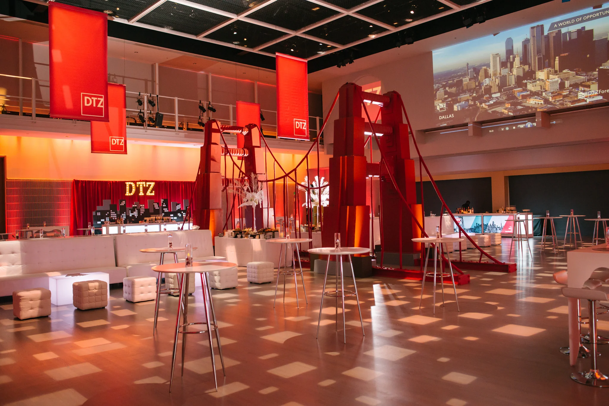
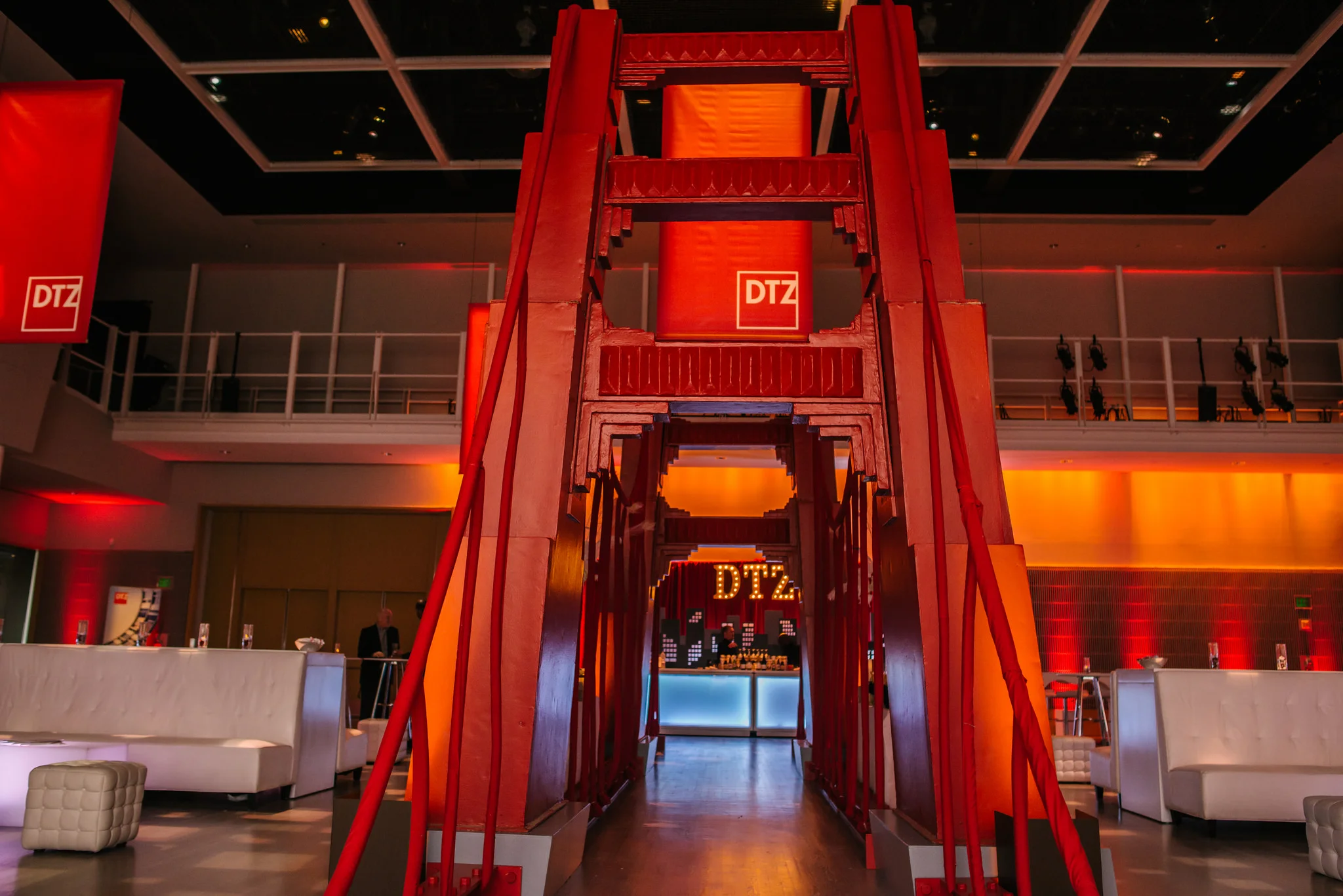
I worked closely with the Art Director and a team of designers to help create the marketing campaign and brand experience for this event: The State of Real Estate 2015.
I personally designed web banners, the city skyline backdrop behind the bar, name tags, event pamphlets, and a motion graphic piece that was projected onto the walls.
“Over 800 people attended DTZ's 2015 'State of Real Estate' forecast presentation and brand launch party on February 4th at the Yerba Buena Center of the Arts. The presentation examined the current macro and micro economy, its impact on Bay Area real estate markets, and a forecast of things to come. The event also celebrated the news that DTZ was last week ranked No.1 Commercial Real Estate firm in the Bay Area by the San Francisco Business Journal in the journal's latest round of listings.”


Animated Google Ads
+ Landing Page Design
Client: Stackla | Timeline: Oct 2018 | Role: Visual Designer
Function: Animation, Digital Designs | Tools: Sketch, AfterEffects
This is a set of retargeting ads that I created for Stackla (a SaaS startup in the MarTech sector). I created them in HTML5 using Adobe Animate for use on the Google Adwords platform.
The ads link to Stackla’s main landing page, which I’ve also redesigned.
Note: Ads below are compressed into .gifs so the images don’t look as crisp as they do in HTML5.


Marketing Videos for a Tech Startup
Client: Stackla | Timeline: June 2017 | Role: Visual Designer, Art Director
Function: Art Direction, Animation, Illustration | Tools: Sketch, AfterEffects
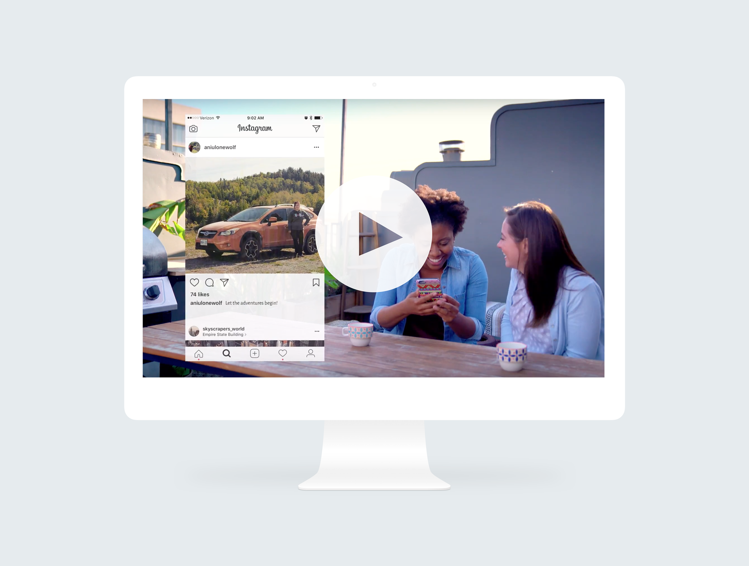
Stackla: Putting User-Generated Content at the Heart of Brand Marketing
This is a company overview video that I worked on with Stackla’s marketing team and an outside agency. It went on Stackla’s homepage and was sent out to prospects as a quick way to education them about the company’s value. I provided conceptualization, art direction and graphics.
Rights Management for UCG
A sales, CS and Marketing asset that helps highlight some of the competitive differentiators when it comes to RM.
Creating Authentic Customer Experiences With User-Generated Content
This video is a sales tool to help prospects (and current customers) envision what a comprehensive UGC strategy could look like from their customers' perspectives. I worked with Stackla’s head of content and an Account Executive to come up with the content and voice over for the video. I provided graphics and art direction, building it out in AfterEffects from start to finish.