
HOMER Learning Website Redesign
Client: HOMER | Company: HOMER | Timeline: June 2020-Nov 2020 | Role: Product Designer
Function: Web Design | Tools: Figma
Overview
I collaborated with the Marketing team and another Product Designer to redesign Homer’s website with updated branding using a new grid, modular design, and design system. Aside from the branding, the website was outdated and did not reflect Homer's current product offerings.
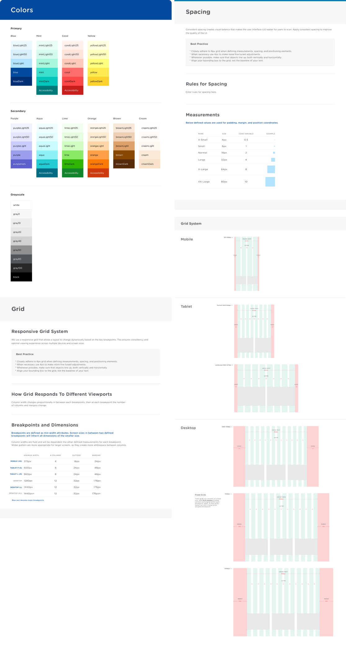
Design System Sample
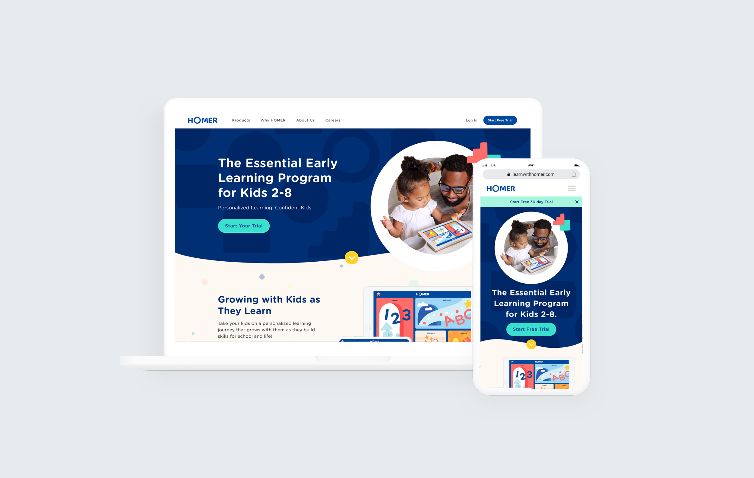
Homepage

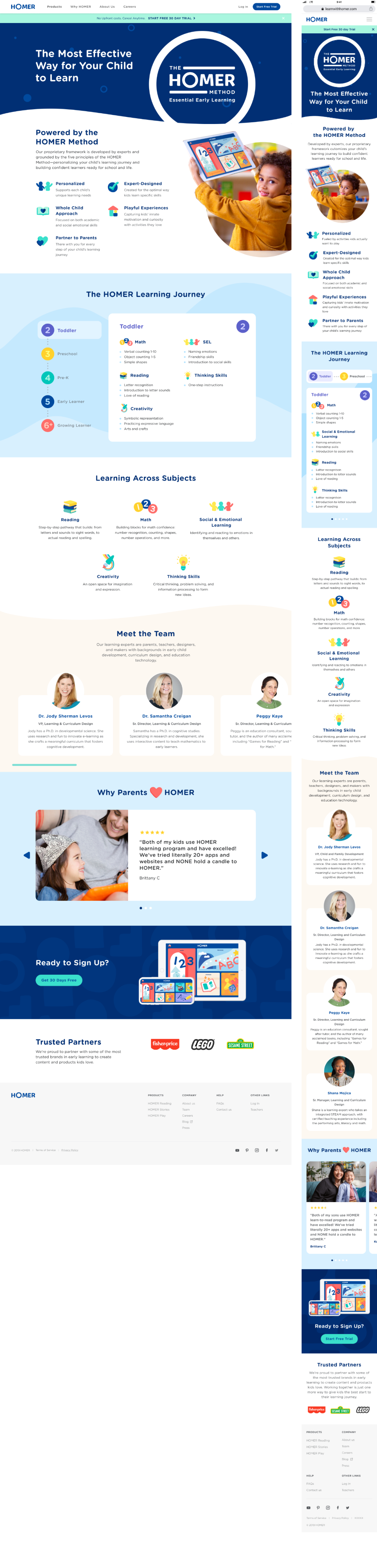
Why Homer
About Homer

Learn & Grow Product Page

Ages

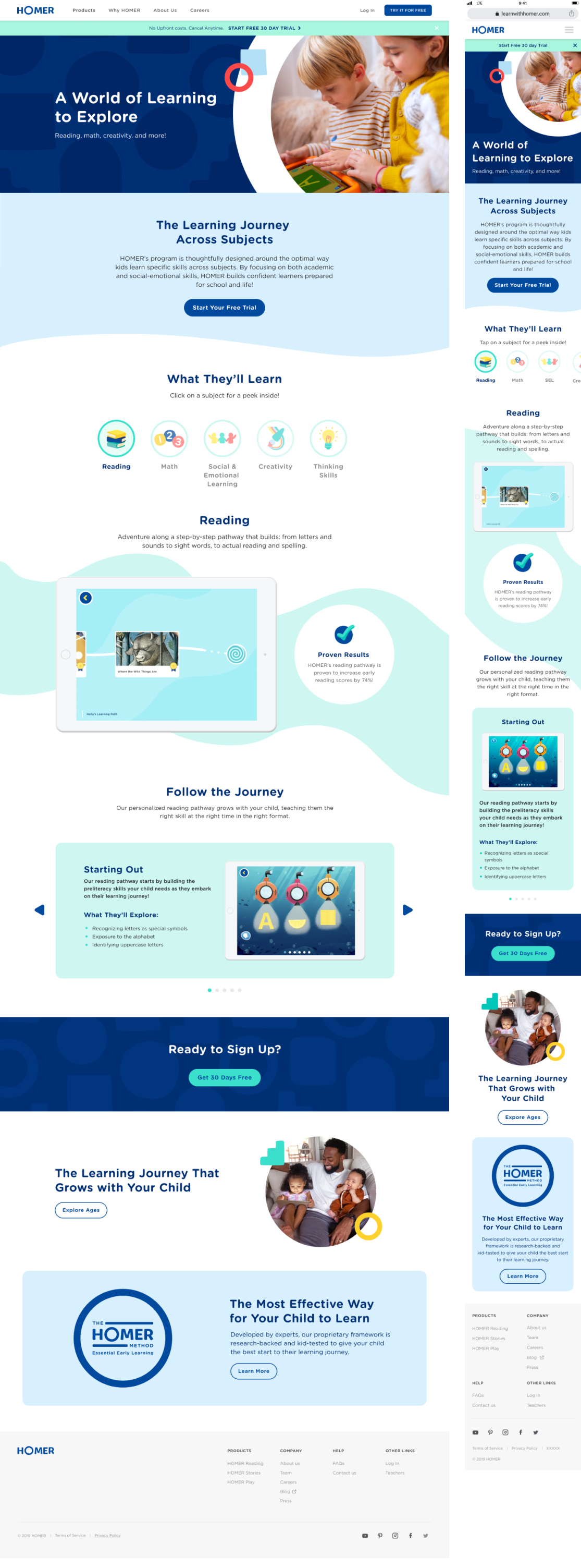
Subjects
Careers

MatchUP App UX Case Study

Client: Student Project | Timeline: October 2017 | Role: UI/UX Designer
Function: User Research, UX Design, UI Design | Tools: Sketch, InVision
Opening Statement
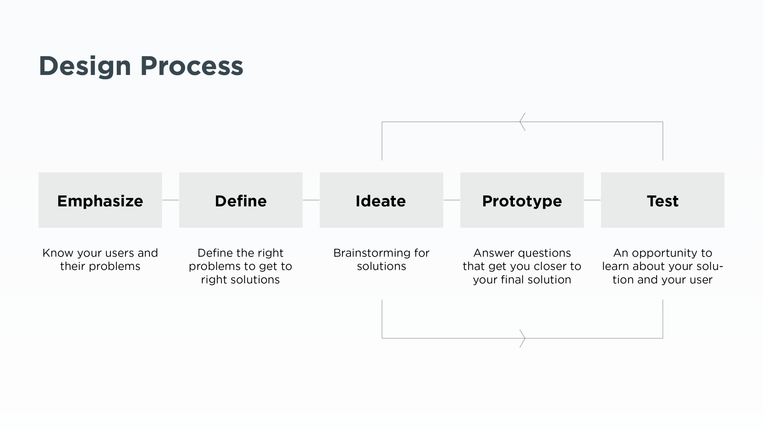
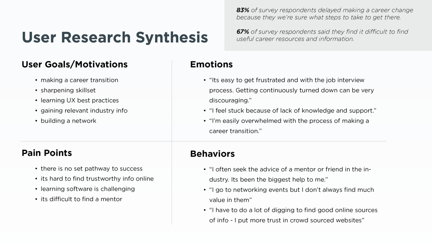
As a student of General Assembly’s User Experience Design Course, I chose a final project topic that was both a proven need in the marketplace and of deep personal interest: a way for newbies in the UX world to connect with mentors.
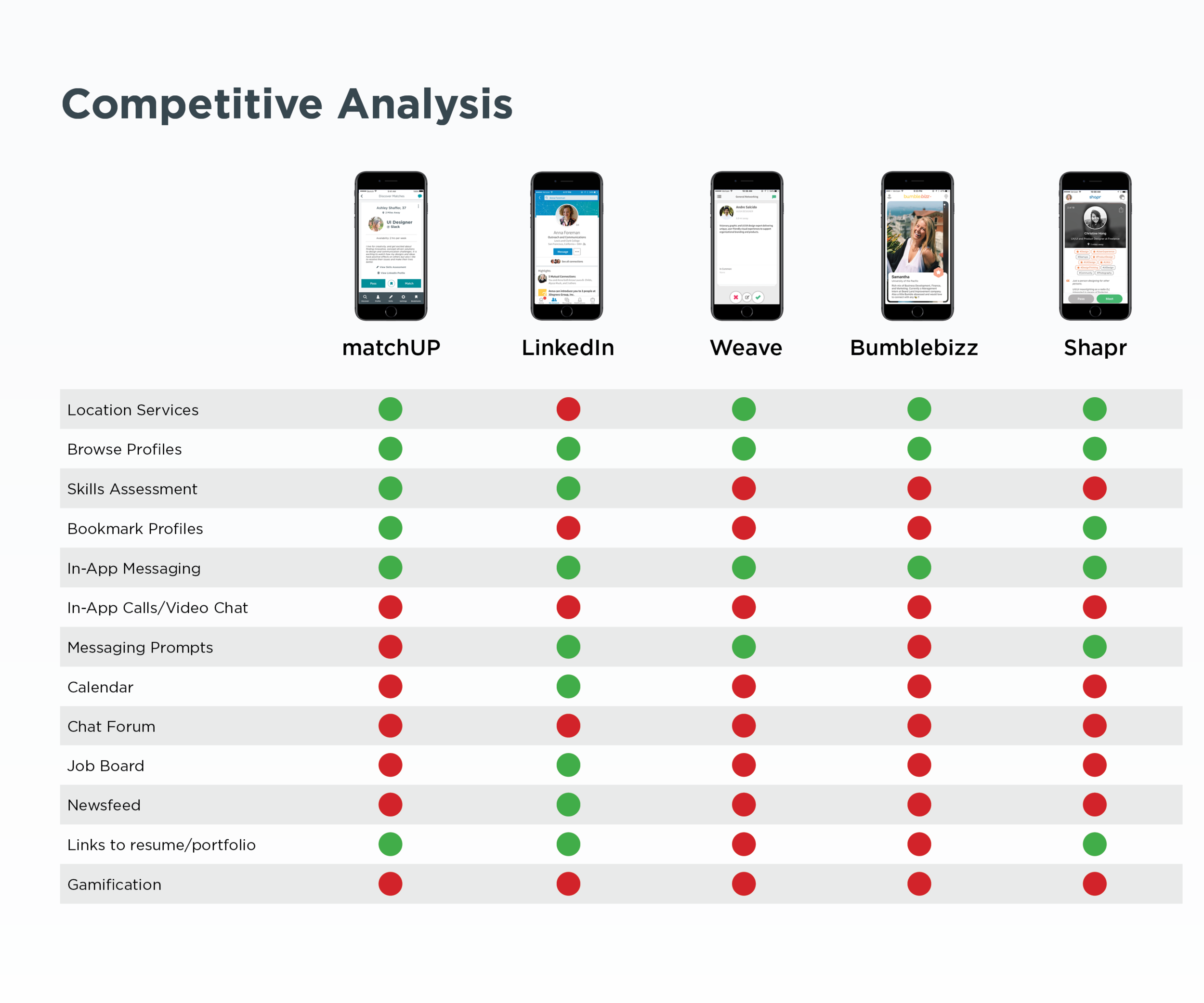
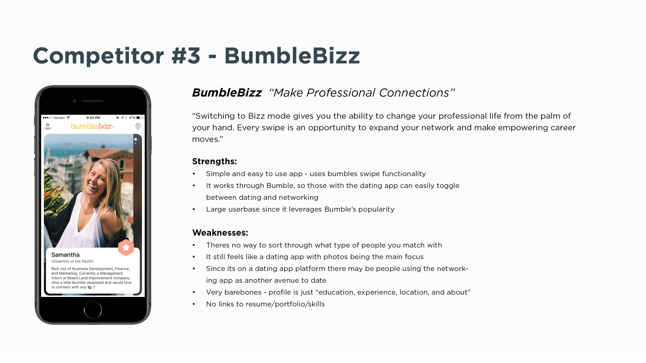
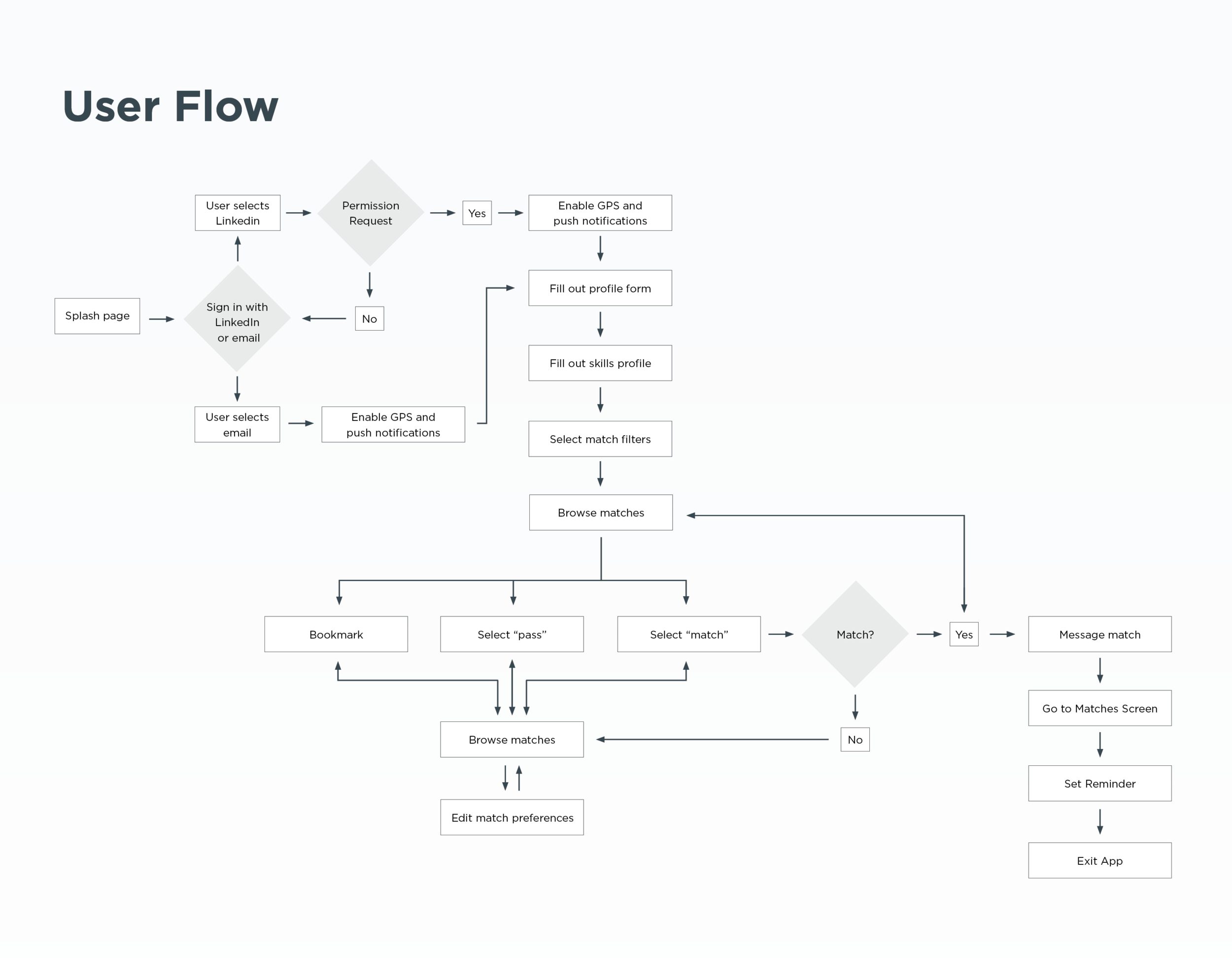
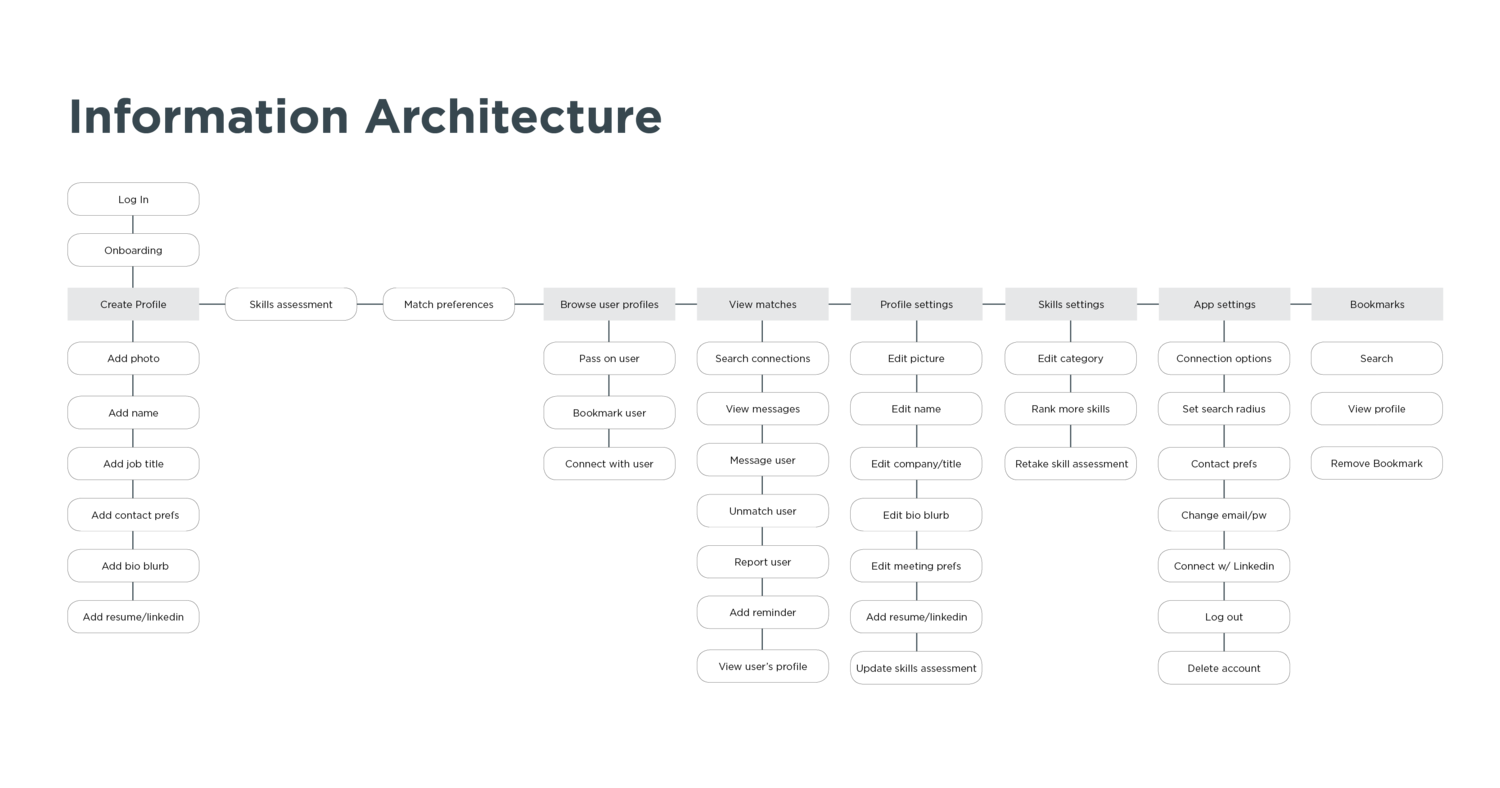
I was responsible for synthesizing user research and customer feedback to design and iterate on a solution, and for producing a full suite of UX documentation: User Research, Competitive Analysis, MVP Proposal, User Personas, Information Architecture, User Flows, Key Screens, and a Prototype.
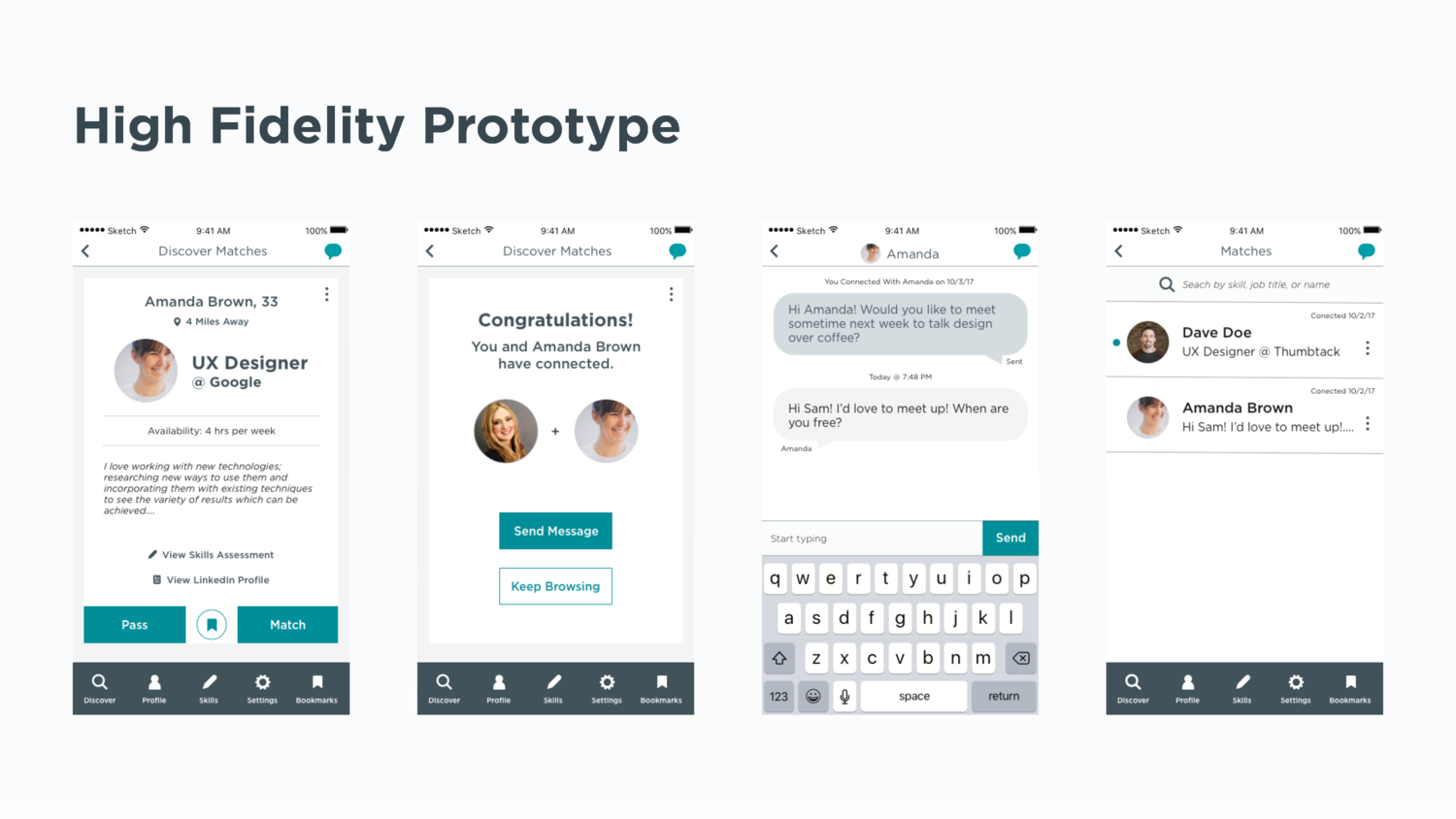
In this case study, I’ll walk through each stage of my design process and illustrate key considerations that shaped the MVP of my final product, MatchUP: a native iOS application that connects UX career mentors, peers, and mentees.

Problem Statement
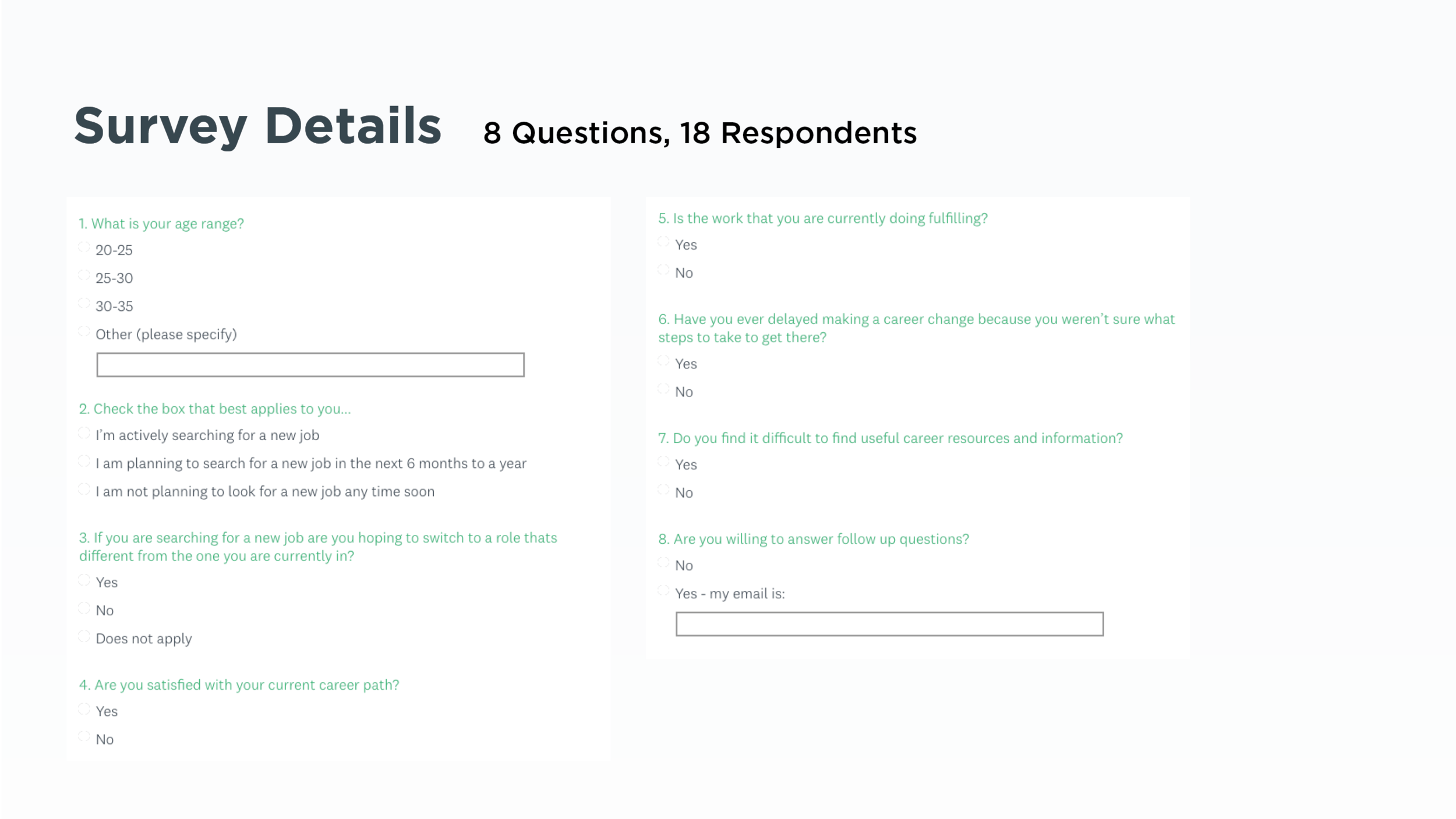
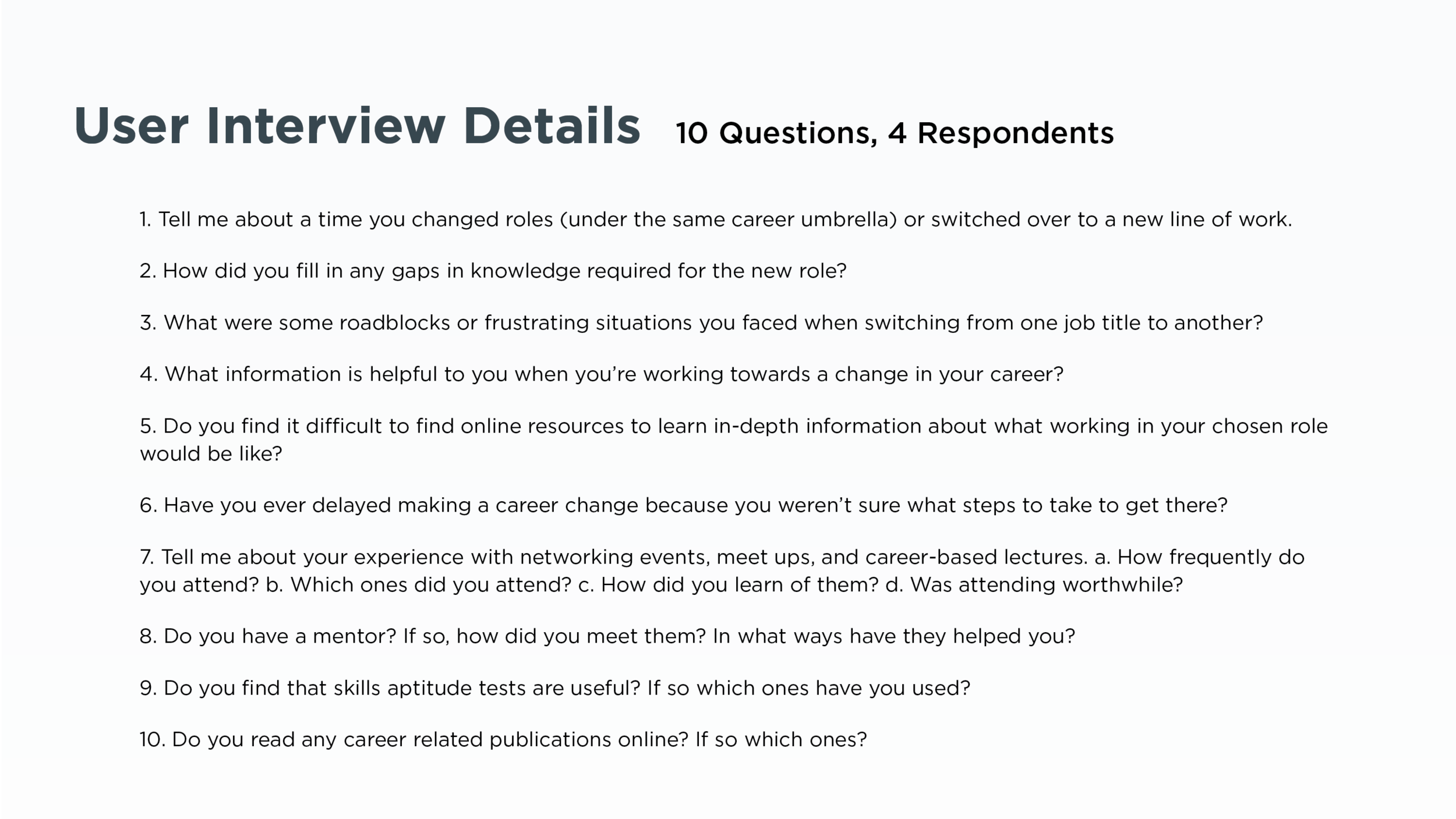
The problem I suspect is that educated millennials [who are unhappy with their current occupations] want to make a career switch in the tech world [specially UX design] but they face difficulty finding mentors and building relationships with them.
Hypothesis
We believe that making an app that connects people with others in their industry will help facilitate relationships that will get them the information and resources needed to expedite a career change or growth in their current roles.
We will know this to be true when we see people making meaningful connections and setting up meetings [virtual or in person].


Reflections
As with any project, there is always room from improvement. I’ve learned that user testing delivers incredibly valuable information, and would have liked to interact with more users had I had more time in class. I was only have to test my paper prototype with 4 people (thus learning about gaps in my flow/missing buttons) but I would have loved to test my final prototype to get the confidence that my design decision are clear and straightforward.
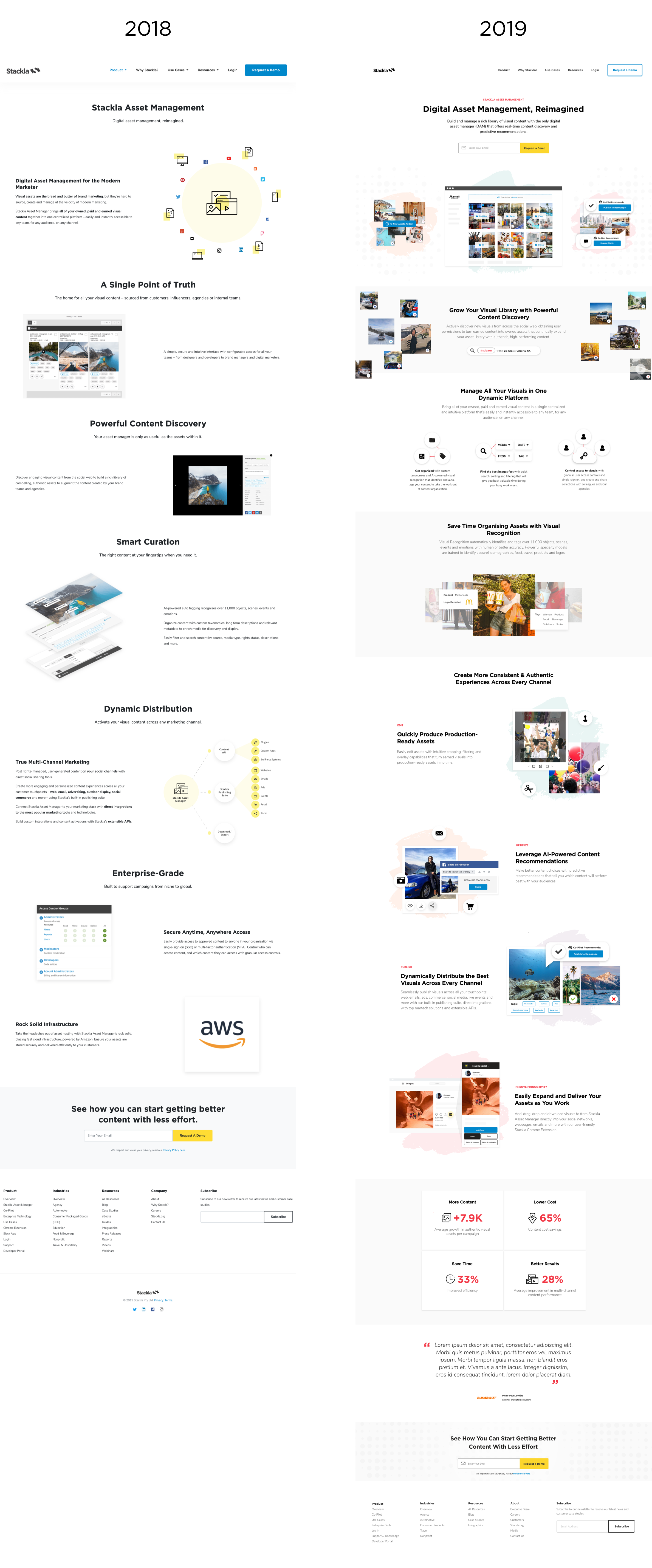
Stackla Website Redesign
Client: Stackla | Timeline: Jan 2018 - Ongoing | Role: Visual Design Lead
Function: Web Design, Animation, UI mockups | Tools: Sketch, Invision, AfterEffects
Opening Statement
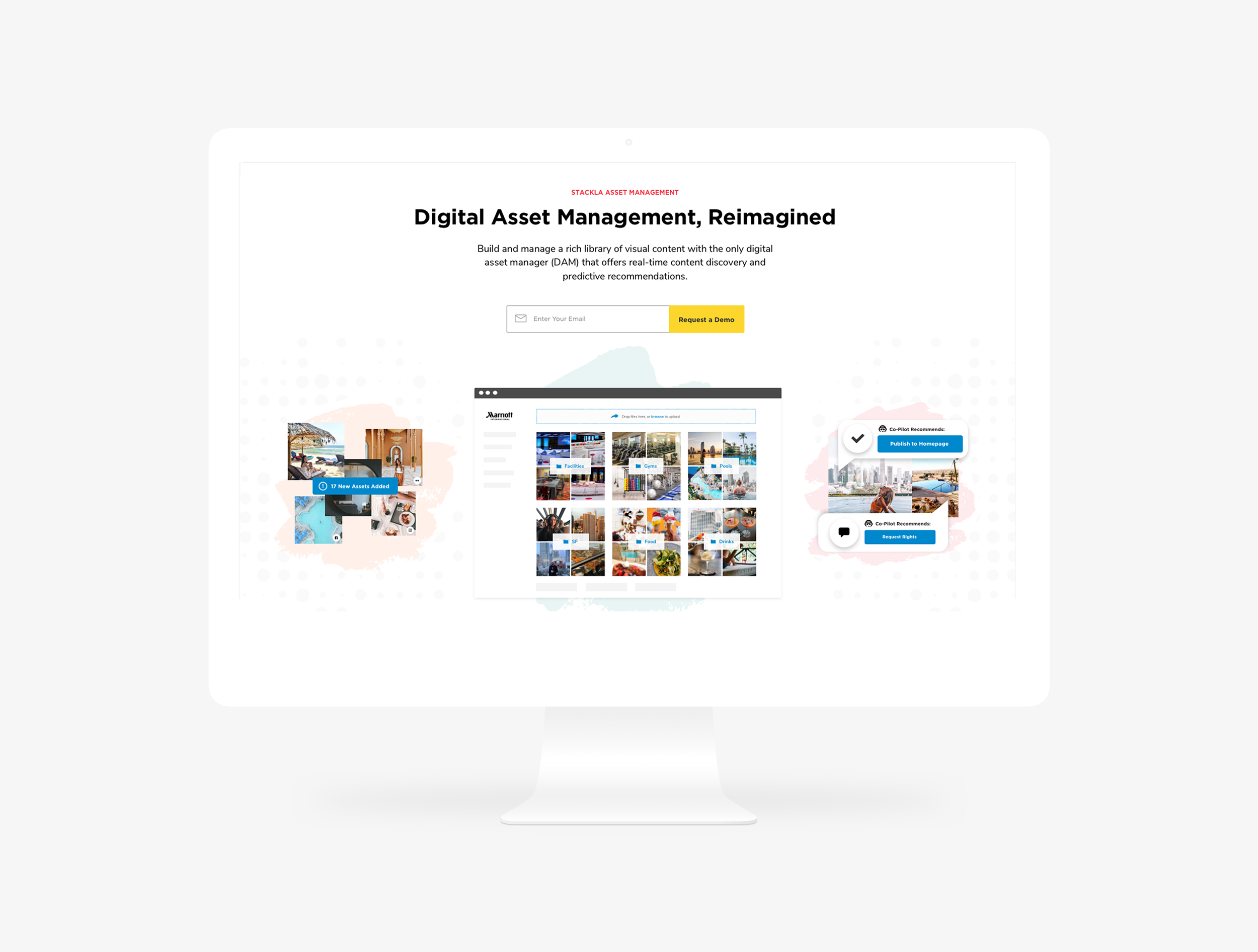
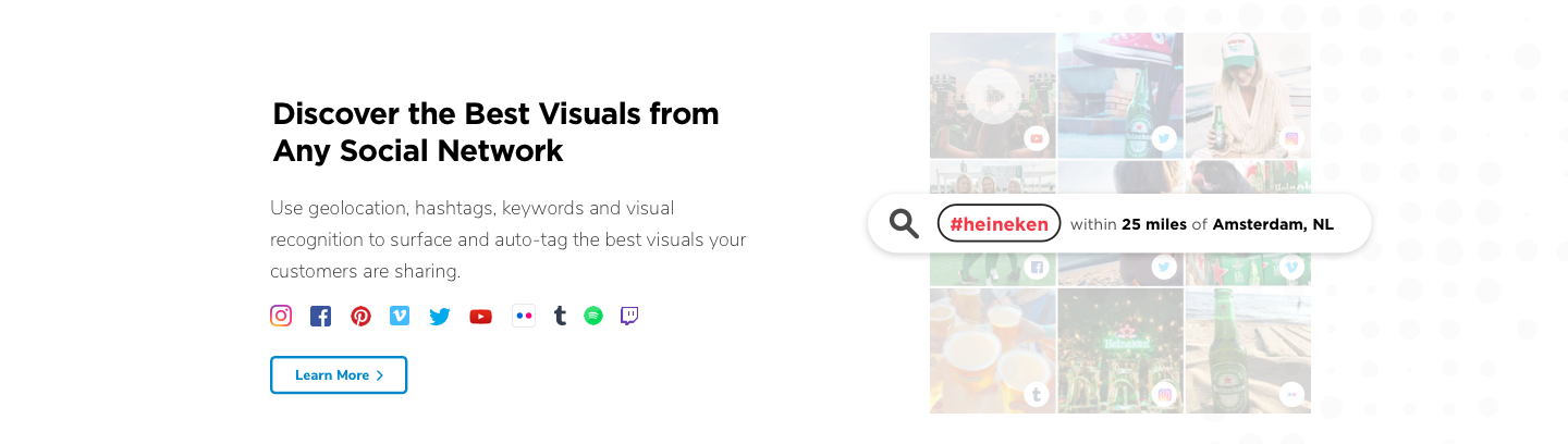
Stackla today is the world’s smartest visual content engine, helping modern marketers discover, manage and display the best content across all their marketing touchpoints with an AI-powered user-generated content (UGC) platform and asset manager.
But before, it was marketed as a social media aggregation platform. Stackla’s branding and website didn’t accurately reflect the company that it had become.
I worked closely with Stackla's marketing team in an effort to overhaul its brand identity. Afterwards, it was time to design a website that aligned with its new direction.
The challenge
Frankly, Stackla’s website was a bit of a mess. There were tons of different page styles using mismatched variations of Wordpress components. The content and design was outdated. I was challenged to come up with a versatile template and redesign the page layouts and visuals.
Stackla’s Homepage Evolution over the years

Role + Deliverables
I worked as the lead Visual Designer on this project to redesign Stackla’s website - starting with the homepage and key (most trafficked) webpages.
I was tasked to:
Adapt Stackla’s refreshed branding and new messaging for the web and apply it across the site (in collaboration with Stackla’s Head of Content)
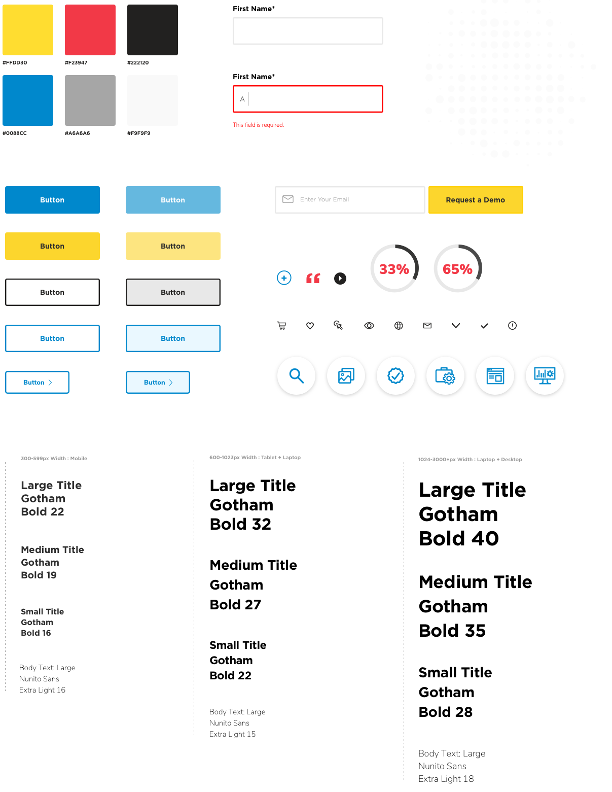
Create a new visual language, component and UI library that could be used for consistency across the site.
Partner with a developer at an agency to ensure quality in execution.
Template
I aimed to make a template that could work for a variety of different types of pages on the website. The key was to create something basic and flexible, allowing for enough customization to keep it dynamic.
Since Stackla uses Wordpress, the template was made of interchangeable components. Ultimately, this saved them a lot of web development time and enabled the site admin to create new pages on their own.

Web UI Kit
Before + After
Product Page

Stackla Asset Manager
Why Stackla

Paid Landing Page

Homepage - Before
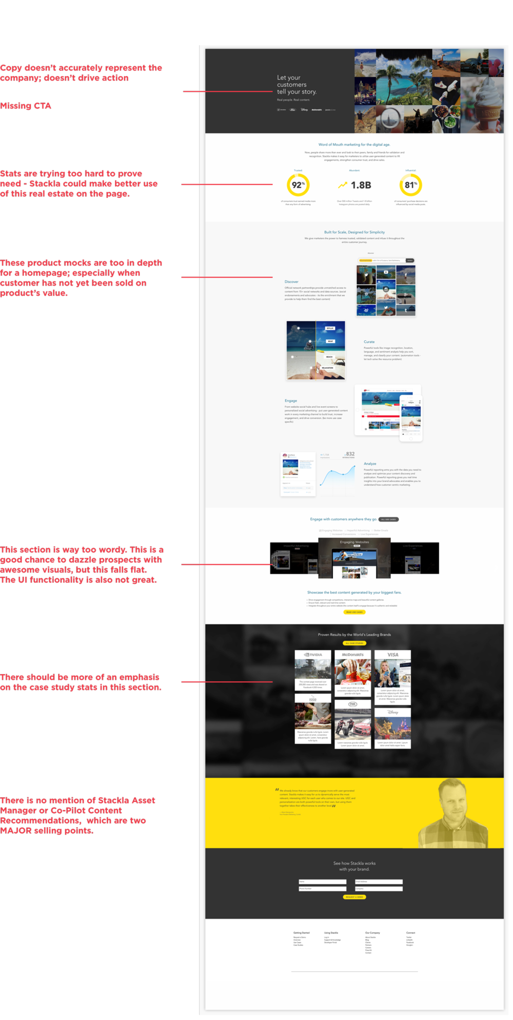
Homepage - After

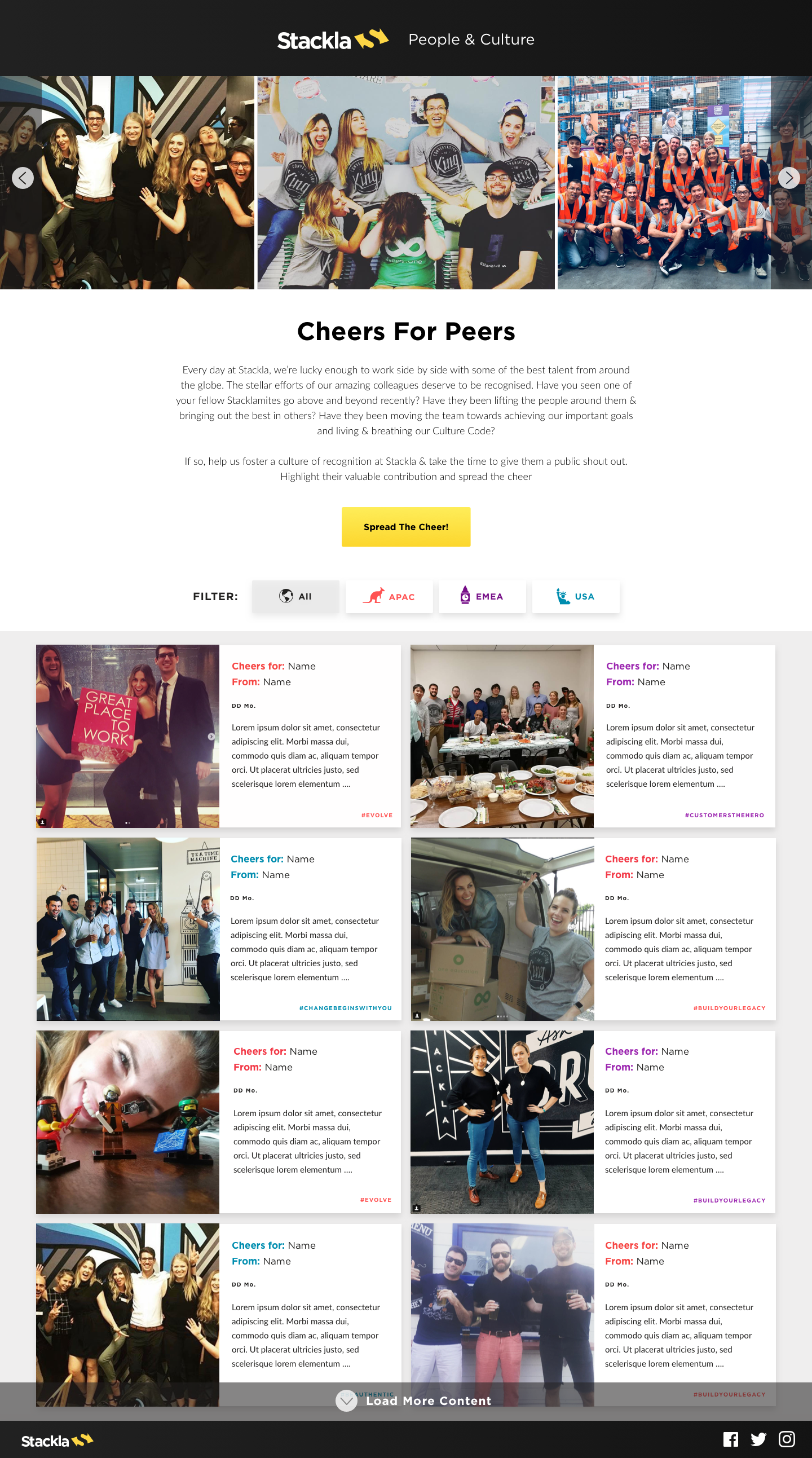
Cheers for Peers Microsite

Client: Stackla People & Culture | Timeline: Nov 2017 | Role: Visual Designer
Function: Web Design, UX Design, UI Design | Tools: Sketch, InVision
Opening Statement
The Cheers for Peers Microsite was created for Stackla People & Culture as an element of Stackla's broader employee recognition program. It was launched specifically to better enable peer to peer recognition. With Stackla’s employee’s scattered through out the world in various offices (San Francisco, Austin, NYC, London, and Sydney) the Cheers for Peers site is a way to bring everyone together by allowing for visibility into each other’s accomplishments and a way to celebrate wins. Additionally, it brings awareness to Stackla’s Culture Code Values.
The challenge
I was responsible for designing the microsite and all the graphics accompanying it from initial sketches to polished designs to hand off to the developers. I partnered with Stackla’s Global VP of People & Culture to get this site off the ground. Since this microsite is to be accessed at work we didn’t create a mobile version at this time.
This was fun project because I got to deviate from Stackla’s branding and use playful language and iconography.
User Flow

Wireframes

Version 1 - High Fidelity Draft

Edits to Version 1
Photo banner: 3 photos in view at once to showcase people from all 3 regions
Filter button: needs to look more like a button, show active state
Tiles: Change BG color of tiles - they were getting too busy and hard to read with the colorful backgrounds, cleaned up the grid, changed place of the date, lessened the amount of text allowed, added a pop of color to correspond with region
Form: change to limit selection to only 1 culture code value
Final Designs


Content Discovery Engine Microsite
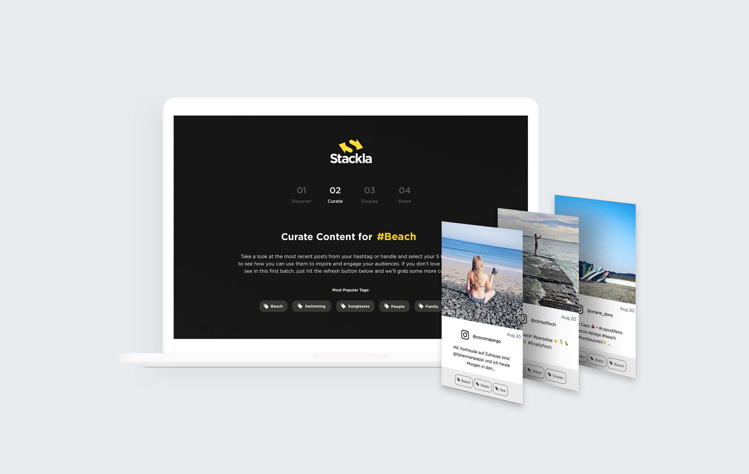
Client: Stackla | Timeline: June 2018 | Role: Visual Designer
Function: Web Design, UX Design, UI Design | Tools: Sketch, InVision
Opening Statement
Stackla needed a quick and easy way to showcase the product’s functionality to potential clients without taking them through a full on product demo (which can be clunky and requires a lot of setup). This microsite is meant to inspire prospects by showing off some of the content users are creating about their brands and then taking that content and showing it in mockups, serving as examples of how that content could be used across all marketing touchpoints. It also doubles as a gated asset to generate marketing leads.
The challenge
I was responsible for designing the microsite and all the graphics accompanying it from initial sketches to polished webdesigns to hand off to the developers. I partnered with Stackla’s head of content, product marketer and founder.
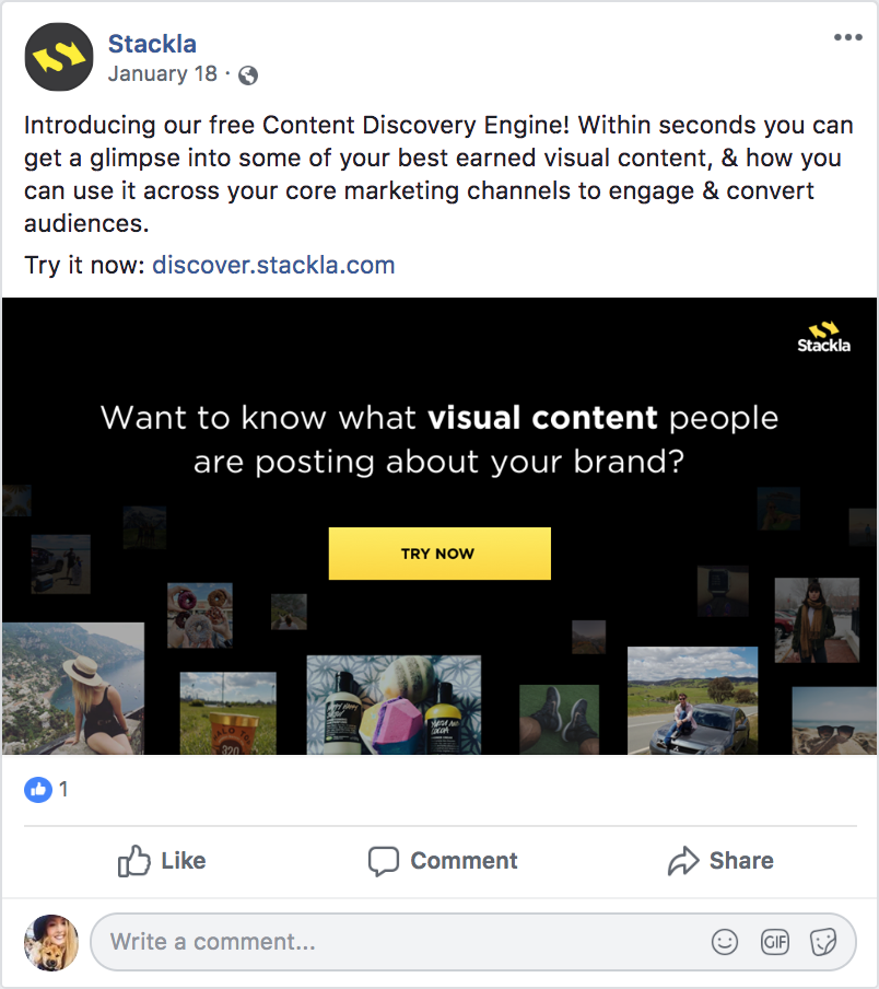
Additionally, I created social ads for Facebook and Linkedin to advertise it to prospects and an email design for marketing outreach.
Users
There are 2 main user groups for this project.
Internal: Stackla Sales and Customer Success Representatives
External: Prospects who arrive at this asset through paid search, Stackla social media, or retargeting ads.
User Flow
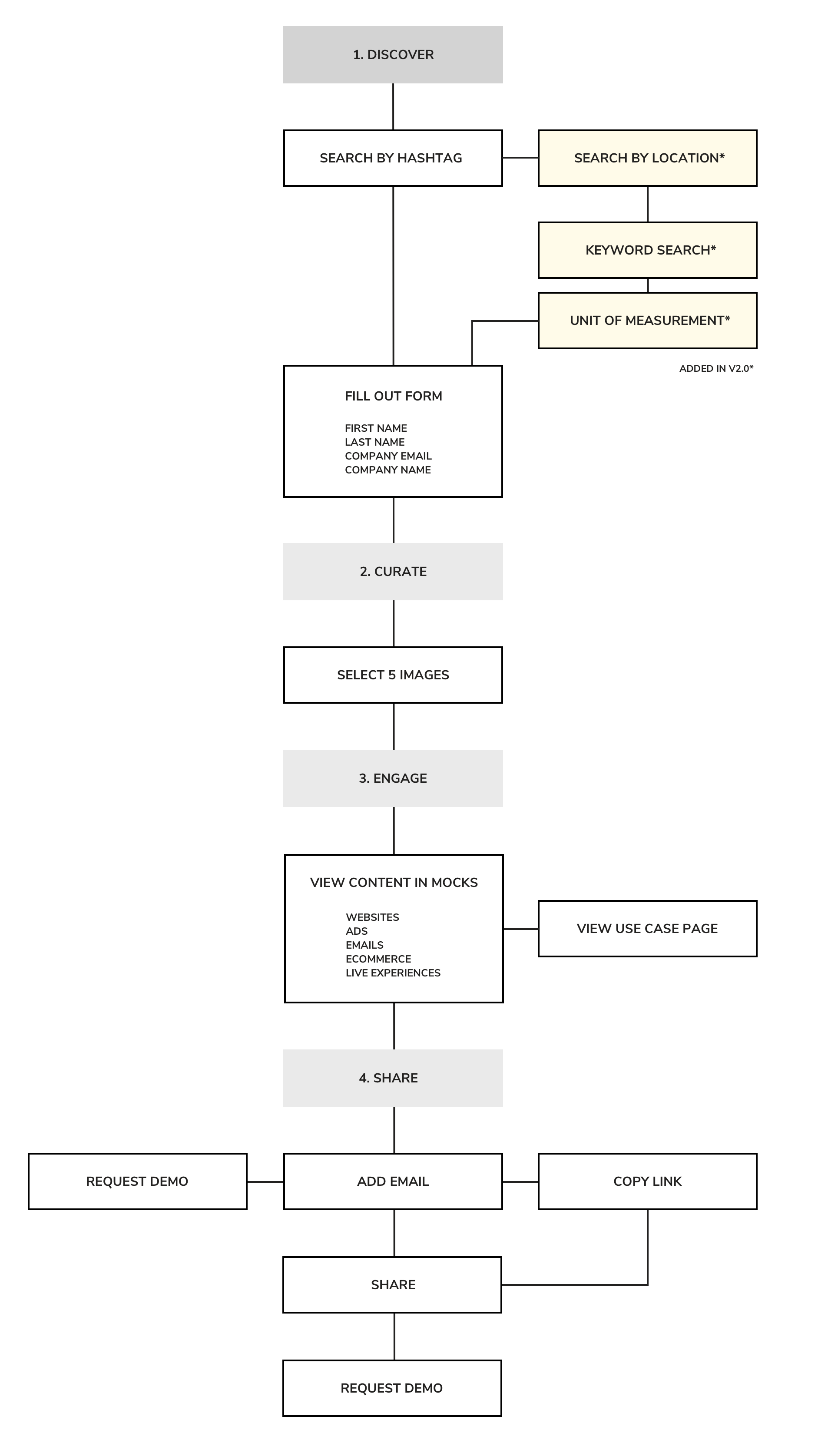
Wireframes

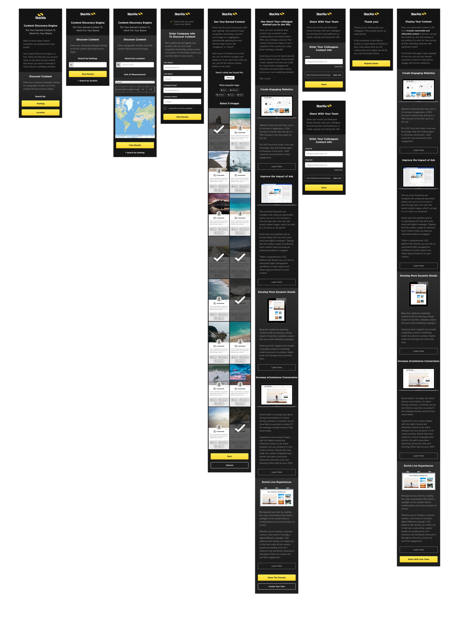
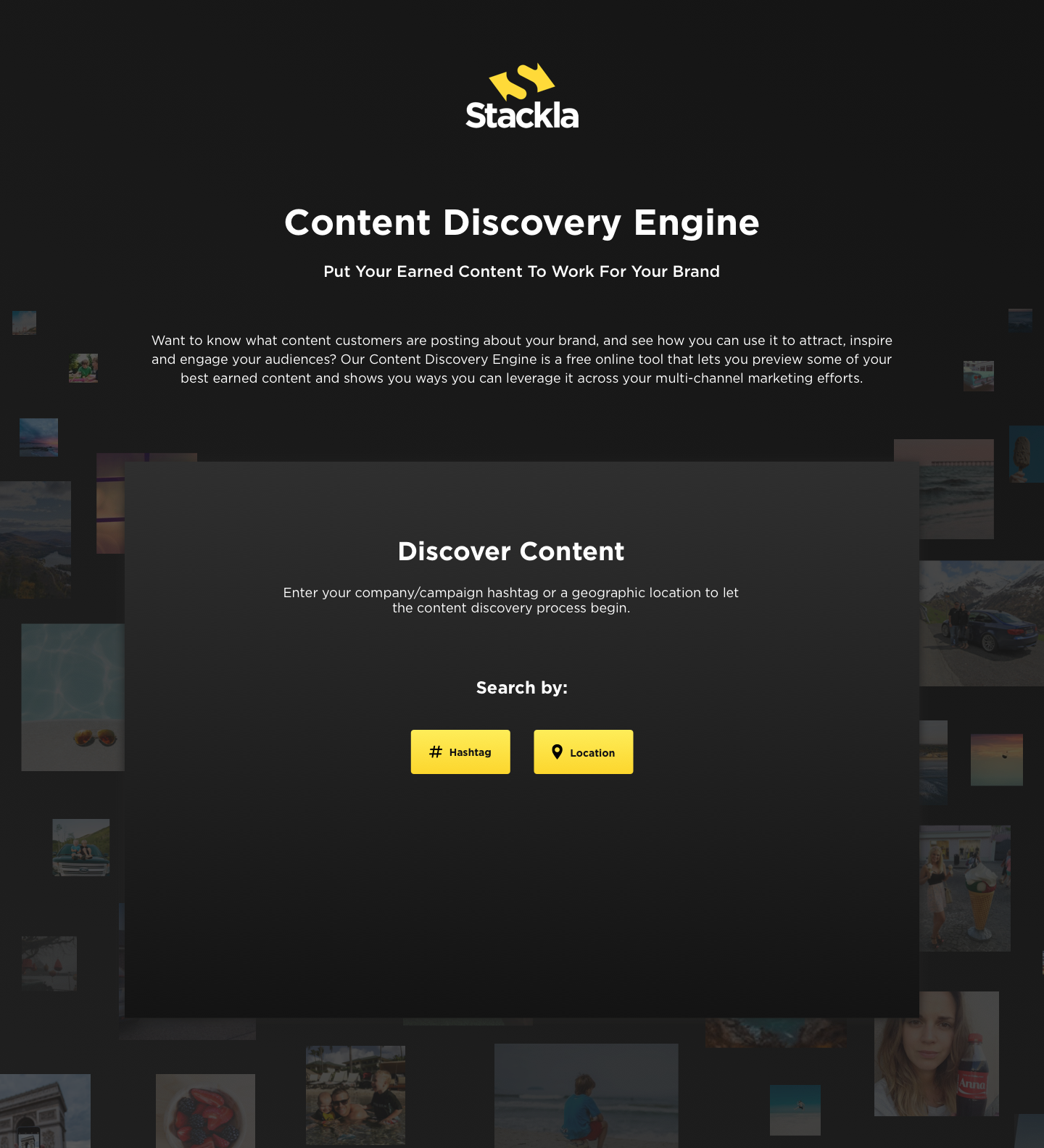
Version 1 - High Fidelity Draft

Mobile Designs
Edits to Version 1
After we reviewed and user tested the first draft (we interviewed Sales and CS people at Stackla that were using the microsite) we realized that we had to make some key changes.
Add the option to search by hashtag OR geolocation
Add loading screen animation
Add company name to the form so we can pull in their brand logo and apply it to the mocks (increase personalization)
Take instagram profile photos off content tiles (problem with pulling them from the API)
Make some stylistic changes to the UI mocks and put them in a white vector mobile device (so it doesn’t get lost on the black BG)
Add stats to each use case to show the value of user-generated content and further inspire potential customers
General stylistic updates to UI for a more streamlined look
Final Designs


Marketing Email

Social Ad + Display Ads


Results
This project has been a success. Its received rave reviews from the Sales and CS teams at Stackla and also generated over 500 net new leads for Stackla in 6 months time.
Reflections
I would have loved to have done more user testing through out the whole process to learn about potential problems and pain points having to do with the design and overall experience. Since we were under a tight budget and deadlines we didn’t test the prototypes as much as we should have.
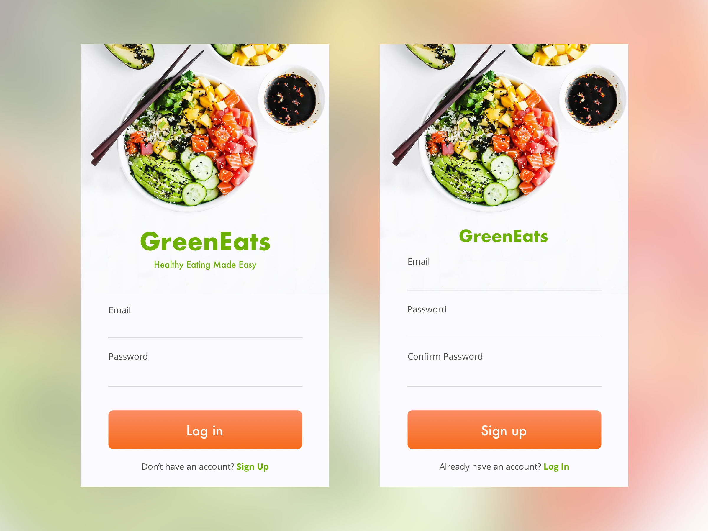
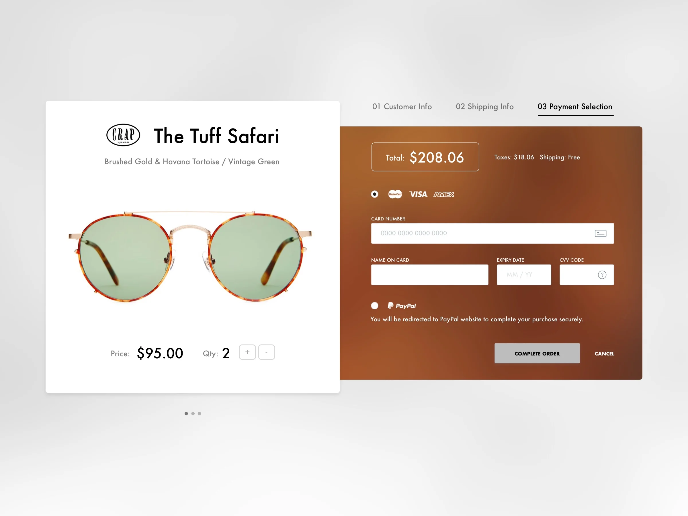
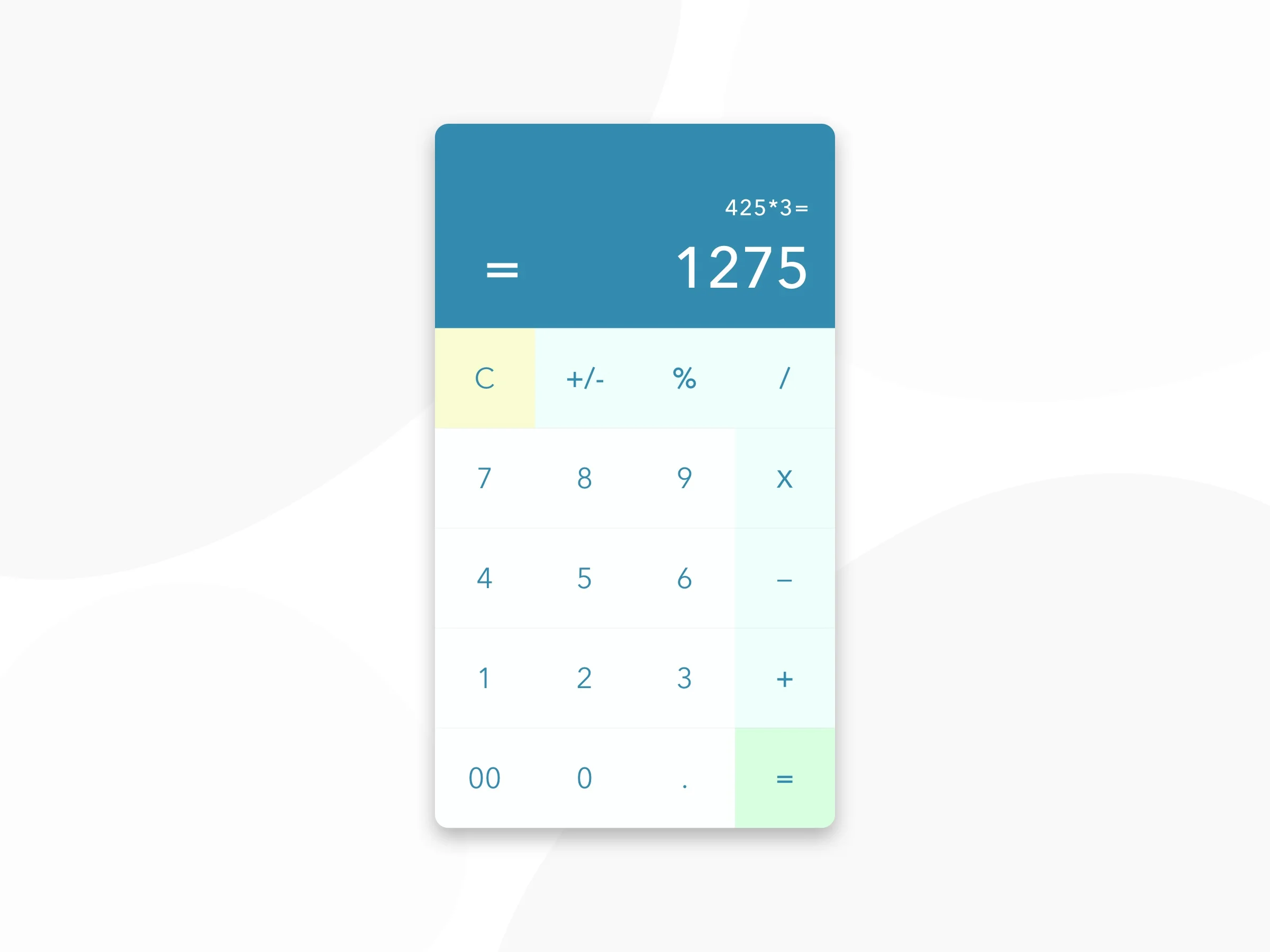
Daily UI Challenge
In an effort to improve my UI Design skills (and to get out of a creative rut at work) I challenged myself to do one UI exercise a day for 100 days - this is the result! http://www.dailyui.co/
001 Sign up
002 Credit Card Checkout
003 Landing Page

004 Calculator
Open Transit Web App
Client: Code4SF | Timeline: Jan 2019 | Role: UI/UX Designer, Brand Designer
Function: Prototyping, Dashboard, Data Visualization, UI Design | Tools: Balsalmiq, Sketch
Opening Statement
OpenTransit is dedicated to empowering people around the world to work with local governments to improve public transit using data, starting with the San Francisco Bay Area. This will be done by visualizing real-time data of the MUNI system so riders understand bus speed and reliability, and using the data to improve the Muni system.
I worked on this project with a Product Manager and a team of Front End and Back End Engineers at Code4SF (part of the Code for America brigade network — a Civic Hack Night where volunteers can discover local civic tech projects to get involved in or start their own).
MVP
For OpenTransit’s minimum viable product, our aim was to create a rider-facing web application that lets riders understand how good — or bad — their most-used bus routes are using historical data.
This consists of two parts:
A data analysis module that calculates key metrics for a given bus route and stop, such as the average historical waiting time at that stop or the average historical travel time between stops (plus min/max, standard deviation, quartiles, etc). This involves querying our raw data to compute when each bus reached each stop, then running algorithms to compute the desired metrics from this information.
A web app that lets riders choose the routes/stops they care about and visualizes the relevant metrics for them. This will live independently of the existing map app.
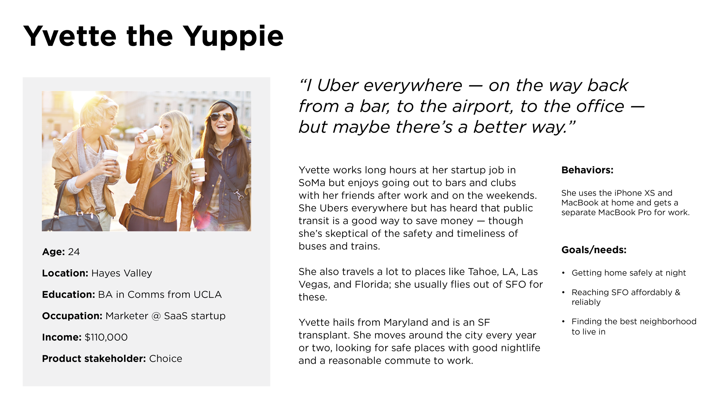
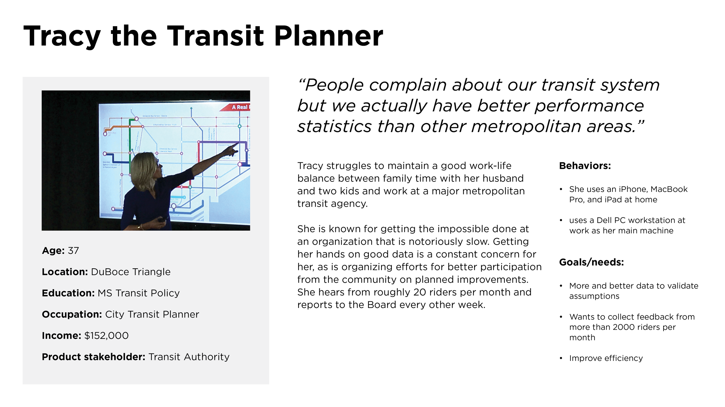
User Personas


Journey Map: Yvette After Work

Competitive Analysis: Bus Stat NYC Web App

What we like about Bus Stat:
1-3 big key metrics
Color-coding of the metrics
Comparing different neighborhoods
Graph of average waiting time at each stop on a route
Cumulative travel time across stops vs. schedules
Helps citizens figure out where the bus is getting derailed so they can pinpoint a particular area to complain about
Not that useful until we have the schedule
Graphical stop chooser
The way busstat does it, you have to choose your direction first and that restricts which “to” stop you can pick. It would be better to have the user choose their “to” and “from” and then pick the direction based on that
Shows breakdown of journey into wait time and onboard time
Graph metrics over time (e.g. average waiting time over the last year) so you can understand trends. But offer things like “7-day moving average” or average out over a week/month.
So user can know if the route is getting better or worse
Compare different days of the week
Filter by weekday/weekend and time window (morning commute, afternoon, evening commute)
Compare wait time vs onboard time so user knows how their time is being split
What we dislike about Bus Stat:
System-level summary (no benchmarks, not actionable)
What is the “planning” time on the journey performance graph? Needs clear labeling
Michael’s feedback: too much stuff on screen, eye isn’t being drawn to the important top-line takeaways
Also route summary isn’t as interesting as stop-to-stop journey
These graphs take some time to dig into
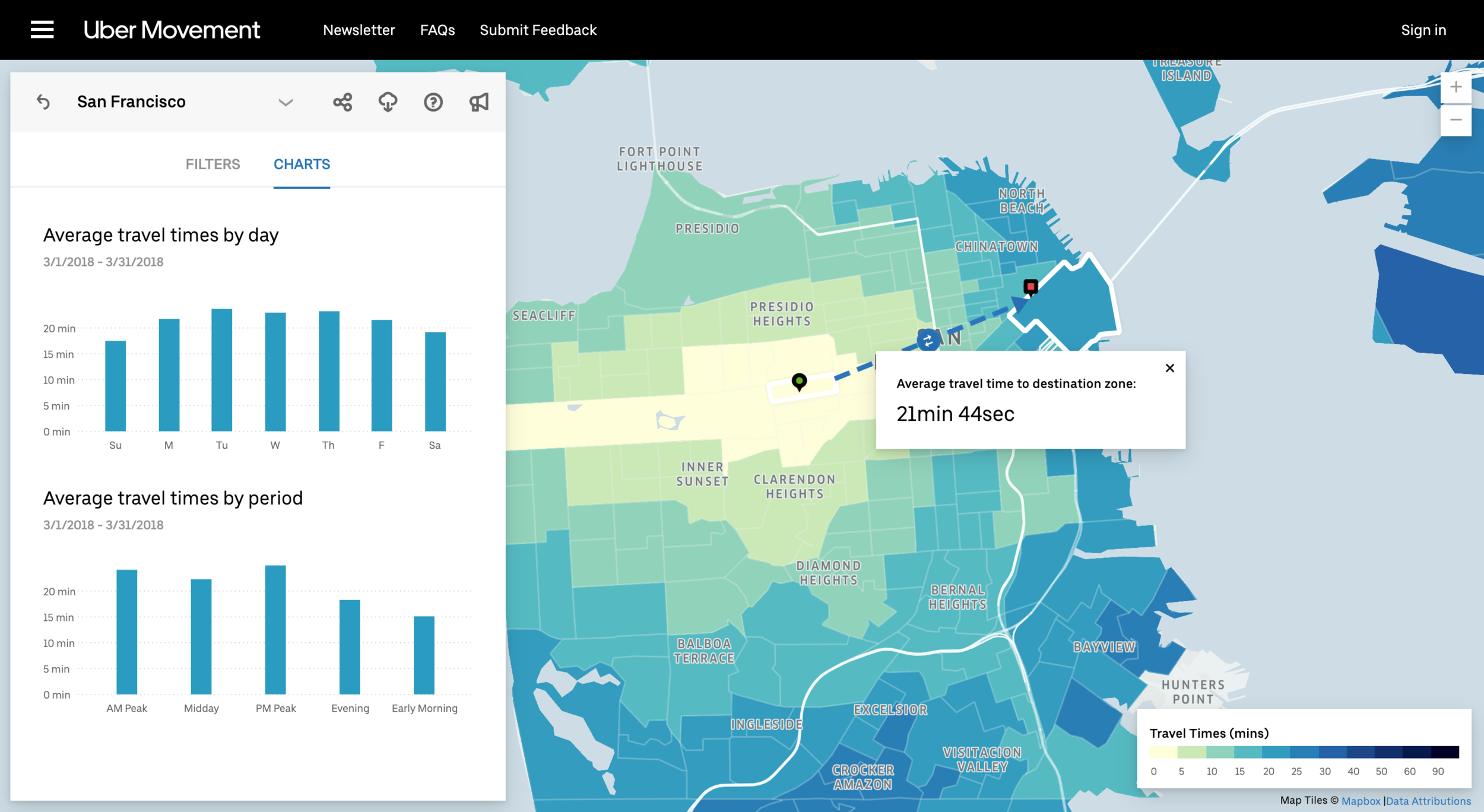
Another Great Example: Uber Movement

Digital Prototype: Draft 1
Digital Prototype: Draft 2
Marketing Design for Commercial Real Estate

Client: DTZ, Cassidy Turley, Newmark Cornish & Carey | Timeline: 2013-2015 | Role: Visual Designer
Function: Branding, Web Design, Email Design, Environmental, Print | Tools: Adobe Creative Suite
This is a sampling of projects I created when I was working at Cassidy Turley (rebranded to DTZ) and Newmark Cornish & Carey.
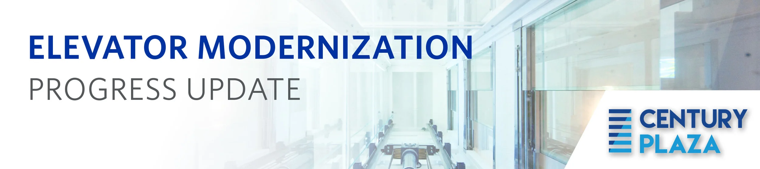
Century Plaza Branding + Webdesign
I worked on this project with a senior designer at Cassidy Turley, a commercial real estate company that rebranded to DTZ (and has since been acquired by Cushman & Wakefield). Century Plaza is a commercial office park in San Jose. The real estate brokers came to the design team needing a full suite of branding and marketing assets. We started with a logo, then created a website and email blast template, and some environmental graphics that were to be displayed in the office building.
Homepage

Environmental Graphics
Email Header
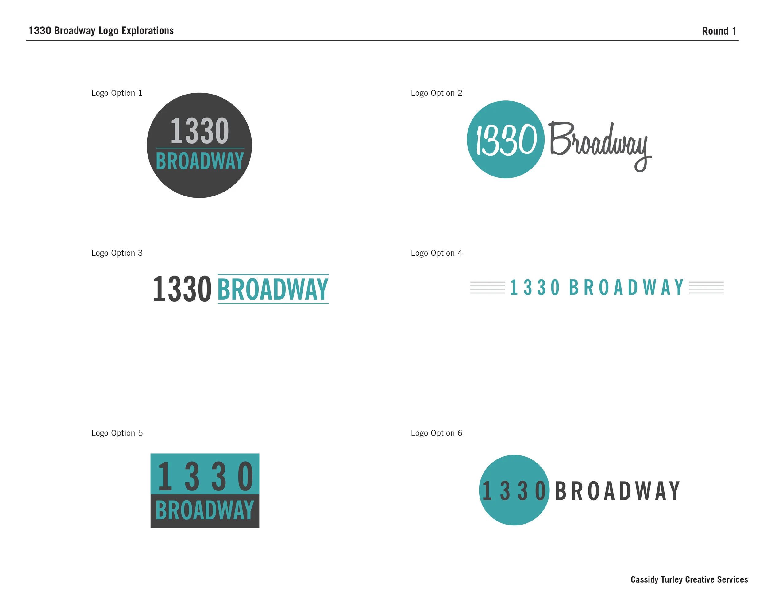
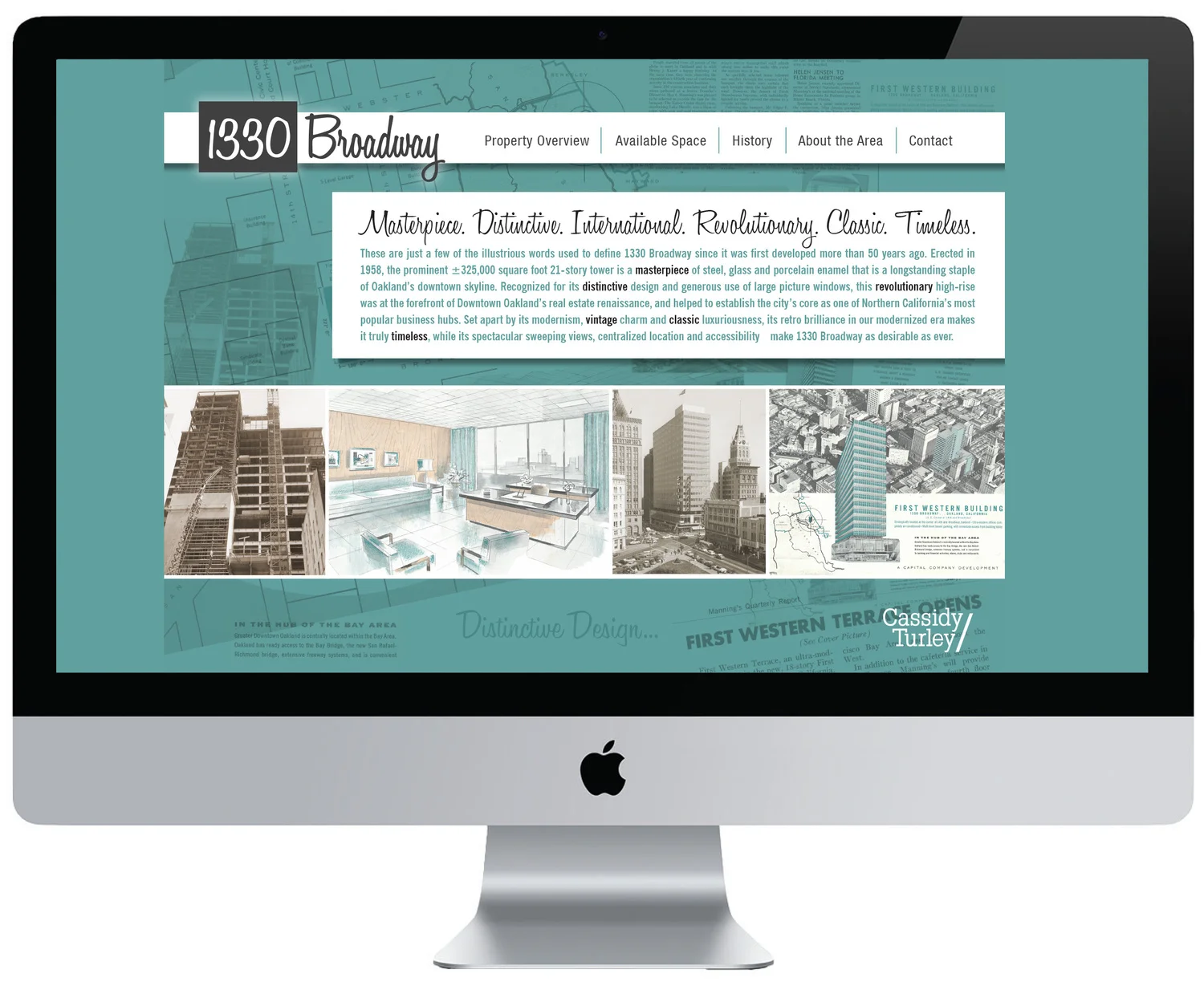
1330 Broadway Branding + Webdesign
1330 Broadway is an 18-story, 320,000 square foot trophy office tower in downtown Oakland, California. It has defined itself as one of the USA’s finest examples of International Style architecture (a major architectural style that was developed in the 1920s and 1930s and was closely related to modernism and modern architecture).
I was tasked to work with a senior designer to create a logo, website, email blast and flyer advertising the property. The brokers really wanted to showcase its unique style so we used photocopies from old print ads from the 1920s and created a custom logo in a vintage script.
Website + Email Blast Template

Digital Flyer

Product Mock UI Animations
Client: Stackla | Timeline: Feb 2019 | Role: Visual Designer
Function: Web Design, Animation, UI mockups | Tools: Sketch, Keynote
Opening Statement
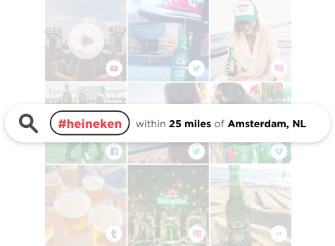
I was tasked to redesign one of Stackla.com’s most visited pages: Why Stackla. The purpose of this page is to explain Stackla’s value proposition by walking the viewer through the product’s main selling points: Asset Manager, Discover/Visual Recognition, Rights Management, Publish Content, and Co-Pilot Content Recommendations.
The challenge
The previous design was very outdated. It used the mocks below, which are as unattractive as they are confusing and better suited for print. I used animation to break down each step of the process in a series of 5 eye catching animations that play automatically as one scrolls down the page.

Animation Storyboards
Final Animations
Asset Manager
Publish Content
Visual Recognition
Co-Pilot Recommendations
Rights Management
Animations In Situation on Webpage
Results
The animation helped simplify technical concepts that are hard to relay in a static UI mock. The redesigned page conveys what Stackla does and why it’s important in a much clearer, more concise way.