Stackla brand refresh & marketing asset evolution
Marketing & branding
Project overview
Stackla has undergone many significant changes over the past few years, evolving from a user-generated content platform into the “world’s smartest visual content engine.” It enhanced its enterprise capabilities, launched AI-powered smart filtering, implemented machine learning-powered content recommendations, and added a digital asset manager to its offerings. Consequently, it outgrew its original branding.
My role
I was the founding brand/marketing design at Stackla so I served as the Lead Visual Designer. I closely collaborated with a marketing team, content folks, a dev team, and the founders of the company.
The challenge
One of the biggest issues with Stackla’s old branding was that it didn’t effectively communicate their vision. Although there is a wealth of dazzling UGC that Stackla can help marketers tap into—saving time, money, and effort—they weren’t living their own message, as they still used stock photos in their marketing assets, which diluted their vision.
What is Stackla?
Stackla is a SaaS application that helps marketers discover, manage, display, and optimize authentic user-generated content (UGC) alongside their branded assets, enabling them to create personalized experiences at every touchpoint. The platform is used by over 400 multinational enterprise brands, including McDonald’s, Expedia, Toyota, and Sony.
Deliverables
As the founding Visual Designer, my challenge was to push the brand forward and ensure that all brand and marketing assets continually looked fresh and engaging while reflecting Stackla's value and market positioning.
I was tasked to:
Create a new visual language and rewrite the brand guidelines
Redesign key assets ie sales deck, digital ads, event kiosks, and marketing materials
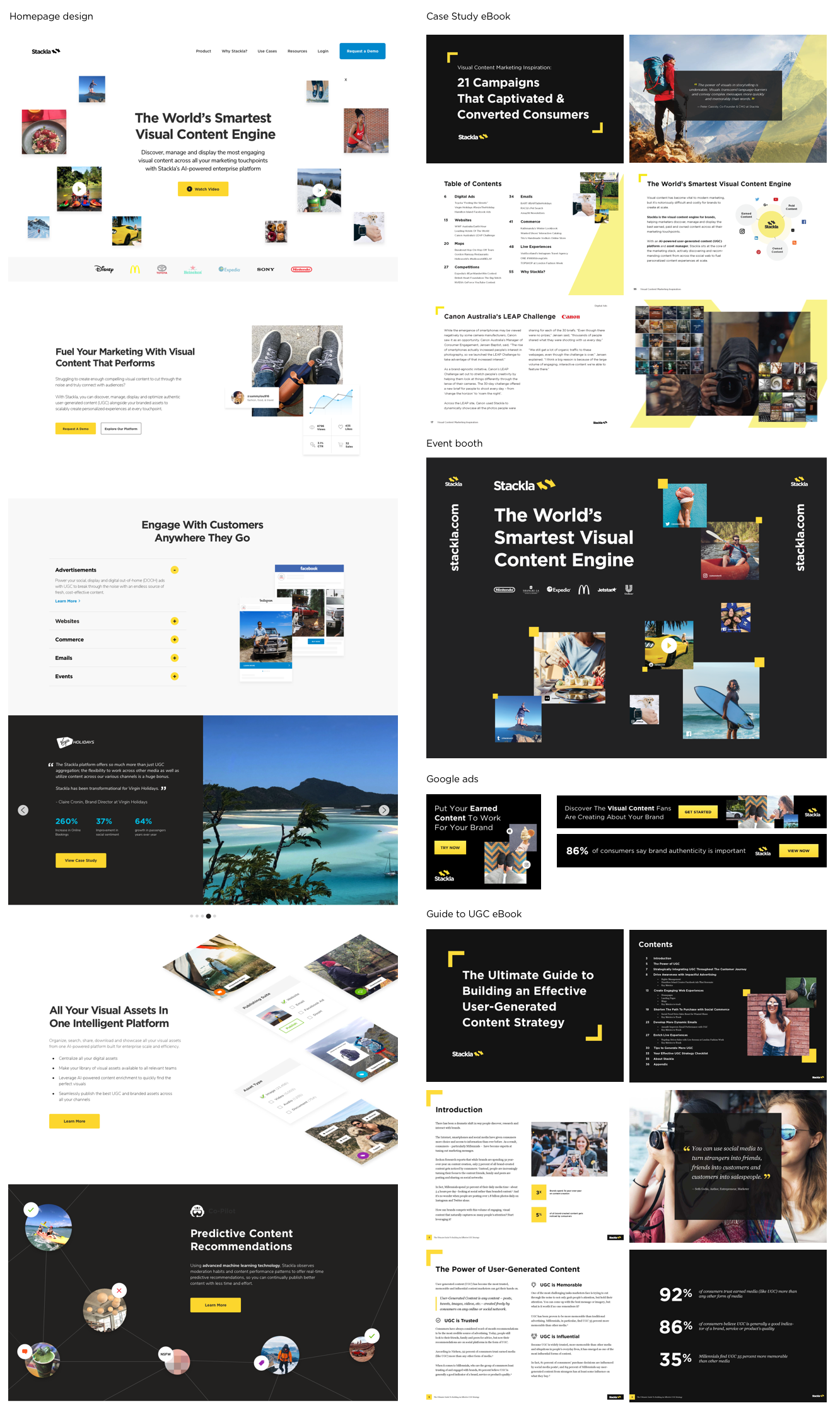
Redesign Stackla.com
Brand experimentation
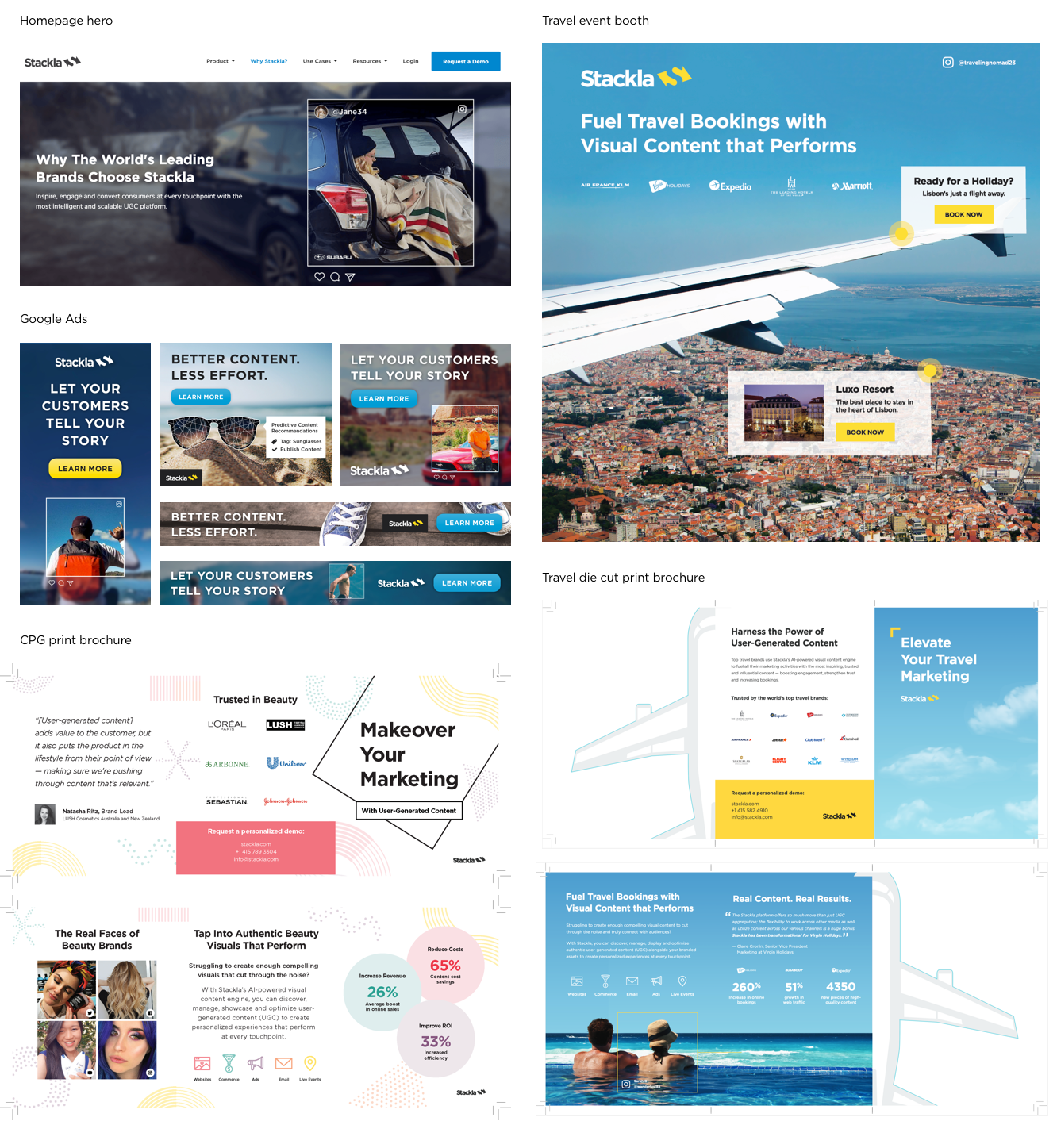
We decided to experiment with the brand by gradually evolving it rather than implementing an immediate overhaul. This was an ideal time for changes, especially since Stackla required campaign-specific sub-branding for its Co-Pilot product launch (AI-powered predictive content recommendations). Additionally, we explored vertical-specific designs featuring UGC photos to target travel, CPG, and automotive customers.
Co-pilot sub-branding

Vertical specific sub-branding
Moving in the right direction
Over time, we phased out unsightly and clunky elements of the branding—such as black backgrounds, diagonal image mosaics, stock photos, and distracting swatches of yellow—in favor of beautiful large-scale UGC photos, clean product UI mocks, concise iconography, and animations that demonstrate how the product works.
A whole new brand?
There was much discussion about which aspects of the brand to retain and which to discard. Ultimately, we decided to keep the logo, fonts, and yellow color because we had worked hard to build brand recognition and didn't want to lose that.
The refreshed brand aims to balance innovation, capability, and polish without talking down to our audience or appearing overly "smart." Dry tech visuals wouldn't create the aspirational feel we wanted.
Our process was roughly:
Compile all existing brand assets for review
Interview with founder + key stakeholders
Research / mood boards / inspiration
Redesign key assets + roll out over time
Overhaul website
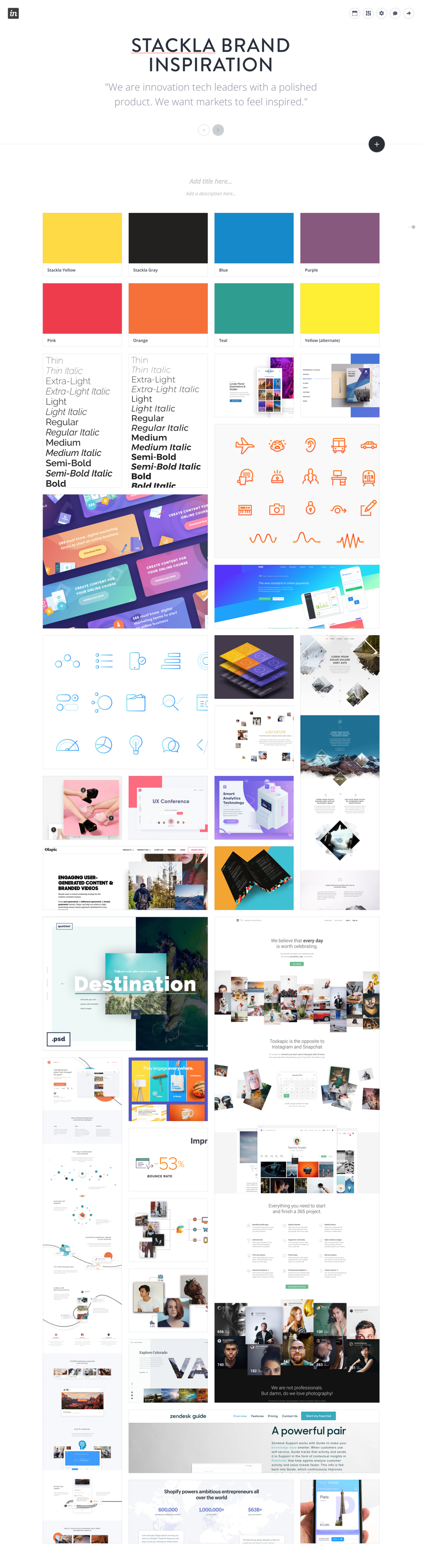
Mood boards
I utilized mood boards such as the one below to compile inspiration for the Stackla brand refresh. This helped me communicate with / get buy in from key stake holders about the direction of the new visuals.
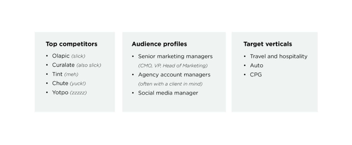
Competitive analysis
Extensive research of the Stackla’s competitors helped me to differentiate the Stackla brand.
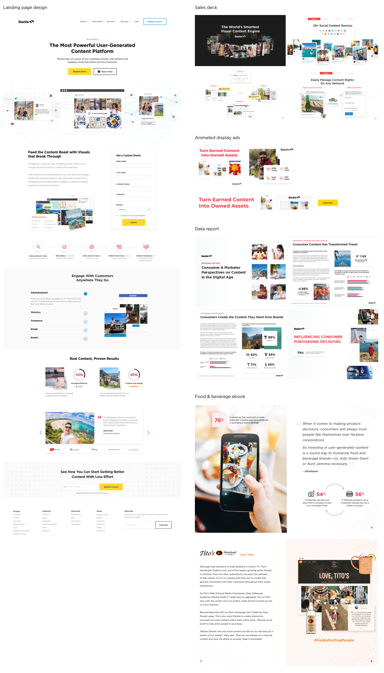
The results (selected marketing materials)
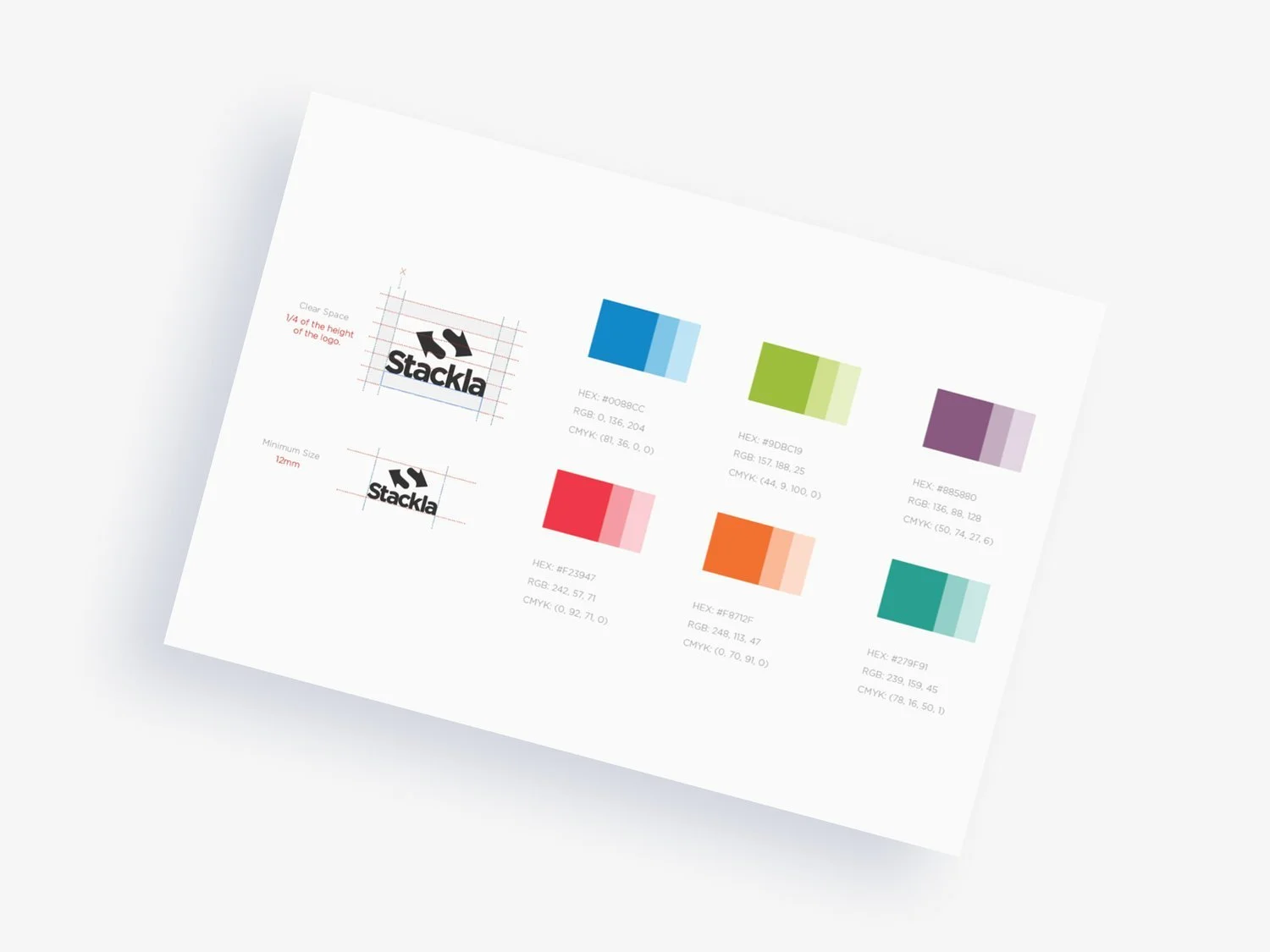
Brand guidelines
Once we established a visual language, we rewrote the brand guidelines to ensure quality and consistency across all brand assets and minimize confusion during the implementation of the refreshed brand.

Reflections
I’d love to say that we put all our other projects on hold, set aside plenty of time to craft the perfect brand refresh, and then methodically redesigned every asset before unveiling the new look in one smooth sweep—Stackla transformed overnight, revenue soared, and everyone was thrilled. Unfortunately, that's not how it usually works at an under-resourced startup.
The journey to get Stackla’s brand, design assets, and website in shape was far from linear. We experimented a lot—and sometimes that meant learning from our failures. Many projects didn’t reach the level of polish I hoped for due to limited design resources, time, and budget. We often worked under the mantra "done is better than perfect" (or "perfect is the enemy of good"), which also meant we weren’t always able to use research and analytics to test and iterate our designs—something I definitely want to focus on more in the future.