
Stackla Brand & Marketing Asset Refresh + Evolution
Timeline: Sept 2016 - Jan 2019
Role: Visual Design Lead
Function: Brand Design, Communication Design
Tools: Adobe Creative Suite, Sketch, Invision

Opening Statement
Stackla underwent many momentous changes over the past few years, evolving from merely a user-generated content platform to the “world’s smartest visual content engine”. It ramped up it's enterprise capabilities, launched AI-powered smart filtering, enabled machine learning powered content recommendations, and added a digital asset manager to it’s offerings. Consequently, it outgrew it’s original branding.
What is Stackla?
Stackla is a SaaS application that helps marketers discover, manage, display and optimize authentic user-generated content (UGC) alongside their branded assets to scalably create personalized experiences at every touchpoint. The platform is used by over 400 multinational enterprise brands like McDonalds, Expedia, Toyota and Sony to name a few.
The Starting Point: Brand Assets in 2016

Their branding was high contrast, harsh and masculine. It relied heavily on the use of the brand yellow, the diagonal framing element, in-device mockups and UGC image mosaics. The color palette was very limited and distracting.
#Uninspirational
One of the biggest issues with Stackla’s old branding is that it wasn’t selling their vision. There’s a world of dazzling UGC out there [that Stackla can help marketers tap into, saving time, money and effort] but Stackla wasn’t drinking its own kool-aid. They were still using stock photos in their marketing assets which muddled their message.
Role + Deliverables
As the only Visual Designer, my challenge was to push the brand forward and ensure that all brand and marketing assets continually looked fresh and engaging while reflecting Stackla's value and market positioning. I was tasked to:
Create a new visual language and rewrite the brand guidelines
(in collaboration with Stackla’s Head of UX Design)Redesign key assets ie sales deck, digital ads, event kiosks, and marketing materials
(in collaboration with Stackla’s Head of Content)Redesign Stackla.com
Brand Experimentation
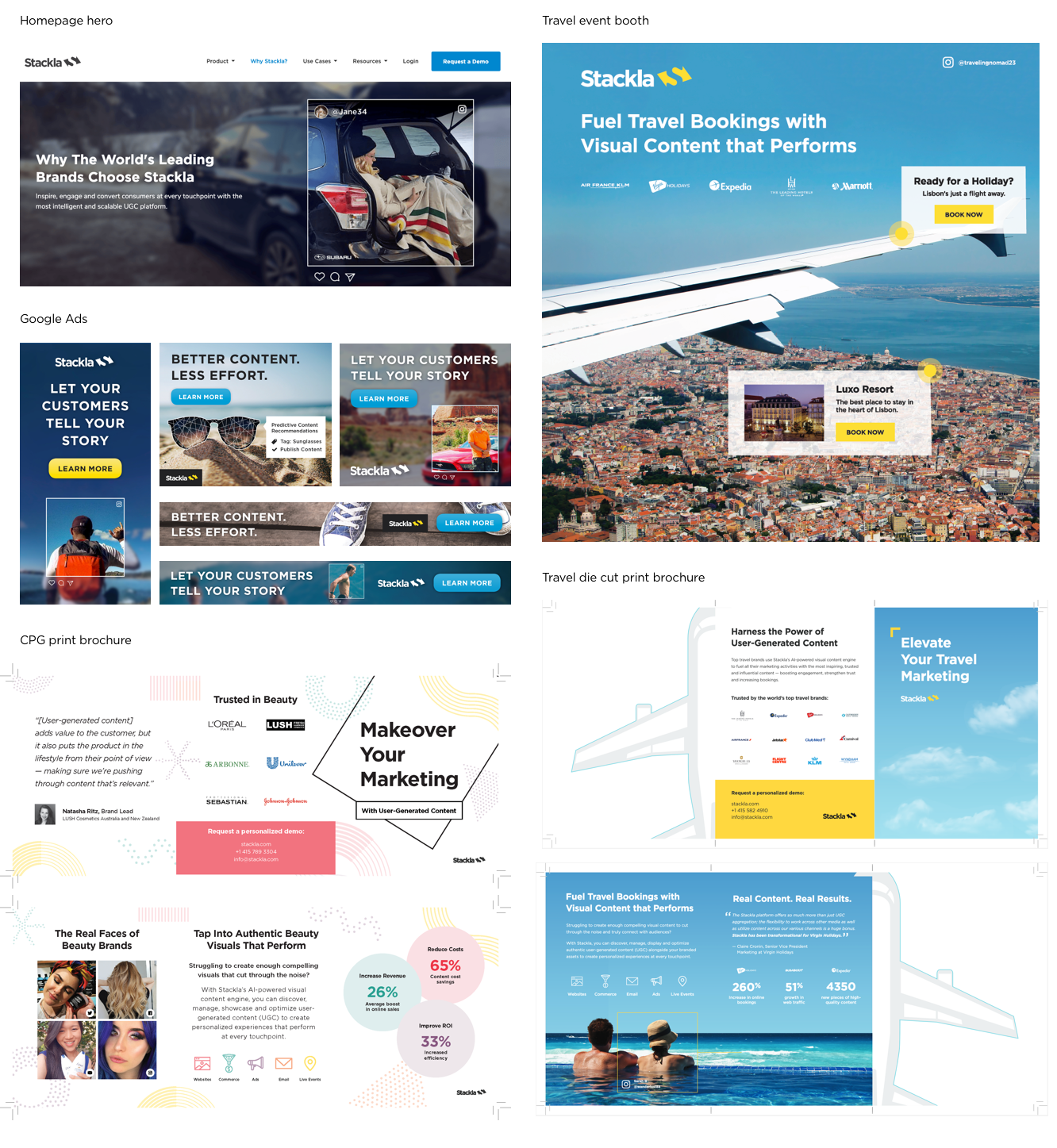
We decided that at this point in time, we should experiment with the brand to see what works by slowly pushing it forward (rather than overhauling it in one fell swoop). It was a good time to implement some changes, because Stackla called for some Campaign specific sub-branding during this time period for its Co-Pilot product launch (AI-Powered predictive content recommendations). As another marketing push, we also tried some vertical specific design featuring UGC photos. We were looking to specifically target travel, CPG, and automotive customers.
Co-pilot Sub-Branding

Vertical Specific Sub-Branding
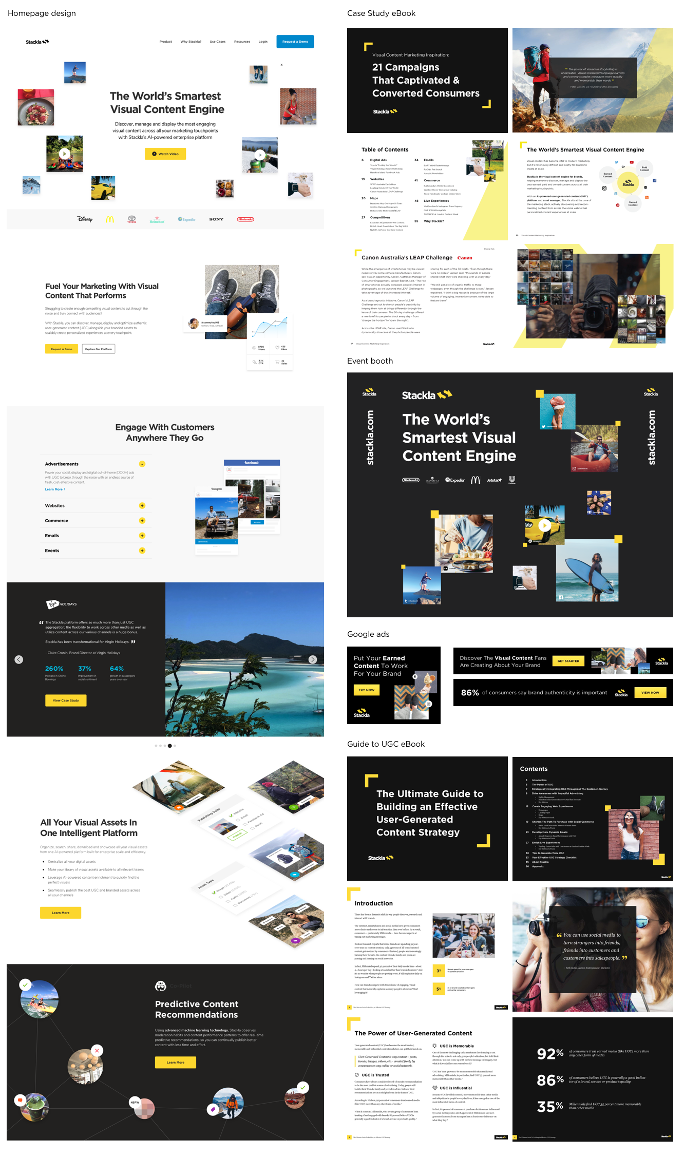
Moving in the Right Direction
Over time we phased out some of the unsightly and clunky elements of the branding: the black backgrounds, the diagonal, image mosaics, stock photos and distracting swatches of yellow. We subbed in more beautiful large scale UGC photos, clean product UI mocks, concise iconography, and more animation showing how the product works.
A Whole New Brand?
There was a lot of discussion about which parts of the brands to keep and what to do away with. Ultimately, we decided to keep the logo, fonts, and yellow color. We’d worked hard to build brand recognition over time and didn’t want to lose that.
The refreshed brand aims to strike a balance between coming off as innovative, capable and polished without talking down to our audience or appearing too “smart” for them. Dry tech visuals weren’t going to create the sense of aspiration we wanted our audience to feel.
“We sell a product that conveys trust, authenticity and real human connections, so that should be at the heart of our visual presentation.”
Our process was roughly:
Compile all existing brand assets for review
Interview with founder + key stakeholders
Research / mood boards / inspiration
Redesign key assets + roll out over time
Overhaul website
Mood Boards
I utilized mood boards such as the one below to compile inspiration for the Stackla brand refresh. This helped me communicate with / get buy in from key stake holders about the direction of the new visuals.
Competitive Analysis
Extensive research of the Stackla’s competitors such as the below helped me to differentiate the Stackla brand.
The Results

Brand Guidelines
Once we nailed down a visual language, it was time to rewrite the brand guidelines document to ensure quality and consistency across all brand assets and minimize confusion around the implementation of the refreshed brand.

Reflections
“It’s through mistakes that you actually can grow. You have to get bad in order to get good.”
I’d love to tell you that we paused our other projects, set aside a bunch of time to come up with the perfect idea for a brand refresh, wrote up some amazing guidelines, redesigned the brand/marketing assets methodically, then rolled out the rebrand in one fell swoop. Tada! Stackla was transformed and saw a huge spike in their revenue and everyone was happy. Rainbows and butterflies! Unfortunately, thats never the reality when working for an under resourced startup.
The path to getting Stackla’s brand, design assets and website in shape definitely wasn't linear. There was a lot of experimentation and consequently, failing forward. Many projects weren’t executed at the level of design polish that I wanted because we were lacking design resource, time and budget. We were working under the mantra “done is better than perfect” / “perfect is the enemy of good”. This also meant that we often weren’t able to use research and analytics to test and iterate upon design, something that I want to do more of moving forward.